This is the weekend edition of TheMarioBlog and will be updated as needed. The next blog post is Monday, January 23.
In our previous blog post, we discussed how our philosophy of WED (Writing/Editing/Design) came to be: a way of making sure that content, the story itself, always took precedence over the design and the aesthetics in the presentation.
We mentioned that with mobile visual storytelling, WED has come full circle and that its relevance has never been greater.
WED is all about the marriage of journalism and design. Today, it is also about the inclusion of technology with the two other disciplines. The designer today returns to his/her journalistic roots, concentrates on the story, guarantees that the design will be appropriate and provide the best user experience.
As a perennial student of story structures—how stories are presented—and because I happen to be preparing my lectures for the start of a new semester at Columbia University's Graduate School of Journalism, where I teach a course titled Multiplatform Design & Storytelling (see this semester's course syllabus here) I am spending considerable time looking at how The New York Times experiments with various forms of storytelling which deviate from the traditional formats of headline, summary and text.
Visual storytelling via linear thinking
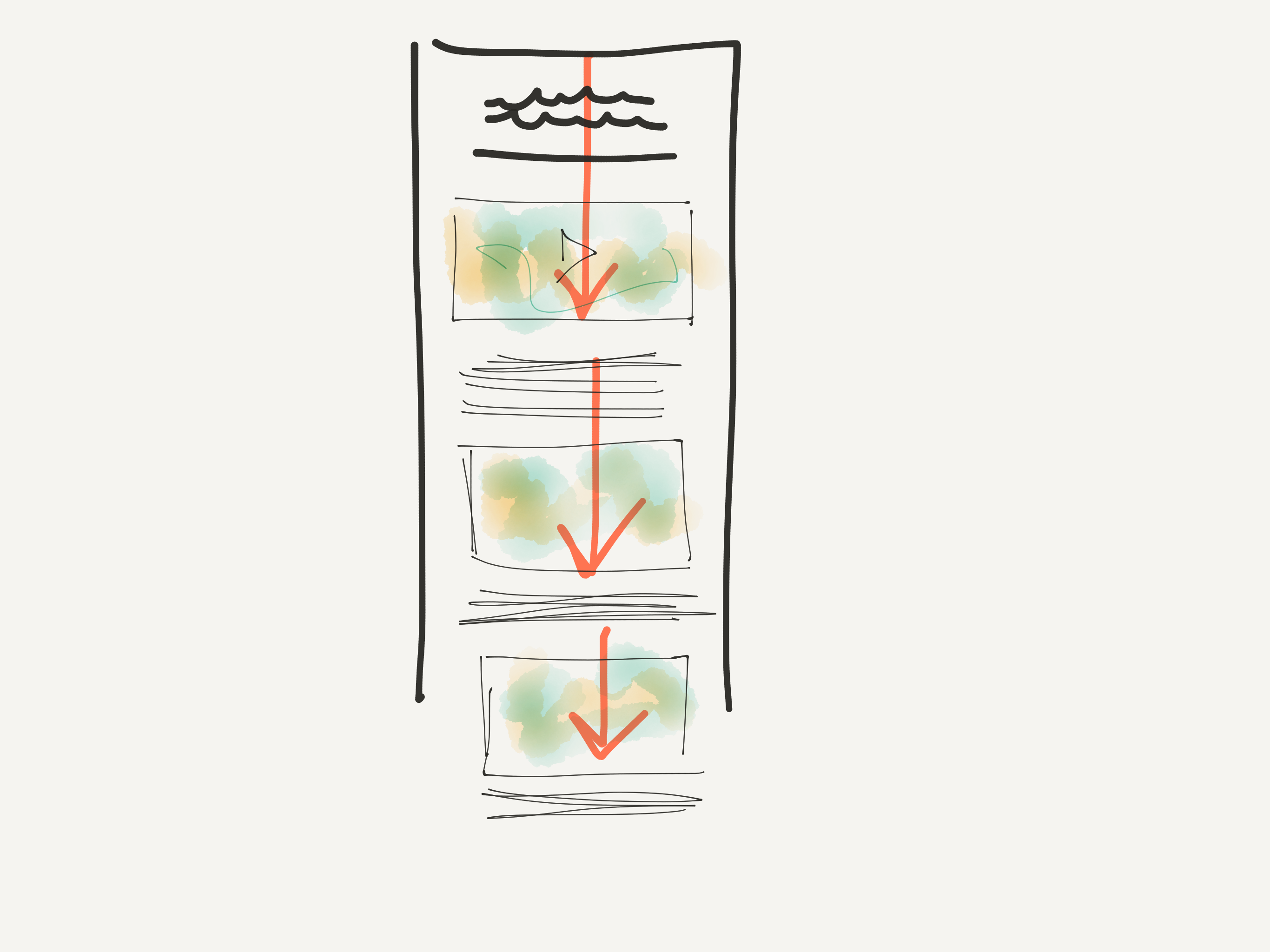
We are beginning to see what may strike many traditional writers and editors as odd and, definitely, different: the text or narrative of the story blends with the images accompanying it. It is a single dimension narrative that involves text and visuals in a seamless flow.
No longer will you see a cluster of photos either before, in the middle or at the end of the story itself. Instead, the writer weaves the text with the imager, a normal, logical progression of how we think.
If in doubt, think back to when you were a child, doing your first storytelling, writing stories in your lined notebook. Chances are that you started your story with words, then drew a photo, then continued. Both the words and the visuals are part of a sequential development. Here is a sample where a child does exactly that, which makes perfect sense.
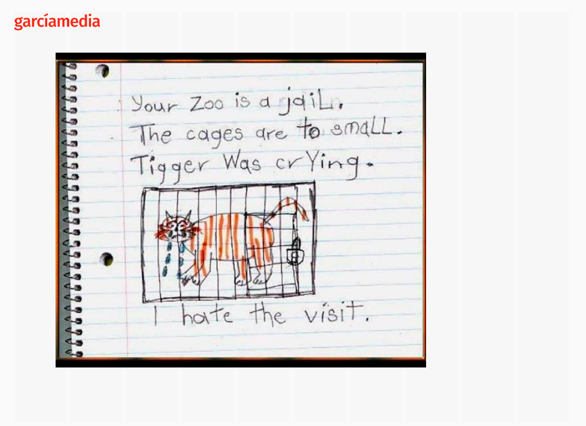
Which prompts the question, if this is so natural and intuitive, why is it that we have traditionally separated text from imagery in printed editions of newspapers and magazines? While I don't know the answer, I imagine that the size of most newspapers and magazines, the fact that at the beginning type was set in metal, and that we are reading on pages that are square and where the eye moves from left to right, have a lot to do with the clustering of photos separated from the text.
This is how we lay out newspaper and magazine pages, letting the text flow with as little interruption as possible. Designers of a certain age may remember editors arguing against even the placement of a long display quote in the middle of text, to avoid “interrupting the flow” of copy.
Take a look at these sketches that show what I refer to.
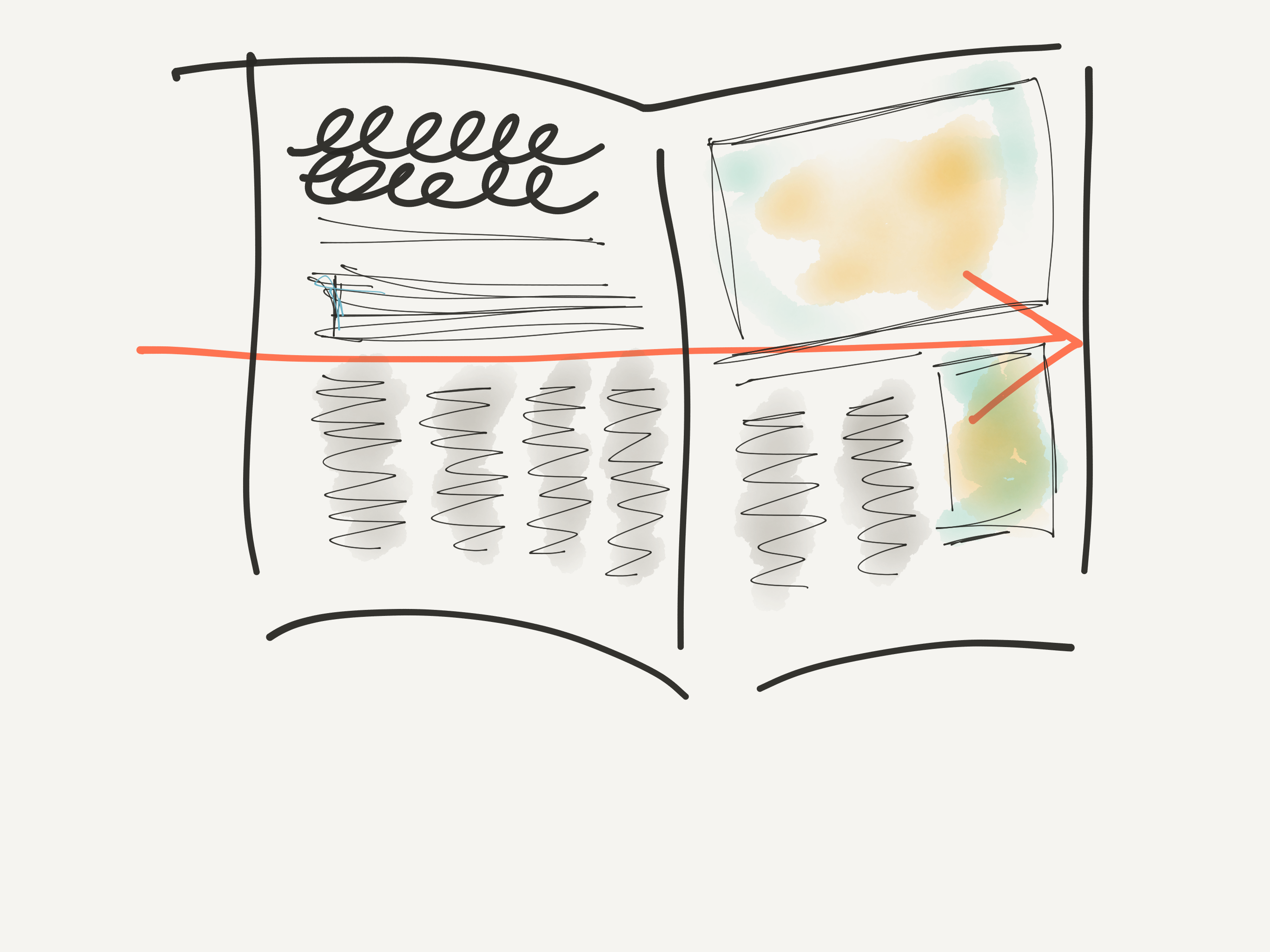
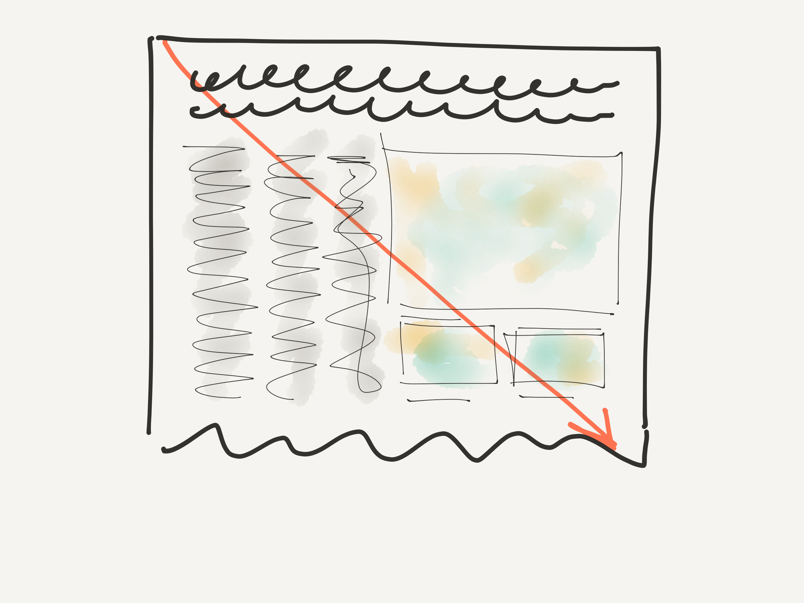
Yet, on mobile devices, we scroll, there is a full linear movement top to bottom. The eyes are not moving diagonally, but, indeed, from the top of the screen to the bottom, when we normally scroll. It is this type of movement that makes the stream of copy and imagery a natural flow for a story.
NYT: A report from Aleppo
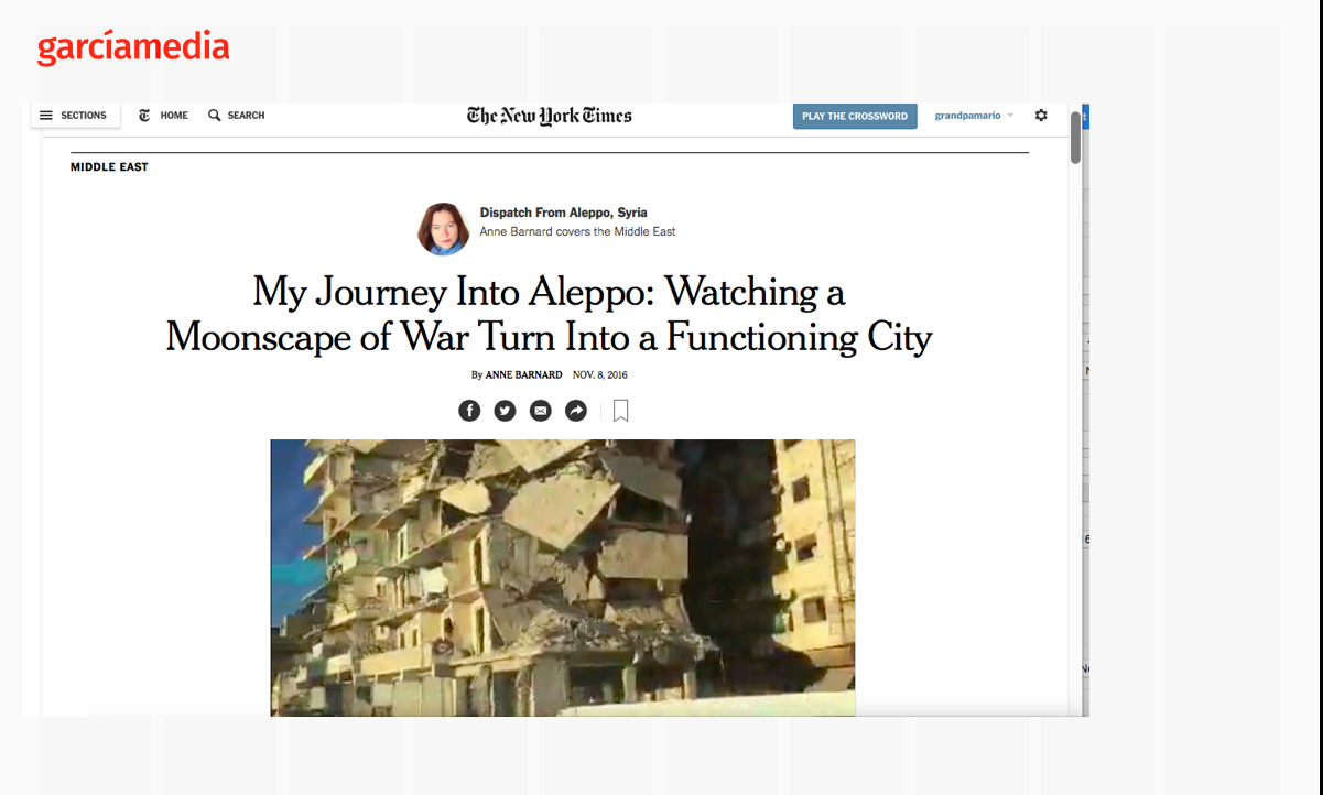
This story by Anne Barnard, who covers the Middle East for The New York Times, is a great example of weaving a narrative with imagery.
The story is written in the first person and the words lead into the images and/or videos described by the writer. It is a normal progression of thoughts and ideas. The words are never redundant, but, quite the contrary, reinforced by what we see immediately after we read them. This, I believe, is a process achieved by having the writer sit down with a designer who thinks visually, nothing short of a WED collaboration, with great results.
So, you see a line in the story that reads: “As you enter western Aleppo, everything seems so normal.”, and you see a photo that amplifies the idea.
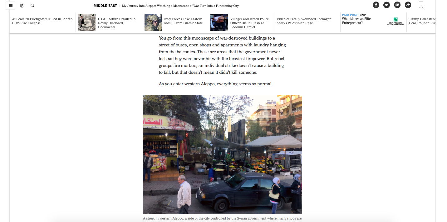
It is worth noting that, in this case, the writer has taken the photos and videos she presents in the story, although this is not a requirement.
Writing coach Dr. Roy Peter Clark discusses the Aleppo story
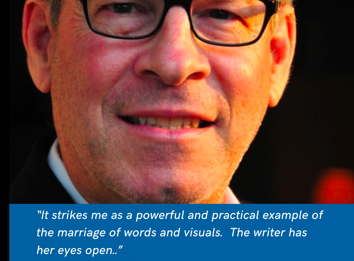
Thanks for sharing this war dispatch from Syria. It strikes me as a powerful and practical example of the marriage of words and visuals. The writer has her eyes open. She captures video of the ruined city. She snaps photos of telling scenes. But her notebook also acts as a camera in which she recreates for her readers a visual experience in words. There is a trick, if I may call it that, that both writers and photographers have on their workbench. It involves the juxtaposition of two things that do not belong together. For the reporter, it is the view from her hotel window. “It was a strange combination of elegance and war.” The elegance is exemplified by the classic Syrian furniture and the sweets left out on the table for hotel guests. The war is made real by the pillar of dark smoke rising in the distance. Every good story has a focus, a theme or pattern that is supported by all the elements — either in words or pictures.
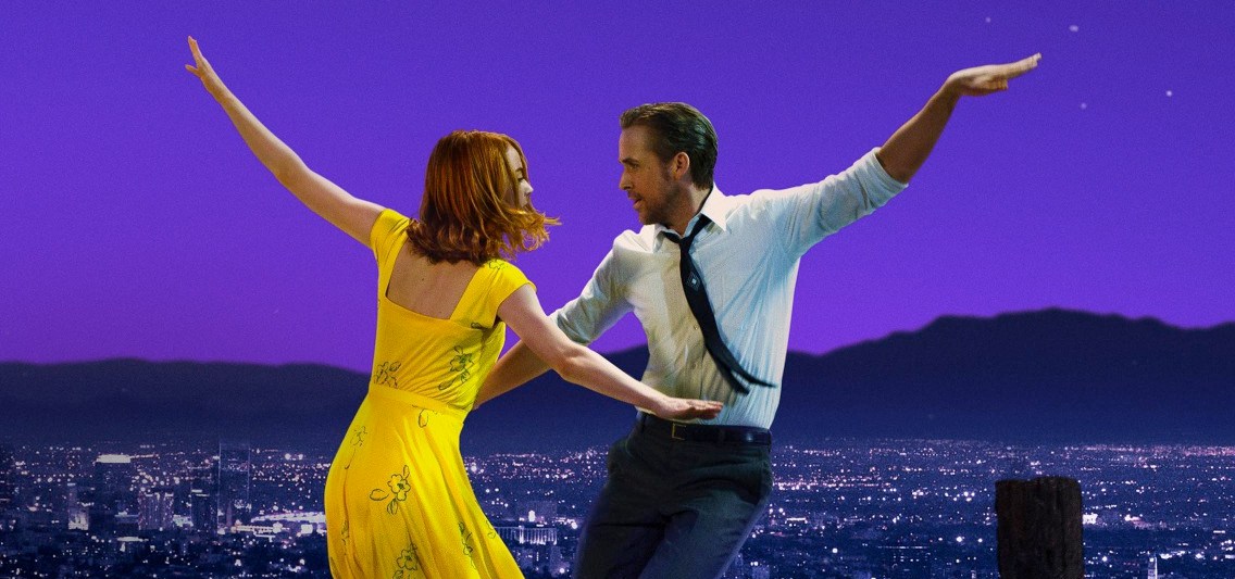
Roy added these comments about WED after he saw the award-winning film, La La Land:
“WED should not be that hard to understand or put into use. Last night, for her birthday, I took my wife to see La La Land. It is a romantic musical, reinventing a genre of film-making from the past, but with a thoroughly modern sensibility. It deserves the plaudits it has received. And think of how many different creative disciplines were required to create it: words, lyrics, instrumental score, cinematography, sound, set design, costuming, acting, voice, choreography, editing. Each discipline will have its own masters. But some creative forces must align to gather these into a coherent whole. If Hollywood can manage all that, why can't we handle W-E-and-D?
Here is the good news: choreography is different from script-writing or orchestration, but at the high-end each discipline shares the big challenges: to find a great idea, to gather the elements that might bring it to life, to discover a governing focus, to envision the architecture, to see it whole, to revise it to make it better. We can share the same creative language, and learn how to speak across disciplines without an accent. “
The WED series
Designers of all ages, let's rethink, reinvent and recharge.
https://www.garciamedia.com/blog/designers_of_all_ages_lets_rethink_reinvent_and_recharge
Digital storytelling, Part One: The fusion of writing/editing/design
https://www.garciamedia.com/blog/digital_storytelling_part_one_the_fusion_of_writing_editing_design
…and, while on the subject of linear thinking…..
I had to smile while, in the midst of reading a New York Times story about “moving day” at the White House, with one moving van taking the Obama family belongings away while another one arrives with the Trump's, suddenly an ad for a moving company interrupts the story. Artificial Intelligence at work here.
