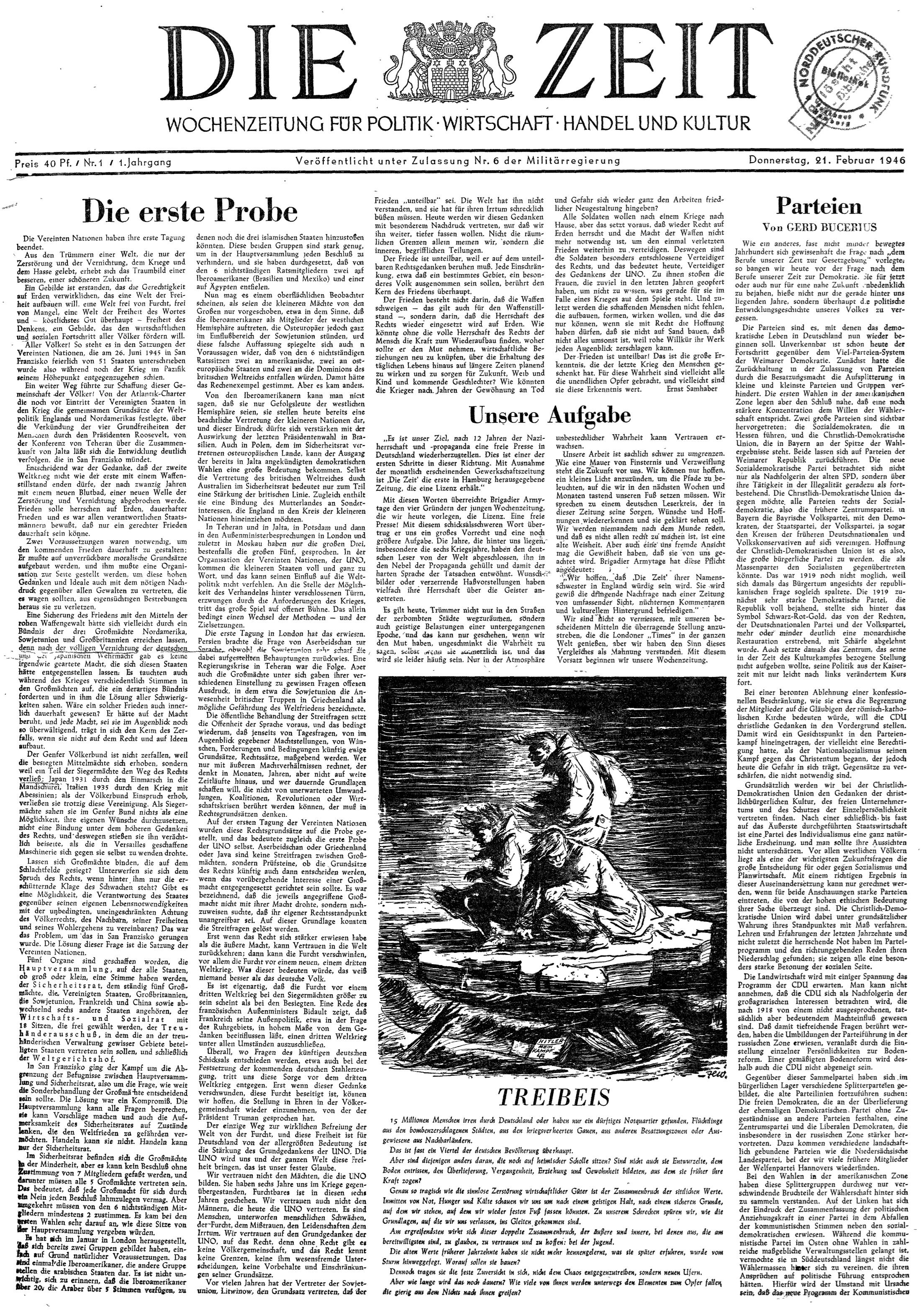
1946: Volume 1, Number 1 edition of Die Zeit
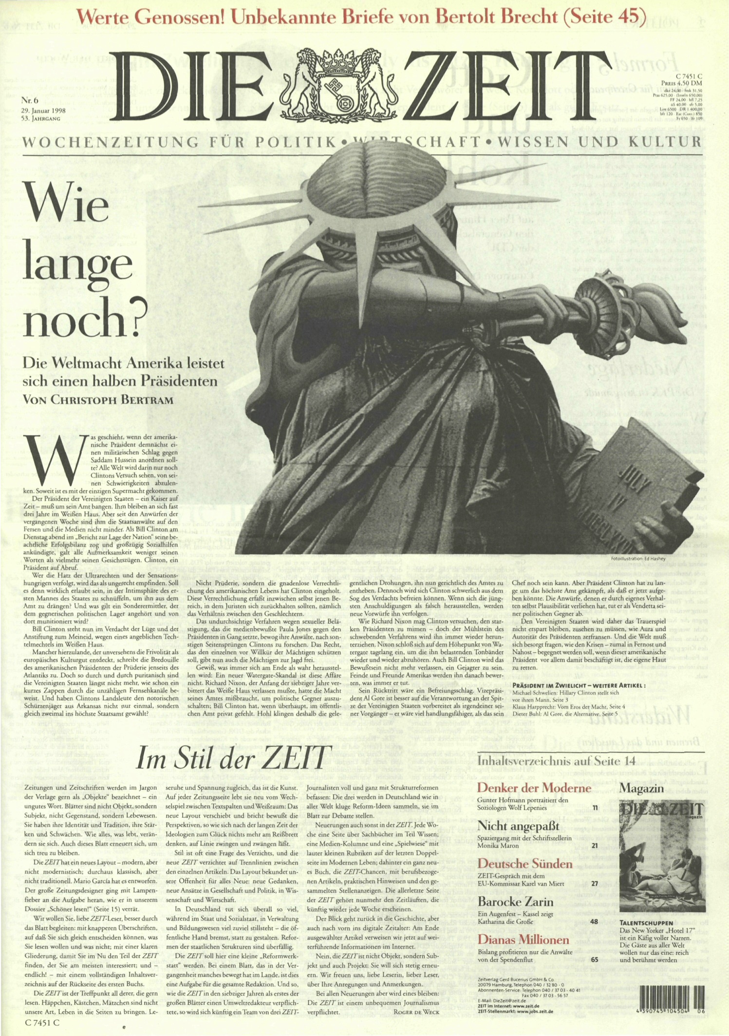
First edition of Die Zeit with the new look (1998)
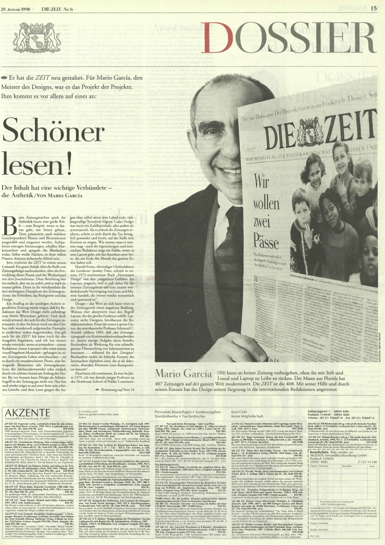
Here I am 19 years ago, on the cover of Die Zeit’s Dossier section, writing a piece about the process of the Die Zeit redesign.
The Best of Die Zeit
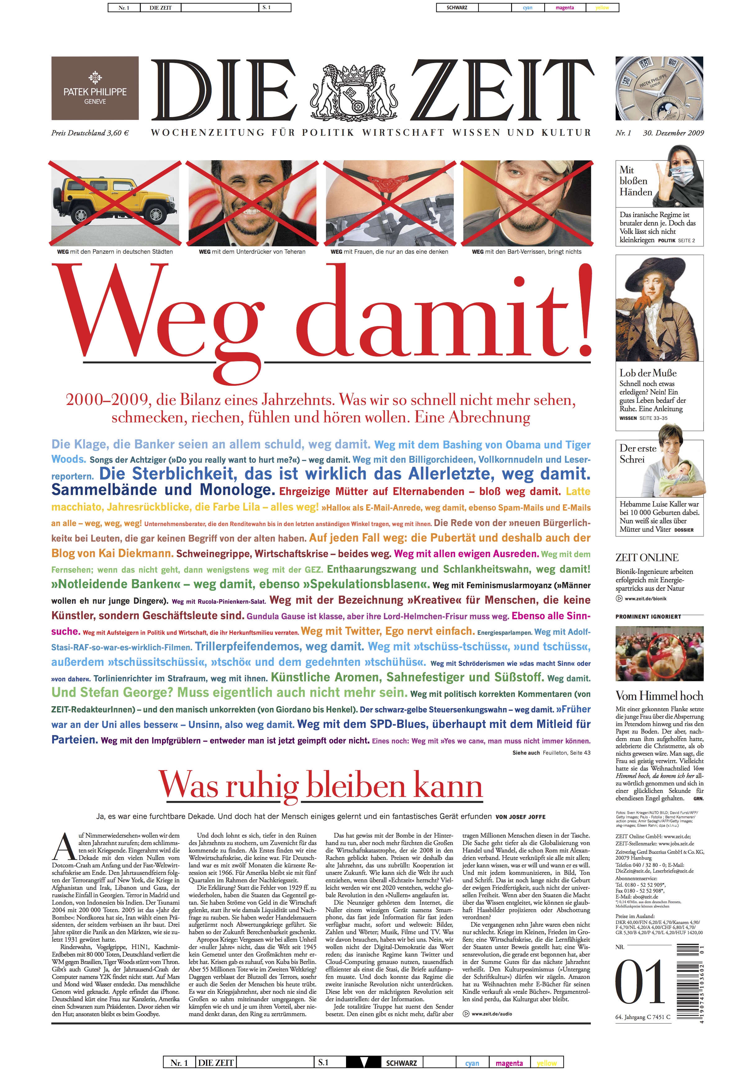
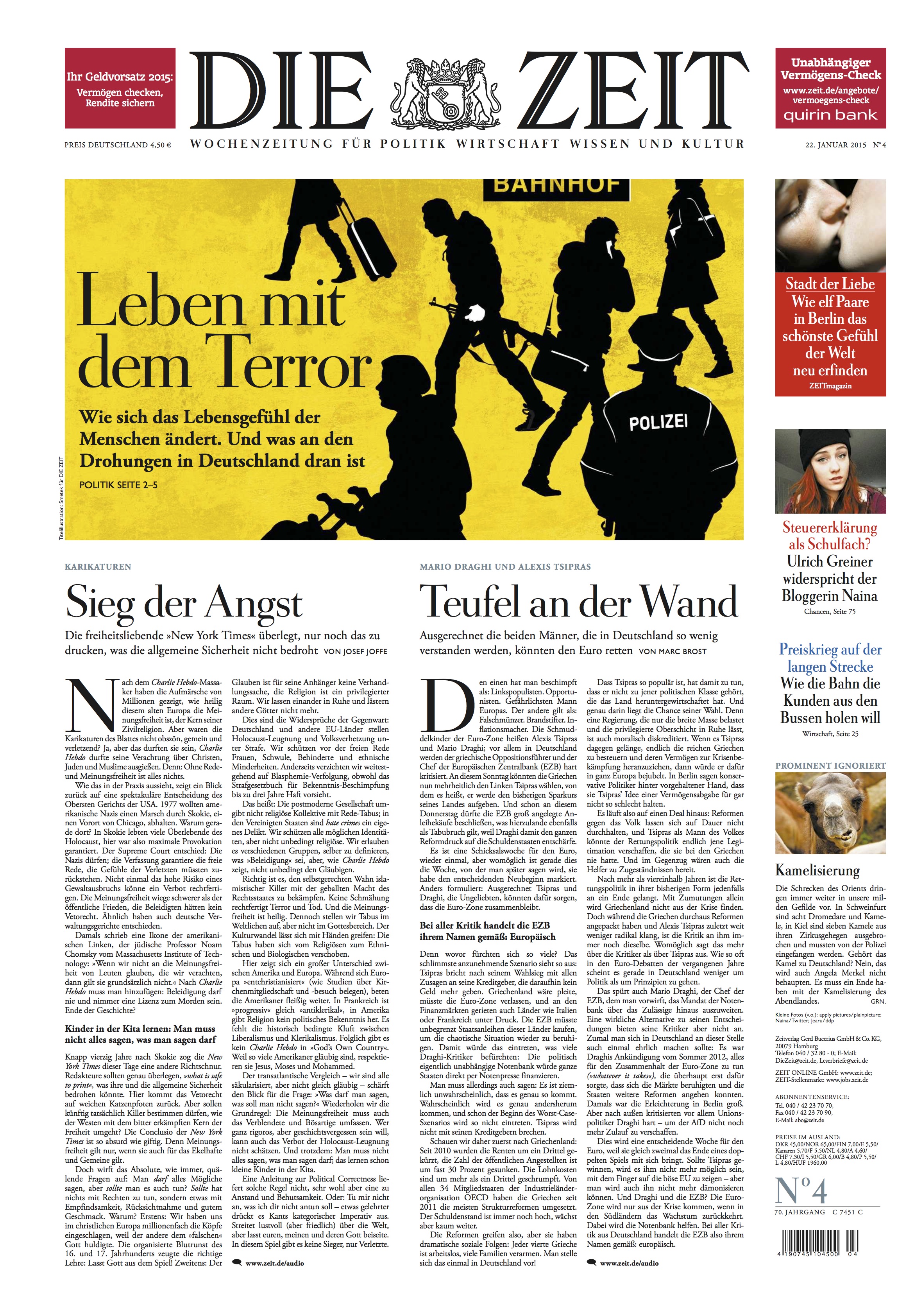
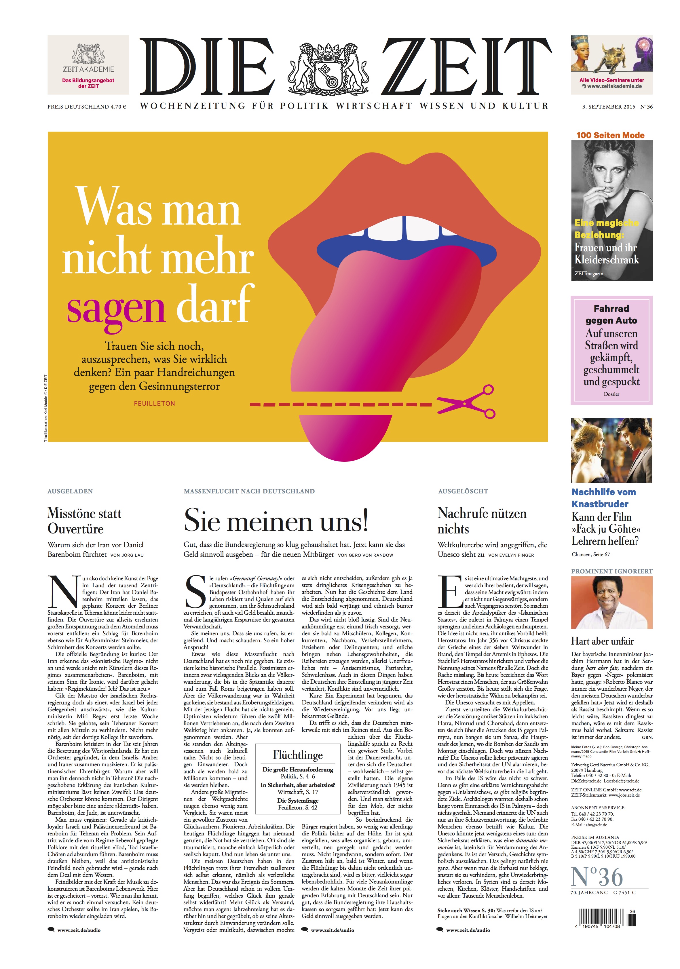
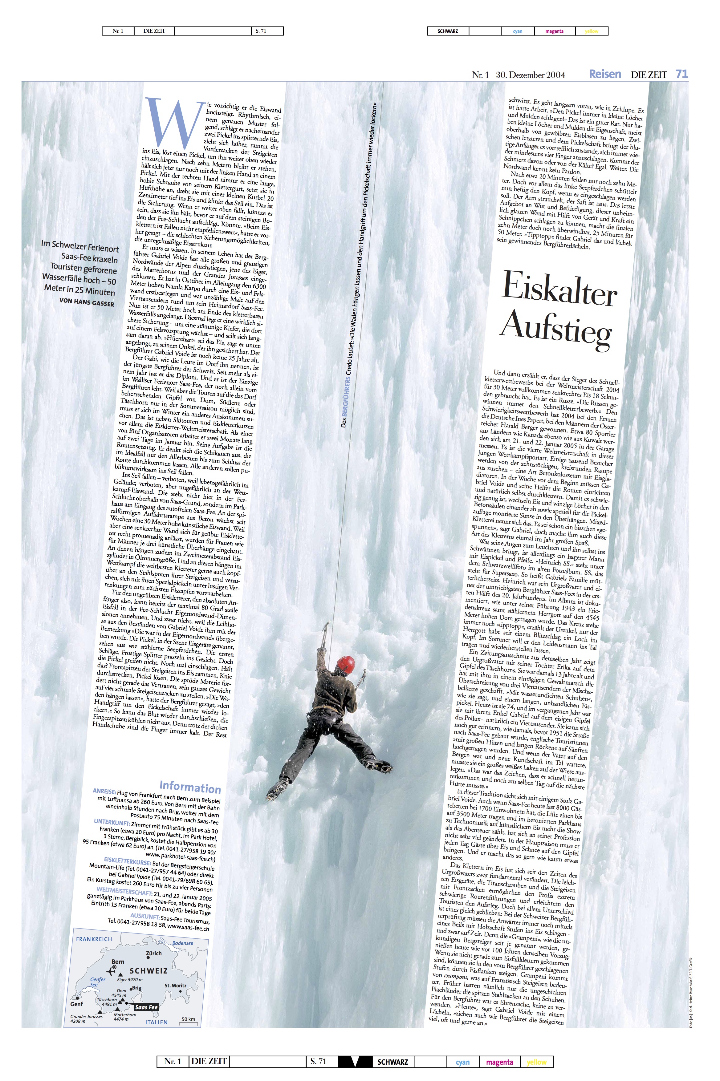
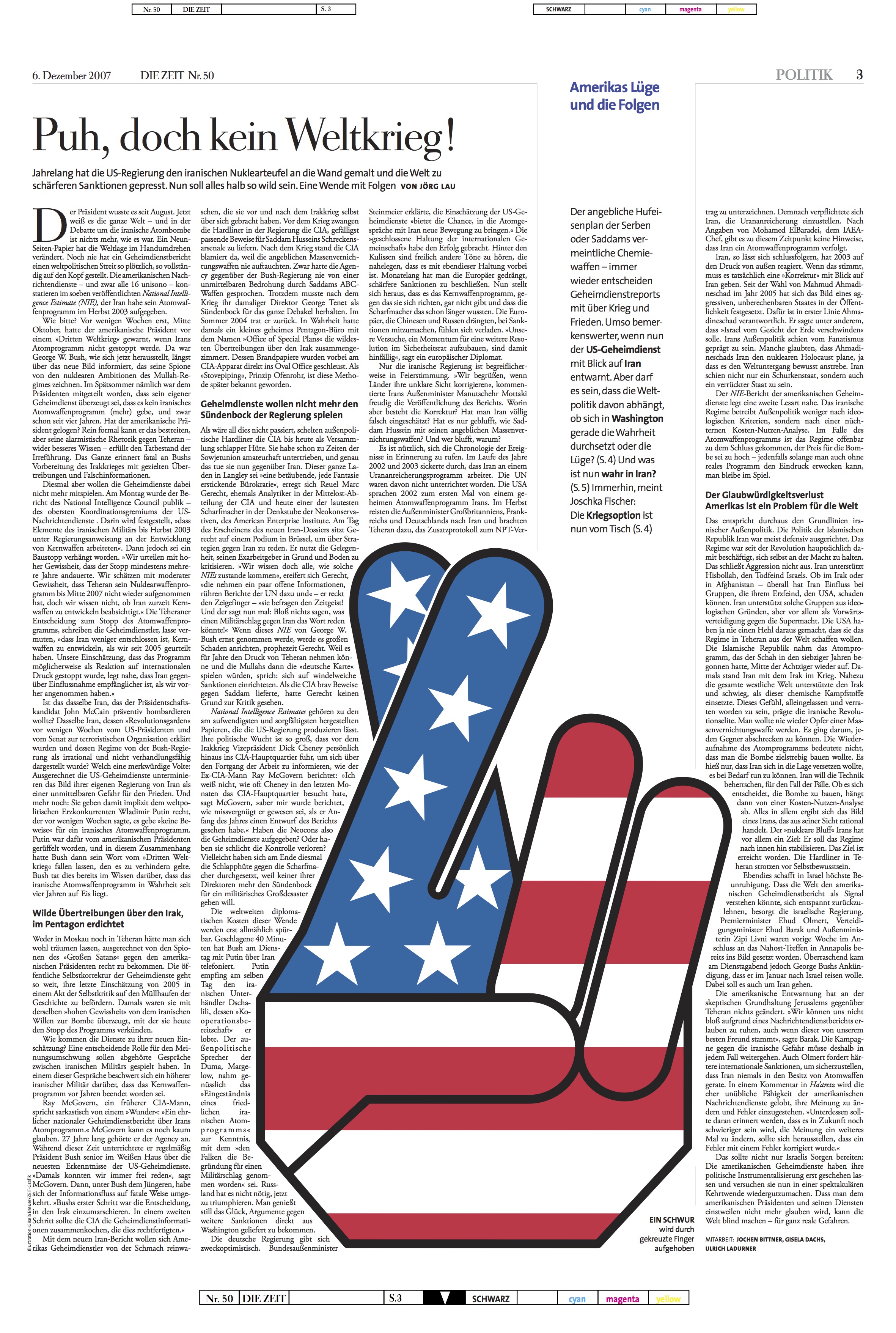
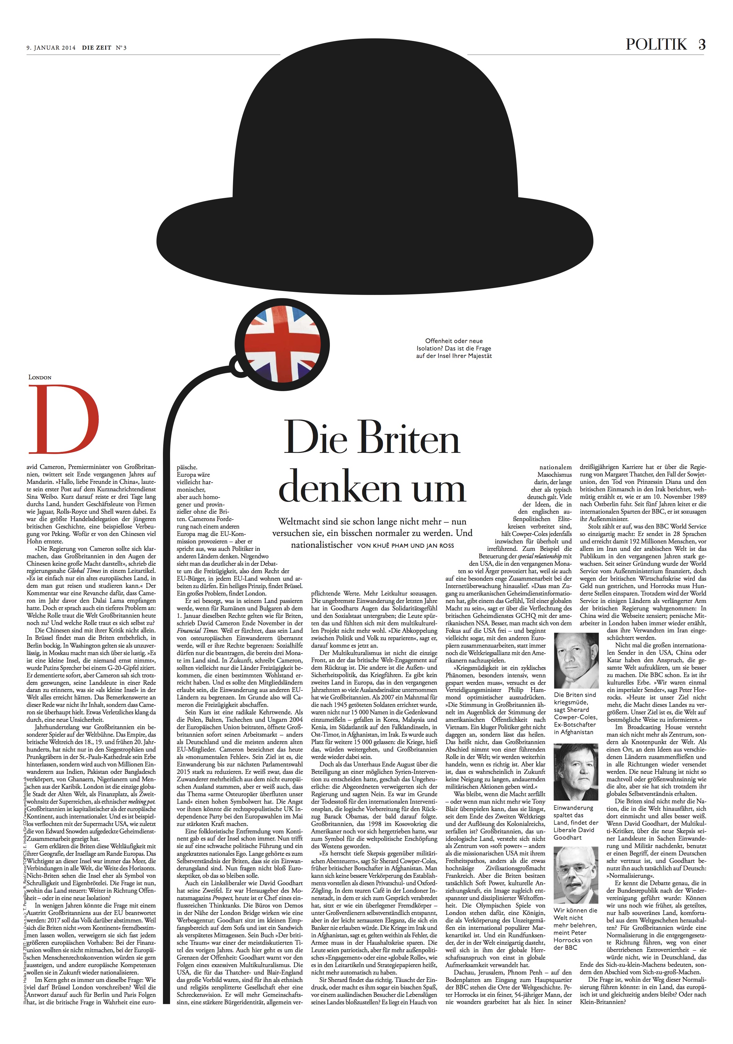
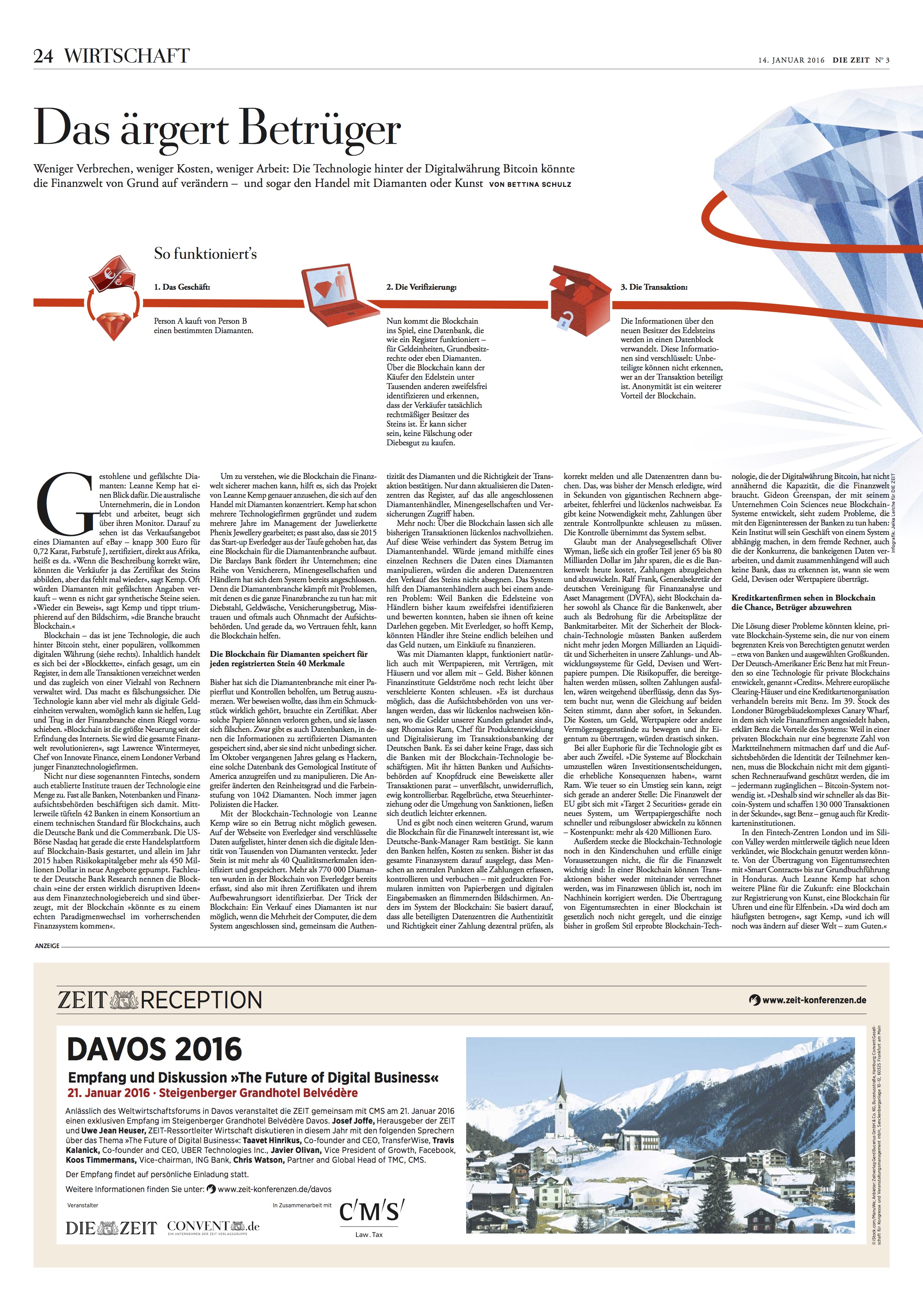
So Die Zeit is turning 70. They say that 70 is the new 50, and looking at issues of Die Zeit, I believe it. If there is a single newspaper in the world in which the terms elegance, classic, functional and complete apply, it is Die Zeit. It is a thing of ageless beauty. It is everything a newspaper should be.
However, newspapers cannot rely on beauty only to succeed. They must have content that is relevant, essential to the lives of its readers and that advances the stories of the day beyond the who, what, when and where.
Die Zeit has done just that in a uniquely distinguished way for seven decades.
For me personally, working with the Die Zeit team for a complete relaunch in 1998 marked a high point of my career. My professional trajectory has been defined by the before and post Die Zeit. I remember coming into a Die Zeit newsroom where photos, color and design were not the most welcoming words. Always authoritative and credible for its content, the Die Zeit of 1998 and before relied on black and white illustrations for visuals. Words dominated each page, and nobody truly paid much attention to design.
When that changed it was not only significant for Die Zeit, but for German newspapers generally. Publishers and editors realized that it was possible to play that wonderful symphony that includes writing, editing and design. Soon, other newspapers were paying attention, taking note and borrowing ideas. I firmly believe that the rethinking of Die Zeit was a factor in how other newspapers changed, and not just in Germany, but globally.
Die Zeit soon became one of the world’s best designed newspapers, observed and admired by editors and designers around the world. While I have been involved in close to 700 projects to date, it is Die Zeit that defines my career. At seminars in six continents, there is always a question about “how you managed to change Die Zeit.”
I always add that the remarkable changes of Die Zeit were a cooperative team effort. Die Zeit became a case study of how to rethink a newspaper and aim it to the future while respecting the legacy of all that Die Zeit means to German readers and German society.
For nearly eighteen we worked to preserve the best of Die Zeit, but make it better. Today, Die Zeit remains true to those values that have made it great for seven decades: it is still text dominated, with content so essential that one must stop to read it and to absorb it. But the new Die Zeit offers us glimpses into what modern newspapers do: not all the texts are long, not everything is black and white (color is used judiciously and elegantly). Die Zeit represents German elegance at its best, its journalism a one of a kind “lean back” approach to storytelling that is the way of the future for newspapers generally.
I often tell my students at Columbia University’s School of Journalism that Die Zeit is a textbook for the newspaper of the future. Ironically, it has been carefully crafted based on a solid foundation of its rich past.
Die Zeit should also continue to be a reminder that less is best and that the ultimate design is that which serves to make the content easier to find, easier to read and visually appealing, a tall order that Die Zeit has mastered.
I raise a glass to wish Die Zeit a happy 70th birthday, hoping it continues to surprise us each week, while making sure that its selection of stories makes us better informed and more eloquent conversationalists.