TAKEAWAY: It is now time to turn my attention to Oman’s Arab language daily, Al Shabiba, which is just about ready to launch with a new look, including new logo. it has been a fascinating process working one character at a time. PLUS: Links to interesting weekend reads
Good news on the Arab font development front
The days when a designer facing the task of redesigning an Arab language newspaper got quickly frustrated over the lack of typographic variety are over. Of course, there are still not as many designers working exclusively on Arab alphabets as we have for Latin fonts. But progress is tremendous, and we now have choices, including for Arab versions of fonts that we are well familiarized with, such as Palatino and Frutiger, among others. This does not mean that one cannot call the local calligrapher to create a customized font. That, I think, will always be a trademark of Arabic language publications generally.
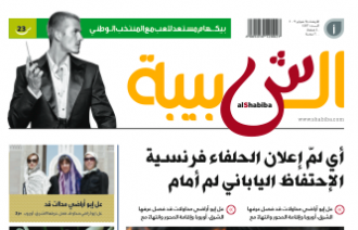
We have had a good experience in recreating the logo of Oman’s Al Shabiba, which is a project we are currently finalizing to get it ready for an April, the first major graphic/design and typographic change for this daily in decades. Al Shabiba, which means Youth, wants to be truer to its name: it wants to appeal to younger readers member of the Google generation. In our design work, we have not only concentrated on modern and faster navigational tools for each section, but also the creation of a softer, more modern color palette, and, a logo that is more clearly visible and says 2012 at a glance.
But getting here was not easy, and it has taken almost two years (a long, long time for a redesign by today’s standards, where a potential client calls and asks if the final product can be delivered four months from today). For Al Shabiba, time has been well spent. This week we give Al Shabiba its final touches, and I plan to blog from here part of the week, with more details about our work on the change for the newspaper’s brand, which was done thru the creation of a hand drawn logo.
![]()
What’s new in Arab font development
Our intern, Reed Reibstein (Yale University ‘11) is quite interested in Arab language fonts. He and I often discuss the topic, especially now that he knows I am deeply involved with the launch of Al Shabiba here in Muscat. To that effect, I asked him what he had read recently about the subject of Arab font development. His report is, as usual, complete and with his opinions, which I always find refreshing.
There are many fewer professional Arabic type designers compared to those who work on the Latin script. So while dozens of exquisitely-designed Latin typefaces appear each year, only a small fraction of that number are designed for Arabic. Despite the slower pace of development, several typefaces complete with advanced typographic features, complemented by multiple weights, and suitable for book, poster, and, thankfully, publication design have emerged over the last few years. For the first time, re-thinking a Middle Eastern newspaper or magazine need not mean commissioning custom type—though custom type will often remain the mark of quality Arabic publications for years to come.
Here are a few relatively recent releases that could be of use in a contemporary newspaper or magazine:
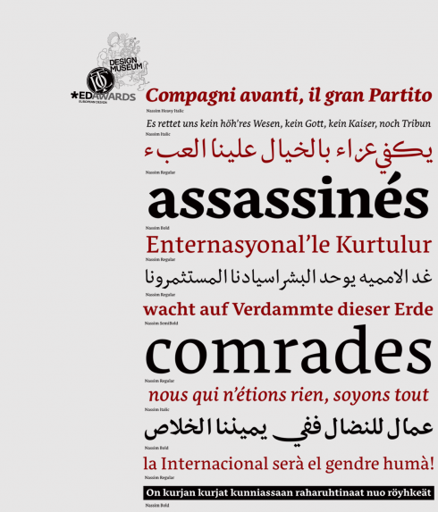
Nassim: adapts well to use in small sizes; created for Tasmeem, the plug-in for InDesign ME
Nassim (http://tntypography.com/nassim.html): Nassim was designed to work in small sizes, in a dictionary, say, or newspaper columns—a rare achievement. With five weights and perfectly matched Latin letters, it’s almost too good to be true. Perhaps the most exciting aspect of Nassim, however, is that it was designed for Tasmeem, the remarkable plug-in for InDesign ME that brings traditional Arabic calligraphic refinement to typography. Tasmeem really has to be seen to be believed: http://www.youtube.com/watch?v=g-1Y2yndUZQ. Even if implementing Tasmeem in newspaper text is too much to hope for, I would love to see Tasmeem-enabled fonts make an appearance in headlines, a modern version of the calligraphic handwritten headlines that some newspapers once used.
![]()
Remember Palatino? Not many designers use it these days, but it may have a vibrant renaissance in Arab language newspapers
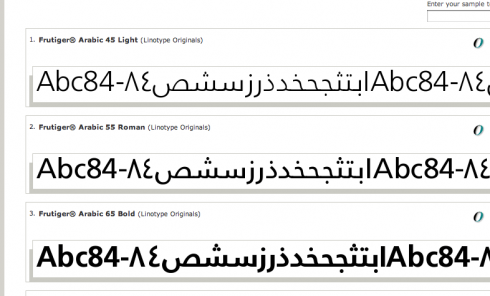
Frutiger: the Swiss font that many tabloids of the 80s loved for front page headlines.
Palatino Arabic (http://www.linotype.com/286269/palatinoarabic-family.html) and Frutiger Arabic (http://www.linotype.com/270925/frutigerarabic-family.html): While their Latin complements have been around long enough (I have used them repeatedly over the years myself, but not much nowadays), to the Arabic reading world these are brand new looks. And of course the designs themselves are new, designed in the last several years by Nadine Chahine at Linotype in collaboration with both Zapf and Frutiger. “While many newly-designed publications have embraced Kufic-style type for its boldness (akin to a Latin sans-serif), I would love to see the elegant touch of Thuluth that would grace any page set in Palatino Arabic,” writes Reed. Chahine recently released her newest face, Neue Helvetica Arabic (http://ilovetypography.com/2009/12/04/neue-helvetica-arabic-wishing-on-a-typeface/).
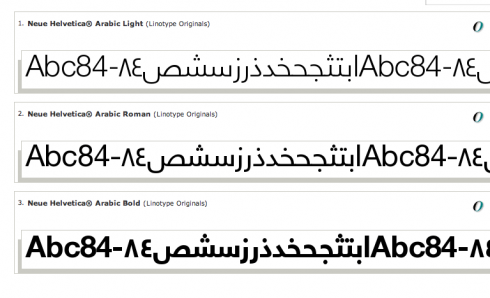
Neue Helvetica Arabic: the minimalist classic conquers new worlds
Reed says that this begs the question: Who will become the Frank Ariss of the Middle East by designing a grid-based newspaper set entirely in Neue Helvetica Arabic? Ariss, as some may know, revolutionized newspaper design in the late 60s when he created a version of the Minneapolis Tribune that was entirely done in Helvetica. It is still one of my favorite newspaper design experiments. And, who knows? Ariss himself may join forces with a young Arabic designer and create the Arabic version of his legendary US product.
One thing is for sure, many Arab language newspapers are NOW very ready to make design a part of their culture. Much has happened in the past five years in this regard, and I know of several other Arab language dailies considering design changes.
The weekend is here and time to offer you some interesting links for when you are ready to sit down to catch up. Reed Reibstein has sent me some materials that I also find of importance for all of us before we head out to business meetings next week:
A superb summary of 15 video demonstrations of prototype publications on the iPad, from exact replicas of the print editions to truly interactive magazines.
Mario’s note: Don’t miss The New York Times and the Dutch daily De Telegraaf if you want to see rare demos of how newspapers will go iPad. So far it is usually magazines that project demos, so I found these to be quite interesting. By the way,
http://paidcontent.org/list/tabletmags/
Study on what potential tablet users plan to use them for; 1/3 plan to read newspapers and magazines, while another 1/3 does not plan to at all!
http://www.comscore.com/Press_Events/Press_Releases/2010/3/comScore_Releases_Results_of_Study_on_Apple_iPad
Good discussion of advertising strategies for the iPad
http://www.nytimes.com/2010/03/25/business/media/25ipad.html?emc=tnt&tntemail1=y
Video interview with Jim Parkinson, designer of the Newsweek, Rolling Stone, and Los Angeles Times nameplates.
http://fontfeed.com/archives/fontcast-10-jim-parkinson/