
Purchase the book on the iBookstore
The EPUB version of book is HERE:
Now available: The EPUB version of iPad Design Lab: Storytelling in the Age of the Tablet, ready for download via Amazon.com for Kindle:
http://tinyurl.com/8u99txw.
TAKEAWAY: An invitation to design the front page of today’s edition of Mas por Mas, a freely distributed tabloid newspaper in Mexico City, turned into a challenging and interesting project for me. Here is how it went.
About two weeks ago I had a request from Sergio Fraire, art director of Mas Por Mas, a free daily newspaper published and distributed in Mexico City. Sergio’s email carried a provocative invitation:
Mario, how would you like to be our guest designer to design the front page of our Mas por Mas for the Nov. 19 edition?
After thinking about it for all of 30 minutes (it’s a busy time for me at the moment), I said yes and sought more details of the assignment.
“We will give you a story a few days before publication, and we will allow you total freedom to handle that story line visually in any way you like,” Sergio told me.
My front page will appear in today’s editions, and it was an interesting exercise to participate with Sergio and the talented illustrator Leticia Barradas on the assignment.
About the newspaper
Mas por Mas is distributed free and it circulates 180,000 in Mexico’s capital, the so called Distrito Federal (DF). It is available in over 400 points in the city, with emphasis on the financial and tourist areas of the capital. The newspaper is three years old, and was designed by Eduardo Danilo, who, by the way, was the first guest art director for the front pages.
Mas por Mas publishes 28 to 40 pages daily. With a staff of about 20, including journalists, editors and designers, the newspaper manages to capture the attention of a wide range of readers, from businessmen to tourists to some who don’t read any other newspapers. “It’s is a success story,” Sergio writes me.
Mas por Mas uses two typographic fonts: Boomer and Zocalo.
Why invite designers?
Sergio tells me that this was the brainstorm of Gustavo Guzman, CEO, who felt that it would be a great idea to provide the front page with visual surprises and new life by inviting “distinguished designers from around the globe.” In addition to Danilo, our own Rodrigo Fino, of the Garcia Media Latinoamerica office, has been a guest designer, as has been our good friend and colleague Ana Lense Larrauri, of The Miami Herald.
Their efforts are shown here! It is great company in which to find myself today.
The story and the process
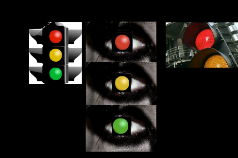
I started by gathering some images to get my thoughts flowing
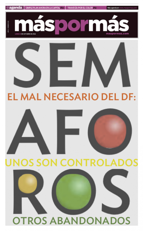
Almost instantly, I thought that a type attack would be a good way to tackle the subject, without getting into iconic or clicheish imagery: these are my first two sketches
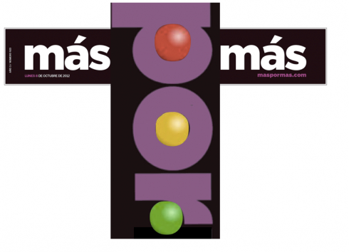
Why not play with the logo, turning the word POR into a traffic light? This was my first sketch for that idea
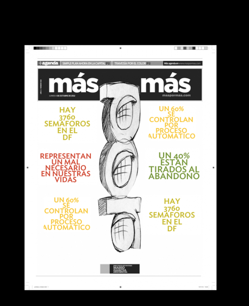
Illustrator Leticia Barradas took my sketch idea and worked on a more polished illustration

The concept now with color
The story for today’s front page is about traffic lights in Mexico City, one of the most heavily populated cities in the world with more than 20 million inhabitants. The briefing for the story explained in detail that 60% of all traffic lights in the city are electronically controlled, with the rest abandoned, which contributes to traffic jams and congested intersections.
A working headline read something like: Traffic lights—a necessary evil.
Mas por Mas is published in a tabloid format, and its front pages is usually poster-inspired, with little or no text, but Sergio gave me total freedom to execute my idea in whichever way I wanted.
My first step was to create images as they rushed into my head: eyes, the colors of traffic lights, even icons we associate with evil.
I put the words traffic, evil,necessary down on paper.
I also wanted to play with the word for Traffic Light in Spanish—-SEMAFORO—not a very pretty or sonorous one, and quite long.
Could I combine the word Semaforo with two or three lines from the content summary, to tell the story typographically?
Sergio had mentioned that I could use the services of Lety Barradas, an illustrator.
I contacted Lety and sent an early sketch for my concept, although it was obvious that she would not have much to do with this “type attack” concept, where mostly letters prevailed.
I admit that I started a second, more playful concept, as a way of getting Lety to apply some of her talent here.
Why not play with the logo of the newspaper—Mas por Mas (which translates as More for More) ?
That led me to take the word POR and hang it from the top, turning it into a traffic light.
Lety saw the initial sketch and jumped to turn it into something
interesting in a matter of hours.
Two concepts
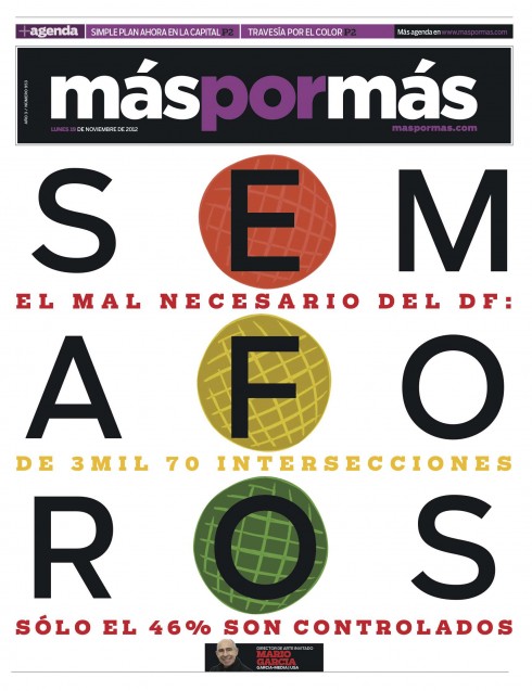
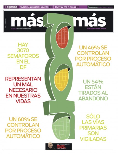
So now, Sergio, the art director, had two concepts. I decided that I liked both equally, so did Lety apparently, which made Sergio’s job all the more difficult.
One concept: a type attack, which is always a great solution and can be exciting visually and tell the story quite quickly.
Second concept: a more visually adventurous and playful take on the story, violating the sanctity of the logo (the brand), but just for one day, why not? A word in the logo becomes the main illustration. I decided that if that was the center of visual impact, there would not be much more going on here, so only about six headlines to tell the story in an evolutionary way.
And the readers today will see this one:
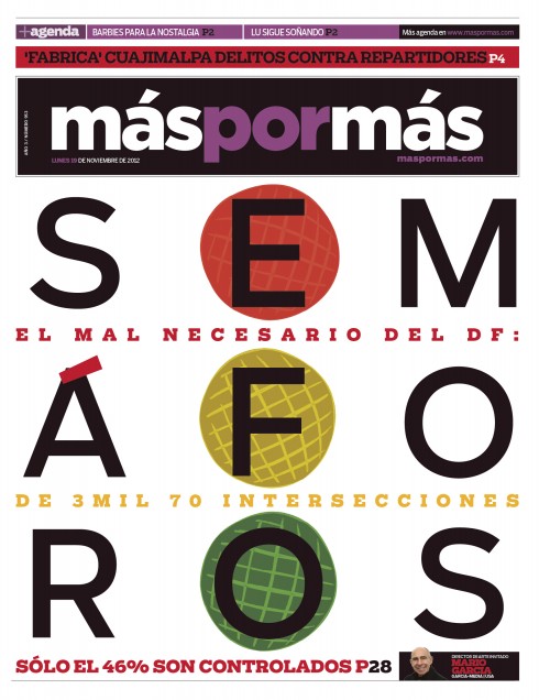
Sergio decided to go with the type attack about 24 hours after receiving both covers.
“We have decided that the type attack concept has much greater impact and communicates our story better, but this exercise has been a great learning exercise for me,” he wrote.
I feel the same way. It was challenging and a great mental/visual workout.
Thanks for inviting me! Hope that you, readers of the blog, enjoy following the process.
Previous front pages of Mas por Mas
These are front pages previously published by Mas por Mas, and designed by invited guest designers.
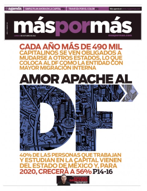
Eduardo Danilo
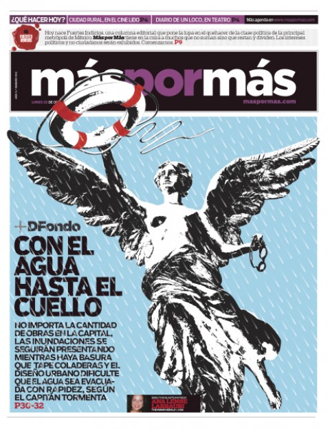
Ana Lense Larrauri
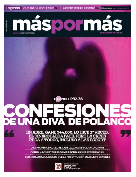
Rodrigo Fino
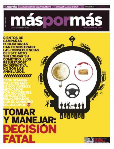
Daniel Esqueda
Pages we like
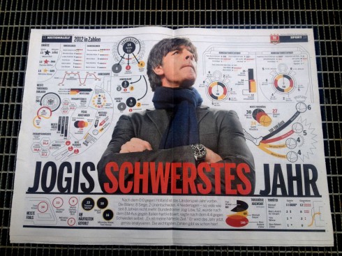
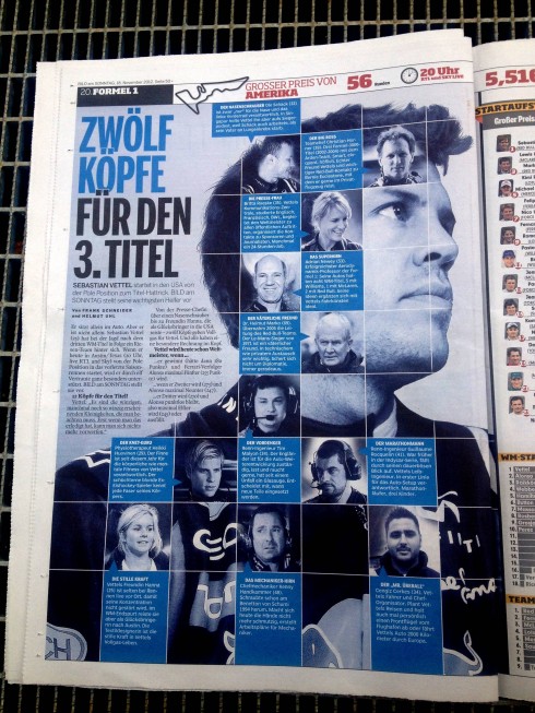
Frank Deville sends us these two pages from Germany’s Bild, : first page rounding up the year for German football coaches; the second one is celebrating the work of football coach Sebastian Vettel, and showing the head shots of 12 in his crew who are now helping him to win his third world championship title.
Of interest today:
Photographers Will Soon Be The Most Valuable People In The News Room
http://www.businessinsider.com/photographers-will-soon-be-the-most-valuable-people-in-the-news-room-2012-11#ixzz2CZw95NSY
You are invited: Designing for Mobile and Tablet devices
Perhaps you would like to join a webinar about designing for mobile and table devices that my son Mario Garcia Jr. and I will offer together.
The webinar will take place November 20, 2012 | 1500 UTC, 1000 EST.
For more information:
http://mobstac.com/webinar-garcia/
Take a video tour of iPad Design Lab
“iPad Design Lab” trailer on Vimeo.
Read the Society of Publication Designers’ review of The iPad Design Lab here:
http://www.spd.org/2012/10/must-read-ipad-design-lab.php
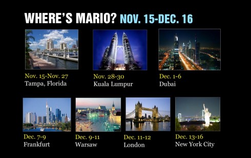
WAN IFRA Asia Conference Nov. 27-29
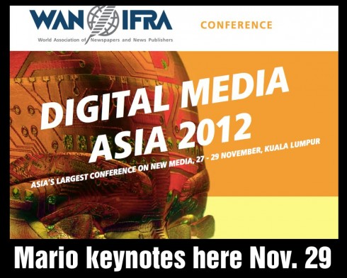
Still time to join the WAN IFRA Asia Conference in Kuala Lumpur, Nov. 27-28.
Online & Social Media
27 November
Smart Media Digital Business Innovations
28 November
Mobile & Tablet Publishing
29 November
For more details, please contact:
Ms. Christine Chin, Events Manager Email: christine.chin@shangri-la.com Tel: +60 (3) 2074 3556—¨Fax: +60 (3) 2078 5990