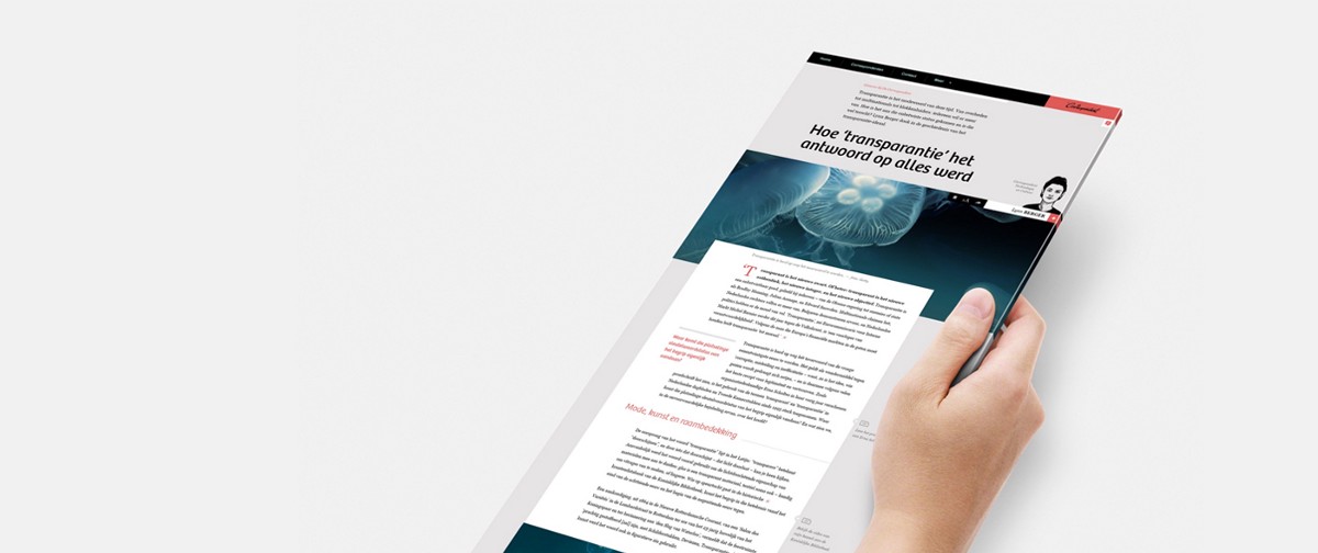
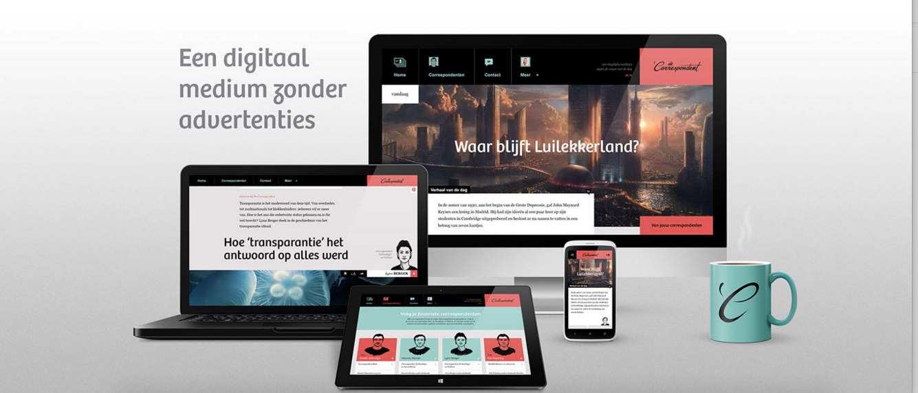
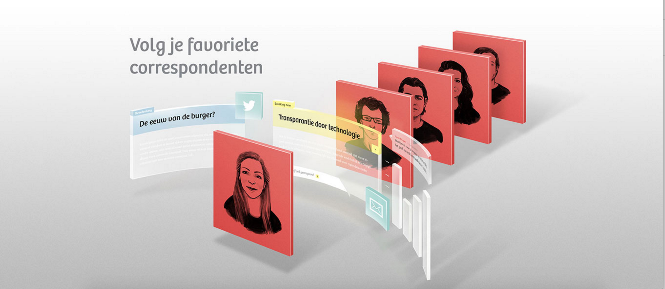
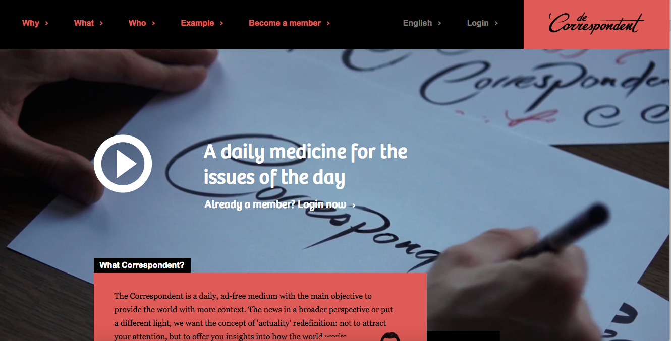
Nothing can be more exciting than discovering a product that gets it (it's all about analysis and expanding the story we already know about it), that has visual appeal (this website is designed to seduce us visually on the spot, and, the best thing, it does not look anything at all like a newspaper website), and where the spirit of the brand start with the logo itself (it's more cursive than the usual fonts we associate with news products).
Professor Jay Rosen, of New York University, discovered De Correspondent and called it “the most interesting journalism start-up I have read about in 2013”.
I am declaring it the most comprehensively perfect combination of content selection and visual presentation that I have seen in 2015.
De Correspondent is also a success story in terms of how it came to be, the brain child and project of philosopher Rob Wijnberg, who had been an editor of nrc.next, the morning edition of NRC Handelsblad, the Netherlands’ premier daily national newspaper, from which he was fired in 2012 as his superiors considered his approach to news “atypical”. Rob insisted in steering the newspaper away from current events as he felt that the newspaper should “focus more on ‘new’ than on ‘news’ by reporting on the kinds of developments that are less spectacular than most news events, but that do have a large impact on our daily lives.”
That situation led Rob to push forward with his pet project for De Correspondent. Rob started talking to friends and former colleagues about starting a new newspaper. In December 2012 he met up with the founders of Momkai, a creative agency with clients such as Red Bull and Nike. Lead designer Harald Dunnink helped him turn his ideas into an identity for a new online journalism publication called ‘De Correspondent’, which Momkai would build for cost price when 15.000 people invested at least 60 euros each during a crowd-funding campaign.
Rob wrote a manifesto, in which he promised that ‘De Correspondent will publish fresh stories on a daily basis, but it aims to uncover, explain and highlight deep-lying structures and long-term developments that powerfully shape our world, rather than reporting on the latest hype, scare, or breaking news story.’
My conversation with Rob Wijnberg
Mario:
I have read about your trajectory, your take on how news should be presented and how your former boss apparently did not approve of your ideas (his loss!). My question: why do you think legacy publications and their teams have so much trouble accepting that in a 24/7 news cycle, there is a need for analysis, for the why of the story?Why is traditional, pre Internet style of journalism prevailing with so many established brands?
Rob:
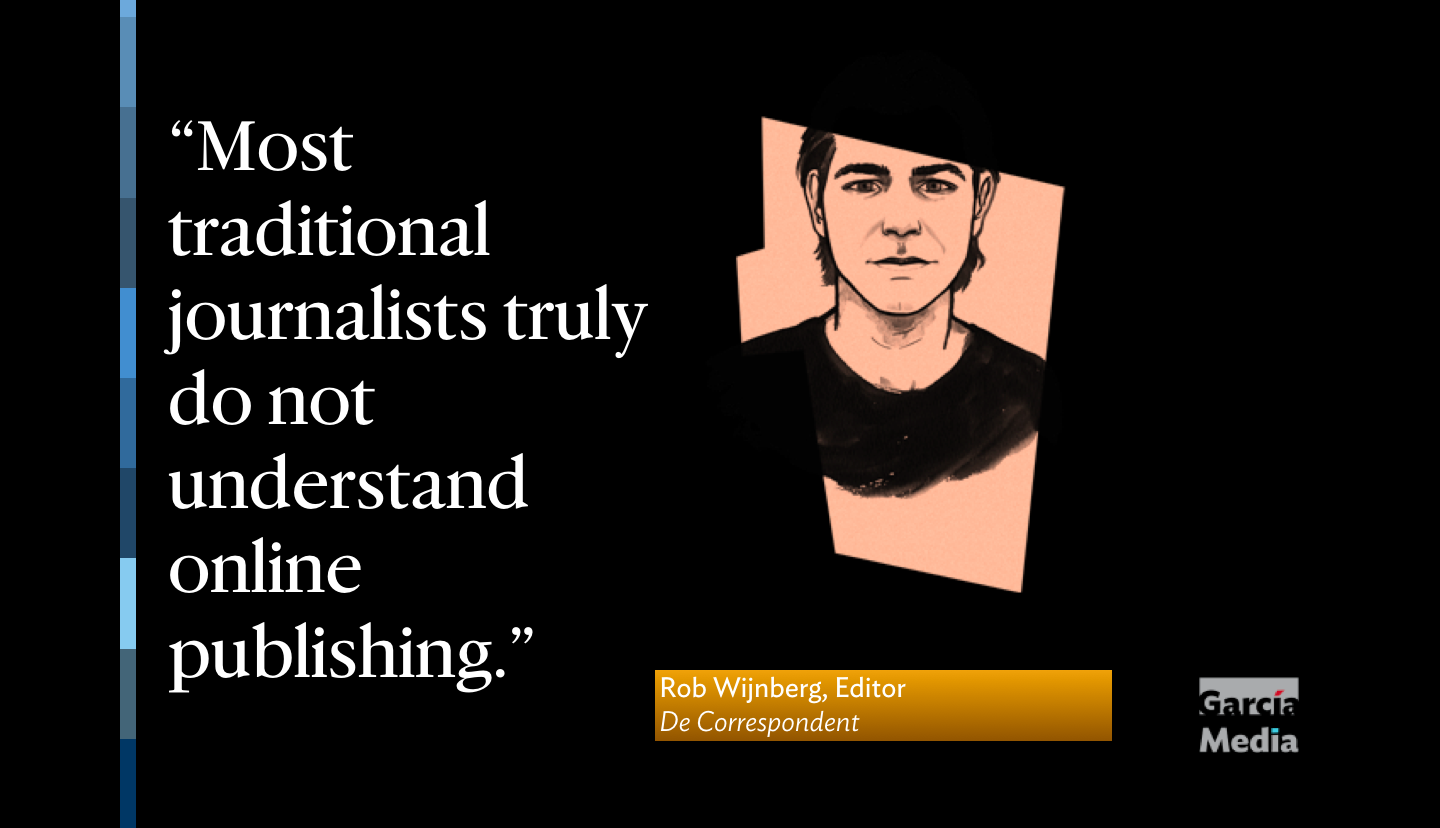
” I think the main reason is that the traditional outlets still are very profitable. Second: they cater to a pre-internet audience (average newspaper reader in the Netherlands is 60 years old). Third: capital wants to avoid risks. And innovation of your current models is risky. 4) Most traditional journalists truly do not understand online publishing. They have been doing the same kind of journalism for 40 years, so it's hard for them to change their habits. Fifth: Most news organizations reward obedience to the current set of rules. You’re applauded when you have scoops, you are dismissed if you think the current definition of news is outdated. It’s like that in almost all organizations, especially the ones that have been the big dogs for a century. You need a Tesla to change a BMW.”
Mario:
I assume that many of your readers are reading De Correspondent on their mobile devices. How do you see the role of mobile affecting what you do?
“Yes, over half read us on mobile. That's why we design everything for mobile first. And also: in the back of our heads we always have the idea that people can and will read you in any place in the world. So, we try to avoid saying things like “here in The Netherlands”, because you might be somewhere else and then feel disconnected.”