TAKEAWAY: A brief but content-filled interview with one of our favorite type designers, Cyrus Highsmith, of the FontBureau. We ask him about the influences on his work and, of course, about designing fonts for the ever popular tablets. Read on.
Cyrus Highsmith is a senior designer at Boston’s Font Bureau. We have admired his work for years, and, of course, have used his fonts in many of our projects, always with great success. Without a doubt, Cyrus has established himself as one of today’s most dynamic and original voices in American type design.
The following questions for Cyrus Highsmith were prepared by me, assisted by our year round intern Reed Reibstein (Yale University ‘11).
What is your favorite part of the type design process?
Lately, my favorite part of the type design process is drawing the numbers. The numbers (0 1 2 3 4 5 6 7 8 9) we use with the roman alphabet have their roots in ancient Hindi numbers. They migrated across the middle east, evolving along the way, and then were introduced into Europe during the Moorish occupation of Spain. They have very different structures than the Roman capitals. Our capitals tend to have structures that are symmetrical like the ‘H’ or ‘T’, or open on the right like the ‘E’ or ‘P’. Our numbers tend to be asymmetrical like the ‘4’ and open on the left like the ‘3’. I am simplifying of course but my point is that the numbers are interesting structures to work with and draw so they are compatible the capitals and lowercase.
Which type designers have the most influence on your work?
I suppose the type designers who influence me the most are the ones who I work with. This includes experienced masters like David Berlow and Matthew Carter as well as our newest designer David Jonathan Ross with his fresh perspective and enthusiasm. At the moment, I am sitting next to Joan Carles Casasín from BaseLab and we are talking, drawing, and cooking up new projects together.
What has been your most challenging project?
I am working on a book about what goes on inside a paragraph of text. It came from the lectures I have been giving to my typography students at RISD. I hope to finish it in early 2011. I didn’t think it would be easy but writing and illustrating a book has really pushed me to edge! There are a lot of excellent books about typography already so it took a long time to boil it down into something that will hopefully add something fresh to the ecosystem.
What are some of the challenges of designing increasingly for the screen? Specifically, readers of my blog would love to hear your views on designing type for the tablets.
When designing a screen typeface for text, you are limited by the resolution. This effects how much detail is going to visible. In print, 10 point Garamond can appear quite different than a 10 point Caslon, for example. The difference between these fonts set at an equivalent size on a tablet screen is much less. There just aren’t enough pixels to do it. From my point of view, this is very discouraging.
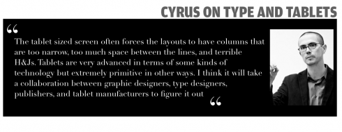
But more discouraging is the lack of typographic control and what happens to the fonts after I am finished drawing them. The tablet sized screen often forces the layouts to have columns that are too narrow, too much space between the lines, and terrible H&Js. Tablets are very advanced in terms of some kinds of technology but extremely primitive in other ways. I think it will take a collaboration between graphic designers, type designers, publishers, and tablet manufactures to figure it out.
Are you optimistic about e-books evolving away from the sameness you mention in “The Smell of Books”?
Yes, I am sure it will happen. E-books will improve. In fact, probably they have already improved since I wrote that article a couple of months ago. It is a very new medium and it would be foolish to say they will never get better. I will confess that I don’t have an iPad or a Kindle yet. I am waiting for a couple of years.
In the meantime, I did install the free Kindle app on my android phone because of course I am curious and excited to see what e-books are like. After using it for the summer, I am back to reading paper books that I check out from my local library. However, I am a big fan of the e-book versions of books that have fallen into the public domain that I can download for free.
Can you share some recent pages from your sketch book?
Yes, you can see more or less recent pages on occupant.org.
pages from 2008
pages from 2010
I also contributed some pages to Steve Heller’s new book Inside the Sketchbooks of the World’s Great Graphic Designers. I haven’t seen it yet but it looks like a great book with a lot of talented contributors.
Some of Cyrus’ fonts
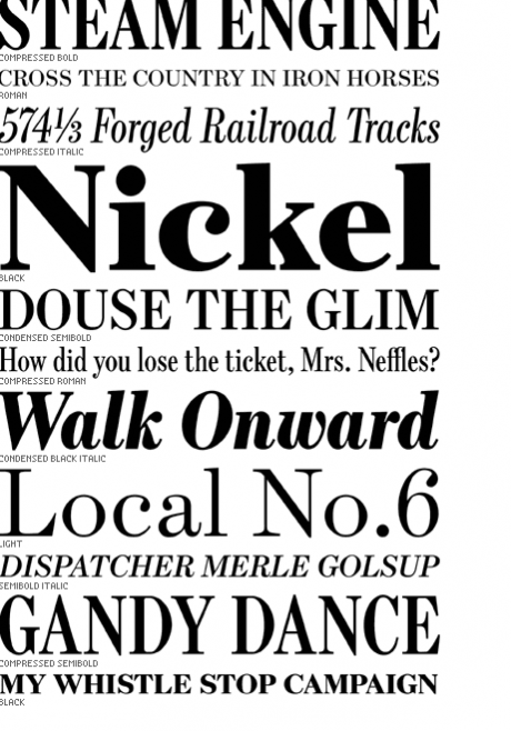
One of his most popular fonts, Escrow, sturdy, elegant and durable
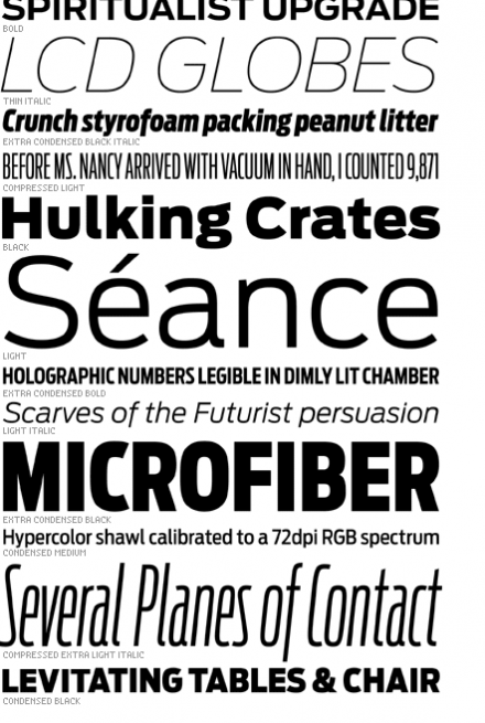
Antenna is Cyrus’ perhaps most popular font, the sans serif that changes the pace
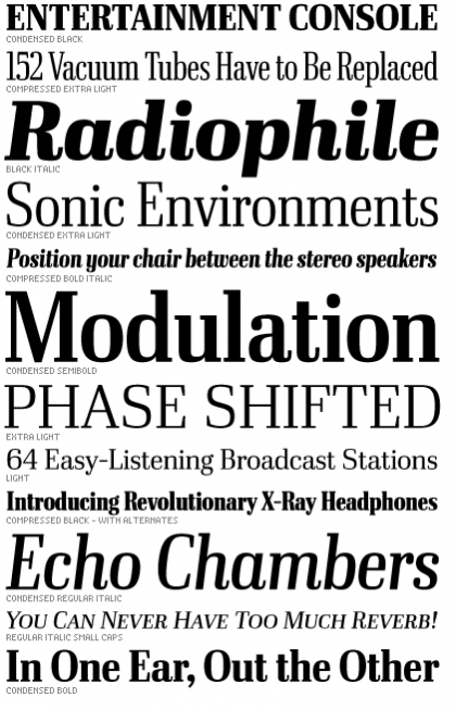
Cyrus’ newest font: Ibis Display could be as functional as a headline face but also for headers and logos.
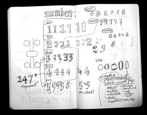
From Cyrus’ sketchbook.
Of special interest: Cyrus Highsmith
Cyrus writes about his fascination with books in this highly recommendable piece: “The Smell of Books”
Here is a quote:
The typographic issues that arise when trying to fit a page of text onto a small screen are obvious, tedious to describe, and unnecessary to review for an audience of graphic designers.
http://type101.fontbureau.com/smell-books/.
More of Cyrus’ sketches (pages from 2008, 2010):
occupant.org.
Coming up:
Cyrus tells us that he has also contributed some pages to Steve Heller’s new book Inside the Sketchbooks of the World’s Great Graphic Designers.
TheMarioBlog post # 683