Update #9: Sunday, Oct. 23, Luxembourg: 08:58; This is our weekend blog, to be updated until the new one is posted Monday, October 24
TAKEAWAY: If you are currently designing your first tablet edition, or preparing a second version, make sure that “pop up” moments are on the menu. Here is a good start: basic pop ups that go a long way to satisfy the user, and the curious finger. PLUS: Tons of great things to read this weekend, we offer you suggestions of “don’t miss” articles
A surprise Sunday sports page from The New York Times
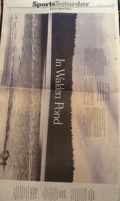
Reed Reibstein sends us this great surprise from Sunday’s New York Times, a sports page that is uniquely different
Covering the death of Muammar Gaddafi

Here is front page of Germany’s Bild: not holding back at all
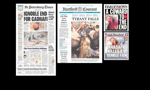
Surprised to see that such US newspapers as The St. Petersburg Times and The Hartford Courant showed these photos; not surprised at all by the New York Post, and NY Daily News.
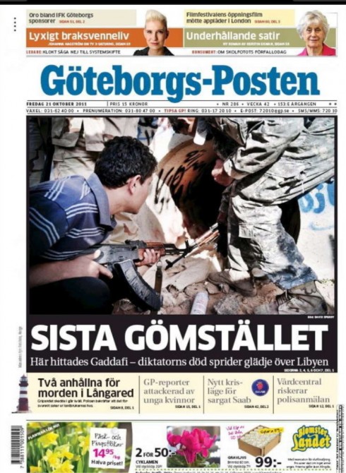
Goteborgs Posten, Sweden

The Sun, London
Malayala Manorama, India
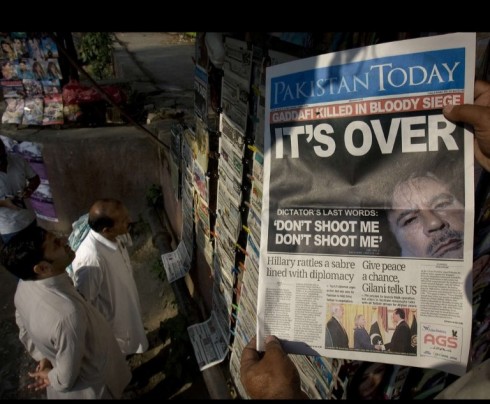
Pakistan Today
One can’t get away from it: coverage of the killing of Gaddafi is everywhere. Many of our readers are sending me messages, mostly thru Facebook and Twitter asking if I feel newspaper front pages should show the bloody head of the Lybian strongman. This, I think, is a matter of philosophy. I do not want the front page of the newspaper at home, where my grandkids can see it, showing such a photo; however, I do understand that newspapers, such as Germany’s Bild, have it within their DNA to treat photos of such occurrences in its most naturalistic form.
Here is the Bild front page: nothing hidden or pixelated! Bild readers apparently like it this way.
Some US regional newspapers, the so called “family newspapers”, have surprised with their photo choices for page one. However, it is important to remember that Gaddafi is considered to be responsible for the bombing of Pan Am 103, which targeted Americans directly, so I imagine editors who would not ordinarily run such photos on Page One, decided that this time it was justified, for an audience that may want to have this sense of closure through the front page of the newspaper.
Please tell me what you think, and do send me pdfs of your pages.
Of related interest:
Few US front pages feature dead Gadhafi; many international papers show body
http://www.poynter.org/latest-news/romenesko/150386/few-us-front-pages-feature-dead-gadhafi-many-international-papers-show-body/
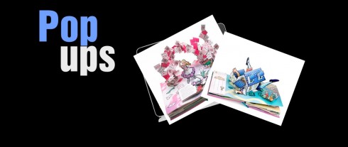
Illustrations: http://toykyokids.blogspot.com/2010/04/it-makes-me-pop.html
The art of the simple pop up for a news tablet edtiion is just that—-simple.
No news tablet should dispense from at least a couple of pop ups, and the frequency and intensity of the pop ups should continue to be work in progress, increasing as the tablet team becomes more familiarized with the new platform and its workings.
However, as we have said repeatedly, one of the great advantages of storytelling on the tablet is that it allows editors and designers to give stories longer legs—-to enhance the storytelling experience.
Not to take advantage of the many possibilities available is to , in a sense, cheat the user out of a richer experience when reading stories on the tablet.
As such, I am always grateful when The New York Times iPad edition shows me a clip of the play that the theater critic is reviewing allowing me, too, to become a critic, even with only one short clip of the play to review. By the way, I don’t think the Times does enough with the pop ups, and there are many wasted opportunities, especially with obituaries of celebrities, but I am sure it is something that will happen with time.
The Daily, the first daily newspaper totally created for the iPad, and recently named the No. 1 on Apple’s Newsstand ,is becoming more pop up driven, a noticeable progress from its early days when it was mostly a turn-the-pages type of tablet edition.
The editors seem to be looking for pop up potential in stories, and then developing them. A recent pop up from The Daily is illustrated here:
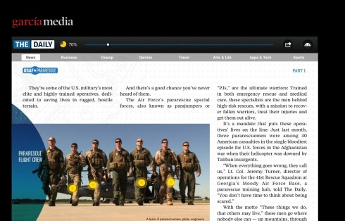
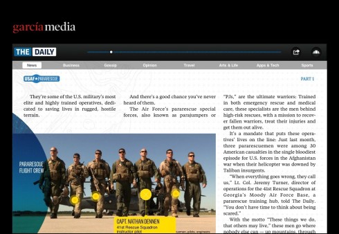
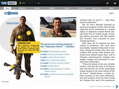
Simple, but functional: instead of writing the captions that we are used to in print, the photo in the tablet edition is milked for all its storytelling possibilities. Click on each of the pilots, get a mini story.
At the New Straits Times
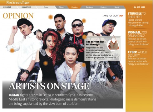
As we put finishing touches on the tablet edition of the NST which premieres in a few weeks, part of our task has been to create styles for pop ups.
The human resources and staffing available here are not large enough yet for us to sustain a series of very frequent and sophisticated pop ups. However, that is no reason not to explore the most basic pop up opportunities which are:
1. The photo pop ups
2. The video
3. The still photo that turns into a video
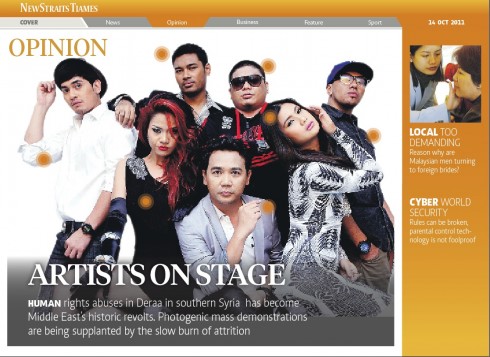
All of these are shown here in the prototype stages.
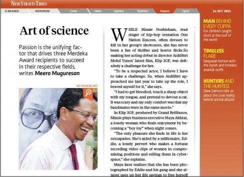
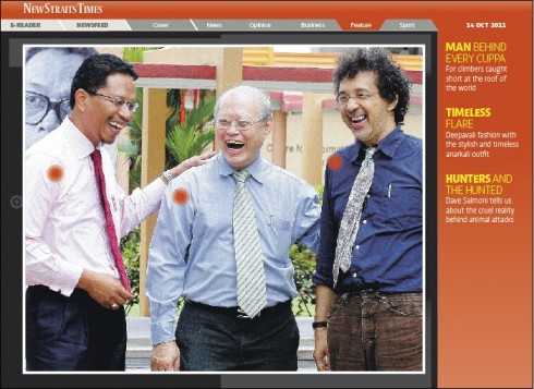
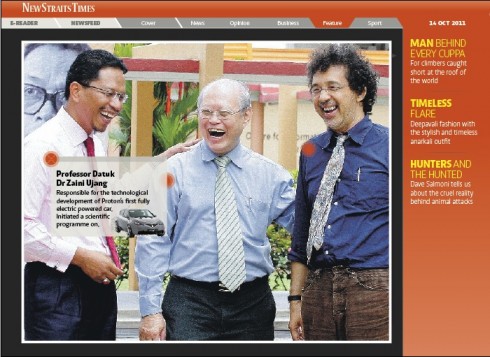
This simple pop up sequence shows how the user is asked to tap on the photo that accompanies story. From there the user sees buttons that accompany three individuals in the story.
Our previous blog posts on pop ups
TheiPadLab: the art of the simple pop up
https://garciamedia.com/blog/articles/theipad
Defining those pop up moments in the iPad
https://garciamedia.com/blog/articles/de1
Amazon’s new tablet may fire up the competition
https://www.garciamedia.com/blog/articles/amazons_new_tablet_may_fire_up_the_competition
Magazine cover nostalgia galore
Images from: http://newmanology.tumblr.com/, http://www.oddee.com/item_94900.aspx
Part 1-The Newsweek collection
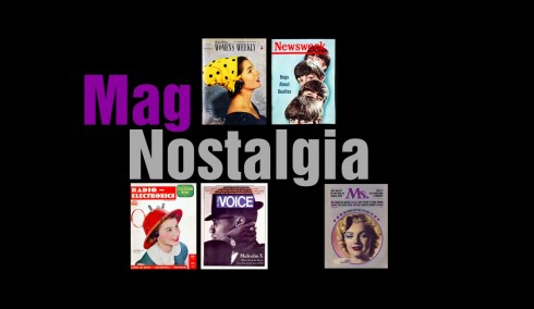
For those into magazine cover nostalgia, don’t miss the Newsweek archivist’s collection. From the Beatles to Princess Diana, with Groucho Marx and the San Francisco earthquake as part of the mix. A magazine in constant evolution, now undergoing one of its most dramatic ones under the editorship of Tina Brown.
http://nwkarchivist.tumblr.com/
Part 2 -Newmanology
Here is a romp through some fantastically inspirational goodies from our good friend, that most talented designer, Robert Newman, the creative director of Reader’s Digest. The mix here runs from the always idea-filled jazzy Blue Books to, yes, the National Enquirer, and assorted magazines (there is a funny science fiction one in there).
http://newmanology.tumblr.com/
While on the subject of magazines
One Magazine, Four Covers….and Some
Joe Zeff’s talented team does it again, in this case, designer Ed Gabel worked on four portraits provided by Fast Company CD Florian Bachleda to create a stylized look that unifies the split-run covers.
http://joezeffdesign.com/one-magazine-four-covers-and-more/
Other stories for good weekend reading:

Illustration: http://www.trendir.com
Apple’s Newsstand Is Already Booming For Some Magazine Publishers
First paragraph: Early indications are that Apple’s new iOS features for publishers have had an immediate beneficial impact.
http://paidcontent.org/article/419-apples-newsstand-is-already-booming-for-magazine-publishers/
The Daily Is No. 1 on Apple’s Newsstand
First paragraph: Apple‘s Newsstand app seems to be a boon for publishers, and no one’s benefiting from it more than The Daily. News Corp.’s eight-month-old iPad-only publication has been the No. 1 seller in the digital storefront since it launched last week, edging out, in order, National Geographic, Wired, The New York Times and The New Yorker. The Daily’s publisher, Greg Clayman, emailed staffers Tuesday notifying them of the win.
http://www.forbes.com/sites/jeffbercovici/2011/10/19/the-daily-is-no-1-on-apples-newsstand/
Rupert Murdoch thinks tablet devices will save newspapers – what if he’s right?
First paragraph: When Rupert Murdoch declared in April 2010 that Apple’s iPad “may well be the saving of the newspaper industry,” some commentators scoffed at him. How could one device reverse the freight train of web publishing and the irreversible structural shift of advertisers and readers away from dead trees?
http://www.themediabriefing.com/article/2011-10-18/rupert-murdoch-thinks-tablet-devices-will-save-newspapers-what-if-hes-right?utm_source=newsletter&utm_medium=email&utm_campaign=digital-media
My take: This piece is must read for anyone who needs to be reminded that Apple’s iPad is, indeed, as we have said many times, a game changer, and the closest thing we have to replicating (and enhancing) the newspaper experience. In his article, Patrick Smith agrees that “tablets are preserving the periodical edition format of printed media just when it looked like it was going out of fashion.” He cites numbers that tell a success story for titles like The New York Times (see report on profits above), News Corps’ The Wall Street Journal and The Times of London, Telegraph Media Company, among others. The facts, we agree with Smith, are ” putting the iPad at the centre of not just their digital strategy but of their entire content distribution and monetisation strategy.”
RIA Novosti designer wins international typographic contest
First paragraph: RIA Novosti’s Maria Doreuli has become the only Russian designer to win the Association Typographique Internationale’s type design competition, which is aimed at finding the best typefaces of the last decade from around the world.
http://en.rian.ru/agency_news/20111020/167885819.html
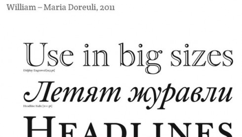
Maria Doreuli’s typeface: A Cyrillic face based on William Caslon’s eighteenth-century classic
Comment from Reed Reibstein, Garcia Media art director: Doreuli’s “William” further expands the typographic palette now available to designers working with non-Latin scripts. Among the Letter.2 competition’s other winners are typefaces for the Greek, Arabic, Japanese, Armenian, and Coptic scripts.
New York Times Company Reports a Profit
Highlight: Readers subscribing to its flagship Web site helped The New York Times Company post a third-quarter profit of $15.7 million, partially offsetting a decline in advertising revenue.
http://nyti.ms/rhaWar
My take: We are finally turning the corner, perhaps, creating business models and subscription packages that appeal to our users and that get us out of free content mode. I know that many media companies globally are watching carefully to see what happens with how the big ones advance in this area. It was obvious to me, during the WAN IFRA World Newspaper Congress in Vienna a few days ago that this is the start of a more profitable period for media companies, as evidenced by presentations from newspapers in the US, Germany and Slovakia.
See the following stories: New York Times http://blog.wan-ifra.org/2011/10/15/nytimes-paywall-allows-us-to-invest-in-journalism-video; Berlin, http://blog.wan-ifra.org/2011/10/15/the-berlin-paywall; Slovakia, http://blog.wan-ifra.org/2011/10/15/paywall-paying-off-in-slovakia
USA: BostonGlobe.com subscription model launches Wednesday
First paragraph: The Boston Globe will launch the paid subscription model of BostonGlobe.com, after a several weeks-long free trial period, the daily newspaper said on Tuesday.
http://www.bizjournals.com/boston/news/2011/10/18/bostonglobecom-subscription-model.html
Our previous references to the new Boston Globe website:
https://garciamedia.com/blog/articles/the_new_boston_globe_website_innovative_functional_sets_the_pace
https://garciamedia.com/blog/articles/news_websites_prepare_for_next_generation_less_is_best/
How the Guardian’s iPad app changed the way that I consumed news
Highlight: Just because you can have an always on app that crams in updates and breathlessly fast breaking news from live blogs, doesn’t necessarily mean that you have to. To me, that is like arguing that there is no point the BBC broadcasting the Today programme or putting Newsnight on iPlayer, because the news might be “out of date” the instant the programme is finished. Not all content in a newspaper bundle is based around breaking news – it kind of doesn’t matter when I get round to reading a review of Biophilia to help me decide whether I’m going to buy it, or an interview with Joe Cole about his first few weeks in France. It is always going to be the same review of the same CD, and always going to be the same interview from the same stage in Joe’s career.
http://www.currybet.net/cbet_blog/2011/10/guardian-ipad-app.php
My take: A fascinating review and dissection of The Guardian’s new iPad edition by The Guardian staffer Martin Belam. This is must reading for those of us who strongly believe in curated editions for the iPad. Here is a review that directly addresses one of the hot button issues in news tablet development: curated versus more static straight transfers of print content to the tablet. A point well made here: “It’s nice to just be shown some things. Just the things that matter today. It doesn’t have to compete with instant.” Of course, our own focus group experiences with tablet users is that they DO want an editor to choose some of the best things they should not miss, but they also want the instant moments and we should provide them with the means to access them. However, as it is stated clearly here, and as is my philosophy: the tablet editions are more about selections of content carefully curated than reporting the instant happening.
UK: Study: ‘Tabloid-broadsheet divide has blurred’
First Paragraph: Research by PR company Clarion Communications claims the once clear distinctions between quality newspapers and the tabloids has been eroded over the last 25 years.
http://www.pressgazette.co.uk/story.asp?sectioncode=1&storycode=48054&c=1
My take: Why did it take so long to realize that first, the public’s perception of tabloid formats is more influenced by content than the size of the page. And, furthermore, just like we have observed for years now, the mainstream (traditionally serious and conservative) media have dipped one toe into the world of the jazzier tabloids (Brangelina news makes it all the way to a lot of those so called family/respectable newspapers, and why shouldn’t it?)
WSJ Tops List Of Best Newspaper Apps
Highlight: The Wall Street Journal’s came in ahead of all other newspapers on iMonitor’s list of the top 10 newspaper tablet and smartphone applications in the world.
http://www.netnewscheck.com/article/2011/10/18/14707/wsj-tops-list-of-best-newspaper-apps
My take: I am not surprised to see one of my daily favorites, El Pais, of Madrid, is number two on the list. Perhaps the design (look and feel) of this app does not send the bells ringing, but its utility is tops. Nothing fancy, but very practical. Few templates that do the job to navigate you, to get you oriented through section color coding, and, constant news updates on the right hand side of the landing page.
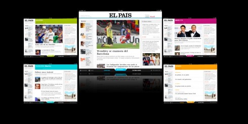
This combo shows various sections (color coded) of El Pais’ tablet edition
Flipboard editorial chief on how magazines are flipping out (Q&A)
First paragraph: Veteran Time Inc. journalist Josh Quittner completed his defection from print media by joining Silicon Valley startup Flipboard—the popular social-magazine app for the iPad—this past July. Quittner is Flipboard’s first editorial director. Before joining the company, he directed Time Inc.‘s digital magazine strategy and ran editorial for Time.com. In the mid-1990s he was the first writer to cover the Internet exclusively for Time. And he’s also had stints running editorial for Fortune and Business 2.0. So why leave a namesake publishing conglomerate for an unproven social-media experiment? Anyone familiar with consumer technology knows Flipboard isn’t your average bootstrapped venture.
http://news.cnet.com/8301-1023_3-20120104-93/flipboard-editorial-chief-on-how-magazines-are-flipping-out-q-a/
The Economist Bows To Apple Terms As iOS 5 Breaks Its App
http://paidcontent.co.uk/article/419-the-economist-bows-to-apple-terms-as-ios-5-breaks-its-app/
Seeking Success for Newspapers in the Social Media Marketplace
First paragraph: Breaking news stories on your website is so 2007. Today it’s all about social media, promoting your “brand,” and maxing out your Twitter stream. If you’re loud enough, you might just break through the chatter and gain some recognition for yourself, but will any of this actually move the needle?
http://www.editorandpublisher.com/TopStories/Article/Seeking-Success-for-Newspapers-in-the-Social-Media-Marketplace
My take: Indeed, come to the central square, as I keep saying. I am sure that the news of Muammar Gaddafi’s death will be yet another example of a recent breaking news event that dominates the social media networks. I was at my computer Thursday when social networks roared into action with unconfirmed reports, and then that famous picture of Gaddafi lying bloody on the ground. After that, tweets galore from everywhere. That is when I turned to CNN, and then got the first prompt from The New York Times. By then, however, the social media had alerted me to this big and historic event for Libya and the freedom-loving world. Interesting note: CNN and the Times were not officially saying that Gadaffi was dead (that happened by the time I woke up in Kuala Lumpur Friday morning), but Twitter was celebrating already.
For our blog posts on the impact of the social media on breaking news:
News agencies and social media: challenges of producing news when everyone’s a “journalist”
https://garciamedia.com/blog/articles/news_agencies_and_social_media_challenges_of_producing_news_when_everyones_/
Breaking news and the people in the central square
https://garciamedia.com/blog/articles/breaking_news_and_the_people_in_the_central_square
Pop ups from Bild

Frank Deville sends us an example of a basic pop up in the Bild app. Each edition includes several of these, with the corresponding mini stories attached
In this pop up, which is in the category of basics (as per above), Bild of Germany has an expert anrchelogist take the user through various famous finds.
And, in Sunday’s edition, Bild am Sonntag, a colorful two-page spread (no pop up)—the story in numbers—- about bird feathers categorized and described in detail. The caption tells us that there are 10,350 species of birds and 40 cannot fly.