Here is a cover for the ages!
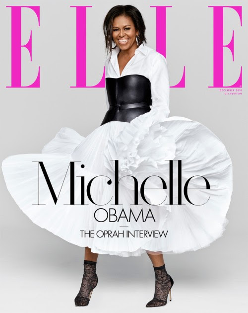
The new ELLE features the former First Lady, Michelle Obama, looking grand.
Why I would show these to my Columbia students during that first segment of the course devoted to Design Essentials (The Design Boot Camp).
In terms of design, this is a clean, minimalist concept that allows for the subject of the cover to be the main event. Black and white contrasts well against the Elle logo in this lilac hue. The type choice is glorious, also the hierarchy of how the words have been set. Must be tough for a designer to do this when the three words are Michelle, Obama, Oprah.
Well done. Not to mention the dress—and those shoes! Michelle Obama does it again.

The Atlantic
Less sex among the young?
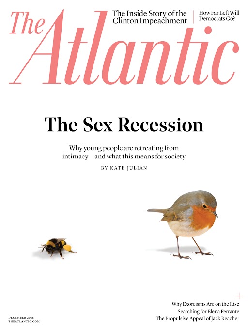
Here is an interesting cover story concept at The Atlantic, in its latest print edition, with an intriguing story: apparently young people are retreating from sex? Who’d know?
Highlight:
Forget the panics over hookup culture and a Tinder apocalypse. Young Americans aren’t having more sex than past generations; they’re having less. They’re launching their sex lives later and having sex with fewer people less frequently. (Among those who are having sex, many say that it is bad.)
https://www.theatlantic.com/…/…/12/the-sex-recession/573949/
Tribute to Stan Lee
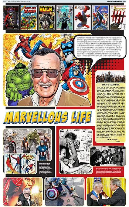
Pages we like: Here is Hong Kong’s the South China Morning Post, with which I have had the honor of working, and its tribute to the great Stan Lee, who died this week. Thanks, Carl Jones, for sending it. Great job.

From Carl Jones, Head of Design at the South China Morning Post:
We decided to honour Stan Lee with a whole page as the Marvel franchise has always been popular in Hong Kong.I looked at the pictures that our photo editor (Yves Sieur) had found and decided I could design a page displaying the images in a comic book style.I asked my art director (Emilio Rivera) to design a headline which our subeditor (Tim Pratt) had written to accompany the obituary.To complement the design we took one of his famous ‘Stan’s Soapbox’ panels which made the page even more personal we thought.Even in this digital age the print can offer that tactile experience some people still enjoy.
Amen!
TheMarioBlog post #2951
