Update #2: Thursday, Aug. 5, 08:08 German time
TAKEAWAY: Have BlackBerry, won’t travel (Not to the UAE, if you wish to text message!): how the Gulf News covered the big story. ALSO: Reed Reibstein’s pick of the 10 best iPad apps that every designer/editor should be downloading.
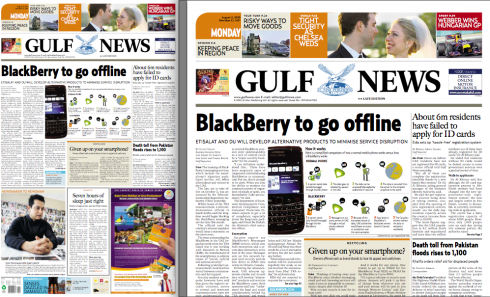
Front page of the Gulf News with lead story about BlackBerry and its future limited use in the UAE
Now that we know that using a BlackBerry in the United Arab Emirates (UAE) may not be so easy, I asked Miguel Gomez, design director of the Gulf News in Dubai to send me images of how the Gulf News had covered this major announcement.
The Emirates’ telecommunications regulator said on Monday that travelers to the city-state of Dubai and the oil industry center of Abu Dhabi will have to do without BlackBerry e-mail, messaging and Web services starting Oct. 11, just like the 500,000 local subscribers. The handsets will still be allowed for phone calls. According to authorities,
the move is based on security concerns, because BlackBerry data is sent to company computers abroad, making it hard for the local authorities to monitor the digital services for illegal activity or abuse.
Obviously, a complicated story that took many by surprise, not only in the UAE, but worldwide. Many business people travel to Dubai—-known as one of the major financial centers in the world. I have observed that there are more BlackBerry users in Dubai than any other smart phones. Wonder how they are reacting to the news.
The Gulf News assigned infographics artist Guillermo Munro to design the graphic to be used on the front page. I communicated with Guillermo, who offered me a step by step description of his thinking as he was trying to explain the situation through his graphic:
First proposal
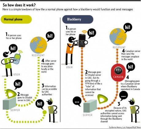
The first proposal I did was a very basic and easy to read graphic to show and that everybody could understand since, when the news broke out most people did not understand what the problem was, and why the UAE had problems with BB.
Second proposal
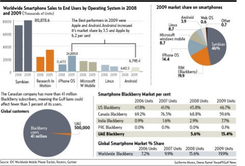
The second proposal that went on the front page changed the graphic (first proposal) from 15cm to 10cm, plus adding a photo (something that I opposed because everybody in the connected world knows what a BB looks like). So at the end we changed and rephrased some information and went more with a vignette-Icons style of a graphic.
The final version
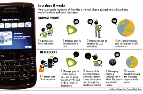
That same night ,while having dinner and discussing the issue with a friend, I realized that we needed to show what percentage of the market compared to BB global market the UAE had, and that would create also some talk about if BlackBerry would cave in to the pressure or not. Even though I wanted to have more info, like users in China, India and France, I only got the comparison from the UAE and total global BB users. Also we added BlackBerry global percentage in the market compared to other devices and operating systems.
10 Essential iPad Apps for Publication Designers
Here is a terrific blog post written by our Garcia Media intern, Reed Reibstein (Yale University ‘11) while spending time in New York City with master magazine designer, Robert Newman. This entry originally appeared as part of a Society of Publication Designers (SPD) blog. I am honored that both Bob Newman and Reed Reibstein have allowed me to reproduce it here, as I agree with these choices 100%, and hope you will too.
Those of us excited about the possibilities of the tablet have already seen the big-name magazine apps for iPad, like Time, Wired, Sports Illustrated, Popular Science, Popular Mechanics, and Entertainment Weekly’s Must List. (If you haven’t, take a few minutes to check them out now.) But there are many other apps of interest to publication designers that have not yet received as much publicity. Below is a sampling of ten apps, many of them free, to kick your iPad imagination into high gear. This is, of course, nowhere near a definitive list. With new releases appearing almost every day in the “News” category of the App Store, many more apps with innovative navigation schemes and vibrant animations await your download.
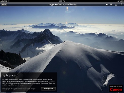
The Guardian Eyewitness
Cost: free
Why you should get this app: a signature print feature adapted to the tablet—and made better in the process
If you like photographic slideshows, check out NY Post Pix (free).
This app is just about as simple as can be: one captioned photo a day. But when the photographs (from The Guardian’s team, as well as other news agencies) are this good, additional features would only detract from the power of the images. In adapting a printed feature—the daily double-page spread dedicated to a single photo—the app’s creators only added a few, largely invisible tools: a 100-day photographic archive, slideshow mode, sharing, and “pro tips” describing the technical details behind each shot. The Guardian team made another smart decision by enticing Canon to sponsor the app for the cost of a logo. This way, the app stays free while making money for its creators.
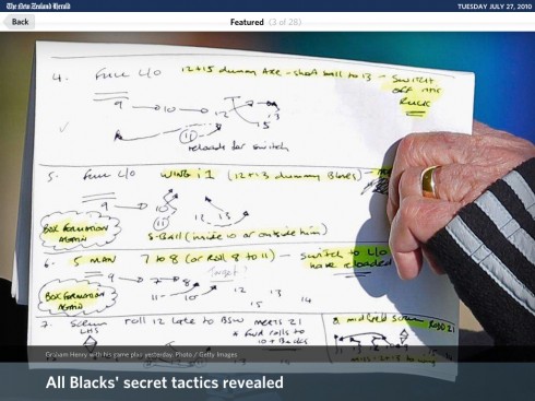
The New Zealand Herald
Cost: free
Why you should get this app: innovative combination of a slideshow and news reader using assets the newspaper already has
If you like newspaper apps (but want smaller photos), check out the Financial Times iPad Edition (free for ten articles per month).
The Kiwis know how to start off the app experience with a bang. Photographs of historical New Zealand events zoom past in the slick intro movie, which is occasionally preceded by an equally well-executed Mercedes ad. The article pages, though, are the true highlights here. Tapping an article in landscape mode brings up a full-screen photo with headline overlaid at the bottom. You can swipe up to reveal the article text, which intelligently uses the exact same headline as the photo, or you can swipe to the side for a full-screen slideshow view of the news. Nearly two apps in one, The New Zealand Herald reminds us that readers appreciate being able to interact with an app in different ways, as long as those interactions are distinct and appealing.
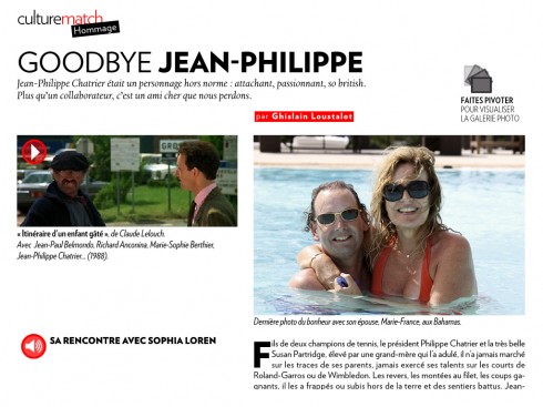
Paris Match
Cost: free for the app, $1.99 per issue
Why you should get this app: perhaps the most interactive magazine out there
If you like interactive magazines, check out Fortune Magazine ($4.99 per issue).
Paris Match is a notable addition to the group of apps that add interactivity to the print edition of a magazine. Although less polished than Wired or Time, the iPad version of the French lifestyle weekly takes excellent advantage of the new medium. Nearly every story has an interactive feature, from hidden sidebars and audio interviews to zoomable slideshows and movie trailers. I particularly like the “match document,” in which the full-screen background images cycle constantly.
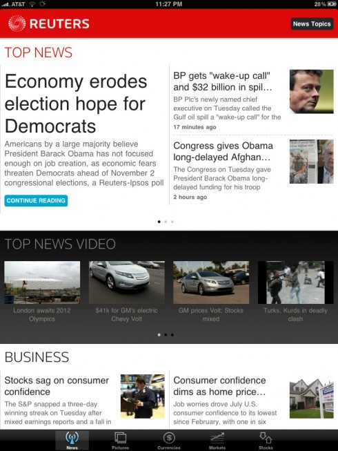
Reuters News Pro for iPad
Cost: free
Why you should get this app: a gorgeous interface that’s a breath of fresh air
If you like wire services, check out AP News (free).
Reuters News Pro may feature the cleanest presentation to be found on a tablet. The gridded bar interface and mostly elegant typography make it a breeze to swipe through the headlines of your favorite section. (It would be nice, however, if you could navigate through articles themselves by swiping in the same manner.) The article pages may be nothing special, but the currency converter, market listings, and stock trends are highly usable.
NPR for iPad
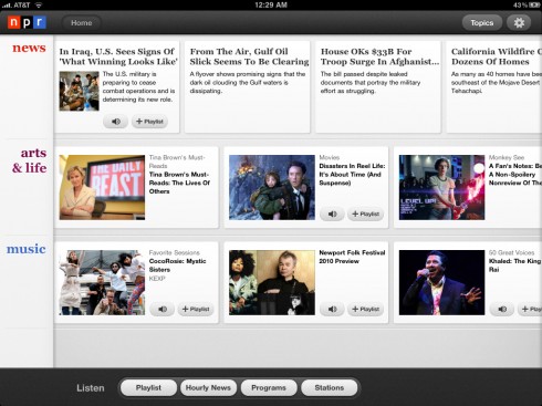
Cost: free
Why you should get this app: an audio playlist makes for an unusually engaging experience
If you like news on the radio, check out BBC News (free; tap “LIVE RADIO” at the top left).
As the designers discuss in a Society for News Design interview, National Public Radio’s iPad app focuses on three topics of equal importance: news, arts & life, and music. While every story has a transcript or text, the star, naturally, is the audio. The key feature that makes it all work is the playlist, which keeps track of what you’ve listened to and what you want to hear next. An improvement over listening in the car, with the app you can easily view accompanying images and share interesting stories. And with a long list of available programs and stations, this is one app you’re unlikely to explore fully the first time round. Best of all, if you quit the app while listening to an audio story, next time you come back a message will ask you if you want to resume where you left off.
Getty Images

Cost: free (only fully accessible with a Getty Images subscription)
Why you should get this app: an elegant way to search for and select stock photos
If you like big photos, check out Reuters Galleries (free).
Getty Images, the popular stock photo agency, may work even better on the iPad than online. The app’s initial view is fun, a shifting gallery of editorial, creative, or archival photos. A nearly hidden “Easter egg”: shake the iPad to bring up images for a random keyword—good for when the creative juices aren’t flowing. The photo search is phenomenal, making it easy to search for keywords and build a custom lightbox from your favorite results. (Lacking a Getty Images account, though, I wasn’t able to try the billed features of sharing lightboxes, viewing them in slideshow mode, and adding voice recordings.) Complex searches work better on gettyimages.com, but the ability to compare up to four photos full screen makes picking the perfect shot a treat. Once again, the iPad’s bright screen proves to be superb for displaying vibrant photography.
Sympatico.ca
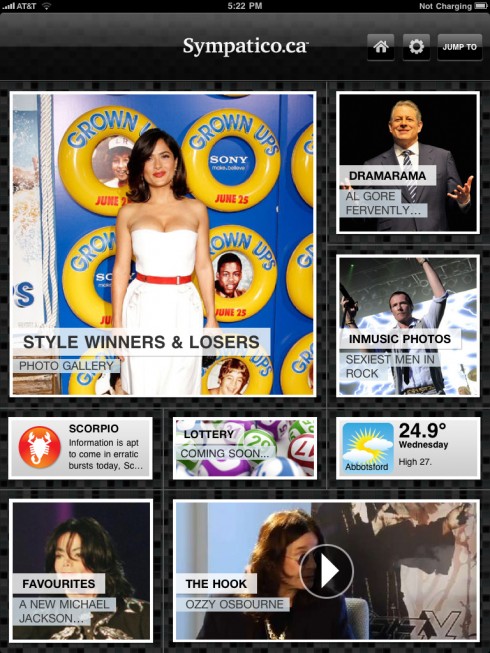
Cost: free
Why you should get this app: a modern, edgy vibe perfectly suited to the content
If you like modular interfaces, check out EW’s Must List (free).
Most Americans can’t name the Canadian prime minister, so I’m not surprised that I’ve never heard of Sympatico.ca, “Canada’s leading information portal.” But the app, with a decided slant toward celebrity, fashion, and music news, is interesting even to a Yankee like me. If you’ve been going straight through this post, you’ll now be familiar with the gridded interface. But Sympatico.ca gives it an edge, with headlines overlaid on the photos that switch every few seconds. Like Reuters News Pro, it is fun to flip through each box until you find a story worth reading. The light tone of the content (be sure to check out some celebrity interviews from “The Hook”) resonates in the option to “Accept Fate” upon reading your horoscope and the photos that flip when you tap them. You may not have heard of Sympatico.ca until now, but it’s definitely worth your attention on the iPad.
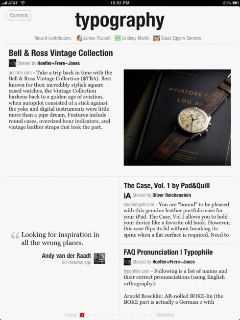
Cost: free
Why you should get this app: shows that Twitter and news feeds don’t have to look drab
If you like Twitter, check out Twitterific (free for ad-supported version).
You may have heard about this app last week. Tweeters and bloggers went wild for the idea of a better interface for your news and social media. There have been a few previous attempts on the iPad to make Twitter or news feeds into more of a newspaper, but none executed so well. The key innovation is that Flipboard pulls text and images from links, making your Twitter feed, for example, far more interesting than usual. As for content, the app’s creators took a hybrid approach, providing some custom feeds (e.g., “FlipDesign,” “FlipTech”), getting feeds from fun websites like Wired.com and TED Talks, and letting you add your own person or list from Twitter. It’s not perfect, but this app has already made it to the first screen on my iPad.
The Elements: A Visual Exploration

Cost: $13.99
Why you should get this app: technically-advanced photography makes the book more useful and enjoyable
If you like interactive books, check out Alice for the iPad (lite version free; full version $8.99).
Moving further away from magazines and newspapers, The Elements puts the iBooks app and your Kindle to shame. Tapping an element in the periodic table brings up its characteristics and historical use (with even more available through Wolfram Alpha), but the images are what captivate. Each item has been photographed in 360 degrees to make them spin round at a touch. At first, this is just (very) entertaining. But as you work your way through the elements, being able to rotate the many glasses, metals, and crystals lends them a tactility that would be otherwise unavailable. Also, don’t miss the illustrated version of Tom Lehrer’s “The Elements” song, available in the main menu. “There’s antimony, arsenic, aluminum, selenium….”
Marvel Comics
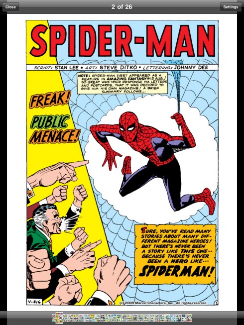
Cost: free ($1.99 for most comics)
Why you should get this app: an efficient store yields eminently readable comics
If you like Batman, check out DC Comics (free, $0.99 to $1.99 for most comics).
When I was younger I enjoyed reading comics, but I haven’t bought a new issue in years. It is a tribute to the simple effectiveness of the Marvel Comics app that I have now begun reading several new series. You can browse comics about the X-Men, Spider-Man, Captain America, and many more by release date and popularity. If you’re a superhero nerd, you can even search for your favorite author or artist. Once you’ve bought an issue, you can read a page in portrait mode at slightly less than actual size, or double-tap to navigate panel by panel. The colors in the heroes’ spandex really pop off the iPad’s screen! At $1.99, these comics are cheap enough for an impulse purchase, so don’t say I didn’t warn you if you spend a small fortune.
P.S. For more thoughts on designing for the tablet, check out the liveblog I co-wrote at the Poynter Institute’s “Power of the Tablet” conference.
Page of the Day
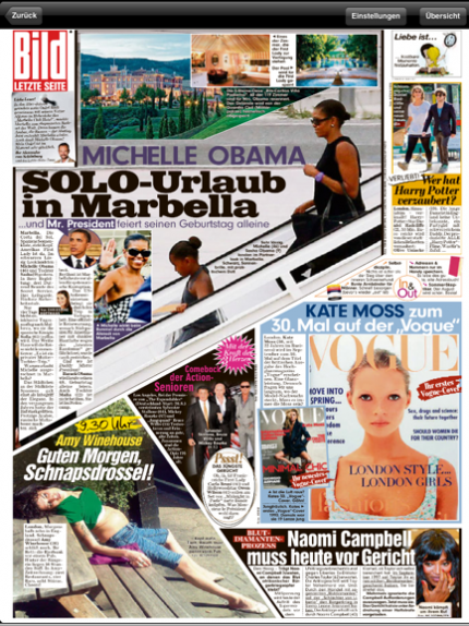
Bild Zeitung, Germany: back page of Thursday, August 5
Again, Germany’s Bild Zeitung rules the day with its People page of today, featuring among dozens of other items, the arrival of US First Lady Michelle Obama and one of her daughters for what is termed as a “private visit” to the resort city of Marbella, Spain. The Obama story takes centerstage on this busy page, the photo of her and her daughter arriving cutting through the center of the page.
TheMarioBlog post #609