strong>TAKEAWAY: Our contdown to the Power of the Tablet conference at Poynter (June 14-15) continues with Reed Reibstein providing us links of interest to get us thinking tablets. Today: the iPad and newspapers
Submit Your Links!
On June 13, the day before the “Power of the Tablet” conference, I will post a list of the tablet-related links you, our valued readers, suggest. So send me your favorite articles, blog posts, tweets, e-mails from Steve Jobs , whatever! Tweet them to @rreibstein or leave them in the comments below.
As we approach Poynter’s The Power of the Tablet conference, I turn over the blog to our Garcia Media intern Reed Reibstein, who will also be blogging live from the conference. Reed’s idea is to “warm up” to the conference with daily postings of essential articles that will help everyone understand the tablet as a new journalistic platform.

Countdown to the Conference: 4 days to go

What the iPad is Missing (No, It’s not a Camera)
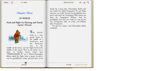
Today we take a detour to a smaller, but still vital, issue. Despite Steve Jobs’ much-touted commitment to typography, Stephen Coles points out that Apple’s iPad apps are woefully deficient in typographic refinement. This is not the fault of the operating system, type designer Jonathan Hoefler reminds us (” ‘That ePub is ugly, so the iOS sucks’ = ‘New York is a terrible city, because I once had a bad sandwich there.’ “). Nevertheless, for a device proposed for long-form reading, the situation is worrying—and few news apps have implemented typographic standards that assuage my concerns.
TheMarioBlog post #575