TAKEAWAY: It is everywhere, more colorization of type. This week’s New York Times Magazine is an example. ALSO:Does a redesign make a publication smarter?
There was a time when colorizing type was a no no, at least with many of the editors and designers I worked with——not to mention professors who taught layout and design in journalism schools. Color in type, if used, was primarily in magazines, which were printed on glossy paper and faced fewer problems with printing and reproduction.
Today, however, it is nothing extraordinary to see type in color.
This weekend I came upon the New York Times Magazine, which is one of the most elegant publications around, and noticed that summaries and accessory headlines are always in color. The treatment looks nice, adds a touch of color on the page and it is subtle enough to go with the rest of the magazine’s elegant look and feel.
Last year, as Anja Horn and I did some prototypes together for Germany’s Die Welt, we also experimented with using pastel colors for promo headers. We created a color palette of ten colors that would be recurring themes in the promos. Some of these concepts did not make the final cut, but we enjoyed experimenting with color and I post them here .
Should type be colorized?
The question should be: why not? I for one think that headlines usually look bertter in black, but an accent of color for type elements around the headline add a sparkle to the page. Also, readers like color and most newspapers today have the ability to reproduce it well, so why not?
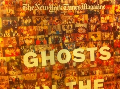
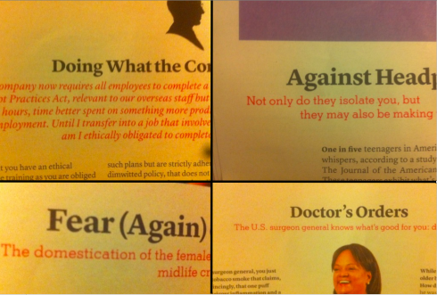
From The New York Times Magazine: summaries and type accessories in color throughout the magazine


Using pastel colors to brighten up those navigational elements
Can a redesign make your newspaper smarter?

I don’t have the answer to the question, by the way, but I was surprised to see that The Wall Street Journal’s promotion of Smart Money, its sister publication, uses Smarter by Redesign as its marketing label.
The full page ad, which ran in Tueseay’s WSJ, reads: Discover the redesigned SmartMoney, now with more stock picks,investment advice and in-depth reporting.
Whether a redesign can make a publication smarter or not, it is good to see the words smart and redesign appearing together. I am also surprised by the concept of “redesign” used in a marketing campaign, not that it is a bad idea. However, usually marketing campaigns emphasize content over design.
TheMarioBlog post #692