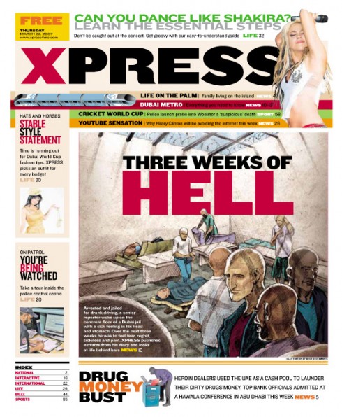
COLORING THOSE HEADS: Xpress, the weekly free newspaper of the United Arab Emirates, published in Dubai, displays headlines in color, starting on page one.
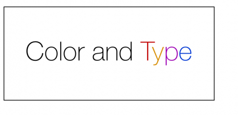
TAKEAWAY: Colorizing type can be effective, but color on type works best on sans serif fonts, where legibility is greater.
I have come to learn a sense of appreciation for the discreet, elegant use of color in a headline, or a summary, or even a photo caption. Yes, if you read my Pure Design book (2002), you probably remember that I wrote: “My preference is for headlines in black, 99 percent of the time.”
Well, how about if we make that 80 percent of the time?
In the last six years, I have come to appreciate how a touch of color can enhance that headline, or draw the eye to a specific secondary element of a story. There is nothing wrong with having two or three words of a summary or even a display quote, highlighted in color.
The use of color in type is NOT limited to feature pages. Color in type, however, should never compete with the color the images bring to a page.; it should be secondary use of color, an accent, a touch to lure the eye, not the protagonist on the page.
TOMORROW: Color Week continues with a segment on The Research of Color
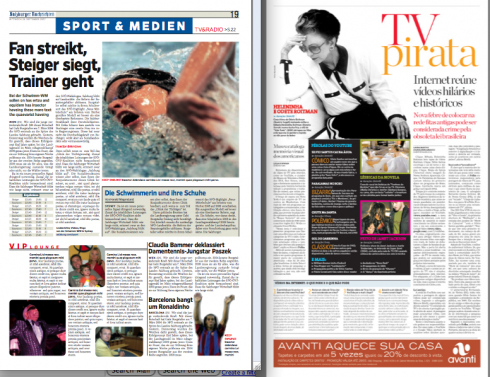
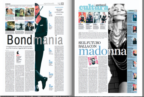
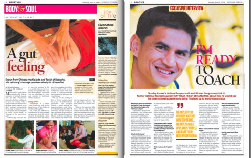
COLORING TYPE: Below, pages from Folha de Sao Paulo (Brazil), Salzburger Nachrichten (Austria), Il Secolo XIX (Italy) and Daily Xpress (Thailand)