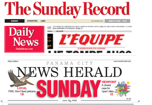
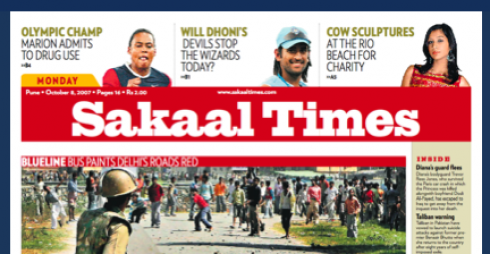
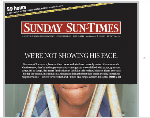
THE POWER OF RED: The newspapers above display red in their nameplates, a sure way to attract readers, especially for street sales. One of India’s newest dailies , Sakaal Times (Pune), and Chicago’s Sunday Sun-Times, have also opted to color their flags in red.
TAKEAWAY: Remember to design with color for your specific audience. Culture and surroundings play a key role. Observe what is around you as a primary source of inspiration.
It should not surprise anybody that a newspaper in Norway uses color differently from one in Brazil or India. It has always been my philosophy that the colorization of a newspaper or website is as important as the selection of type. Color and type convey the image of the product in about 10 seconds.
Design is deeply rooted in the culture and traditions of the people for whom it is intended. Deciphering cultural elements takes nothing more than a quick run or walk through the city, or a sharp eye when traveling by train or bus within a city. One immediately spots “the palette”. I hear myself often saying “this is a pastel color kind of city, ” or “here bright is better, let’s go for the yellows and the oranges.”
Sometimes the inspiration comes from that overcrowded bus painted with illustrations in purple, orange and green. At times, I count the number of white curtains I see while taking the train from Stockholm to Goteborg, Sweden. (The count is high)
In her book Wie Farben Wirken, Eva Heller maintains that, although culture affects how we perceive color, there are some colors, such as black and red, which evoke feelings more associated with psychology than with geographical or cultural factors.
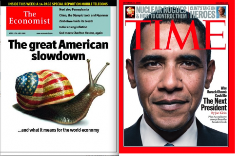
Red , for example, is associated with blood as well as with passion almost universally. In newspapers, a red nameplate is one we are likely to see in a tabloid or boulevard newspaper more readily than in a classic one. However, red can be an effective “accent” color, as we see often to emphasize a key word in the brand, such as Sunday (see samples above). And, let’s not forget that publications with such gravitas as The Economist and TIME magazines also have red logos.
Black has negative connotations that can be associated with death, the danger of the night, darkness that to some signifies winter. Yet, black is a popular color with newspapers, and in its new redesign, the Orlando Sentinel has opted for a black reversed nameplate.
Perhaps the Sentinel designers see black in a different light: as in the importance that a black limousine or black Mercedes can convey. Black as elegance and power. It will be interesting to find out what Sentinel readers think.
MOST MEMORABLE COLOR MOMENT: For me it happened in Miami, as we were preparing a redesign of the Spanish edition of The Miami Herald in the 1980s. Florida’s flamingoes were my inspiration for a touch of pink in the nameplate. It looked nice and fresh, we all thought; the readers had a different idea. As we took the prototype for focus group testing in Little Havana, we soon had readers up in arms about “that pinko communist logo”. Of course, we quickly removed the pink and replaced it with the ever safe blue.
MOST RECENT COLOR ENCOUNTER: As we presented prototypes to the staff of the Yale Daily News, Yale University’s daily newspaper, some of the pages contained a bit “too much” of what the Yalies referred to as Harvard crimson, obviously a taboo hue for their palette!
WE SEND YOU: Related links:
http://webdesign.about.com/od/color/a/bl_colorculture.htm
http://faculty.ed.umuc.edu/~dgriggs/instructional_activities/color/color.htm
WHERE IS MARIO? In Lagos, Nigeria