TAKEAWAY: Just launched, El Tiempo’s iPad app offers a different way of looking at the issue of “updates” for iPad apps. It offers two editions daily: morning and evening, adjusting to the two news cycles as opposed to constant updates for breaking news.
El Tiempo’s door screen
This screen shows the various saved editions that can be accessed
Here the user has a choice of reading a morning or evening edition of El Tiempo
An internal screen from El Tiempo

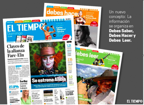
The look and feel of the newly designed El Tiempo carries through to online and iPad app
This is the home page of eltiempo.com
El Tiempo’s iPad app, just launched December 4, and still working through a series of necessary tweaks, is a model for what I call the concept of editioning for apps. (In fact, I experienced some trouble downloading yesterday’s evening edition, as it took longer than normal. These are the usual early technical glitches that I know will be solved soon)
Indeed, a much debated topic in news app development is the frequency with which they must be updated. I have stated my position on the topic earlier: the app is a medium for relaxation and not for constant beeps and updates. However, I understand this is an issue that has two strong sides for debate.
In the case of El Tiempo, and as I was involved with the early stages of creation for the app, I proposed the idea of editioning, nothing new if you are a journalist of a certain age and remember when US newspapers had morning and evening editions, and sometimes even three a day.
I know. I was working as an intern at the now defunct The Miami News, which had a lunchtime edition that hit the streets of downtown Miami just about noon, followed by a home edition around 6 pm. It was a way of refreshing the news offering for certain audiences at specific times of the day. The lunchtime edition was quite visual, tons of photos, big ones too, so if you decided to sit in a park bench and contemplate the bay of Biscayne, you could have a quick sampling of the news, mosttly through photos, while eating your sandwich.
As El Tiempo crew gathered in August to plan the app, I was in Bogota working on the rethinking of
El Tiempo’s print edition. I participated in the planning sessions and suggested that El Tiempo would be an ideal publication to have perhaps three daily editions: morning, lunchtime and evening. The idea took off and after some tryouts, it was decided to do two editions a day: morning and evening, which is the one you see here.
It is a concept I believe in and which you will see soon on three other apps in which I am participating. Each will do it differently, but the “time” and “updates” elements are based on the same principle. Stay tuned for those case studies which are likely to happen between the end of this month and end of January 2011.
(Note: I plan to extend this El Tiempo case study throughout the day as time permits, so come back!)