TAKEAWAY: If the calls and emails I have received so far this young year of 2013 are an indication, publishers are serious about effective, dramatic change and seeking ways to carry it out.

While so many of us are still finding our way through the so called “routine” of getting back to work and to the daily tasks that appear a little difficult to tackle after the Christmas and New Year’s holidays (in my case more than three weeks away from work!), I sense that this baby we call the year 2013 is ready for action. Definitely not a sleepy baby, not at all.
Each of us can gauge what is happening through the microcosm that is our own experience. For us at Garcia Media, and for me personally, the thermometer that we use to take the pulse of our industry is a simple, not too sophisticated one: who calls us for assistance? Which segments of the industry are interested in projects? What are those projects and their scope?
The 1980s: Help us introduce color
There was a time (the 1980s) when every publisher/editor who contacted me wanted to deal with the subject of color: how can I make use of color in my newspaper more efficient? Or, better yet, how can I introduce color to what is an almost totally black and white newspaper?
The 1990s: Did you say scanners?
Then there were the 1990s. By then, color has become the standard, so the issues dealt more with storytelling. Loyal readers who read everything patiently were beginning to disappear, giving way to “scanners” who moved quickly thru the pages, almost shouting orders: give me breakout boxes, more summaries of stories, more and better briefs, and, of course, more info graphics.
The 2000’s: The Internet is here
One could almost draw a thick line in the sand here as the new century arrived and the Internet became a strong presence, then it was all about online editions: how much of the newspaper content to put there? How should a website reflect the brand of the newspaper? How can we charge for this new avenue for our content? It was a tough decade which has spilled into the next one.
Let’s say hello to 2013: it’s a media quartet world
Here we are, 14 days into 2013, a year barely in the diaper stage, but advancing quickly to toddler status. When the phone rings this day, or when I read those emails that pour in, I see one dominating theme, and I use quotes to paint the picture of what I read and what I hear from those coming to me:
Thinking multi platforms
“We have not done enough in the newsroom to think in terms of multi platforms. Here, we still come to work daily to produce a newspaper, as with ink on paper. We know that we can’t continue to do that: where do we start?”
The newsroom that thinks media quartet
“Yes, we have a mobile telephone presence that is so so, and, of course, a website, and print and an emerging tablet edition, but the content that flows through it is pretty much the same. How do we organize our newsrooms to correct this? “
Tablet editions
“Our competitors have developed a great tablet edition, when we have barely gotten out of the gate with ours, mostly a pdf edition at the moment: should we venture into a curated tablet edition now, or spend our resources elsewhere?”
Brand extensions
“We have a group of newspapers that we have acquired through the years, all looking different, each with its own typographic components, logos, etc. We want to unify them, while preserving their identities.”
Starting the new newspaper in 2013
“We would like to start a new newspaper, including a print edition.”
There you have it, the full range of topics in the minds of publishers and editors. I am sure that many of you can identify with these issues, and, in fact, you may be wrestling with them as well as the new year begins.
Exciting it is, and, today, more than ever, our thoughts are clear on the topic: 2013 is the year of the total rethink.
Now, let’s push that rethinking button.
In case you missed it
Responsive vs. Adaptive Design: Which Is Best for Publishers?
http://www.huffingtonpost.com/garrett-goodman/adaptive-design_b_2344569.html?utm_hp_ref=media
Highlight:
There are two similar buzzwords flying around the digital media space right now, and to the uninitiated, responsive and adaptive design might seem like interchangeable labels for the same tech. They are both, after all, methods to optimize web content for mobile consumption
a challenge that publishers must face if they are to adapt to today’s news consumption trends.
My take:
This is one of the most effectively presented pieces I have read about responsive design and why it works so well, both for users and for those of us creating it for a publication.
The fact that the grid adapts to accommodate the dimensions of a specific medium allows for much better image resolution, while giving the title the proper brand extension across platforms.
Another reference I found useful:
A recent Pew Research study shows that mobile users are not just skimming headlines as once assumed, but “many also are reading longer news stories
73% of adults who consume news on their tablet read in-depth articles at least sometimes, including 19% who do so daily. Fully 61% of smartphone news consumers at least sometimes read longer stories, 11% regularly.”
This is a must read article.
UK: Telegraph runs augmented reality iPad ad for Virgin
http://www.inpublishing.co.uk/news/articles/telegraph_runs_augmented_reality_ipad_ad_for_virgin.aspx
USA: The New York Times’ Plan to Save the Banner Ad
Belgium: Newspaper readers are driven to distraction
www.guardian.co.uk/media/greenslade/2013/jan/10/newspapers-marketingandpr
Where’s Mario?

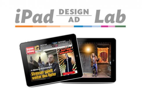
Take advantage of our iPad Design/Ad Lab workshops

Do you want to take your brand to the next level by creating a tablet edition? Garcia Media can help. We now offer one- to two-day iPad Design Lab workshops on demand to jumpstart your presence on this exciting new platform. We also offer iPad Ad Lab workshops to develop engaging advertising models for your app. Contact us for more information.

Purchase the book on the iBookstore
The EPUB version of book is HERE:
Now available: The EPUB version of  iPad Design Lab: Storytelling in the Age of the Tablet, ready for download via Amazon.com for Kindle:
http://tinyurl.com/8u99txw
Here is how you can get iPad Design Lab book:
The original version of the book is the multitouch textbook version available on the iBookstore for iPad (iOS 5.0 and up):Â https://itunes.apple.com/book/ipad-design-lab/id565672822. This version includes video walkthroughs, audio introductions to each chapter, swipeable slideshows, a glossary and a sophisticated look and feel.
Apple only sells multitouch textbooks in certain countries at this time, unfortunately. Copies are available in at least the following countries: Australia, Austria, Belgium, Canada, Finland, France, Germany, Great Britain, Greece, Italy, Latvia, Luxembourg, The Netherlands, Poland, Portugal, Romania, Slovakia, Spain, and the United States.
For those in other countries and without an iPad, we have made the book available in a basic edition for other platforms. This basic edition includes the full text of the original, along with the images and captions, but lacks the other features such as audio and video. It is available on the following platforms in many countries:
Amazon Kindle:
http://amzn.to/SlPzjZ
Google Books:
http://bit.ly/TYKcew
Take a video tour of iPad Design Lab
“iPad Design Lab” trailer on Vimeo.
Read the Society of Publication Designers’ review of The iPad Design Lab here:
http://www.spd.org/2012/10/must-read-ipad-design-lab.php

Keep up with Mario Garcia Jr.. via Garcia Interactive: helping transform online news since 1995.
www.garciainteractive.com