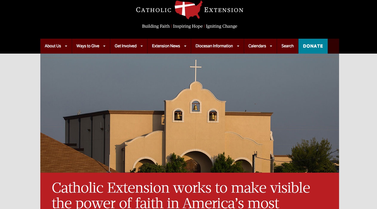
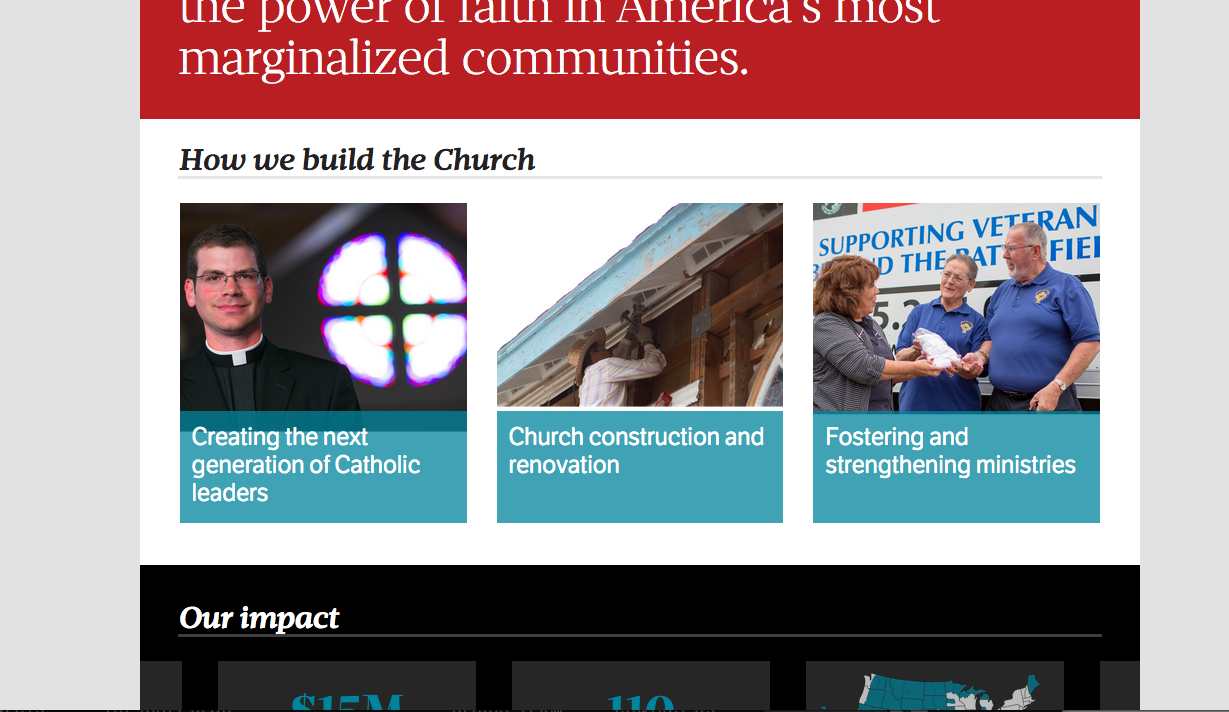
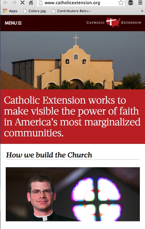
Readers of Catholic Extension magazine and its website can now enjoy the newly launched design and rethinking, which includes a new navigation, better use of information architecture and navigation.
The Garcia Media team, headed by Reed Reibstein, who served as art director for this project, worked for six months with Tom Gordon, publisher as well as with Matt Paolelli, Manager of Digital Communications, to rethink the website and to make the content more appealing, easier to find and more pleasant to navigate.
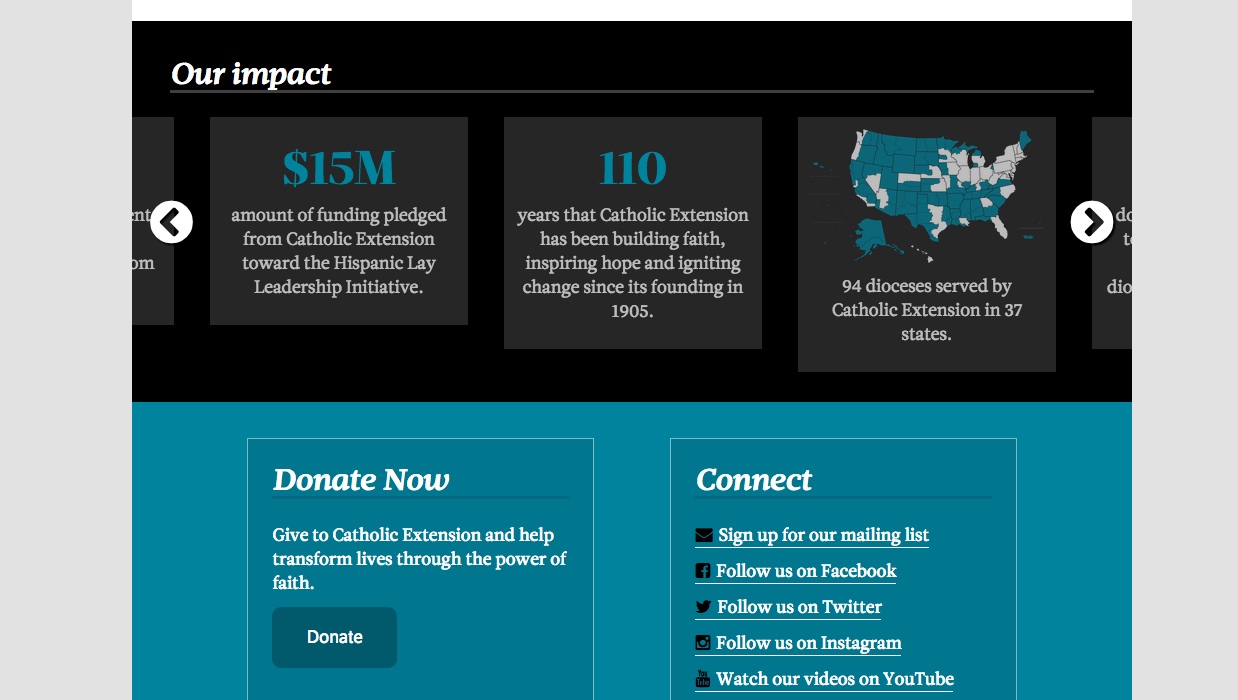
“Mario and Reed served as wonderful guides on our journey of digital discovery, and I am very happy with the finished product. The new design allows users to instantly understand the mission of Catholic Extension by succinctly explaining our impact right on the home page. With improved navigation and a fresh layout that works well across devices, the new site is a wonderful platform for sharing inspirational stories from the areas we serve,” Matt said.
“Now that our site is so visually pleasing and functionally flexible, we are able to use the wonderful photo and video assets that we have collected over the years to better tell our stories. Now it’s up to us to keep producing new content to feature.”
For publisher Tom Gordon this project was the culmination of a year of discussions and much introspection for how to make Catholic Extension's contents more appealing
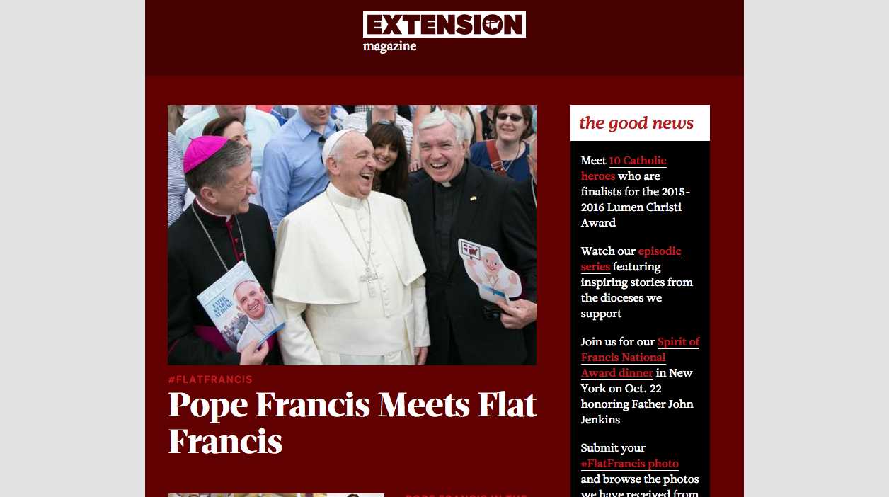
It was exciting to work with Mario and his team on our rebranding initiative. They showed us creative ways to share Catholic Extension’s story across multiple platforms and helped us develop a cohesive look for both our print and digital communications. We are thrilled with both our redesigned magazine and the newly launched website. Thanks to our collaboration with Garcia Media, we have great, new possibilities for spreading awareness about our important work.
Type palette
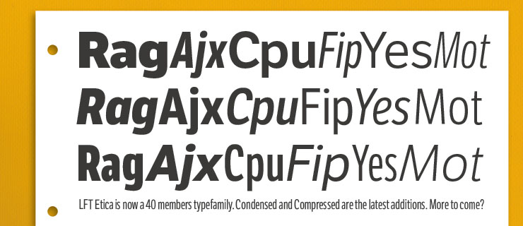
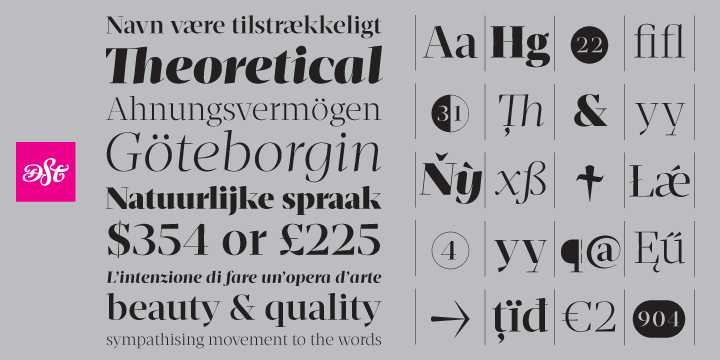
Fonts used for Catholic Extension: LFT Etica (a sans serif) and Mafra, a sharp serif
Here is how art director Reed Reibstein describes the choice of fonts for the new Catholic Extension:
Catholic Extension uses two type families for consistency across platforms: Mafra, a sharp serif with warm touches, and LFT Etica, a clean sans-serif with both humanist and grotesque elements. These are equally at home in the printed Extension magazine as on the responsive website.