TAKEAWAY: Mario Garcia Jr’s Garcia Interactive team unveil the new look of Il Sole 24 Ore’s website, a wonderful case study of design shining through even when information architecture presented extraordinary challenges in terms of all that needed to go into this site. Take a look and read Mario Jr’s Garcia Interactive blog account of his experience with Il Sole’s talented team. ALSO: La Nueva Provincia’s look of today: “the revolution started in 1981,” says Alejandro Massot, executive director. AND: Reminder, May 26 is last day to apply for few spots left in The Power of the Tablet conferece at Poynter, June 14-15
A financial website gets redesigned
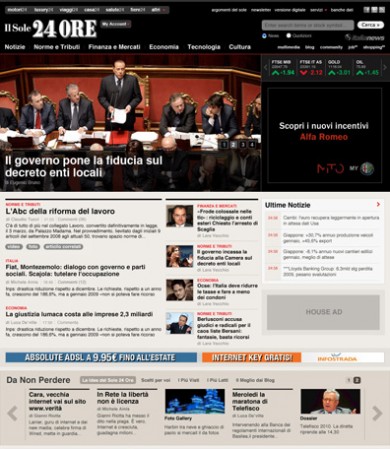
Home page of the new Il Sole 24 Ore website, which premiered this week
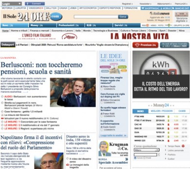
The look of the Il Sole 24 Ore’s website before the new design was introduced
As one who has watched the process of the redesign of Il Sole 24 Ore’s website from its start, I am extremely satisfied with the product that premiered this week. It is not easy to pack tons of information into a website where navigation is key to keeping users happy and coming back. Mario Jr. and I conferred routinely as he and his Garcia Interactive
team developed prototype after prototype, and as they travelled to Milan to work closely with Il Sole’s team of talented web editors and designers.
As happens with prototypes, some that were visually extraordinary were found to be perhaps too much like a magazine, or not able to carry all the information the editors had planned for the site. So it is exciting to see that, in the end, usability and aesthetics are sort of sitting together sipping expressos in one of those cafes that we often see in Fellini’s classic movies.
Mario Jr. writes about his experience at Il Sole 24 Ore and explains the visual revolution that has taken place.
Go to Garcia Interactive for Mario Jr.‘s blog:
http://garciainteractive.com/blog/view/58/
To see a video (in Italian) describing the key features of the new design:
http://www.ilsole24ore.com/concorso/2010/index.shtml#commenta
My comment: Who says a financial news website has to look like a textbook?
Two reminders
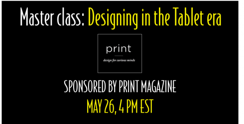
I am honored to be invited to give an online Master Class, May 26, duration one hour.
The class, sponsored by Print Magazine, will allow me to present my views about designing for what I call “printnets”, readers/users who travel well from print to digital,and who use a series of platforms to receive information.
Details of the class
Highlights of what I will cover in my class:
• Strategies for storytelling and designing in the times of the iPad and beyond
• What to be aware of in terms of type, architecture, and multimedia
• The difference in reading patterns between the page and screen
• To identify examples of work that succeeds, and work that doesn’t, on tablet devices
• The process behind some of the best work being done today. I plan to highlight examples from a variety of sources.
If you are interested
Those interested in participating in this class should apply here at My Design Shop:
http://www.mydesignshop.com/product/masterclass-mario-garcia/DesignCasts/
The Power of the Tablet
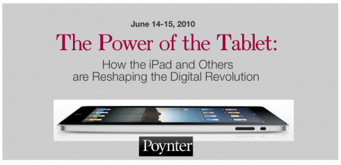
May 26 is also the last day to apply for the few spots left in The Power of the Tablet conference at the Poynter Institute, June 14-15.
To apply, go here:
http://www.poynter.org/seminar/seminar.asp?id=5515&catid=
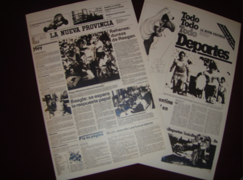
La Nueva Provincia of today is here
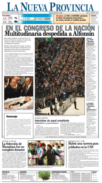
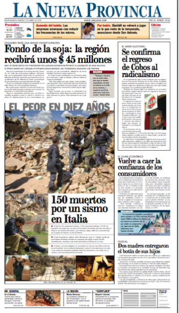
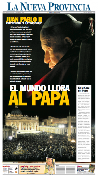
A series of current front pages of La Nueva Provincia
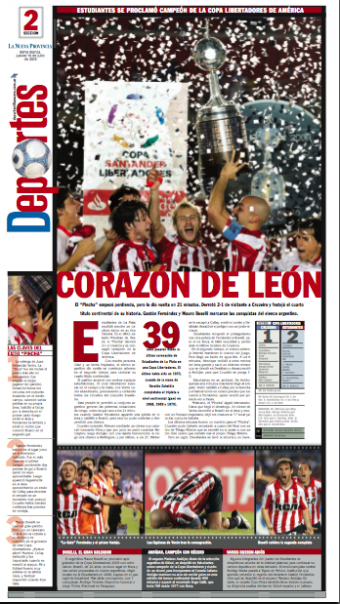
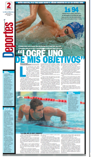
Sports section fronts for La Nueva Provincia of today
The publication of the segment below put me back in contact with my good friends atLa Nueva Provincia, and its executive director, Alejandro Massot, who has been very greatefuil to send me the pages I show here, along with kind words about our work together, which I reproduce here:
“A peaceful design revolution”
“Mario has that rare virtue of conducting true revolutions in a rather peaceful manner, which is what he did at La Nueva Provincia of the 80s, when he accepted the challenge to redesign a family owned regional newspaper, founded in 1898, in which, even the youngest employee felt very protective about the almost impossible to move traditions.
” Don’t touch the logo”
With the exception of the logo, Mario was able to convince the executive board, editors, layouters about the advantages and possibilities of a radical change in the design. He was the guide who took the project into port, without resignations nor resentments, one by one Mario was able to win them over, with his professionalism, through pure expertise, and, in a way, taking down, through his human quality, whatever cultural barrier or personal prejudice was put before him. It is that special trait which distinguishes a true leader.
”….and then the logo changed”
However, it was the successful launch of that new design, January 5 1981, which set the revolution in motion—yes a peaceful and fruitful revolution, as the quality of the new aesthetics, and how it was achieved, was able to win over any intolerance for change; to that actualization of design followed a permanent appetite for updating of contents and technical resources. That project set us going and made us continue to look for the advice of great teachers. And, who would know that a few years later, that Garcia “revolution” continued to take effect, and the team of designers in house took it upon themselves to change the traditional typography of the logo, symbolizing the harvest following the planting of a good seed.”
However, it was the successful launch of that new design, January 5 1981, which set the revolution in motion—yes a peaceful and fruitful revolution, as the quality of the new aesthetics, and how it was achieved, was able to win over any intolerance for change; to that actualization of design followed a permanent appetite for updating of contents and technical resources. That project set us going and made us continue to look for the advice of great teachers. And, who would know that a few years later, that Garcia “revolution” continued to take effect, and the team of designers in house took it upon themselves to change the traditional typography of the logo, symbolizing the harvest following the planting of a good seed.”
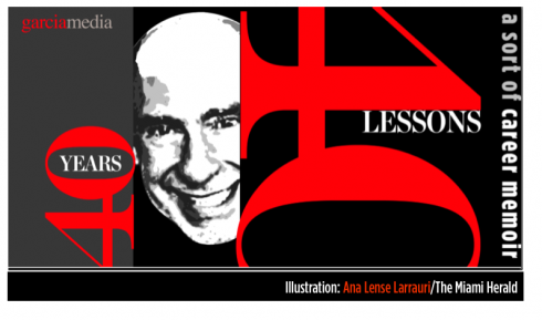
Illustration by Ana Lense Larrauri/The Miami Herald

This is part 7 of my occasional series 40 Years/40 Lessons, which I call a “sort of career memoir” capturing highlights and reminiscing about what has been a spectacular journey for me, doing what I love most. Today’s segment: A casual encounter at the end of my presentation takes me on my first journey for a project abroad: La Nueva Provincia , Bahia Blanca, Argentina.
The start of a long journey abroad
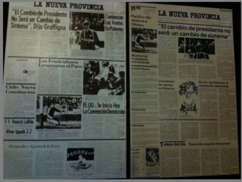
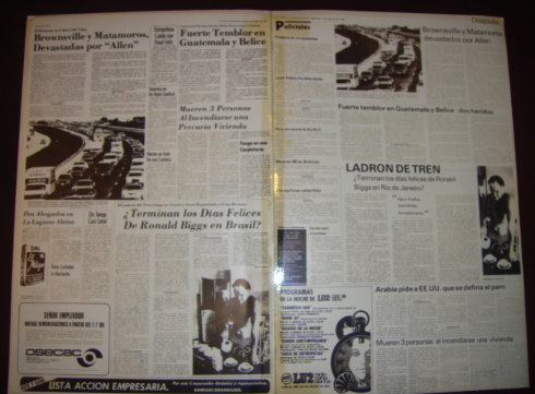
Front page of La Nueva Provincia before and after the 1981 redesign
I had made a collection of the dozens of styles used for headers before the redesign; at right, a more consistent pattern for headers after redesign
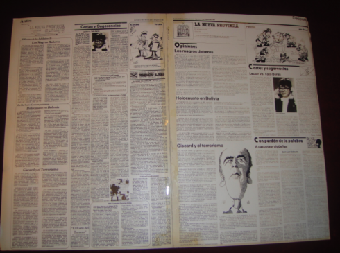
Editorial/opinion page before and after redesign
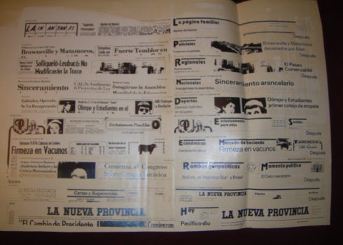
Inside pages were a bit chaotic and text heavy before redesign (left); more modular organization after redesign
A Monday special for Sports: more features, more visual presentation, a new concept for the time
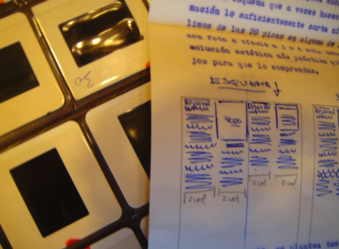
Sucho was the chief of layout and he sent me frequent and copious notes with small sketches to make his point during the course of the redesign. It was a world of slides then, and we kept that slide project plugged in at all times
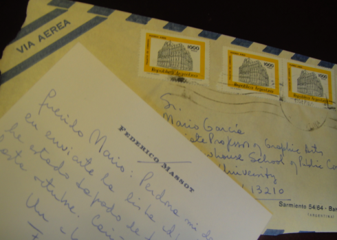
Oh, those handwritten notes, memories of another era when penmanship and slow mail made each message special. Here a note from Federico Massot to me
It was the end of my session on newspaper layout and design at the American Press Institute one day in May 1980. The young man approaching me was Federico Massot, whose family owned La Nueva Provincia
, of Latin American office (in Buenos Aires), and where I went on to do several other dailies.
Not to mention that, when I list my forever five favorite cities in the world, Buenos Aires, continues to rank as the third (the others: New York, Paris, Stockholm and Cape Town).
La Nueva Provincia was my first project outside of the United States, the start of an incredibly exciting career as a global consultant. It was here that I learned to respect culture, history, brand and all that is there long before any of us arrives to keep the publication’s “constant evolution” in motion.
TheMarioBlog post #562