It is about four years ago that Garcia Media art director Christian Fortanet and I sat with DeMorgen design director Martin Huisman to create a new look for DeMorgen, which was moving into its existing Berliner format, and increasing use of color throughout. Today, DeMorgen continues to be vibrant, colorful and ahead of many other newspapers, especially in its ability to surprise the reader on page one.
We decided from the start that DeMorgen would not have a “formula” for page one: let it evolve, let the content of the day dictate what happens on that front page.
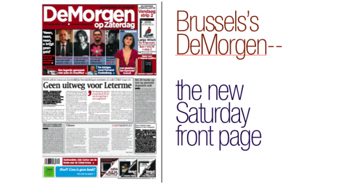
I show you here some of the original concepts, and you can observe the way the design has evolved.
Here is what Martin Huisman has to tell us:
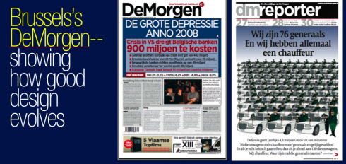
“Today , we continue to experiment. Notice the type attack we have used . This is the rough translation of the cover made on the day of the Lehman Brothers breakdown (September 16th)
‘The big depression anno 2008’ US-crisis threatens to cost Belgian banks about 900 million euros.
Lehman Brothers cause a crash with a financial ‘hole’ of 442 billion (euros)
Biggest stockhouse in the world Merill Lynch sold for 35 billion
Most important banks create an emergencyfund of 49 billion
Biggest insurance company in the world is trying to find 28 billion
European Central Bank pays 35 billion to ease the effects of the crash
The result: (followed bij the hard numbers on the Belgian Stock exchange and the main banks)”
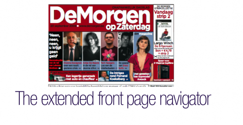
But there are other things that are new, most importantly, a newly revamped Saturday edition, where the navigator almost takes up one half of the page, informing readers of inside page content.
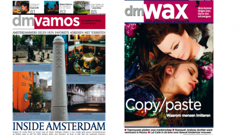
In addition, says Martin, DeMorgen has started a new section, called Wax, aimed at women—-with a disclaimer that reads “not only for women”.
In my view, what has always made DeMorgen interesting visually is that its editors are not afraid to experiment, as long as the reader gets an immediate sense of what stories are about. Here we have seen, on that first illustration at the top, a Type Attack concept for the Lehman stories, but next to it is what Martin refers to a Cartoon Attack concept, as in this case, a cartoon image told the story best. Notice how color is used as more than just an accessory. Color is used to enhance content, to guide the eye, and as a protagonistic element in the overall design of the newspaper.
TOMORROW: One hundred days of TheMarioBlog
TheMarioBlog posting # 99