 As individuals, we live in a 24-hour cycle of news and information. No matter where we turn, there is a message waiting.
Yes, many say we are the culture of the “always-on.” And, indeed, we are, to the point that I personally know some people who feel “neglected” if they have no text message or email for more than fifteen minutes.
For those of us in the media, this is good news. If people are “always-on”, then they may be tuning in to our products to seek further information and gratification. And because our information is conveyed through a variety of means, we must make an effort to UNIFY the brand that offers the information.
In many of our projects now we are not just redesigning a newspaper, or a magazine or a Web site; in fact, we are doing all three of them, or two of them, trying to harmonize visually elements such as typography, color palette, architecture, to provide a unique brand that tells users who is providing the information. For newspaper editors, specifically, the idea is to convey to readers that they are part of a 24-hour news operation, that the printed newspaper does not STOP reporting the news when it is printed, that the Web site continues to carry on with the latest information, updated by the hour or more often.
Add to that the fact that with convergence, newspapers also have television and radio outlets, which, when added to their Web sites, provide true 24-hour cycles of news and information.
Some of our most recent projects have benefited from both the fact that we know readers are always on, seeking information, and by the fact that more and more projects involve not just changing the look and content strategies of one medium, but several.
At the Gulf News, of Dubai, the Garcia Media team first redesigned the newspaper, creating better navigational techniques, a distinctive color palette and a typographic combination of legible fonts; the same strategies were applied to the redesign of the Gulf News’ Web site, to reflect visual continuity and provide an environment of familiarization for the users. Both the printed newspaper and the Web site benefit from such strategy.
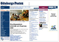
The Goteborgs Posten, of Goteborg, Sweden, followed the same path, with the newspaper redesigning first, to convert some sections to tabloid, then the Web site, but following the same styles of architecture, navigation and color palette.
And most recently we have done the same with Newsday, of Long Island, New York, creating a distinct look for the newspaper, while customizing two Web sites one for Long Island and one for New York City.
For users of the “always-on” culture, who usually have little time for contemplation, providing elements of the visually familiar through branding is the way to go.