Updated: Monday, Nov. 9, at 13:03 EST
Bild Zeitung: 89 front pages from 1989, fall of the Berlin Wall
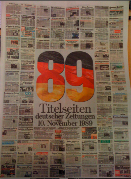
Frank Deville shares with me today a phenomenal double page treatment from Bild Zeitung in Germany, including 89 front pages of German newspapers and how they covered the fall of the Berlin Wall, 20 years ago. I find this type of graphic display surprising and a bonus for the readers.
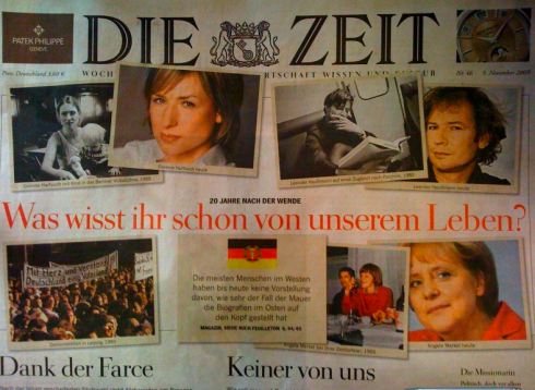
Die Zeit, the German weekly, recounts the story of the Berlin Wall fall through before and after pictures of well known personalities, including Chancellor Angela Merkel, with a headline that reads: What do you know about our lives?
TAKEAWAY: In our weekend blog post we discussed the important of prototypes. I urged designers out there to send me a favorite prototype they prepared, which never saw the light of day. Bob Newman, one of the world’s most prolific and talented magazine designers, shares his Newsweek prototype that wasn’t with us.
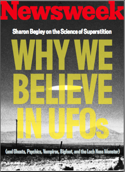
Newsweek: The Way it Wasn’t
Classic and elegant. Vibrant and inviting.
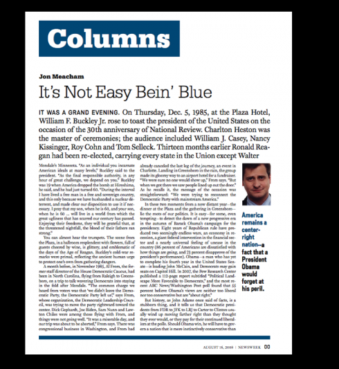
Those are the adjectives I would use to describe the pages that Bob Newman has sent me of his prototype for the newsweekly, Newsweek, which, for whatever reasons, were not the ones that appeared with much fanfare in May 2009. The design that appeared was carried out by New York-based design studio, Number 17. (By the way, a visit to Number 17’s website gives you a glimpse of the simplistic and minimalist approach to information architecture followed there, and which is quite obvious in Newsweek)
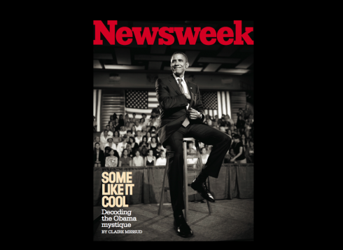
It is obvious that Newman had followed his briefing for this prototype. The new Newsweek that emerged and is out in the streets is bolder, with much bigger headlines on the cover (street sales oriented), and with a greater sense of “urgency”, or what a blogger described as ” either an extraordinarily brave or an unbelievably foolish move,http://magculture.com/blog/?p=3776
Bob tells me that his prototype was designed with then-Newsweek art director Amid Capeci (who is now the design director at Entertainment Weekly). “We worked with a group of editors and photo editors, with all live stories and images, many of which were assigned just for the prototype,” Bob said.
The redesign that appeared became the subject of much discussion in the design community after it was launched May 15.
One of the best such blogs actually had a designer making an attempt to “fix” the redesign: http://www.deckchairs.net/2009/06/redesigning_newsweek.html
The briefing according to Bob Newman
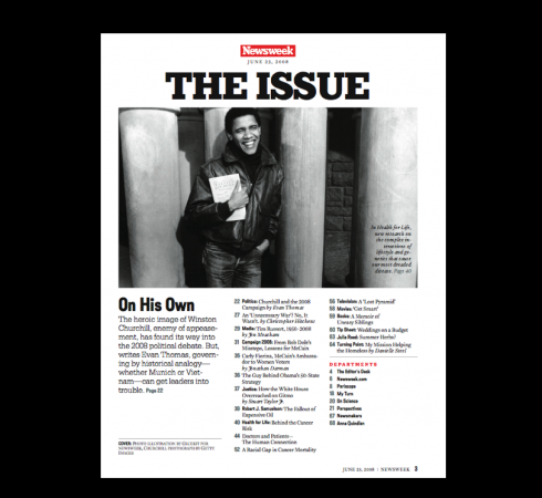
Newsweek hired a number of designers to pursue different directions for the magazine. Our brief was to create something that kept the essential editorial and design DNA of Newsweek, but played down the newsweekly aspect in favor of longer stories and bigger, bolder images. It was to feel more like Vanity Fair or the New Yorker, but with more of a visual sense of news and immediacy. This version was printed out on laserprints and put into loose leaf binders and circulated internally
The prototyping process and final selection
After the first round of prototyping, they picked two versions and developed them further. (Some of those pages shown here) The columnists were molded into one giant snaking column section, and the letters pages were turned into more of a readers’ section. This version was printed up into actual bound magazines, and circulated to focus groups. Again, we used real stories and images, done on assignment, and had a dedicated editorial staff. Ultimately a design by the studio Number Seventeen was selected for the finished Newsweek design.
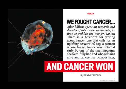
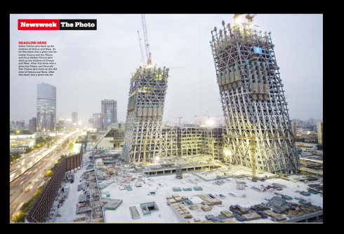
Here are selected pages from the Bob Newman prototype:
The concept for the look of this prototype: we wanted to create a version of Newsweek that was more of a read, that highlighted the voices of the columnists, the power of the writers’ analysis, and the impact of their long-form reporting. We kept the bold, simple look of the magazine, with minimal use of color and a simple palette of fonts. We broke up the traditional newsweekly format, and gave the magazine an actual feature well, with bold, powerful story openers. We reduced the numbers of bitsy, pickup photography, and instead focused on strong, original photography and illustration, displayed big. The idea was to make the design as simple as possible, so that the focus was on the words and images. On the cover, we eliminated the knockout logo and reverted to the old-school Newsweek red type logo.

Bob Newman’s reflections on the Number 17 design of Newsweek that was adopted
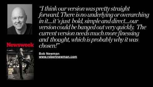
My thoughts on Number Seventeen’s version vs. ours: I think ours was pretty straight-forward. There is no underlying or overarching intellectual concept to it. It’s just bold, simple, and direct. It’s fairly reflective of the approach that Michael Beirut took on the powerful, elegant redesign of The Atlantic monthly, which debuted earlier this year. I think Number Seventeen’s version has more of an intellectual concept to it, it feels more “modern” and original, and I imagine that was appealing to the Newsweek team. Amid and I were going for more of a retro feel, a throwback to the magazine design days of the 50s and 60s, and that may have not felt dynamic enough to the magazine’s leadership. This is all conjecture, of course. One thing that I think our version did well was that it played to the strengths (and weaknesses) of the Newsweek production system. The Number Seventeen version is much more sophisticated, and demands a much higher skill level on the part of the design team to successfully pull it off. Basically, our version could be banged out very quickly. The current version needs much more finessing and thought. Which is probably why it was chosen!
Mario’s take on the Newsweek redesign when it was launched
This is what I had to say about the initial premiere of the Newsweek redesign, although I have to admit that I have grown more accustomed to it and like many of its features today, especially the use of photos. However, it is the content and how it is approached that wins me over each week. Here are my initial comments:
https://garciamedia.com/blog/articles/miami_daily_business_review—one_month_after_redesign_also_newsweeks_retro-
Starting tomorrow: a different kind of project
![]()
Starting tomorrow, my diary of a very different project. I lend a hand to The Philadelphia Inquirer as it rethinks itself for survival in the midst of bankruptcy proceedings. Innovation and change never felt more vitally important and needed. For me, finally, an American project after more than two years without working in an American newsroom.
TheMarioBlog post #416