This is the weekend edition of TheMarioBlog and will be updated as needed. The next blog post is Monday, August 12.
My first disclaimer: I am a jazz aficionado.
My second disclaimer: My father was a tenor saxophone player and I grew up with jazzy music around me, for which I am thankful. My dad played with Cuba’s best bands and also at the renowned Tropicana nightclub in Havana. Jazz and all types of music were an important part of my childhood, along with my lessons in piano, violin and accordion. All of my dad’s brothers were also musicians, and at one point had an orchestra named The Havana Boys.
I must have been in my 30s, however, when I discovered Blue Note. Ironically, I did not get to Blue Note for its fantastic music, but for the design of its album jackets, books, etc. I came to Blue Note as a designer admiring the good use of type, color and photography, but stayed for the music.
Now The New York Times reminds us that Blue Note is turning 80.
While I encourage you to listen to some of the great music that has made Blue Note a unique and iconic destination for anyone interested in serious jazz, I know that the visual thinkers in my audience will enjoy the “look” of Blue Notes. Take a look here at Blue Note basics:
A unique, classy look
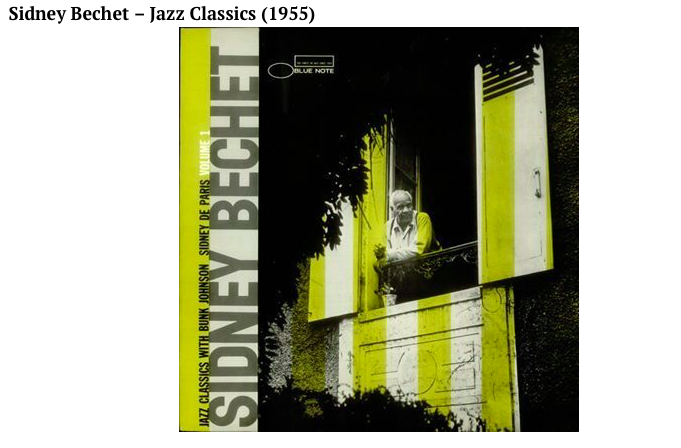
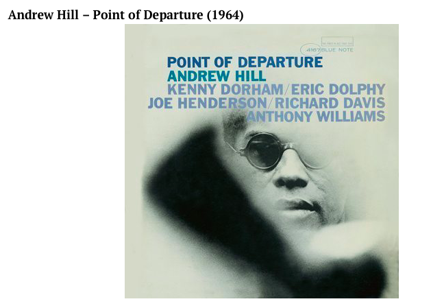
What stands out in any Blue Note product: type, color and photography are used in a minimalist but effective and attractive manner. The art director responsible for creating such a look was Reid Miles , who was twenty-eight years old when he began working on the designs for Blue Note’s long playing records. He was working for Esquire magazine when he did his debut for Blue Note, as co-designer with John Hermansadet in late 1955, but the first album to carry the sole name Reid K. Miles was a Sidney Bechet release a few months later.
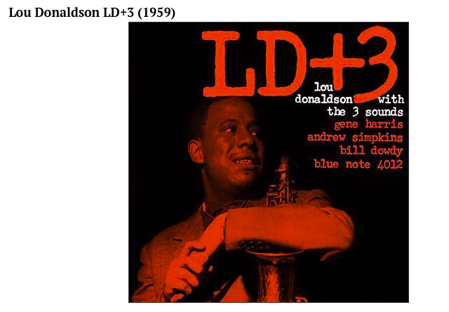
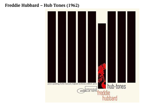
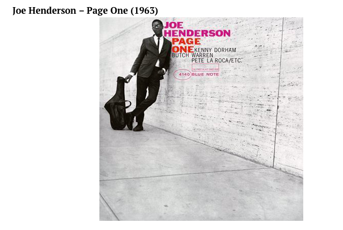
Miles set the simple style that would become the standard for Blue Note: the album title, the feel of the music, and something about the session. And of course, he had Francis Wolff’s brilliant photographs to work with.
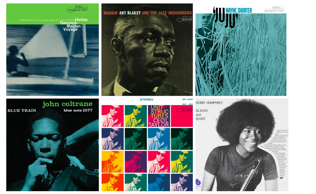
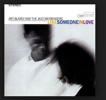
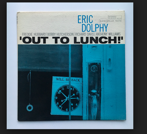
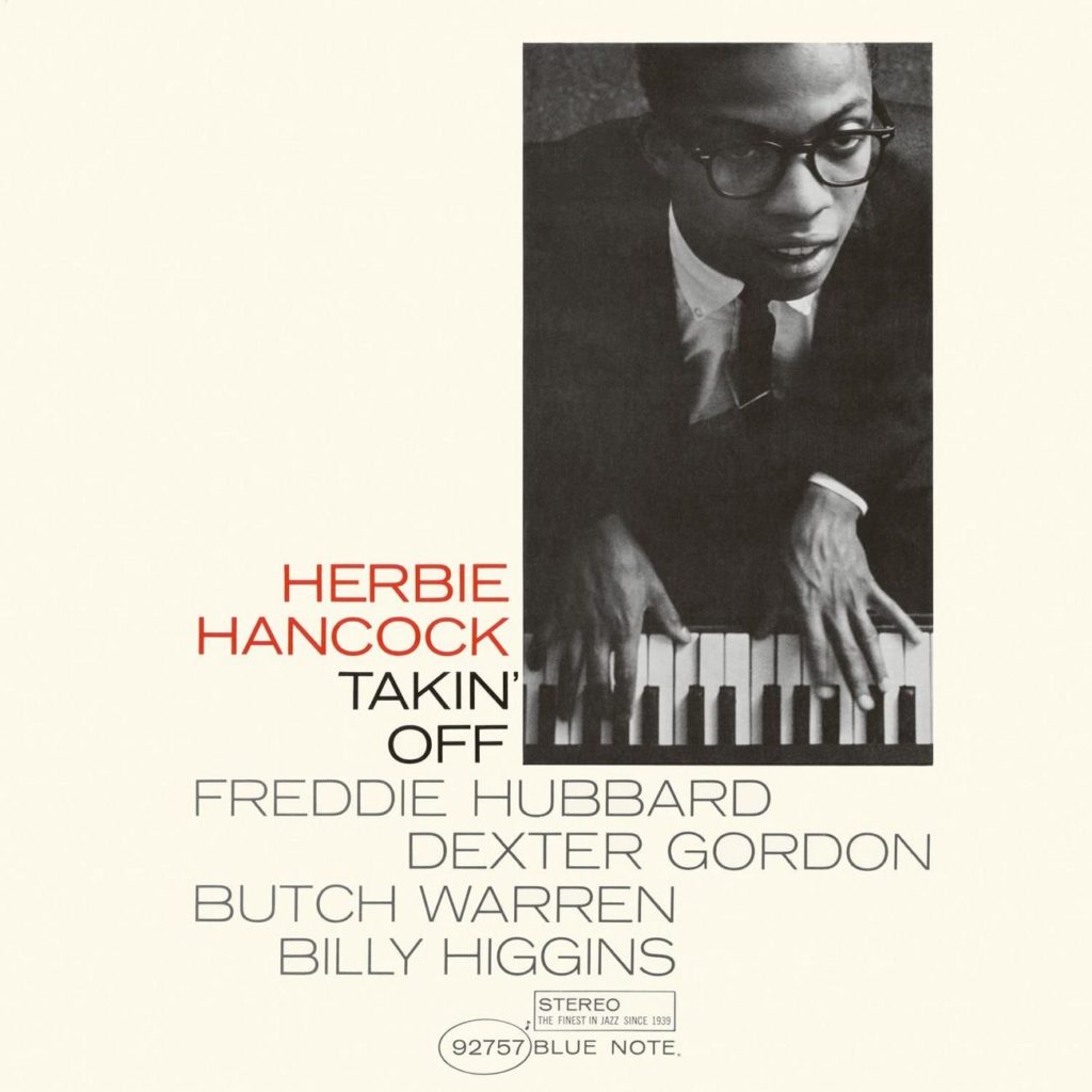
Reid was also interested in photography and cropped his photographs drastically. Like Someone In Love by Art Blakey and the Jazz Messengers, Eric Dolphy’s Out To Lunch as well as Herbie Hancock’s Takin’ Off , are just two of the covers with photographs by Miles (the remaining images are all by Francis Wolff).
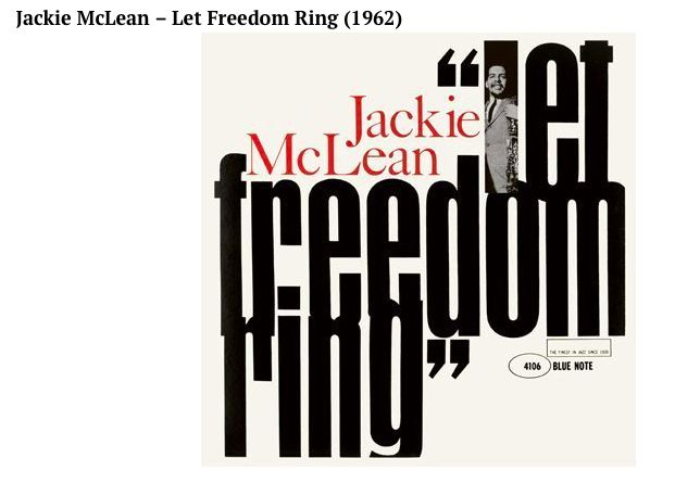
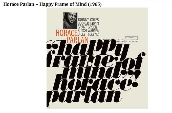
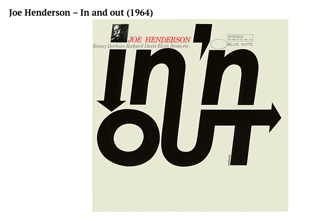
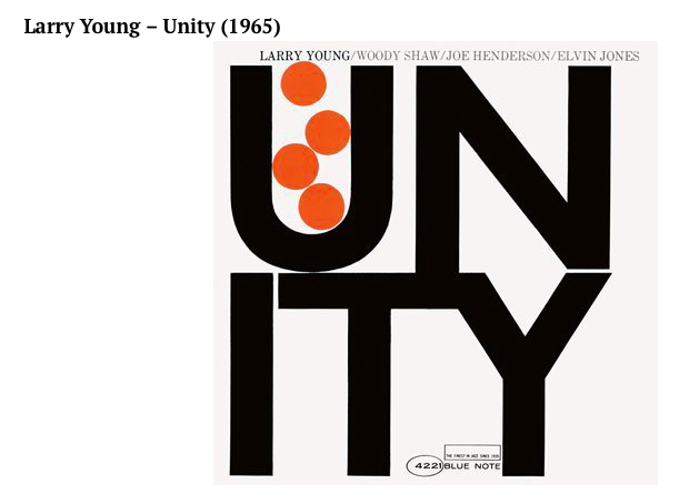
Great use of type
I have always enjoyed how much fun Miles and other Blue Note designers had with type.
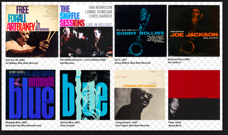
Not two albums look the same. Type is always easy to read. Color is used to enhance the look of type on the cover. Type attacks abound, and images and typography always combine well to tell us in simple terms what the album and its music are all about. Take a look at these examples, each unique and effective in its own way:
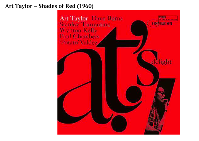
The color of jazz albums
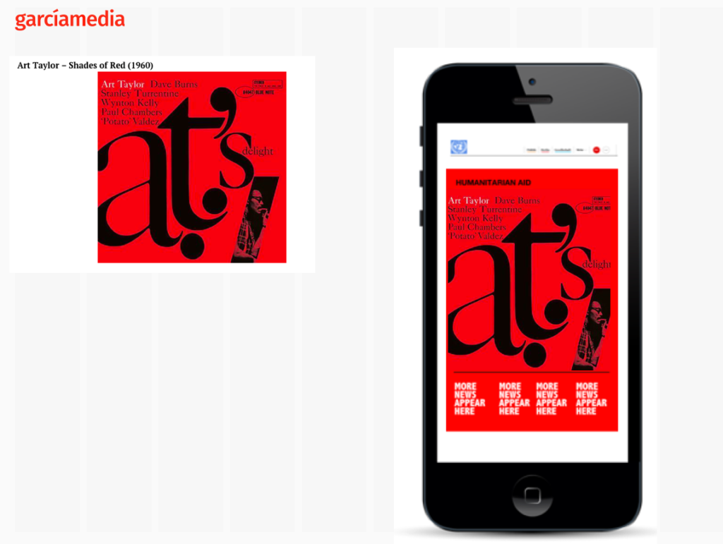
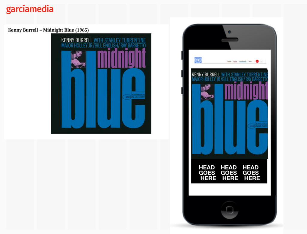
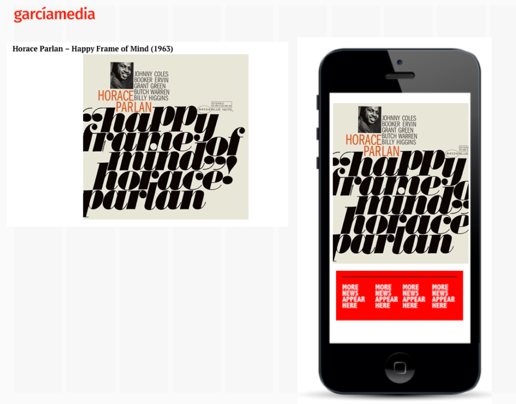
Another source of inspiration is the effective, and often minimalist, use of color. I have turned to the Blue Note books often when starting a project and creating a color palette. There is much to learn here. Take a look at some of the examples I have picked, which are only a very small number of representative excellent use of color to convey information.
Getting inspired
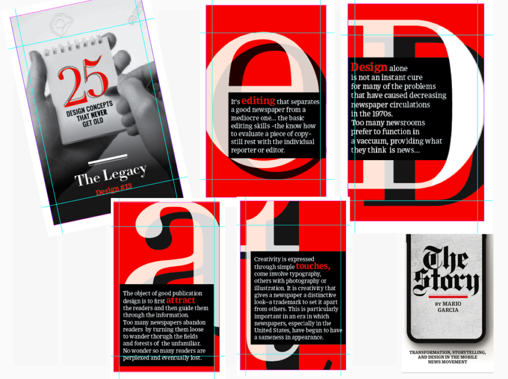
Today, I turn to Blue Note when starting projects for mobile. The Blue Note albums are mini posters in the approach to visual simplicity. That is the precise formula needed to do good design on the small canvas of smartphones. Take a look at some very quick applications o fhow the album covers of Blue Note would translate to the phone screen:
Of related interest
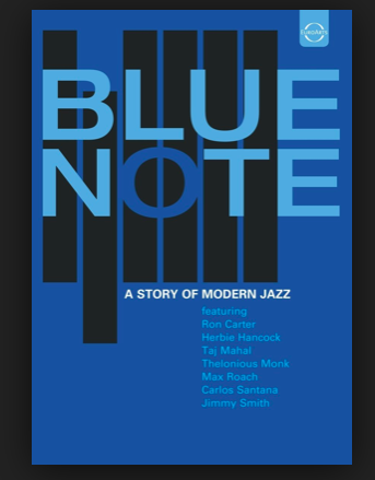
The book
https://www.amazon.com/Blue-Note-Story-Modern-Jazz/dp/B0012K53U4
The video
Those German weekend newspapers!

Love those Sunday & Weekend German newspapers. While several of these print editions wear conservative look during the week, they pull all the stops visually for their weekend products. Total lean back experiences, very magazinish design. At a time when print products represent a blast from the past, these newspapers scream “Grab me and read me.” A good thing! Bravo.
Pages we like
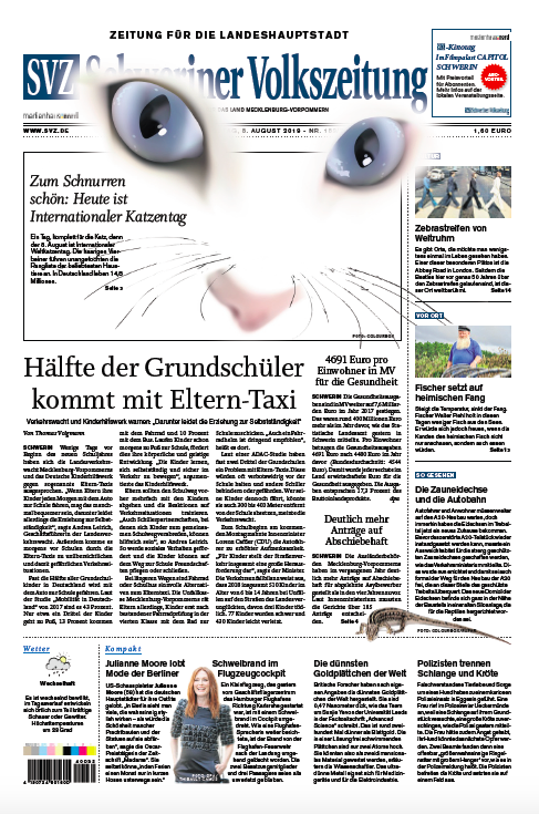
It is World Cat Day, all of you cat lovers. And thinking of my Dad, the ultimate cat aficionado, who must be surrounded by hundreds of cats in heaven. At one point he was feeding 28 cats in Miami, the descendants of all the cats he had as he moved through different neighborhoods in the city. Here is how one regional German daily , Schweriner Volkszeitung, in Schwerin, honors the felines.
Mario’s speaking engagements
Nov. 12
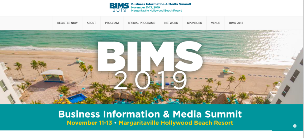
Keynote presentation: Business Information & Media Summit (BIMS).
Order print edition of The Story from Amazon
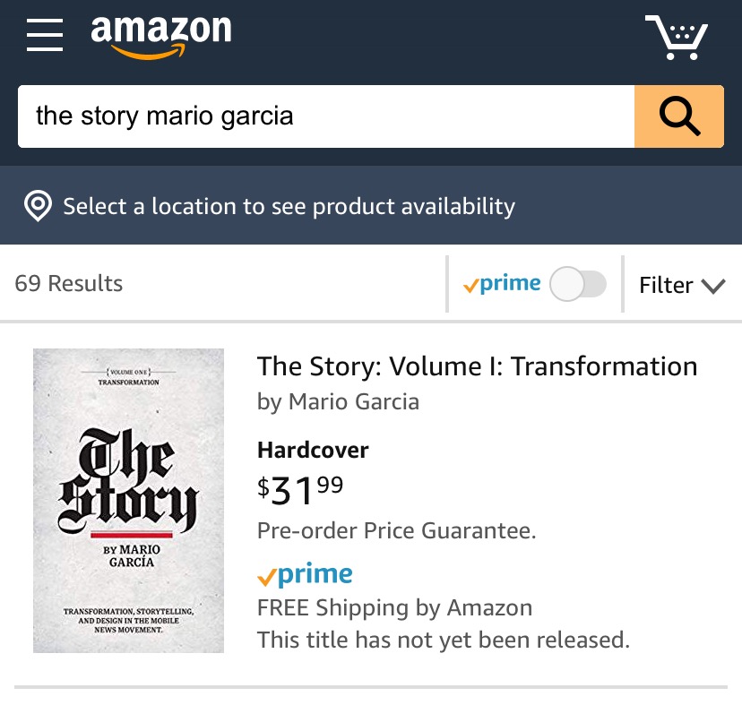
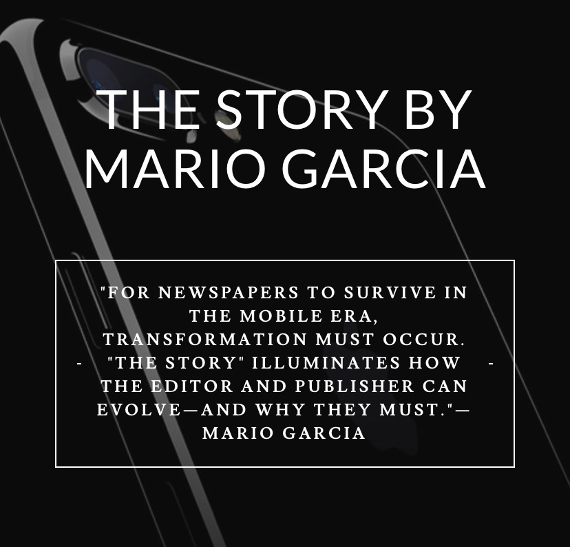
You can order the print edition of my new mobile storytelling book, The Story, from Amazon already here:
Pre-order The Story
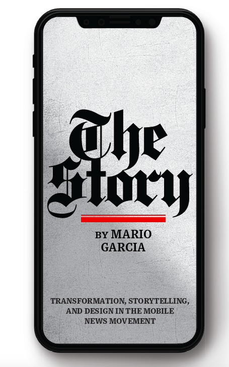
The newspaper remains the most powerful source of storytelling on the planet. But technology threatens its very existence. To survive, the Editor must transform, adapt, and manage the newsroom in a new way. Find out how, pre-orderThe Story by Mario Garcia, chief strategist for the redesign of over 700 newspapers around the world.
Order here:
https://thaneandprose.com/shop-the-bookstore?olsPage=products%2Fthe-story
The Story will also appear in print
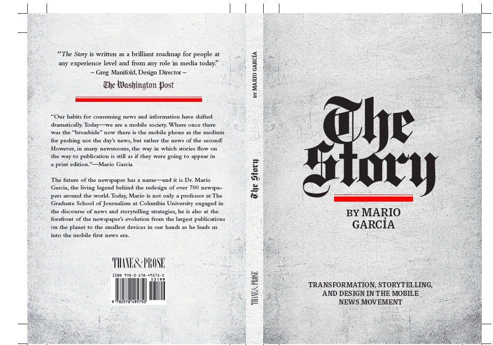
I am happy to announce that we will, indeed, have a print edition of my mobile storytelling book, The Story. I thank you for expressing your interest to our publisher, Thane Boulton, of Thane & Prose. Now the print edition will be a reality, and you can already see the cover and back cover here:
Interviews of interest
Mario Garcia: The most sought-after media designer in the planet
http://www.itertranslations.com/blog/2019/3/11/fd60ybflpvlqrgrpdp5ida5rq0c3sp
6 Questions with Mario García
Mario García is one of the world’s most famous leaders in design for newspapers. The Cuban-American autodidact has over four decades of experience under his belt with a batting average of around 20 projects each year.
https://gestalten.com/blogs/journal/interview-mario-garcia
TheMarioBlog post # 3088