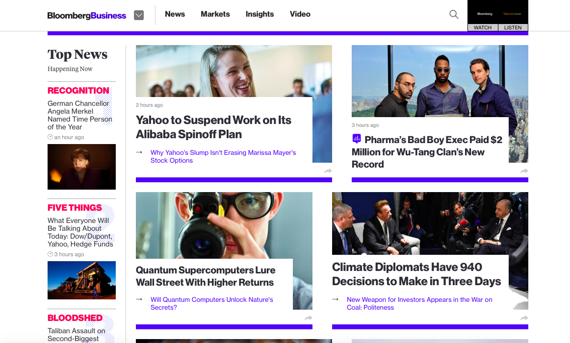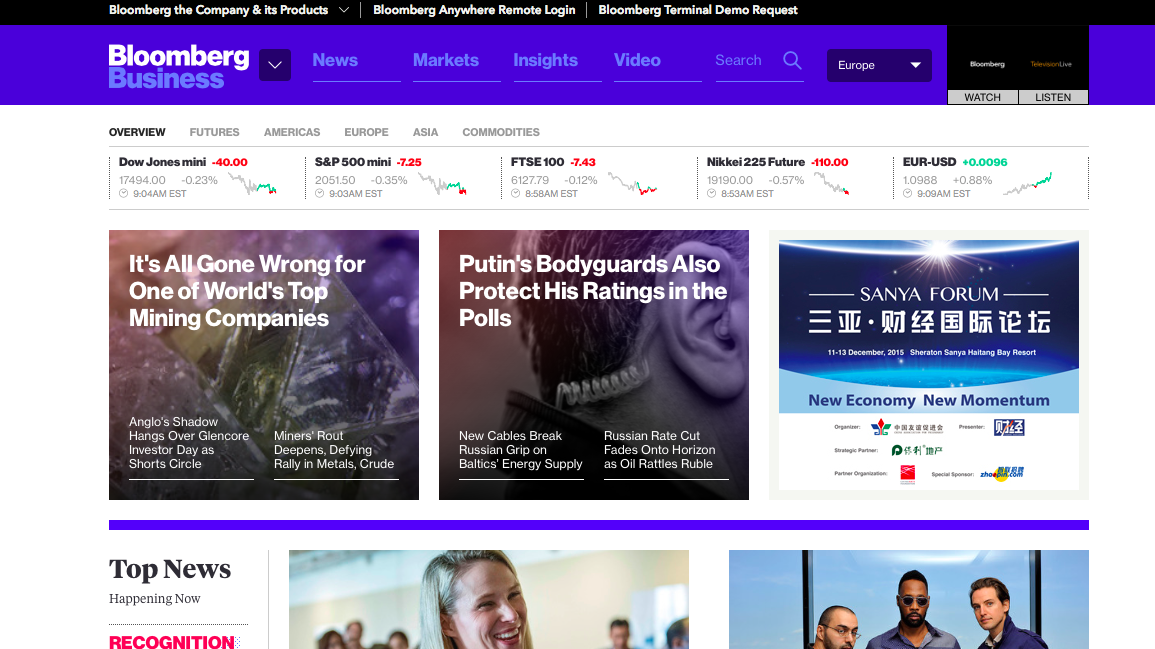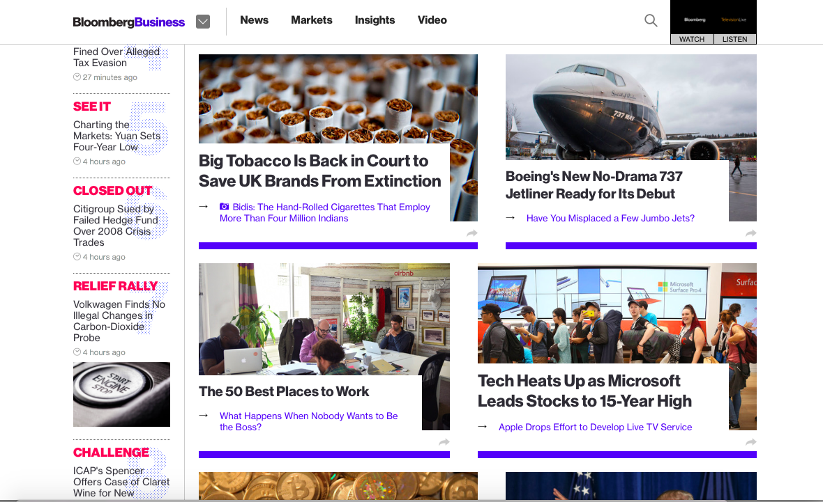


Bloomberg Business' home page is visually attractive, quite rectangular —modular?—and easy to navigate.
It lacks a “lead” story in the traditional sense (isn't fun to be using tradition in conjunction with websites? Goes to show that print is NO longer the only elephant in the newsroom.
What has happened to the home page in the last few months? It has lost its prestige and rank as the main point of entry. It is no longer the “digital front page” of a newspaper or magazine. Mobile entry points via social media have replaced the home page as the place where the user's eyes land first.
The new home page blends advertising and content in a more harmonious way
Algorithms make sure that modules move according to time they were posted, so if you come into the home page you see about 6-8 modules with the latest stories that moved, but there is no sense of hierarchy as we knew it.
What is happening is that perhaps the users are quite aware of the hierarchy of story based on the time the stories are posted, without a larger headline or module determining status of story.
Will more news websites follow this model in 2016? I see it as inevitable.
For logistical purposes, start by designing how your content will appear on mobile devices, and then let your new home page grow organically from there.
Mobile first it is for 2016.