Updated Sunday, Nov. 29, 05:45 EST
TAKEAWAY: Santa Claus was listening somewhere in Berlin when I said all I wanted for Christmas was to sit down to design a page of Germany’s ultimate boulevard newspaper, Bild Zeitung. I am invited to take the plunge, to accept the challenge and to dip my hands into that giant tutti-fruti gelato. ALSO:Jacky’s picks: all about vampires in Bild am Sonntag

Who is Jacky?
Jacky belongs to Frank Deville, of Luxembourg. Each Sunday, Jacky makes his picks from the colorful Bild am Sonntag and shares them with us here.

Jacky prepares for long winter in Luxembourg
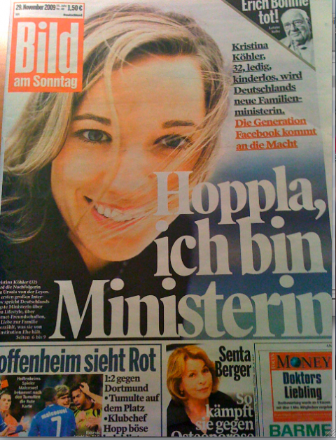
Front page of today’s Bild am Sonntag
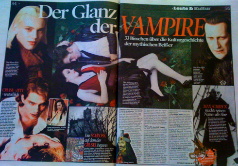
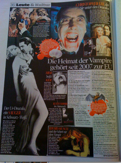
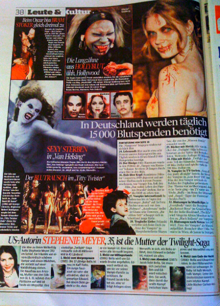
It’s vampires galore in today’s Bild am Sonntag as seen through these pages
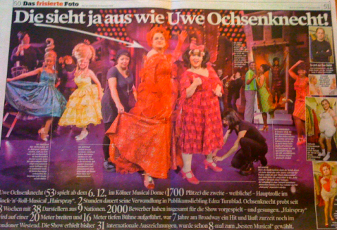
Actor Uwe Ochsenknecht on stage playing the big mama Edna Turnbull in the musical Hairspray!
Thanksgiving Weekend in the US !

It’s Thanksgiving Weekend today in the United States. America takes a break, so will TheMarioBlog, unless there is something interesting to report. We are on holiday mode in the US till Monday.
Mario is ready!
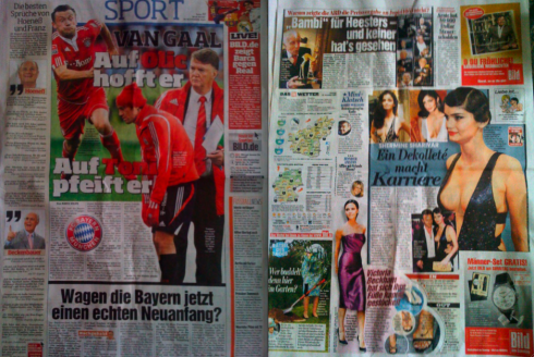
Two pages from Saturday’s Bild: trying to decypher where the grid is as well as which of the several typographic schemes used would work best as a dominant.
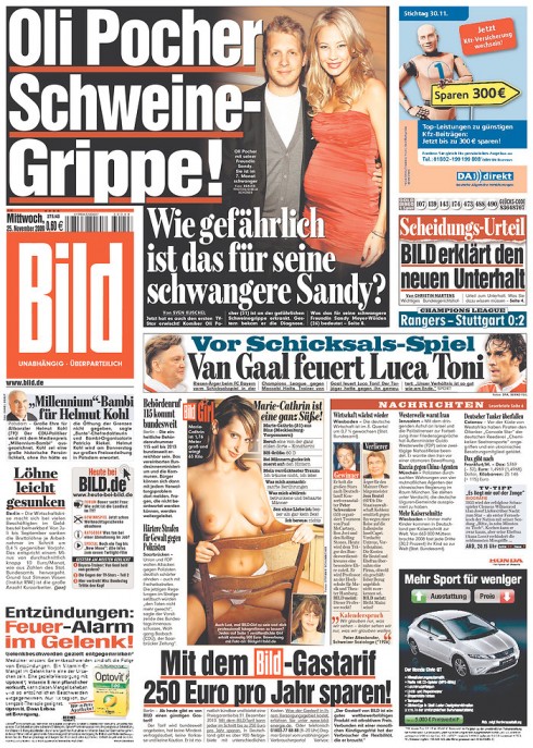
Front page of today’s Bild: the window of the hardware store approach to design holds its own personality. For me, fascinating!
I must have been a good boy this year, or perhaps the angels are smiling. Whatever, I am thrilled that the editor of Bild Zeitung,
Kai Diekmann, has read my blog posting yesterday in which I mentioned that all I wanted for Christmas was to sit down to layout a page of his colorful Bild-—one of the largest circulation newspapers in the world (read by over 5 million readers daily). Bild is “designed” in its very own peculiar style: totally non apologetic, not affected by design textbook rules, and, proud of how it looks. In this newspaper, cutout photographs meet odd shape boxes and circles to accommodate 300-point headlines that titillate at every step of the way and on each page.
In his blog “My Small World,” with a headline in English that read: Get Ready, Mario, Diekmann has extended an invitation to me to join his team so that I can roll up my sleeves and see if I can take the challenge of doing a page that violates every possible rule of design as we know it.
Can I do it?
Well, the challenge is there and it remains to be proved, but I am willing and excited. Here is a project for which you don’t have to prepare by reading many books. Indeed, the task is to study Bild itself, many editions of it, then leave behind many of the notions we all carry about what constitutes good newspaper design. If the real test is that readers like it——and in the case of Bild Zeitung, that they crave it—-then this newspaper is doing it right for its target audience.
Now it is a matter of coordinating dates. Of course, I will be nervous, but, Herr Diekmann, I thank you for the invitation and we are on!
Stay tuned for The Adventures of Mario in Bild Zeitung Land.
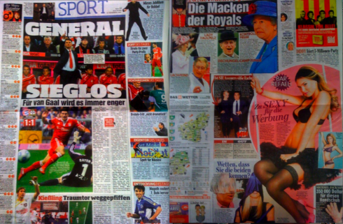
So, where does one begin? Is there a Center of Visual Impact here? Yes? But where? OK, lots to analyze and to study here. But, alas, nothing like a giant and colorful challenge in front of your eyes!
Remembering a tragic day in India
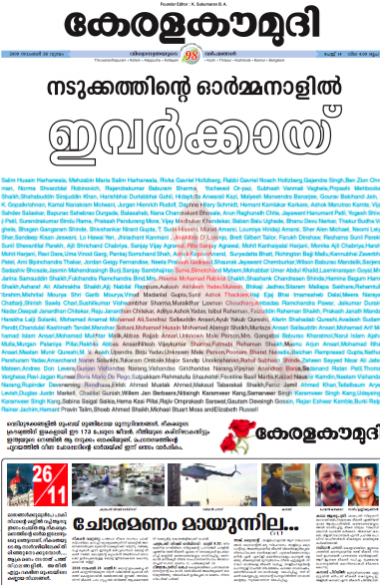
Front page of the Indian newspaper Kerala Kaumudi doing a tribute to the 173 persons who lost their lives in the Mumbai terrorist attack a year ago. Thanks to Sajeev Kumar T.K, visual editor, for sharing his work with us.
TheMarioBlog post #427