To be updated throughout the weekend of Feb. 25-27
Update 2: Dubai, Saturday, Feb. 26, 14:42
TAKEAWAY: You don’t have to be interested in making banana whoopie pies to download the new Martha Stewart apps for iPad and iPhone. It is all part of how you train to become a better app creator; by studying how effective apps convey information. PLUS: Beirut postcard in the city that undergoes big revival
Today’s pop ups

Frank has chosen two timely pop ups from Bild Zeitung: one is all about Oscar weekend, which is the main event for those who follow the movies; in addition, and appropriate to our postings of great Martha Stewart food pop ups, Bild tells us how to choose the best breads for those homemade paninis.
Hint: Try turning that Oscar statuette around with your finger!
Suddenly Chanel
Today’s An Nahar tucked inside the wrap around special ad announcing the opening of the new Chanel boutique in Beirut
During my time here in Beirut, I had been taken peeks through the half dressed windows of what seemed to be a unique, exclusive boutique opening soon. But, surprise, today when the windows were finished, all the mannequins with bright red wigs and matching red purses, everything else black and white. It is Chanel’s new opening of its store in Beirut.
To make it official, and announce it to the world, today’s An Nahar, the leading daily here and the one we are in the process of rethinking totally, wrapped a luxurious glossy Chanel ad around its edition.
Disregard the fact that Lebanon politicians have not been able to agree on the forming of a government yet
Obviously the Beirut city planners do have a focus and it is all about revival n rebirth of this beautiful city by the sea that has often been described as the Paris of the middle east
Everywhere one turns cranes appear , another tall building announces what it will be like when completed, and the signs in French, English and Arabic tell the story: Revival of a Landmark, Rebirth of the Best.
Soon, another rebirth, that of An Nahar, in April, with a total rethinking of how it presents the news, how its pages look, and the addition of new content to connect with the readers emotionally, covering topics that deal with how readers face life’s choices everyday, from health, lifestyle, family, technology to travel, food and fitness.
Be on the lookout for more on An Nahar’s rethinking in this blog.
Someone is in the kitchen with Martha, and it could be you
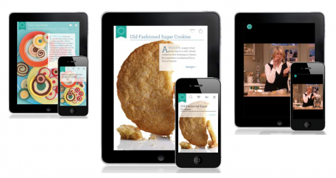
It is Friday in sunny Beirut, and my last day here before continuing on to even warmer Dubai.
I have received several emails from people who read yesterday’s blog (scroll down if you missed it) about the new Martha Stewart food magazine on the iPad, and, called attention to what some describe as “even better, and the most fun iPad app out there.” And Bob Newman wrote that “it is supposed to be in the style of Wired magazine”, which means a real pop up fest with those cookies jumping right out of the oven and ready for biting.
It is the Martha Stewart Makes Cookies app, available not just for the iPad but the iPhone as well. I still have to download it, but based on the buzz it has from those who have tried it, I had to include it in today’s blog. Go here for more information: http://www.marthastewart.com/cookie-recipes-app
Learning by observing, then doing
Whether you are interested in baking or not, if you are a working designer or editor, you need to see how the iPad is used to present information, not just news and features. These apps are the best existing textbooks, seminars and workshops that we have to study this new platform.
Hardly a day passes that someone will not write to me asking if I know of an organization that is offering Designing for the iPad workshops. I am sure that such programs exist, but I firmly believe that the best way to learn about what works and doesn’t in this new medium is by downloading apps, dissecting them, and studying what I think constitute the primary elements of an effective app:
1. Navigational tools, both for the overall app, and secondary navigation for internal movement within the app.
2. Frames: how the app facilitates the access to various textures within the app, or interactivity between the user, the makers and others sharing the same experience.
3. Look and Feel: how the app establishes its own identity while preserving the branding elements of the publication inspiring it and feeding it content.
I plan to discuss these three elements in more detail in the days ahead here in TheMarioBlog.
It is no secret that aspiring artists first sit in front of the works of the masters, pencil and sketchpad in hand, to try to capture what is on the original canvas. The same principle has always applied to how we learn design.
For years, if I like the design of a newspaper or magazine page, I simply don’t stop with a smile of admiration; I dissect it: why does the page work so well? Then, to make sure the impression stays with me, I take my trusted Moleskine pad and do a sketch of what I saw, paying attention to dimension and space relationships, the reason the page holds together well; by the same token, when I see a page that represents a chamber of horrors, I dissect it with the same attention, then do a sketch of how it could have been improved. I remember engaging in that type of quick design gymnastics since the time I was in high school, and still do it to this day.
There is a difference between observing and making a mental note and actually observing and taking action. The brain registers that quick action more permanently than it does simple observations.
This applies to iPad creation as well. I now have my own iPad sketchbook and I collect my iPad doodles and refer to them often.
The process of studying and assimilating information never stops. And, if you have the Martha Stewart repertoire of goodies as part of the package, then it is even more fun. I must try that banana whoopie pie, for sure.
More on my Moleskine sketches:
https://garciamedia.com/blog/articles/my_moleskine_good_for_sketching_that_first_idea_or_for_explaining_amy_wineh
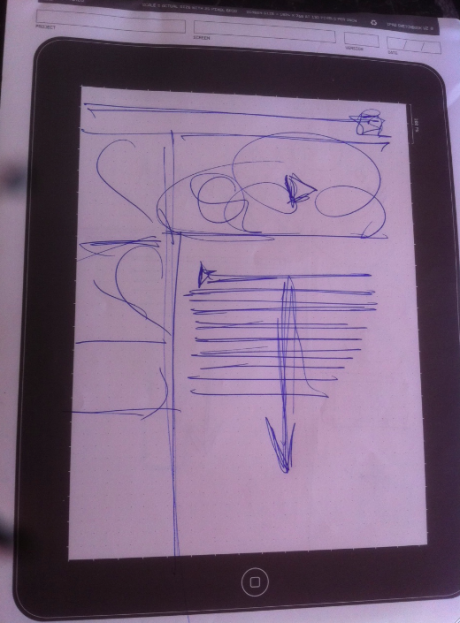
One of my iPad sketches of the last two days
Another mini poster from Il Secolo XIX
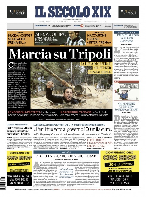
Massimo Gentile, design director of Il Secolo XIX (Genoa, Italy) sends us his mini poster treatment today, continuing with the Libyan crisis.
TheMarioBlog post #719
What’s cooking in the iPad? Try the new Martha Stewart food mag
TAKEAWAY: The iPad now has food smudged all over its never-too-clean screen. Indeed, what cooking is hot and it is the new Martha Stewart Food Magazine. This is exactly what the iPad can do best: the new app is as full of delicious pop ups as anyone can hope for. Now, if you are like me, putting off learning how to cook, you are one step closer to starting your lessons. PLUS: When color purrs like a kitten
It is one of my dreams: to learn how to cook. I always put it off till the next “quiet period” in my life. Today, at 64, it is beginning to look like I will probably enroll in cooking class whenever I am ready to retire (big secret). My mom, who died last August, was the ultimate chef with great expertise in Cuban cuisine. She tried unsuccessfully to teach me how to make some of her wonderful recipes. While she had no success with me, she succeeded with both my daughters Ana and Elena, who were very apt and quick pupils. It is through them that I can still enjoy Mom’s world famous oxtail (rabo encendido), or her flan caramel. As for me, Mom got me as far as teaching me how to make white rice and how to fry an egg. In case you are not familiar with the Cuban palate, there is nothing more satisfying, especially on a rainy day, than a fried egg over steaming white rice or arroz con huevo frito.
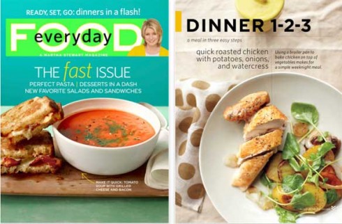
But, alas, along comes Martha Stewart’s announcement that her Everyday Food Magazine App for iPad is now available on the App Store. I thank dear friend Bob Newman , the great magazine designer, for alerting me to it in an email this morning. Thanks, Bob.
The app may actually move me to action, straight into the kitchen and straight to the more advanced levels beyond the fried egg and rice routine. The iPad is such an ideal platform for food preparation, and this Martha Stewart app takes cooking with the help of the new gadget to the next delicious level. The recipes are easy and innovative, but so are the features and functionality of the app. Cooking lessons include videos, slide shows, audio, animation, recipes that scroll. And I can send best friend Annie a great cookie making recipe. Of course, you can shop directly from it: want to get that special cinnamon that is only sold in a specialized store, go place your order now.
I suspect that food/wine will be among the most popular and serviceable apps out there for the tablets. We, too, prepare now to conduct a workshop for a major food magazine that wants to take its test kitchen right into the iPad.
For more information:
The January/February issue is complimentary, and it includes 74-email ready recipes, and 14 videos.
The Martha Stewart Everyday Food Magazine App, with complimentary January/February issue, is available for free from the App Store on iPad or at www.iTunes.com/AppStore.
Individual issues, including the current March issue, will be available for $2.99 through In-App Purchase.
The subject was color
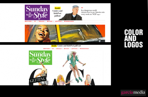
Fun with color in those pill box logos for The Washington Post’s new Sunday Style section; five colors are part of the palette, surprising the reader each week

Interesting interaction of orange and red for the logo of Al Shabiba, of Oman
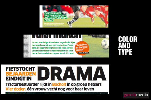
Color and type: a perfect combination to bring an accent and highlight the words
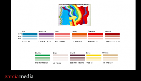
Color palette created for our project, Moscovskiye Novosti, with the help of colleague Dr. Pegie Stark Adam
My dear colleague Dr. Pegie Stark Adam, finds herself preparing a lecture on her specialty, color, and asked me to send her samples of my most recent work. I did, with gusto, and her note made me think about color and the excitement of using it these days. I share my thoughts with you:
It is an exciting time, especially for color. I experiment with it everyday, treat it as a little kitten that never grows, purrs when you touch it and when you squeeze it. Each project brings a new energy to how color can be used: I use it as conversation in summaries, the intonations that a good red or green can bring to a well written sentence; or I use it bold and orange for a sports headline (shout like the fans), or I go mutely pastely with Arabic type, for a world where there is too much shouting color (and real shouting, too) outside, so the newspaper they hold should bring the peace the people in the region long for. The days of color only on photos are over. And, oh, in the iPad: the perfect canvas for color, no worries about the old printer not giving you the right color for grapes or tangerines.

Il Secolo mini poster and the Libyan unrest
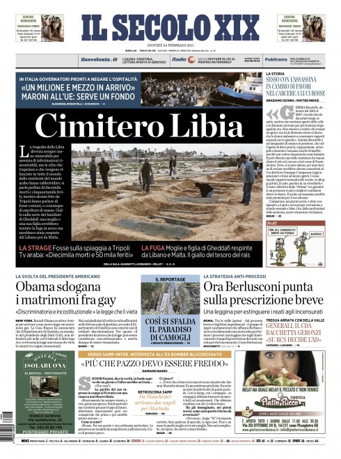
The front page of today’s Il Secolo XIX; mini poster, lead headline reads Libya’s Cemetery
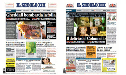
Design director Massimo Gentile, of Il Secolo XIX (Genoa, Italy) sends us front pages of Il Secolo for the past two days, using the mini poster concept to cluster information related to coverage of the Libyan crisis.
For previous TheMarioBlog posts on mini posters use on page one:
Il Secolo XIX’s mini poster prototypes
https://garciamedia.com/blog/articles/il_secolo_xixs_mini_poster_prototypes
More about those mini posters
https://garciamedia.com/blog/articles/oslos_sydost_and_a_recipe_for_passion
A day for follow ups on mini posters/logos
https://garciamedia.com/blog/articles/a_day_for_follow_ups_on_mini_posters_logos/
Today’s pop ups

It was a big football game in Germany last night, and this is how Bild highlighted it on the iPad edition
TheMarioBlog post #718
