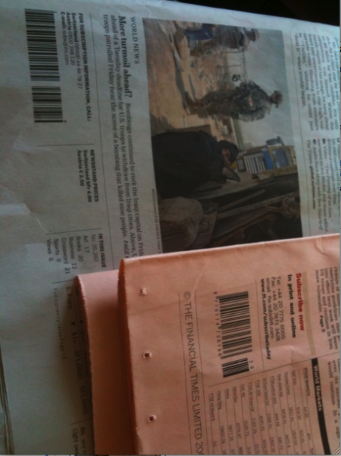
TAKEAWAY: It is the 35th birthday of that little zebra-inspired element called the bar code. Reason to celebrate? PLUS: Pure Design comes to the blog July 1 AND: Newspaper tributes to the king of pop, Michael Jackson. ALSO: Berlin postcard
Well, so the bar code is 35 years old. This is one birthday party I am not going to, no matter what magical or glamorous locale they stage it at.
No, sir, I am not celebrating.
Bar codes on the front pages of newspapers and magazines are a pain to deal with.
You may call it denial, but I, for one, put off dealing with those 59 lines of various widths as I conceptualize a magazine cover or newspaper front page. I put it off. And put it off. And try to imagine that someone at the top will come and tell me: Mario, it is OK, we will not need a bar code on the first page.
Call me the bar code procrastrinator.
Fantasy land, I know. Because, in the last minute, it never fails. Someone from circulation, in a dark suit, striped shirt and a sort of bland tie that does not match the rest, will enter the room and tell me: Mario, you forgot to place the bar code here somewhere.
Reality sets in.
I always pretend that it was just an oversight. Then I proceed to the discussion that follows: where do we put this necessary but absolutely intruding stranger on the page?
Bottom right?
Bottom left?
Next to the weather?
Horizontally or vertically?
“Could we make it smaller?,” I find myself asking in hushed tones.
But today the world celebrates the 35th anniversary of the bar code. And, yes, before you tell me, I know the benefits of these little inconsequential, unattractive lines: they help get us through the supermarket counter faster (unless, as happens often, they become stubborn on the side of a can of tomato juice, and refuse to produce the expected beep, much to the exasperation of the cashier, who keeps scanning and scanning the can until she hears the beep), and I know that on airline tickets they hold the key to tons of information about a passenger. They also help people with diabetes to calibrate glucose meters.
Did we do that?
Funny and ironic: last week, as we put together a first prototype dummy of a financial daily I am working with, we were coldly reminded that we had left the bar code out completely.
Ooooops, the art directors and I said a capella.
Then we discussed for a half hour WHERE and HOW to display it, settling on a vertical, smallish position, bottom left of the page.
Well, I just saw the printed prototype. No bar code in sight. But we did put it there, I swear.
Sometimes one gets help from the least expected and most mysterious sources.
Bar code facts at a glance
If you want the facts about barcodes: they are scanned more than 10 billion times a day around the world. Invented by George J. Laurer, an engineer at IBM, bar codes are cheap, about just half a cent each.
The design is carefully calibrated as well: 30 black and 29 white lines to convey 12 bits of data in binary code.
Ok, so bar codes are here to stay, and we are likely to see more of them rather than less; however, could someone please start thinking about how to make them more attractive? Multi colored? Half their size?
How about making bar codes Inconspicuously efficient, almost invisible and perhaps out of the front page.
Something to think about.
Bar code placement solutions?
I am sure some of you there have struggled with bar code placement and perhaps found incredibly creative solutions. Send them to me, please. Email me at mario@garcia-media.com.
Berlin postcard Monday
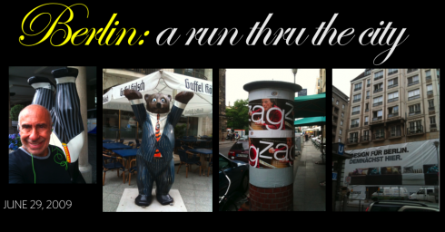
Attending to meetings in Berlin today. The German capital is always special, and if one runs thru the city, one finds a city in constant change. The bears that represent the city wear different suits, and one, at the entrance to the Hilton Berlin hotel stands upside down. The eastern section of the city combines the classic architecture of another era, with new business and residential buildings. Culture abounds here. I had to stop several times during my morning run to read posters of coming events. Lucky those who live here.
Berlin Tips: A nightcap or a glass of bubblies anytime, try Billy Wilder’s Berlin (Potsdamer Straße 2, 10785 Tiergarten, Berlin,030 26554860). Billy Wilder, the famous Hollywood director (Sunset Boulevard, Some Like it Hot, The Apartment), directed the 1961 comedy, One, Two, Three in West Berlin during the Cold War, but before the construction of the Berlin Wall, and politics is predominant in the setup that brings together capitalists and communists, Americans, Germans, and Russians, men and women.
For dinner try Amici (Jägerstraße 56, Tel.: 208 79 98 00), offers great Italian food, not to mention the history of the house. Used to be the Französischen Hof, a restaurant I frequented often during my years working here with the Tagesspiegel newspaper. The restaurant fills two floors connected by a Belle Epoque staircase, evoking a century-old Parisian bistro. I was told that during the Communist years, only the elite members of the party were able to afford to dine here, and, because they were VIPs, the windows of the restaurant were always kept totally shut, as to keep the proletariat from looking in and witnessing how their leaders enjoyed their vodka, caviar and champagne while preaching a simplistic life to the masses.
Michael Jackson: tributes on the front pages worldwide
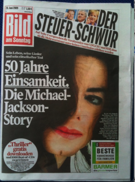
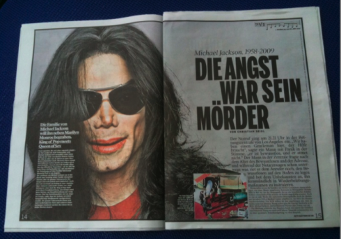
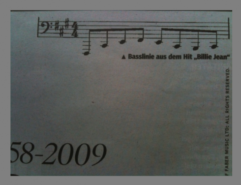
Germany’s Bild Am Sonntag today starts with Michael Jackson’s image on its cover, then devotes a dozen pages to his life and music. Interesting detail: the package, which is very visual, carries a bar at the top with some of the notes from Jackson’s hit “Billie Jean”.
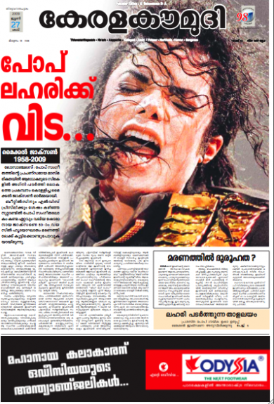
Page One sent by Sajeevkumar T.K, visual editor, Kerala Kaumudi (India)
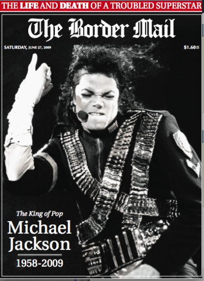
Page One sent by Daniel Dulhunty, The Border Mail, Australia

Front pages of newspapers from around the world, paying tribute to Michael Jackson and Farrah Fawcett
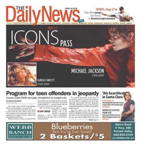
The Daily News, Palo Alto, California: honoring Farrah and Michael on Page One
Pure Design comes to the blog
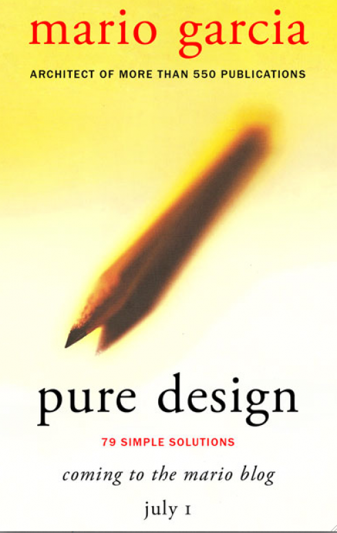
While my 2002 book Pure Design is virtually out of print, we will be bringing you the short “fable-inspired” entries, offering solutions for magazines, books, newspapers and websites.It is all about the basics of visual journalism. Starting here July 1.
As readers of Pure Design know, I was inspired by Aesop’s fables to write short, all inclusive entries on a variety of design-related topics, from color and typography to white space use and page architecture.
My plan is to add new thoughts to each of the “fable entries”, to update the topics whenever possible. Our summer intern, Reed Reibstein, will be assisting me as we prepare the materials for presentation in this new medium.
As I read through the material one more time, I realize that 85% of what is in Pure Design still matters today. I will make an attempt to update that other 15% in which we can add new dimensions almost 7 years later.
Pure Design’s pages will be available as PDFs through the Issuu viewer (http://issuu.com/) embedded in the blog.
TheMarioBlog posting #292