TAKEAWAY: It’s the third lecture for my class at Columbia University’s School of Journalism and the topic is Fundamentals of Visual Storytelling and Design. Let’s review some of the basics as we prepare for class tonight.
The experienced designer knows all of the fundamentals by heart, implements them without giving them much thought, and this allows him/her time for the creative process, which is the part of the deal that we cannot teach in a lecture. We can only inspire creativity, but we definitely can emphasize the principles that are likely to make a page or screen more functional and attractive.
Because our class at Columbia is a mix of graduate students with a variety of undergraduate degrees and work experiences, I have decided to do a sort of design primer to bring everyone up to speed, and to make sure that we have a common vocabulary as we progress into major projects during the semester.
So, what are the fundamentals?
In my view, whether one is designing for print or digital, there are four essentials: story structures, typography, space/distance (grids), color palette.
My idea of what I refer to as pure design is inspired by minimalism. Good design happens when simplicity trumps complexity.
Before one can deal with the creative side of design, it is important to learn a series of repetitions. These are those elements that provide for continuity and create that 60% of the formula that allows time for the important 40% of surprise (the creative side of our work). The first of these repetitions, and perhaps one of the most important, is what I refer to as story structures.
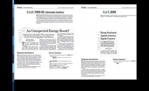
Story structures are the basis of how storytelling elements will fit into a specific design concept. How will we tell a lead story from a secondary story or a compact or a brief? How will we handle quotes, numbers, secondary readings? Photo captions? This is the first step, and it is one where typography plays a role, of course.
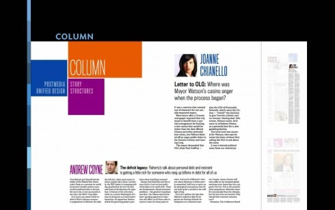
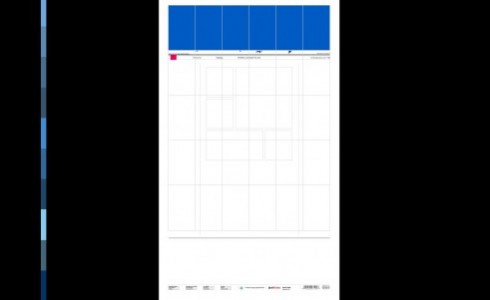
The grid is the space within which these story structures will appear: the grid, or container, is a key element to guide the designer and make the various elements on the page or screen find their own space), including white space strategies. A grid is the skeleton on which we put the flesh! As in type, photos, illustrations.
A grid determines how space will be used both vertically and horizontally.
When evaluating the design of anything, start with an analysis of how the grid has been created and utilized
Start with the margins: are they consistent. Remember that margins are the frames that hold the page/screen together.
The grid is the formula portion of the design. Go precise here, so that you can go freeform with your creativity. These two strategies complement each other
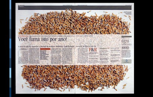
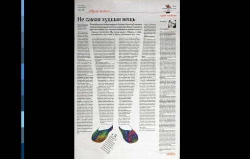
The typographic palette: type represents 75% of what a reader/user sees in a specific publication and/or website/digital platform.
The color palette: one of the most visible aspects of any design, one that provides an impression early in the process.
Repetition of forms through story structures, grid, type and color palette gives way to a grand overall impression.
These are the elements that support the creative input.
The Design Process
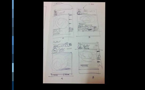
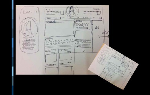
When you start with a simple but clear sketch, you already have the map to the journey in hand
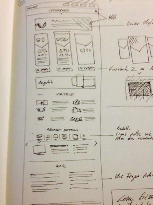

See sketch and real presentation above, as made by our art director Constantin Eberle for Die Welt offer page
Start with a good sketch-the map to the journey. A hand drawn sketch, to me, is the key to get a sense of space and distance, and move forward with a concept.
Hierarchy—this is what allows the user to evaluate content in terms of its importance. So I always make a case for the Center of Visual Impact: one element that is three to five times bigger than any other on the page or screen. This is an essential part of creating a friendly visual environment.
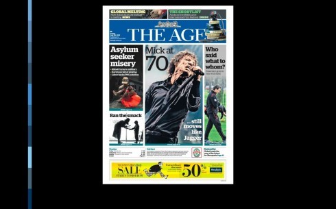
Contrast—Emphasize large, medium and small images. The same applies to type, white space and color.
Eye movement--Beware of how the user’s eye will move on the page or the screen. On broadsheets the eye moves from top left to bottom right; for tabloids it is a horizontal sweeping motion from left to right.
We will review the EyeTrack Studies from The Poynter Institute for Media Studies.
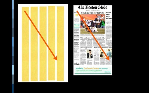
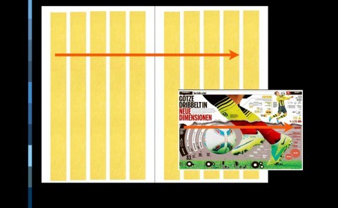
Eye movement: top to bottom for broadsheet pages; horizontal left to right for tabloids
The Use of Color
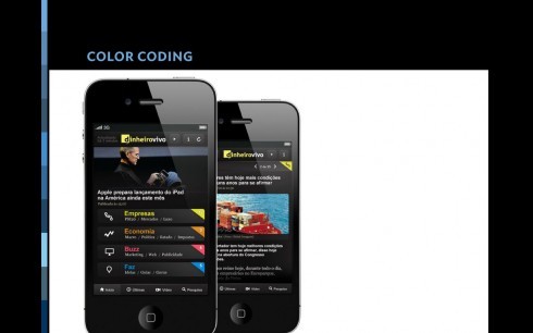
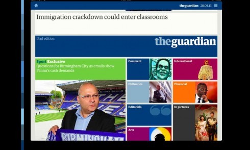

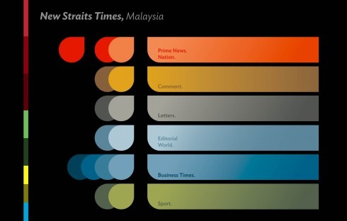
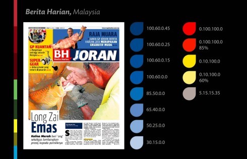
Color is everywhere, and it is one of the designers’ most important tool. Color can create a mood. It can provide for easier and more functional eye movement across a canvas.
It can also identify the story and its meaning, especially when color and symbols come together.
During this lecture we will review the principles of color use, color temperatures, the creation of color palettes and how to use color effectively on a page and/or screen.
The takeaways
It’s all about space and distance and how they come together on a page or screen .
Before you even begin to create, plan how your grid will accommodate elements.
The grid is not just a structure, it can also be a design inspiration.
In addition to the grid, other elements that are part of the repetitive forms:
Story structures
Typographic palette
Color palette
Parting shot
While creativity plays a powerful role in the design of pages and screens, it is the repetition of forms that provides direction for space and contrast, and guides not just the designer in the process, but also the reader/user as he consumes information. In good design, simplicity trumps complexity.