Two examples come to view today:
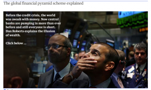
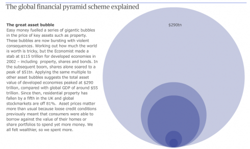
The Guardian: Where did the money go?
In London, The Guardian’s online edition uses an animated graphic with the enticing headline: Where did all the money go?.
The editors proceed to explain the global financial pyramid with a series of bubbles that intensify as one clicks from one image to the next, showing the full effect of losses, in a visual, easy to follow manner.
Follow the graphic here:
http://www.guardian.co.uk/business/dan-roberts-on-business-blog/interactive/2009/jan/29/financial-pyramid
Goteborgs Posten: The Volvo Crash
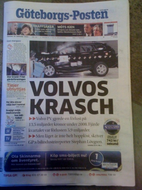
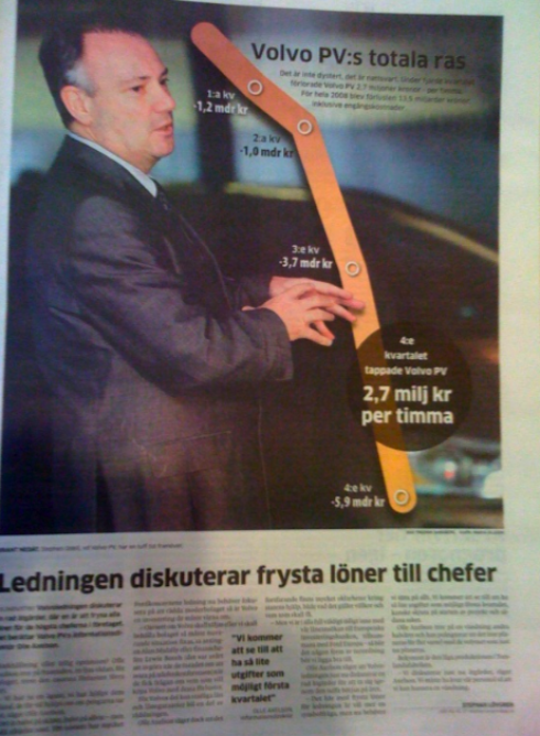
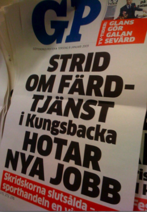
Swedish newspaper, like the GP, print large size posters to stimulate street sales
Volvo, the automobile manufacturer, is Goteborg’s largest business and employer. Today, with the news that the company is losing 2,7 million Swedish crowns per hour, editors used a poster look for the front page, with an image of a crash test from Volvo, following it up with a large photo/graphic image of Volvo’s CEO with superimposed graphic indicating recent losses.

To read TheRodrigoFino blog, in Spanish, go:
https://garciamedia.com/latinamerica/blog/
Today Rodrigo Fino writes about “design surprises”:
Fuck the rain
Design byAnton Schnaider

TheMarioBlog posting #180