In observance of the Easter Holiday, this will be the weekend edition of TheMarioBlog and will be upgraded as needed. The next blog post is Tuesday, April 18.
Your plane lands in Vienna. You get out of the plane and walked through one of those fingers connecting plane and terminal.
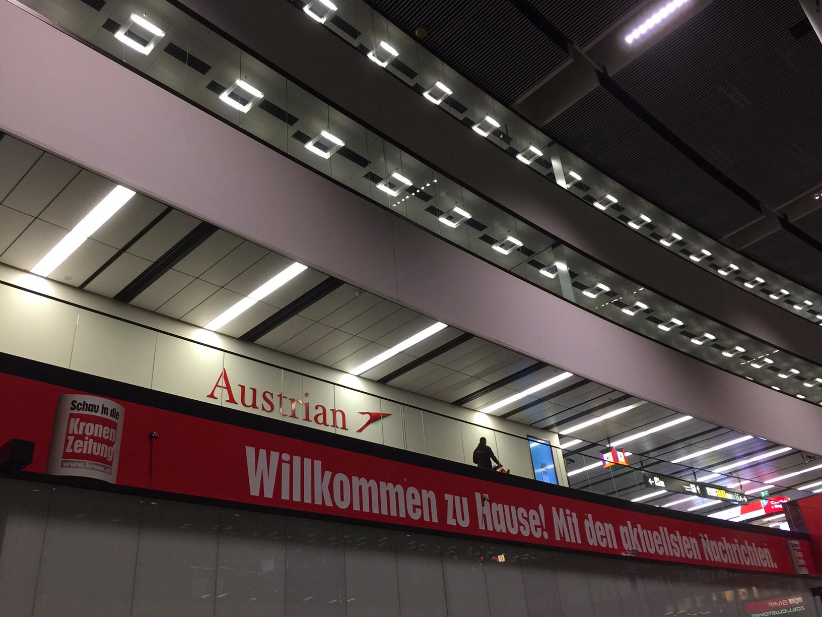
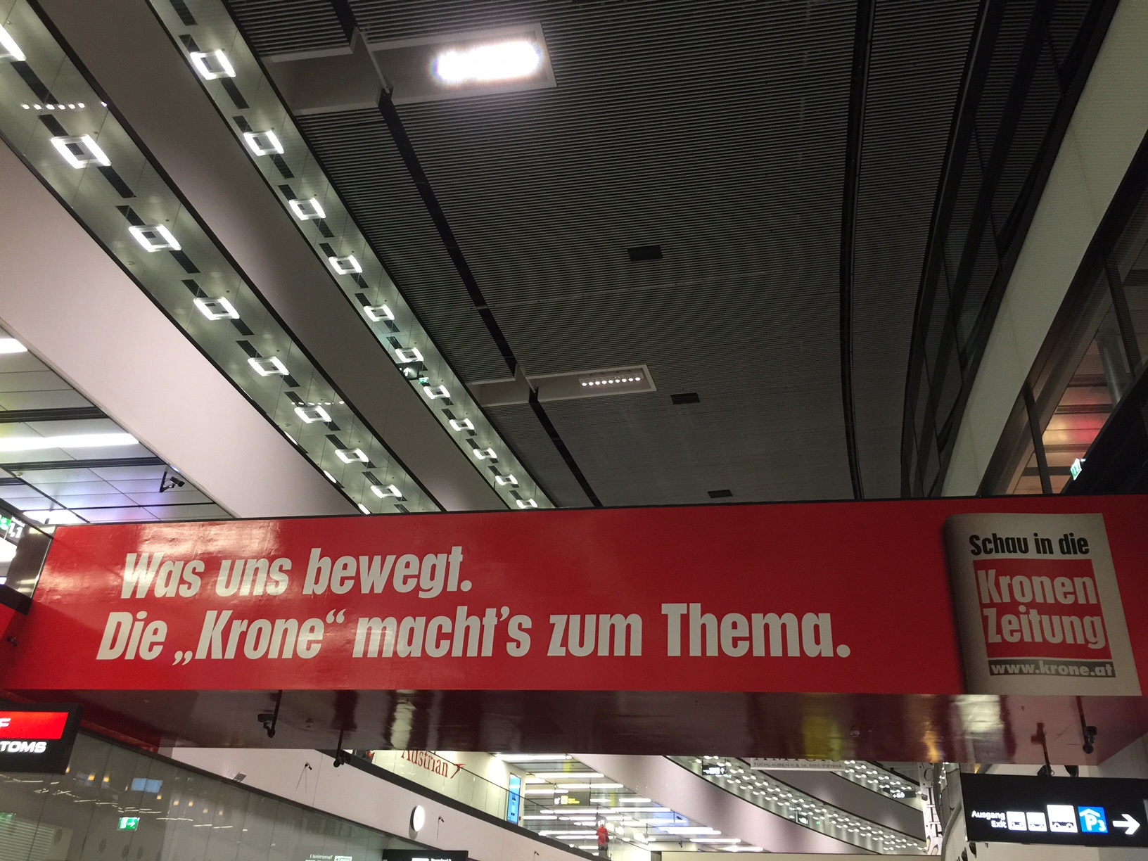
And, presto, suddenly you have signs in bright yellow telling you that Kronen Zeitung welcomes you to Austria. As you move through the terminal, red banners reminding you that Kronen Zeitung has the best information, that it is the newspaper to have if you are in Vienna, the best read, the best everything.
It’s the same at the arrivals hall, where the Kronen Zeitung does more to welcome you to Vienna than any ambassadors that could be on hand to do so.

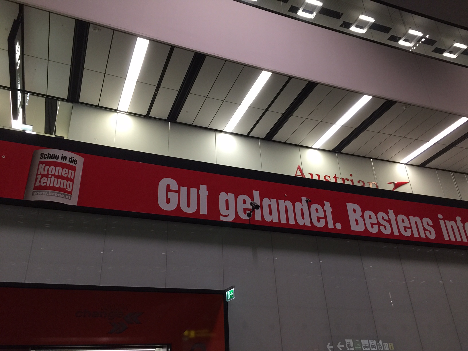
In this day when a lot of the marketing is about newspapers defending their position promoting quality and truthe in a world of fake news, the Kronen Zeitung goes for a more traditional and perhaps old fashioned marketing: we are the best!
Not bad. I am happy to see that for the KZ, just like its style of design and journalism has not changed much through the decades, neither has its sales approach.
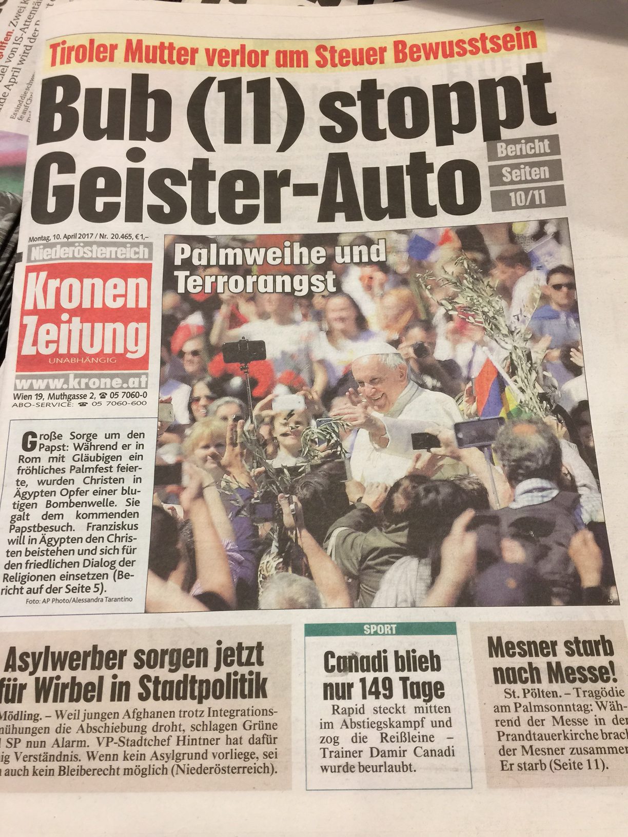
It’s all about marketing. This seems to work for the KZ.
Disclaimer: while we at Garcia Media were hired to work with the KZ team four years ago in what supposed to be a redesign of the print product, the various proposals we presented remain filed away somewhere, and it was decided that the newspaper would keep its traditional design. Win some, lose some.
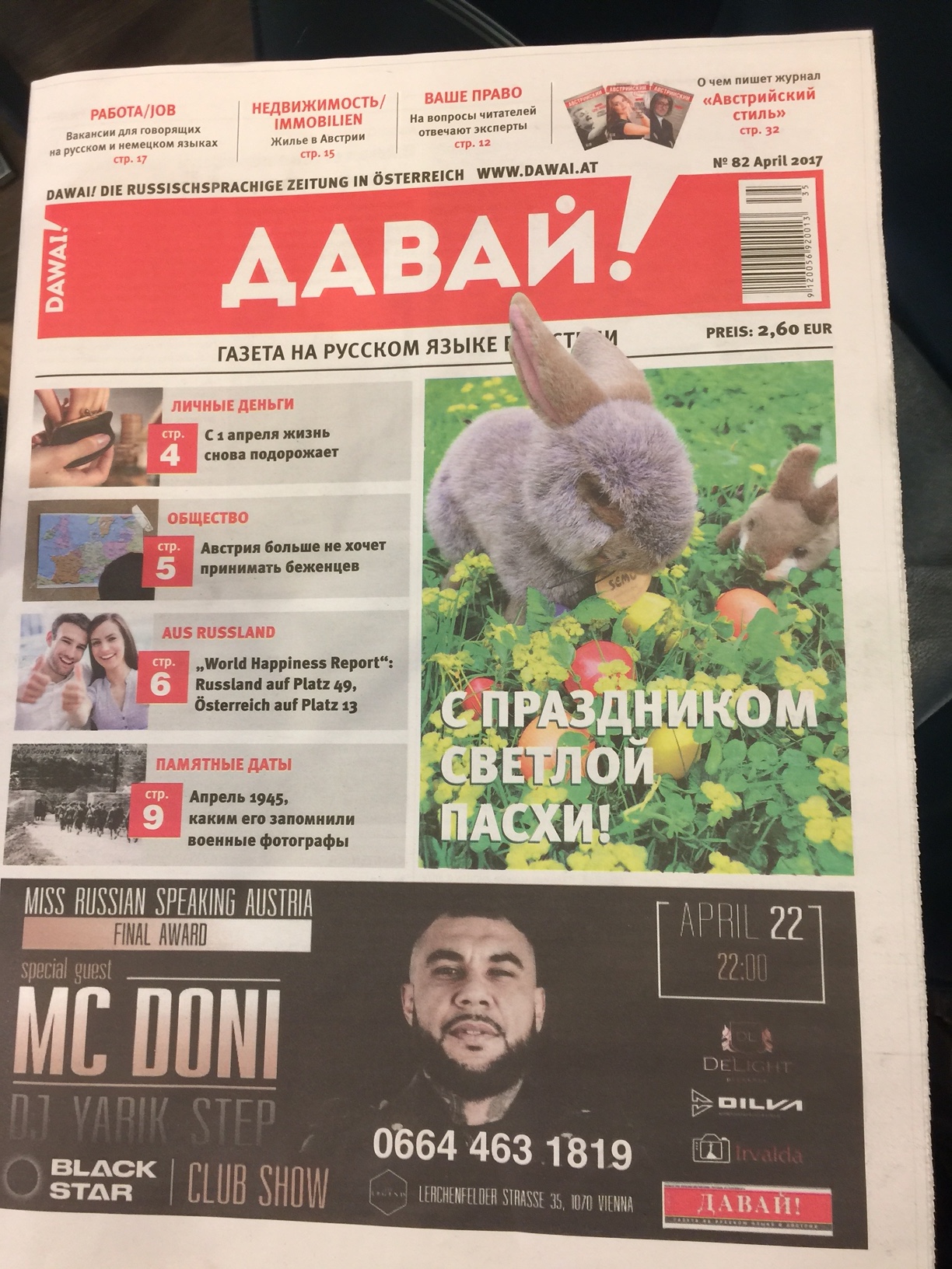
Russian-language newspaper in Austria
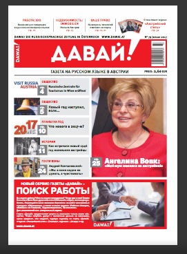
While in Vienna I came across this newspaper that I had never seen before. It is named Dawai and it is an example of newspaper design (at least on the front page) that seems to take its visual clues from the digital media. Notice the front page navigator. It is a fixed template where only the content changes.
