TAKEAWAY: It is the end of the year and a good occasion to review these pages from The Washington Post, representing textbook examples of what happens when great stories are packaged just the right way. This is the WED concept (writing-editing-design, the marriage of words and pictures) at its best. The designers of these pages share the background stories in today’s blog.
It all began with a remake of the Sunday front page
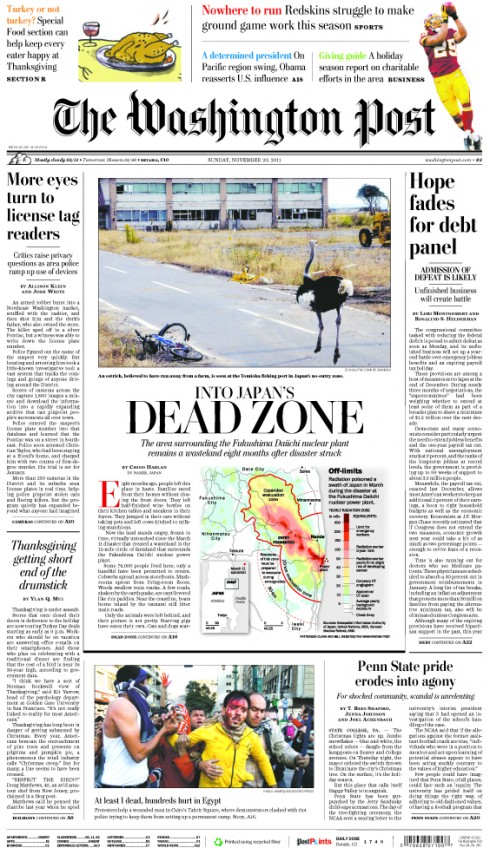
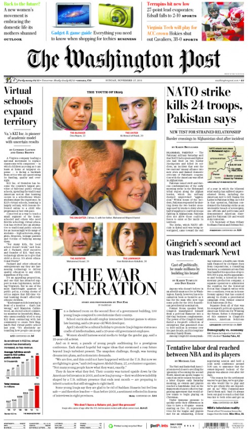
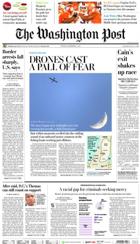
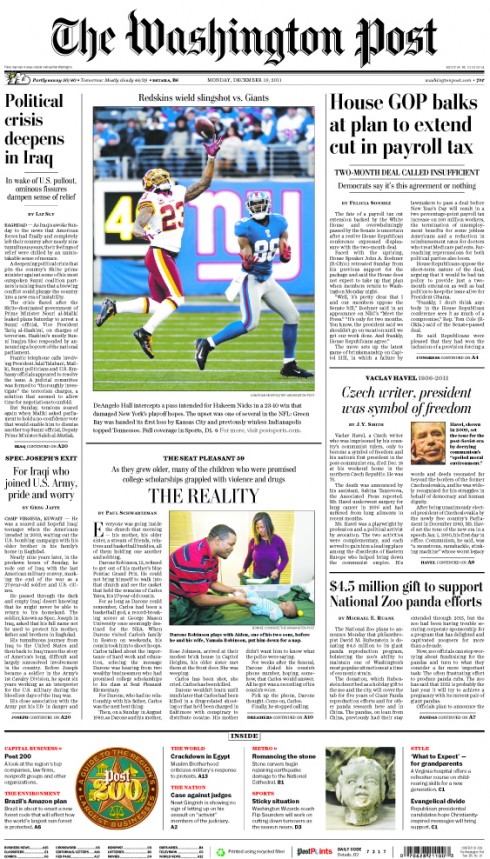
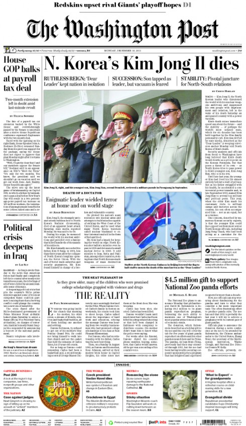
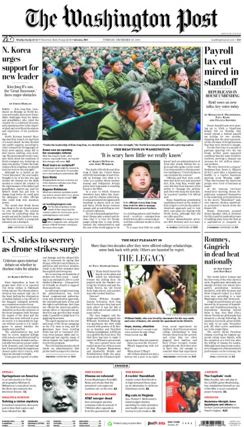
These are all recent A1 pages from The Washington Post, which underwent changes January 2011, most visibly the promos above the nameplate, with a soft pastel color palette
My year 2011 began with a visit to The Washington Post, invited by editor Marcus Brauchli, to work with him and his team of editors and designers on a series of assignments geared to facilitate the newspaper’s navigation plus the concept for a tabloid version of the Sunday Style section, one of the newspaper’s best read (see new pages below). Now, almost a year later, my last blog post of the year picks up where we started.
During the past 11 months, I have kept in touch with Marcus, and, especially, with Jon Wile, senior news designer, who shares his work on the Sunday Page A1 with me often, since that was the mainstay of my work with the WaPo team.
It is through those contacts that I have been able to see the magnificent work that the design team has done with some very special packages. I asked Jon to send me pages to show you here, and to offer us the designer’s insight as to how the design came together.
Jon has sent three big projects that have rolled out in the last two weeks at the Post, along with a few more of the Sunday A-1s and Sunday Styles;
Project 1: Arab Winter Pages
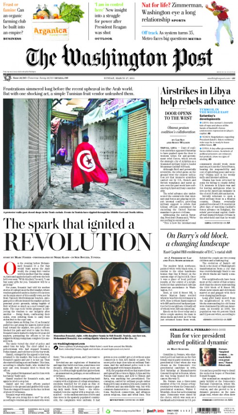
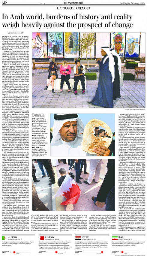
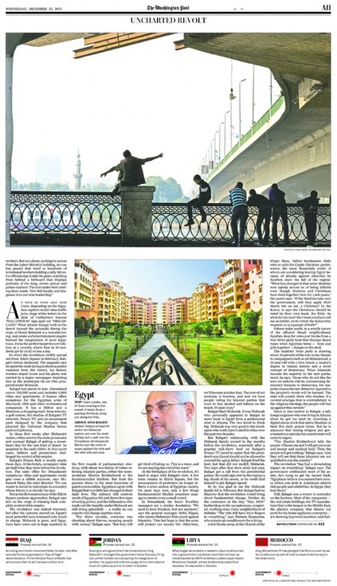
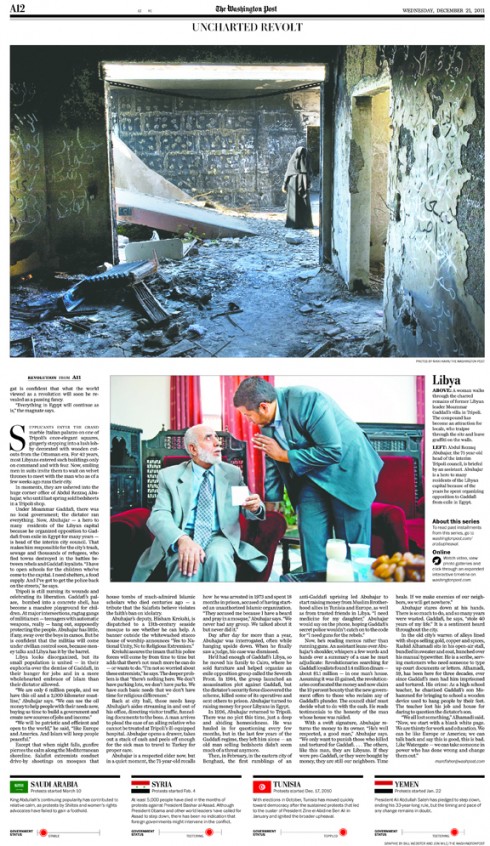

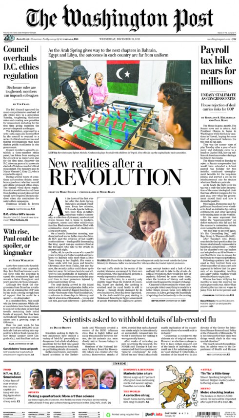
Following are Jon Wile’s own comments about this special package:
Why this project worked well: As a designer, I think one of the most crucial—and often overlooked—facets of the job is relationship building with reporters, photographers, graphic artists and editors. This particular project was a follow-up from an earlier piece on Arab Spring. Marc Fisher (reporter) and Nikki Kahn (Pulitzer Prize-winning photographer) left the day after Thanksgiving for two weeks of reporting. They came back and both immediately reached out to me since I had worked on the first story. After reading the story and seeing the initial photo edit, I was overjoyed to see how the visuals and the words married perfectly together.
Heading into the weekend I worked on a rough draft of the pages with Visuals Editor David Griffin. We pushed the design to be more about the user, that is, Marc’s narrative had three distinctive parts that we tried to break evenly across three inside pages, which made the 135-inch story (about 5,300 words) more easy to digest. Marc and I worked on a front-page headline, trying to parallel the head treatment we used for the Arab Spring piece. I came up with an initial offering, then we emailed back and forth to smooth it out. The all-caps headline is a tool we usually reserve for the Sunday paper to identify our best piece of enterprise on the front page, but we used it on this piece to tell readers that this wasn’t an every day type of centerpiece.
The day of production (Tuesday night for the Wednesday paper) was seamless because of the legwork that had been done ahead of time. We informed our photo engravers about the project so the top person in the department could tone the pictures (on his day off no less!). Being ahead also allowed us a chance to focus on the detail work of the pages, like the country capsules at the bottom. I worked with Foreign Editor Doug Jehl on the government rankings to remind the casual reader what happened over the past year, spending most of my day building those bottom graphics and printing out the pages to check spacing/kern widows/etc. As Griffin reminded in an email after the project was over, “The attention to the minutia is what takes us up a notch.”
For those interested, read Marc’s story here:
http://www.washingtonpost.com/world/arab-spring-yields-different-outcomes-in-bahrain-egypt-and-libya/2011/12/15/gIQAY6h57O_story.html
Some tips from Jon Wile about building successful projects in a big newsroom full of layers and opinions
– Know what your boss likes and dislikes: Don’t be afraid to push the envelope and push your supervisor on something, but also have a fallback plan. And version, version, version. When you are done, version some more!
– Know the expectations: Don’t design something in four pages that only needs a page. Try to engage top editors early to see how they feel about the project, when it could run and how much real estate they want to give it.
– Work with your colleagues: This is very crucial. I feel that a lot of designers work in a vacuum, which can be dangerous. Talk with reporters and photographers. Ask to see some of the photos that didn’t get submitted, suggest a different size/shape on a graphic or work on photo crops together. Build a relationship your co-workers so you can engage them in dialogue about the project on a level that is higher than just a production worker. Good design can elevate any type of content.
Project 2: The Seat Pleasant
News Designer Katie Myrick worked on a recent 3-part project and shares details of a big design challenge—what happens when the photos don’t match the text.
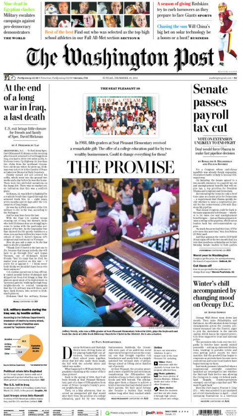
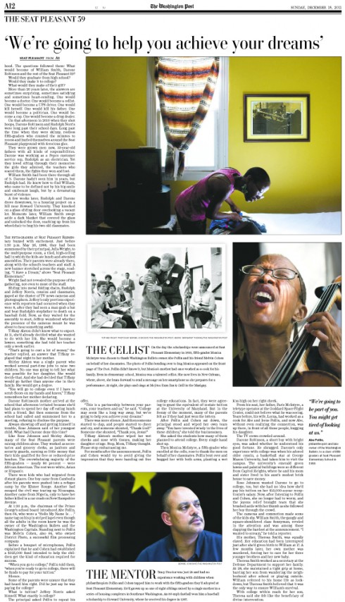
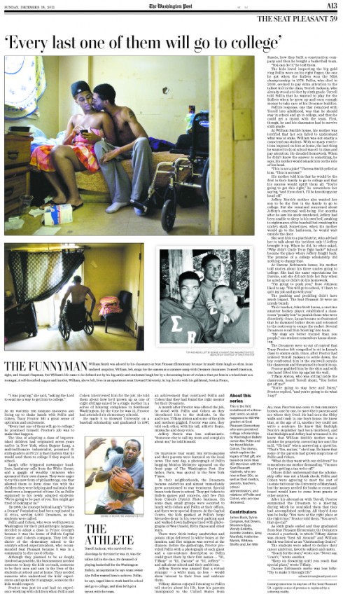
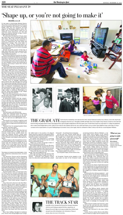
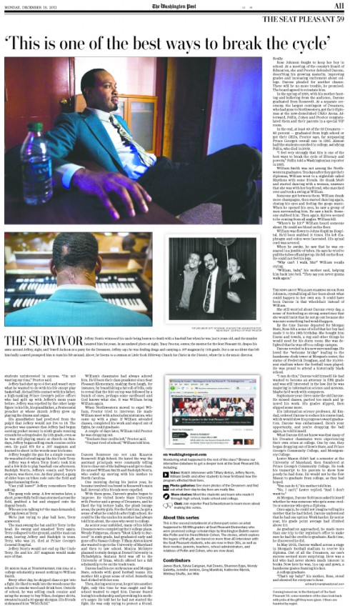
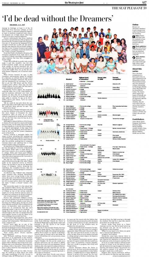
Katie explains the process:
The Seat Pleasant project focused on a group of 59 people who, in 1988, as 5th graders at a poverty-stricken school, received the gift of four years of college tuition, provided that they make it through high school. When I got the first draft of the text, it was three 120-inch stories focused on about 10 main characters and 6 secondary characters. We had beautiful photographs by Bonnie Jo Mount to go with most of the main and secondary characters. My boss, Greg Manifold, and I thought we would try using blocks of photos—taking a couple of Bonnie Jo’s current photos and put them together with a historical photo of that particular student. We also decided to give each of the students nicknames as identifiers, because after reading about so many people in one sitting, the names start to lose meaning or jumble together. After about four days of photo edits and rearranging the photo blocks to match with the story, we got word that our managing editor thought the draft had too many characters in it—how about going down to four main characters?
That threw quite a wrench into our plans, but in the end, it made it possible for us to tell an even better story. We kept our photo blocks and used the extended captions to bring back some of the reporting that had been lost in the final version of the story. The project editor loved being able to include more information about the students and the photographer and photo editor were equally happy that we were still able to display some of the best photos, even though those characters were ultimately eliminated from the text. In a way, it made the story more complete. It was a way for us to marry the visuals and the words together to give the reader a better experience overall.
Read the 3-part series here:
http://www.washingtonpost.com/local/for-the-seat-pleasant-59-giddy-promise-is-replaced-by-sobering-reality/2011/12/15/gIQAQ13syO_story.html
Project 3: Candidates’ Profiles
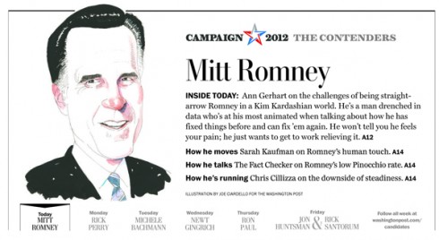
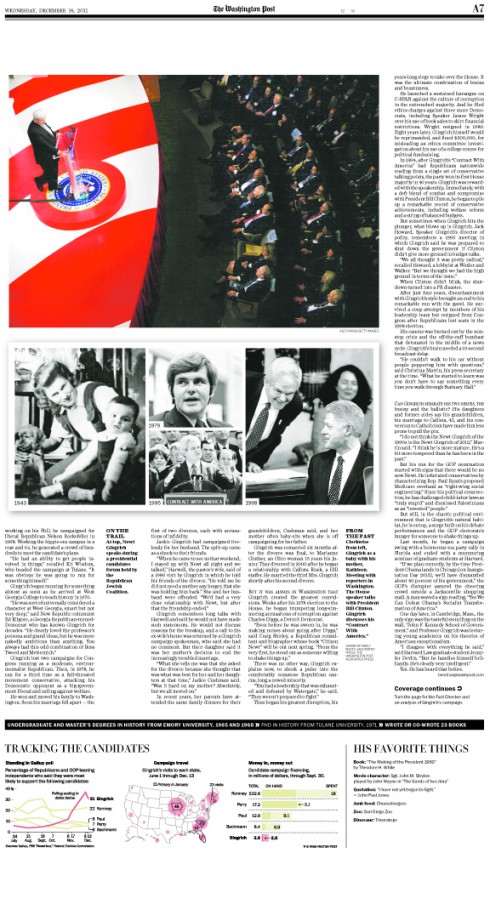
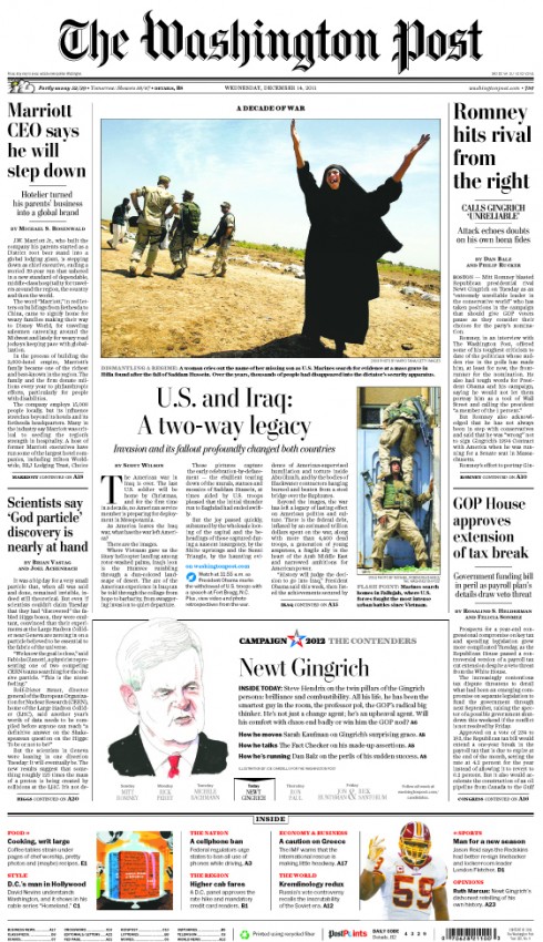
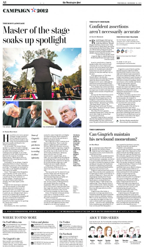
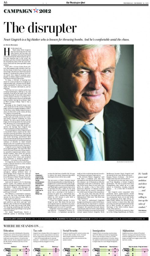
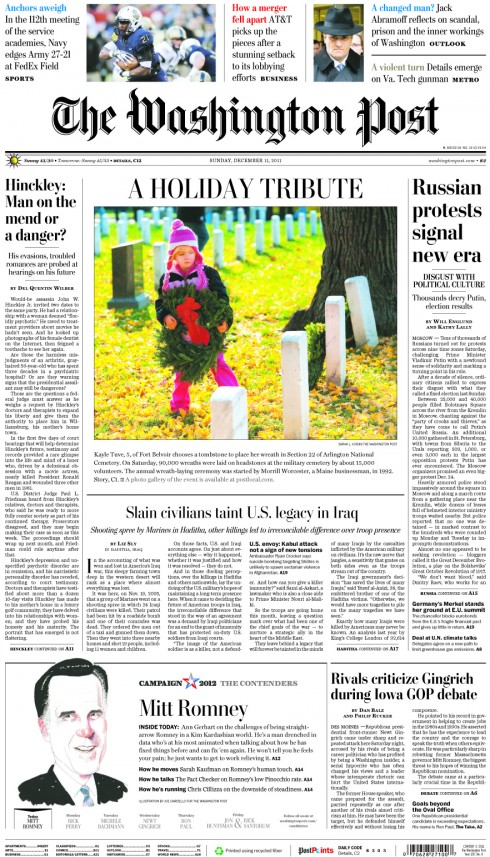
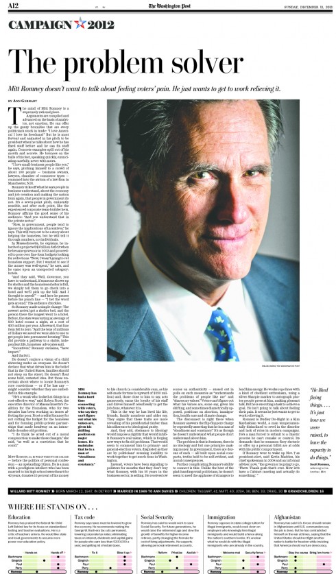
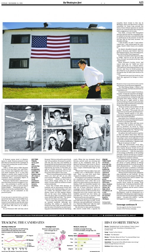
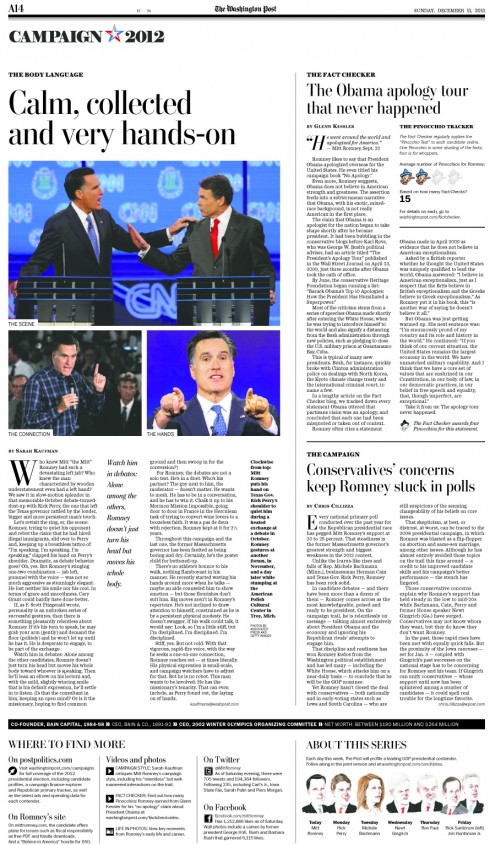
Here Jon Wile explains this project:
Every four years we profile the top presidential candidates. This year we focused on the top seven GOP contenders (Romney, Perry, Bachmann, Gingrich, Paul, Huntsman and Santorum). The problem is that we have to give the same play to all the candidates on the front page, so we have to design a secondary A-1 element that pops. We also get a photo opp with each candidate, usually playing that image small on the front. However, this time around we came up with a different solution—use an illustration of each candidate on the front and then play our staff portrait larger on the inside. Joe Ciaradello did all of the illustrations for us.
Lots of hands involved on this project, mainly designer Tim Ball who sketched out the entire project and worked for a solid week before leaving on vacation to get these pages ready. Notice the slightly more aggressive use of white space and the 10-column grid on the inside pages, neither of which are staples at The Washington Post. Visuals Editor David Griffin, Design Director Janet Michaud, Deputy Design Director for News Greg Manifold, Photo Editor Michel du Cille and staff photographer Melina Mara also dove in head first to make the project a success.
4. Sunday Style
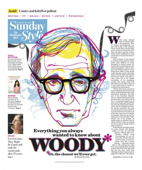
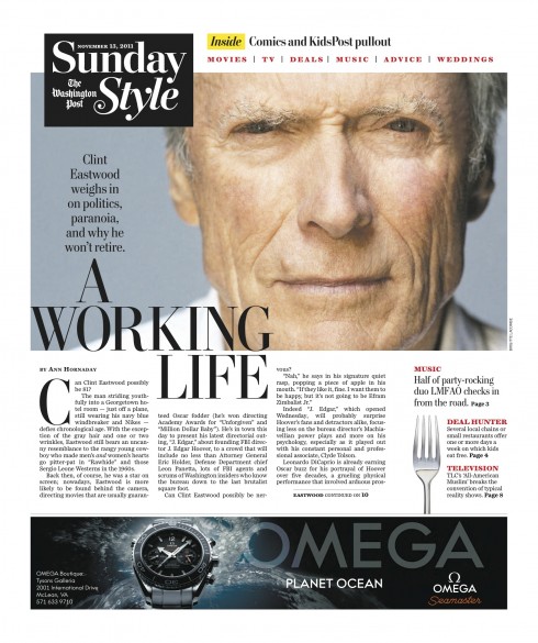
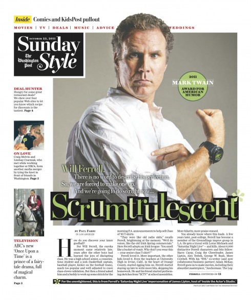
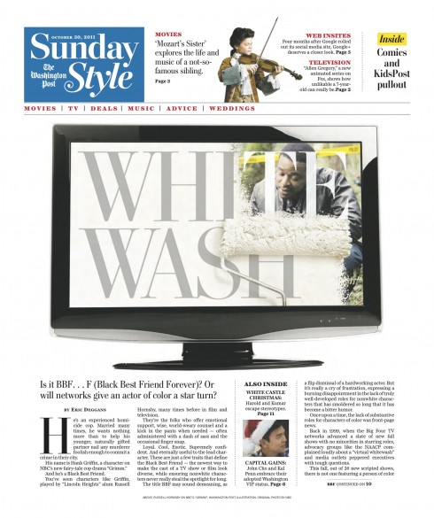
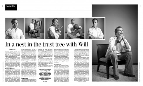
One of the most fun aspects of my work with the WaPo team earlier this year, was the transformation of the Sunday Style section from broadsheet to compact format. Working closely with Design Director Janet Michaud, we set out to create a product that would be visually bold and colorful, while allowing for the great storytelling that appears in the section to find its own place.
The result? A combination of well chosen images, a grid that allows for white space, and a clear navigation, makes it all possible for Sunday Style. Content here ranges from entertainment, movies, TV and even advice and weddings. Art director Kim Vu is keeping these Style pages going strong.
The digital WaPo
The Washington Post offers a robust digital platform variety of choices for its readers. Managing Editor Raju Narisetti sends us this link to the Post’s most innovative journalism as it played out on the web.
“In addition to listing, we are going one step more in terms of engaging our readers by actually asking them to vote on what they thought was really good for them from this list,” Raju wrote to me in an email.
http://www.washingtonpost.com/blogs/ask-the-post/post/the-washington-posts-most-innovative-journalism-of-the-year/2011/12/02/gIQAYADl9O_blog.html#pagebreak
“As a single newsroom that uses multiple platforms, the web allows us to create much more dynamic experiences for our readers well beyond what we can do in print with all of the same projects,” Raju said.
Related blog posts:
The Washington Post: introducing lots of new changes this Sunday
https://garciamedia.com/blog/articles/the_washington_post_introducing_lots_of_new_changes_this_sunday/
Revisiting Dubai, Washington projects
https://garciamedia.com/blog/articles/revis/
Last blog post of 2011

Wishing all of you the best of this wonderful holiday season. Have a Merry Christmas and a new year full of health, love and success.
TheMarioBlog will resume in January.