To be updated as new images come in
TAKEAWAY: It is a new, dedicated tablet edition premiering today for Austria’s Kronen Zeitung. We worked with the creative and technical staffs to get this app created and here is a case study of how it came to be.
Kronen Zeitung’s new curated tablet edition
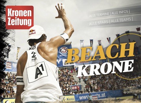
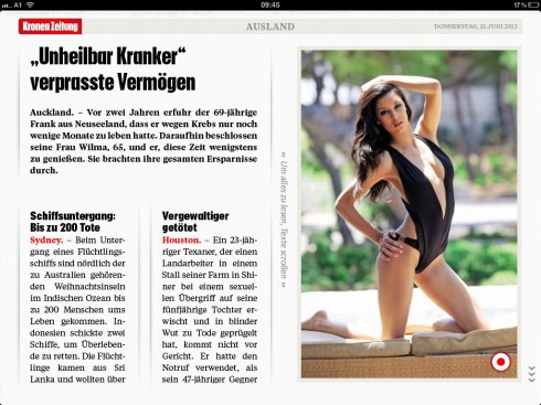
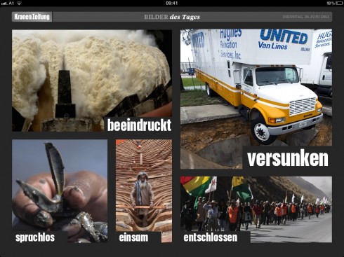
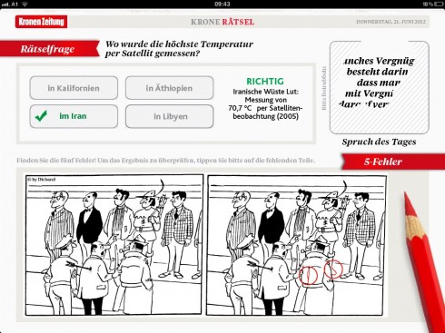
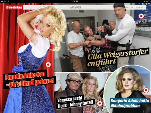
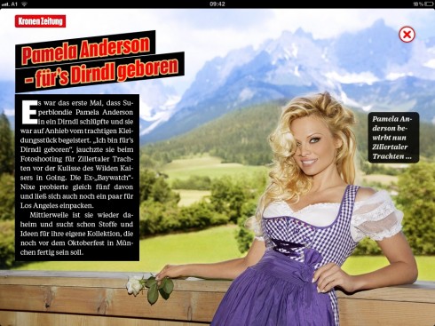
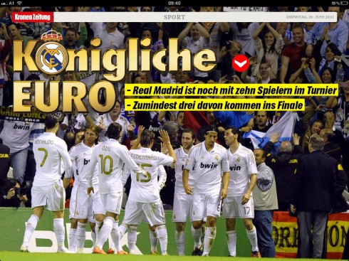
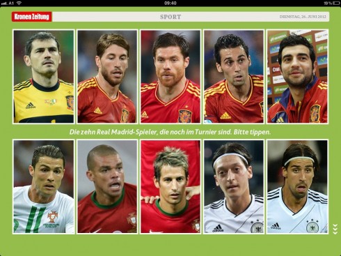
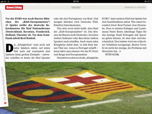
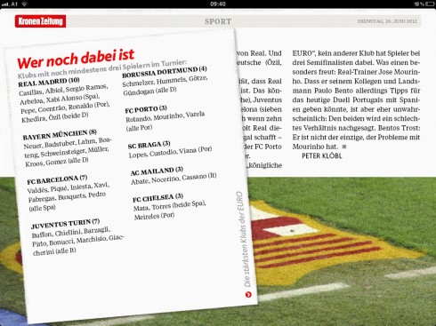
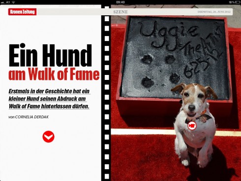
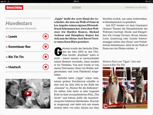
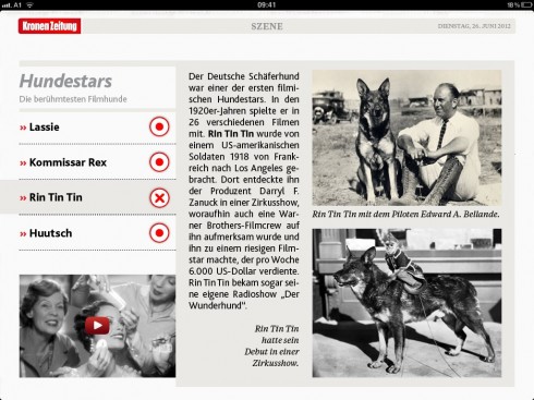
It is a new iPad edition for Austria’s Kronen Zeitung launching today.
While this most popular of Austrian dailies has had a presence in the tablet since 2011—-through an e-reader version where the printed newspaper pdf file is available for viewing on the tablet—-today markes the first day that Krone goes to a curated edition.
We at Garcia Media are happy to have worked with the talented Krone digital group to make it happen.
From the start, the Kronen Zeitung publisher, Dr. Christoph Dichand, knew that he wanted for the newspaper to go beyond the daily pdf posting of the printed newspaper:
“We wanted to offer our many readers that, but we also wanted to expand and to be able to use so much more of what the tablet can do,” Dr. Dichand said.
What users who download the Krone app will see will be a rich combination of the best of the Kronen Zeitung stories and features, but also enhanced storytelling through pop ups, photo galleries and videos.
The KZ tablet edition will be prepared for daily update around 6 pm (18h) in the evening.
This is an interesting parallel here, since the Kronen Zeitung, which is published in a compact A4 format, has an evening edition that people usually get while dining in restaurants in Vienna, for example. I remember being at dinner when suddenly a Krone vendor walks into the restaurant to sell copies: very traditional, very Austrian and very much Kronen Zeitung.
Now the tablet edtiion will also be available just about that time.
The process
We at Garcia Media worked with the Krone group headed by Richard Schmidtt, Paul Tikal , Robert Kuschela and Michael Eder. Constantin Eberle, of our Garcia Media Europe office, is the art director for this project. Working with the team on the technical aspects of the project: Peter Ungvari – of zweipunktnull, an Austrian-based firm. In addition, the talented tablet app designer Florian Fromm, art director for the iPad & iPhone WELT HD-App. for the Axel Springer Verlag. joined our early workshops and contributed excellent ideas.
Together we started with a series of workshops aimed at deciding what the structure and content flow of the Krone tablet edition would be.
Once we had that taken care of, the next step was the creation of some early sketches.
It is my belief that the best way to get the conversation advanced during these workshops is to create sketches. Immediately, one knows what works and what does not.
I should mention here that we at Garcia Media continue to work with the Krone group on a redesign of the printed newspaper for a launch later in the year.
But, from the start, I thought that the tablet edition did not have to match that look 100%, and that, as a new product launched by the Kronen Zeitung, which already is one of Austria’s journalistic institutions, it should borrow heavily from its DNA, but retain its ability to look and to appear very new.
The Kronen Zeitung’s content runs the full range of serious political stories, to the more frivolous features and interviews with celebrities. It is rich with short items, revered columnists, and photos everywhere.
So , in my mind, the landing page had to reflect all of this rich texture, with the colors and the boldness, but it could be a quieter, more stylish presentation.
It was satisfying to see that Dr. Dichand, the publisher, liked such thinking from the start.
The early sketches
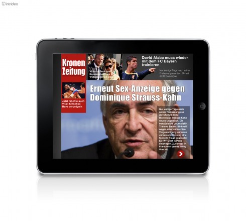
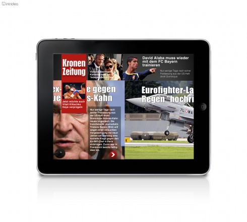
Here are some early sketches of the work we did, to get us going:
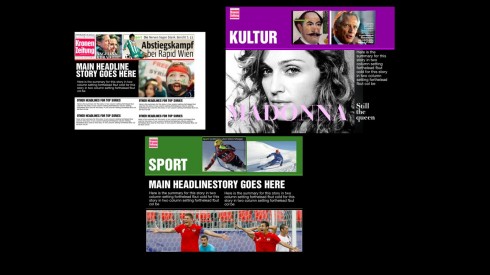
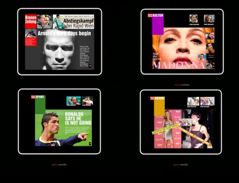
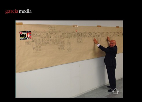
And here is how the digital group had created the full content flow for the app: I do the “skip and hop” navigation exercise by going to any spot on the app then asking how we go from this screen to another desired section of the app.
More finalized sketches of the concpet
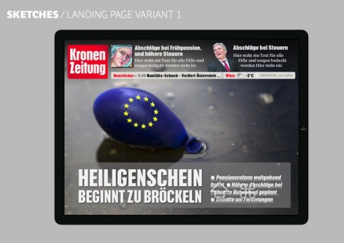
Go here to flip through a file of our more finalized sketches as prepared by Consti Eberle. By now we knew what the final version would look like, and this was a matter of making an inventory of all content and how it would be presented on the tablet:
The KZ digital group speaks up
Paul Tikal, responsible editor for the new tablet edition, had this to say about his experience:
“It took a couple of weeks of trial and error to find our bearings, and it took us a while to get accustomed to the new software. Our initial goal was to drastically reduce the time it takes to publish an issue. We moved from six days to two days to nine hours, simultaneously raising the quality of the product. A strong base of layout guidelines provided by Garcia Media gave us additional confidence to develop new formats.”
From Michael Eder, who handled coordination and all technical details:
“As it was an all new terrain for us, also in a technical perspective, we tried out a lot of things to provide a smooth workflow and an magnificent multimedia experience in short period of time. The whole team managed it and did a great job.”
For Robert Kuschela, who managed various aspects of the project, the task at hand was to translate as much as possible of the print Kronen Zeitung to the tablet;?
“ It was quite a big challenge to redesign a daily newspaper for the iPad. We wanted for the reader to experience a multimedia sort of feeling and I think we have achieved our goal.”
The technical side
Peter Ungvari, CEO of zweipunktnull GmbH, was our technical expert for the project. I asked him to give us his assessment:
“Though we already brought a daily to the tablet, this project was extraordinary demanding in its logistic and technical dimension for zweipunktnull. From integrating the print editorial system to receive content, over making layouts to build automatically in InDesign to the whole dimension of monetization – the Krone HD app supports all sorts of commercial availability, iTunes subscription, print subscribers, test subscription and single in-app purchases – we had to work together with more than 20 people over a period of almost half a year.
“A redundant clearing system had to be built in order to authorize downloads on the fly against the available legacy systems of the publishing house, everything under high-availability aspects and scalable to the high number of requests during peaks of interest during the day or due to special events.
“But technical aspects were just one side of the equation.
“We have seen tremendous creativity among the editorial staff, after they got acquainted with our digital magazine tools from Woodwing. Having made routine layout work automatized gives the small layout team now the chance to concentrate more on the individual creative aspects of designing for a tablet reader audience on a daily basis.
“Future HTML5 widgets will give even more interactive possibilities into the hands of the team of the daily news Krone HD edition. zweipunktnull is looking forward to supporting its customer Kronen Zeitung to push these technical design limits even further in the near future
Tomorrow in TheMarioBlog
Apologies for not having published our Gulf News Styleguide promised blog Monday. As readers of the blog can see, it has been a busy week for Garcia Media and TheMarioBlog, with three of our projects launching simultaneously. However, as things calm down, we hope to have our Styleguide blog post Wednesday. Don’t miss it!
The iPad Design Lab: Storytelling in the Age of the Tablet
Video walkthrough of the iPad prototype of iPad Design Lab
