Update #3: Monday, Aug. 2, 17:17 Hamburg, Germany
TAKEAWAY: Just about a month after it was published, William Powers’ first book, Hamlet’s BlackBerry, is already a bestseller. Powers definitely hit a chord with readers when he invited us to disconnect from the digital addictions of our day and turn to print. ALSO: Skin deep love with Helvetica.
The book of disconnect connects with readers

It came out June 24, and it is already on The New York Times” Bestseller list, and I am not surprised at all.
William Powers can now be introduced as a New York Times bestselling author, and his first book, Hamlet’s BlackBerry, has joined the prestigious list at #33.
Not too bad for a book that suggests that we disconnect a little to contemplate life around us, In doing so, the book places a mirror in front of us so that we can see the level of addiction that we all have to the digital world in which we exist.
As readers of this blog know, William Powers and I exchange ideas about this very topic on a regular basis. In fact, we use the airport code DCT between us when we talk about destination Disconnect.
It is not unusual for William to send me a note wishing me a “happy DCT weekend”, or for me to reply with “….here I am in the Canaries, the ultimate DCT”.
The success of Hamlet’s BlackBerry indicates that DCT may be a destination of choice for many who have taken seriously to the message in his book.
Here is William Powers’ reaction to the success of his book:
In traveling around to promote Hamlet’s BlackBerry, I’ve noticed people are incredibly eager to talk about the question at the heart of the book: How to live happily in a digital world? They don’t want to run away from their BlackBerrys and iPads, they just want to use them wisely. It’s all about striking a healthy balance – a simple idea, but one that kind of got lost in the elation of the early digital years.
Readers also seem to love the notion that human beings have been in this place many times before, all through history, and things turned out just fine. In Plato, Seneca, Thoreau, McLuhan and other great thinkers of the past, the same theme returns over and over: Our tools should enrich our lives, not impoverish them. Let’s make sure they do! That’s my message, and it seems to be one people were ready to hear.
For those of us in the media, the book is must read material; on the one hand it inspires us with William’s certainty that “print is eternal”, a thought that is so much needed by an industry in constant angst about its survival, while, on the other, the book explains that fear of new discoveries and advances is nothing new:
In one passage, Powers tells us that Socrates went a little crazy over “the very latest communications technology, written language based on an alphabet” . Socrates believed that scrolls would erode thought by permitting people to forget what they had learned because they’d be able to look things up, that they wouldn’t feel the need to ‘remember it from the inside, completely on their own.’ Google would have caused Socrates much despair.
Our interview with William Powers prior to publication of Hamlet’s BlackBerry:
https://garciamedia.com/blog/articles/william_powers_disconnect_is_emerging_as_the_ultimate_luxury_destination
Helvetica “rediscovered”?

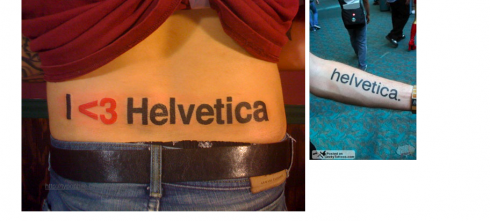
Actress Angelina Jolie used Helvetica for one of her hidden tatoos with the name of her former man, Billy Bob Thornton

“Hurt like HELvetica” is the headline the person whose Helvetica tatoo appears left chose to tell the story; the photo on the right was shot by Simon Daoudi at the 2008 San Diego Comic Con.
Not that Helvetica, that venerable font that we like so much, needs publicity. After all, Helvetica even has had a movie made about it . But now Helvetica finds itself in another book——and not necessarily as the font used for the text. Instead, Andrew Morton’s Angelina: An Unauthorized Biography is sad to include a little salacious reference to our beloved Helvetica: “the typeface in which the Billy Bob Thornton tattoo on Ms. Jolie’s nether parts is written.” Indeed — Helvetica.
This may prompt a rediscovering of the minimalist font for those who may have put it aside for too long.
And for those interested in the subject of type on skin, go straight to one of the best sources:
Cover of the book by Ina Saltz about the typography of tatoos
New York City designer/teacher Ina Saltz offers a delicious trip through the typography of tatoos.
In fact, the genesis of Ina’s project was a tattoo of the word “Happy” that she spotted on a young man on a cross-town bus. She recognized that the tattoo was done in Helvetica and then took note of the tight kerning.
A book was born, and, so now we know that Angelina’s use of Helvetica for her tatoo may not have been such an original idea.
Also of interest:
How do you show your love for Helvetica?
http://velvetant.net/blog/helvetica-love/
Luxemburger Wort on the iPad

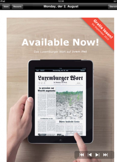
Another newspaper develops its iPad app. In Luxembourg, the Luxemburger Wort today introduced its first iPad app and offers it free to customers until September.