This is the weekend edition of TheMarioBlog and will be updated as needed. The next blog post is Monday, August 18.
Update # 2: Saturday, August 16, New York City, 08:22
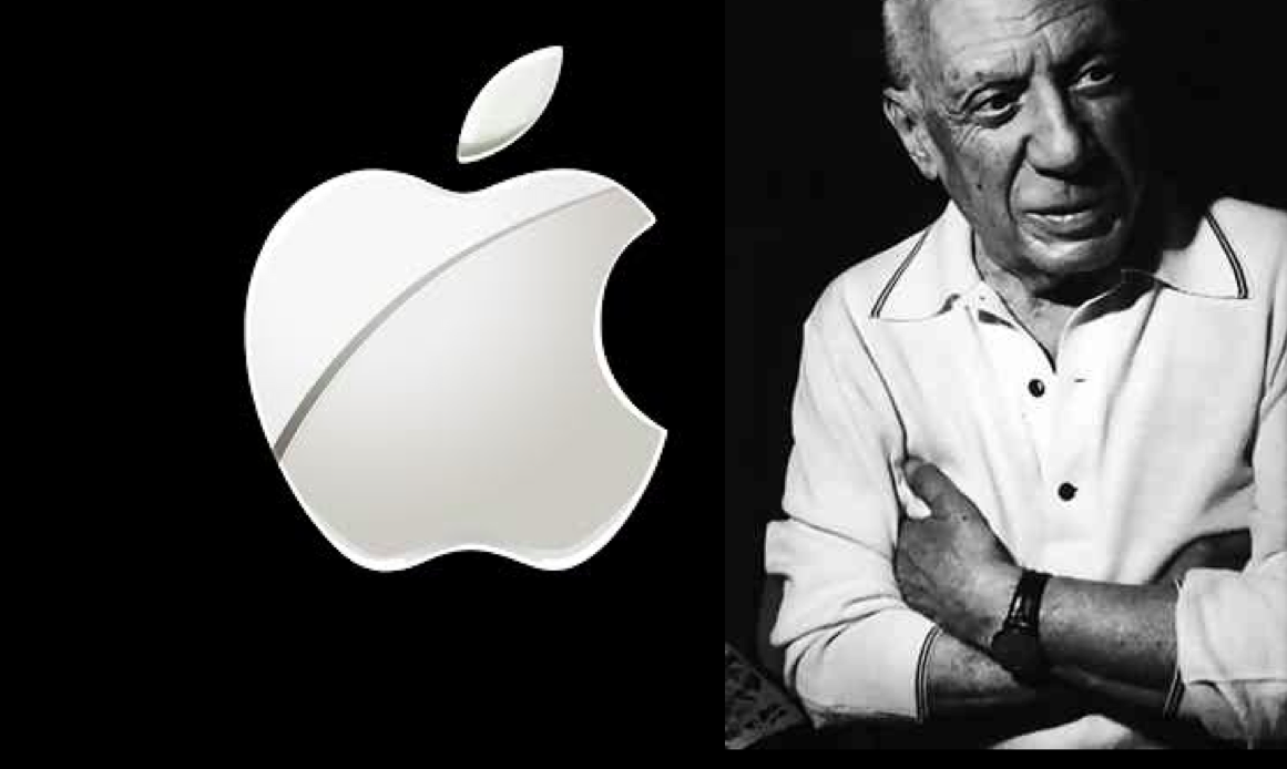
I am not at all surprised that at Apple University, the work of the Spanish master Pablo Picasso is part of the curriculum. Why, someone is likely to ask, would you have a 20th Century icon of the fine arts canvas influencing the 21st Century giant of all things digital, of all things Apple?
A great New York Times piece by Brian X. Chen helps to answer the question.
We find out, for example, that:
–“Apple designers strive for simplicity just as Picasso eliminated details to create a great work of art.”
–In a recent Apple University class, the “instructor showed “The Bull,” a series of 11 lithographs of a bull that Picasso created over about a month, starting in late 1945. In the early stages, the bull has a snout, shoulder shanks and hooves, but over the iterations, those details vanish. The last image is a curvy stick figure that is still unmistakably a bull.”
Case studies of how Apple products have been created are presented in these Apple University classes, showing how, for example, a TV remote control usually can have more than 20 buttons, but Apple's has only three.
The less is best school of functionality
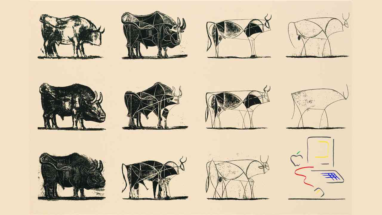
The Bull, created in late 1945, reveals how a great artist turns an idea into a masterpiece. Starting the series with a realistic drawing of a Picasso starts with a genuine image of a bull, then continues to scrutinize it, stripping it off details simplifying it. What a valuable lesson for designers everywhere.
Everyone in the business of communication today can learn from these lessons taught at Apple University, and also from not just Picasso, but other fine artists as well. In my own work I have often referred to sketches from Picasso and Dali as they conceptualized their masterpieces. I also look at Piet Mondrian's work as inspiration for grid creation and color palettes. From the Impressionists I have learned much about utilizing color effectively.
Picasso probably never could have imagined that his work would resonate with those technical folks in Sillicon Valley. Yet, it makes perfect sense that those seeking simplicity, functionality and visual impact would turn to the cofounder of the Cubist movement, the invention of constructed sculpture and the co-invention of the collage.
Picasso was all about experimentation and innovation in his art. It is the same thing the late Steve Jobs continuously pursued for Apple.
Picasso and Apple have both created masterpieces. While the masterpieces are quite different in nature, they both rely on functionality,a minimalist approach and high level of visual appeal.
We only wish we could sit in a class at Apple University.
Of related interest
Previously in TheMarioBlog about Mondrian-inspired design:
https://www.garciamedia.com/blog/death_of_bin_laden_a_perspective_from_lebanon2
How Apple Uses Picasso To Teach Employees About Product Design
Highlight
Picasso's The Bull, created in late 1945, reveals how a great artist turns an idea into a masterpiece. Starting the series with a realistic drawing of a bull, Picasso used the following 10 lithographs to mutate and dissect its form, stripping away details and stylizing its anatomy. In the end, Picasso turned a highly literal representation of a bull into an intertwined series of abstract elements that balance and counterbalance each other to make up a powerful and expressive work of art. The last image is a single sinuous line that is still unmistakably a bull.
Don’t Miss This
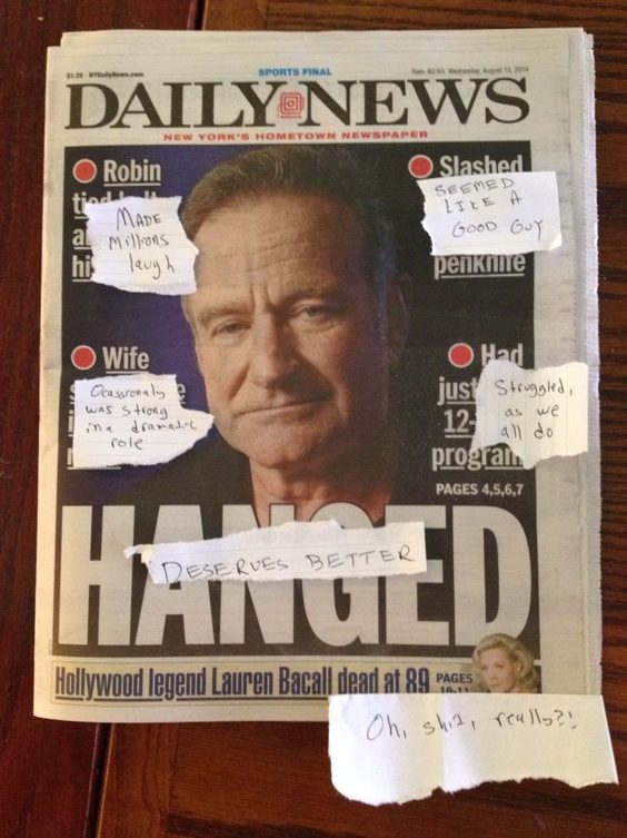
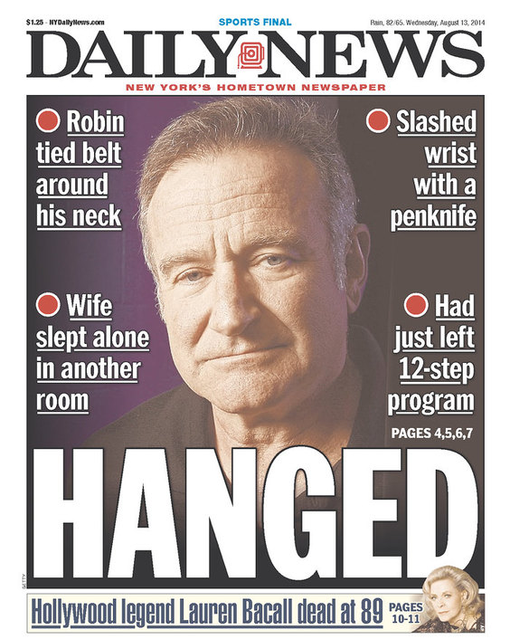
Image left is the original insensitive front page of The New York Daily News. Right, Village Voice film editor Alan Scherstuhl ‘s version of how he would have done it.
Newspaper Editor Shows How Media SHOULD Have Covered Robin Williams's Death
A lot has been said about the flawed and at times intrusive nature of much of the media coverage of Robin Williams's suicide on Monday.
The New York Daily News published a particularly insensitive front page Wednesday morning, with the words “HANGED” in large, bold font and graphic, private details about the actor's home life written above.
In response, Village Voice film editor Alan Scherstuhl decided to show how he might have done things a little differently if he were in charge of the newspaper's front page.
My take:
I applaud Alan Scherstuhl's initiative to offer suggestions that would have made this front page more in line with how we all remember Robin Williams.
The visual impact would not have been minimized, but the storytelling would have been more positive. Down market tabloids historically have emphasized the lurid and sensational to attract readers. Of course, there will always be people who will be attracted to such treatment of the news of the day. However, there is such a thing as “sophisticated sensationalism”, and this is a case where a bit more introspection and discretion would have carried the day. Especially in the case of such a beloved icon of American pop culture, such as Robin Williams is, those front pages would have sold just as well.
Weekend Reads
The Long Fall of Philly Newspapers
Highlight
The problem — in Philly and elsewhere — is that print advertising has declined radically, but also remains the revenue backbone of the papers. In 2012, for example, circulation revenue in Philadelphia exceeded print advertising for the first time — $81 million to $78 million — but that $78 million still represented a third of the company’s revenues. (Digital advertising wasn't even tracked by the company in 2000; in 2012, the $15.3 million earned from online advertising amounted to little more than 12 percent of the company's ad revenues.)
Previously in TheMarioBlog about Philadelphia newspapers and Garcia Media's involvement:
The Philadelphia Story (Entry 1):
https://www.garciamedia.com/blog/articles/a_very_special_project_for_me_the_philadelphia_story
The Philadelphia Story (Entry 2):
The Philadelphia Story (Entries 3-4-5):
The Philadelphia Story (Entry 6):
https://garciamedia.com/blog/the_philadelphia_story_entry_6_we_present_positive_reactions
What Lies Ahead for Newspapers
http://www.usatoday.com/story/money/columnist/wolff/2014/08/10/newspapers-on-their-own/13772095/
Highlight
Nowadays, it's much less clear what an organization of people broadly curious about the world and eager to collect facts about it is supposed to primarily do or be. We're journalists, of course, trying to address the common good — perhaps more squarely part of a newspaper's mission than at anytime in the past (this is disputed only by people who don't remember how low newspaper ambitions could be when they didn't have to try very hard). And then there's the information business — that is, being able to provide data and analysis that people will actually pay a lot for, Bloomberg being something like the ultimate example of this. And there's the content business, which, in the new vernacular, with sponsored content, or content marketing, is another way to say advertising — Vice has mastered this business. And there is a broader idea of the news business, cross-platform, on demand, and more and more about ceaseless hunter-gatherer-type aggregation. And, of course, there is a digital/social/mobile strategy — think BuzzFeed here.
Death of newspapers announced prematurely (yet again)
Highight
Last quarter A.H. Belo achieved a landmark of sorts. It was able to offset continuing print ad revenue losses with revenue growth in its digital marketing and contract printing activity. That is a key first step in any industry turnaround, and credit “orphan” A.H. Belo for being one of the first to get there.
By the way, if Wall Street seems not to be giving the industry much love, it has at least been rewarding the changes at A.H. Belo (and Gannett too) with a lot of likes. The company’s shares are up 40 percent in the last six months to $11.23, have more than doubled in value over the last two years and show even more dramatic appreciation from a 2009 low of $0.71 a share.
And for those who cling to their typewriters: take a look!
Tom Hanks just released a typewriter app for iPad
http://www.theverge.com/2014/8/14/6002055/hanx-writer-ipad-app-released-by-tom-hanks
Highlight:
Tom Hanks has made it well known that he's one of the few remaining typewriter diehards, but today he's taking that passion digital. He's releasing an iPad app called Hanx Writer that recreates the typewriter experience on a tablet: keys clack, the paper moves side-to-side, and new sheets need to be rolled in each time you start a page.
Pages We Like
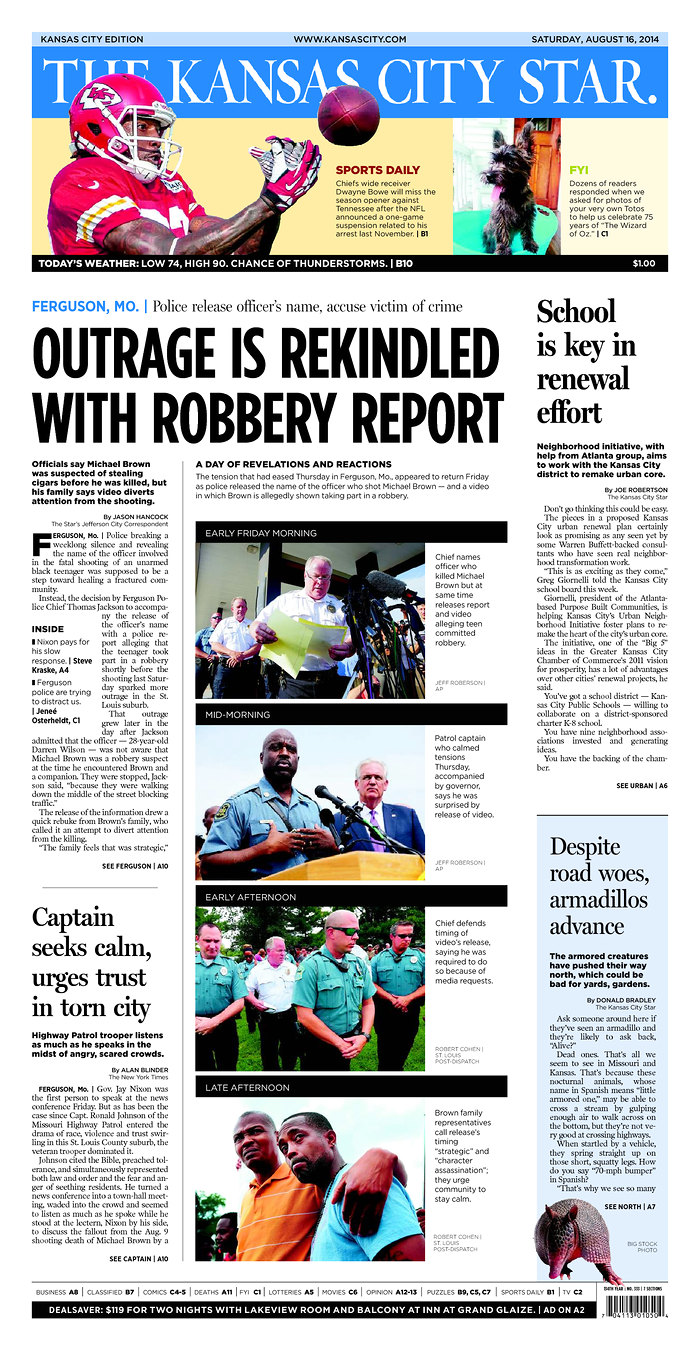
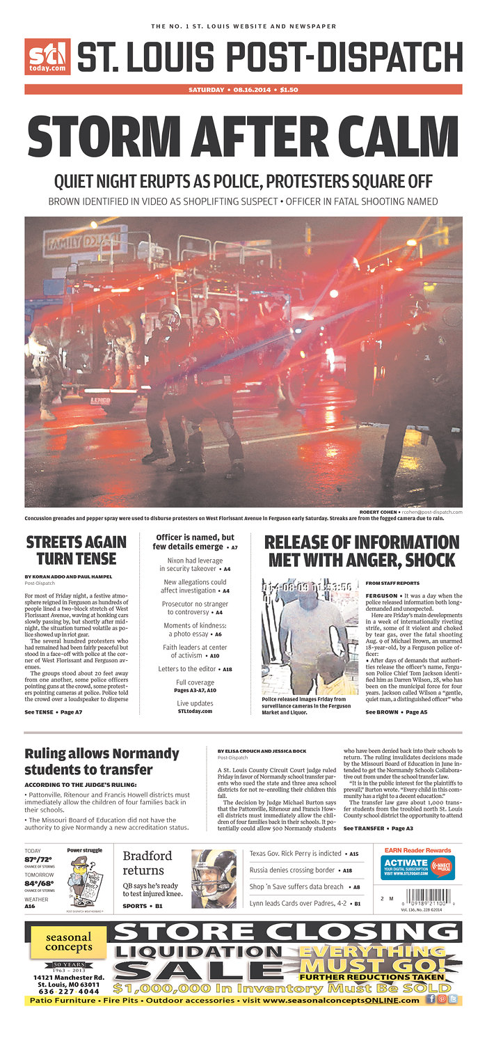
Front pages from The St. Louis Post Dispatch and The Kansas City Star with coverage of one of the major national stories of the week: the shooting of an unarmed African American teenager, Michael Brown, in Ferguson, Mo. It is a story that has attracted major attention from the media nationally. For the Post Dispatch and the Star, it is a local story, too.
I like the impact of the Post Dispatch's robust headline and photo, giving the story the prominence it deserves. It's a different approach for The Star, going with a series of equally sized photos, as opposed to one dominant one.
Both pages work and convey the significance of the story.