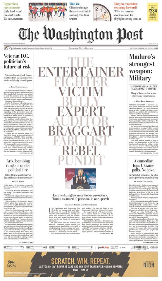
I like what the design team of The Washington Post has done with this front page special report. It is a fantastic example of using typography as the main visual on the page.
The story is told directly and effectively through the words in this cascading headline, with contrast of black and gray.
Who will not be lured to the story with this special treatment?
Bravo to the WaPo team for a job well done.

Pre-order The Story now

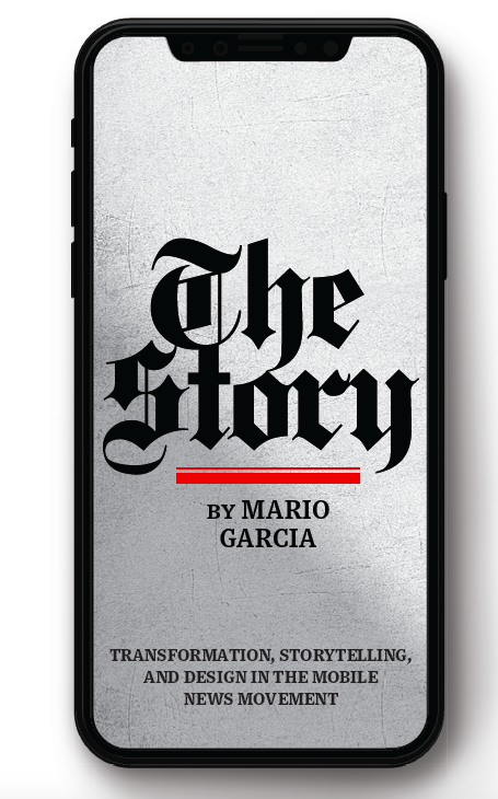
The newspaper remains the most powerful source of storytelling on the planet. But technology threatens its very existence. To survive, the Editor must transform, adapt, and manage the newsroom in a new way. Find out how, pre-orderThe Story by Mario Garcia, chief strategist for the redesign of over 700 newspapers around the world.
Order here:
https://thaneandprose.com/shop-the-bookstore?olsPage=products%2Fthe-story
TheMarioBlog post # 3009