Will be updating the blog throughout the day again today and welcome your Copenhagen UN Climate Change pages. Send them to me at mario@garcia-media.com
Updated Tuesday, Dec. 8 at 15:05 EST
TAKEAWAY: Newspapers from Sweden, Germany, Portugal and Croatia are the big winners in the latest European Newspaper Awards, a contest that rewards good design for the continent’s dailies. ALSO: Wikipedia opts for a thorough rethinking, and you can test the beta prototype. PLUS: We continue our coverage of how you cover Copenhagen’s UN Climate Change Conference.
Small format newspapers take the honors

European Newspaper of the Year—National Newspaper—Portugal’s i
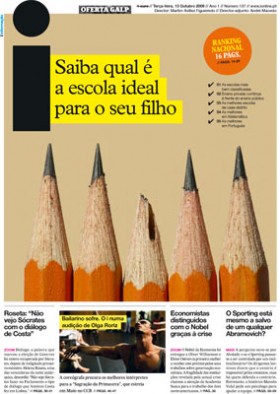
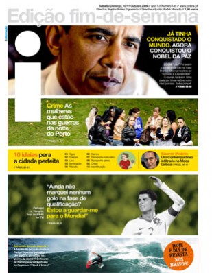
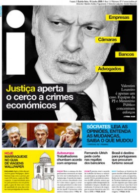
Portugal’s i becomes European Newspaper of the Year in the National newspaper category
European Newspaper of the Year—Local Newspaper—Sweden’s Smalandsposten
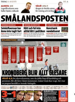
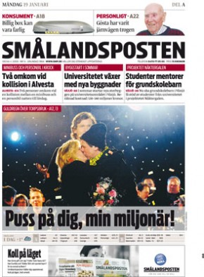
Sweden’s Smålandsposten ia the European Newspaper of the Year in the Local newspaper category
European Newspaper of the Year—Regional Newspaper—Germany’s Stuttgarter Zeitung
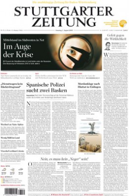
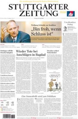
Germany’s Stuttgarter Zeitung is the European Newspaper of the Year award in the Regional category.
Special Judges’ Recognition: Croatia’s 24sata
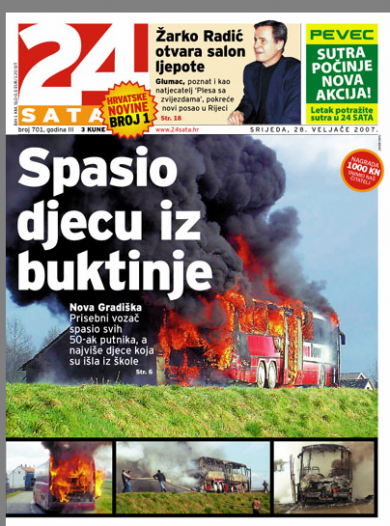
Special Judges’ Recognition: Croatia’s 24sata, created in 2005, and published in Zagreb
Four of the most attractive newspapers in Europe have been rewarded for their efforts in visual presentation at the 11th annual European Newspaper Awards. In each case, the winners come in compact formats, which seems to be the rule across Europe.
I am not surprised by any of the winners. As usual, the top prizes went to newspapers that foster good visual presentation beyond cosmetics, including Portugal’s crowd pleaser with the short name—-i——whose front pages with the horizontal strip images wowed the judges to receive the European Newspaper of the Year Award in the category of “national” newspaper.
Other winners:
Sweden’s Smålandsposten, published in Växjö became the European Newspaper of the Year in the Local newspaper category. This is a regional daily that excels in its use of photography and overall visual presentation, with surprising double pages that surprise. The front page offers good navigation and, again, impacts with its photogrpahy.
Germany’s Stuttgarter Zeitung won the European Newspaper of the Year award in the Regional category. A typical classic-style German daily, Stuttgarter Zeitung manages that difficult task of presenting tons of text with illustrations that lure readers to its pages.
Judges’ Special Recognition went to a Garcia Media project, 24sata, of Zagreb, Croatia, one that we are quite proud of, as we were there to create the original look when it was launched by Styria Medien AG, an Austrian media group, in March 2005. It has become a big success with those young readers that every publisher wishes to attract.
Wikipedia rethinks its site
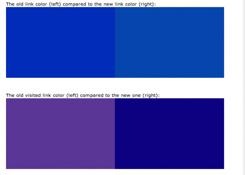
Deeper blue tones are part of Wikipedia’s proposed “rethinking” of its website
Reed Reibstein calls attention to an interesting item concerning Wikipedia’s “rethinking” of how it presents information. You can all go try a beta version of this rethinking. I did go there.
At first, I had to admit doing a couple of double takes to see what was new. However, once I took the time to analyze the many changes presented, I realized that this is more substantial a change than meets the eye.
Wikipedia has opted for functional changes rather than cosmetic ones. Even the color palette has received major consideration here, with deeper tones of blue which do make the website look more modern.
For Wikipedia, this know-it-all digital encyclopedia, its rethinking is more about making life easier for those of us who go there several times a day to find out about a who or a what. I think this initial approach accomplishes that.
My favorite part of the proposed new Wikipedia?
The relocation of the search bar—-one of the most used tools in this site. Ironically, the Wikipedia folks think that this is the one change that might trip up regular visitors. I don’t think so. It might jar you a bit the first time you try it, but then you will realize that this relocation facilitates use of the site in major ways. I believe that this placement has become standard on many websites and is where we look first when doing detective work online, which is the main reason to visit Wikipedia.
Copenhagen is the hot seat of climate change discussion
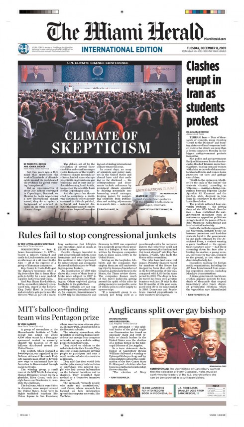
The Miami Herald’s front page today, Dec. 8
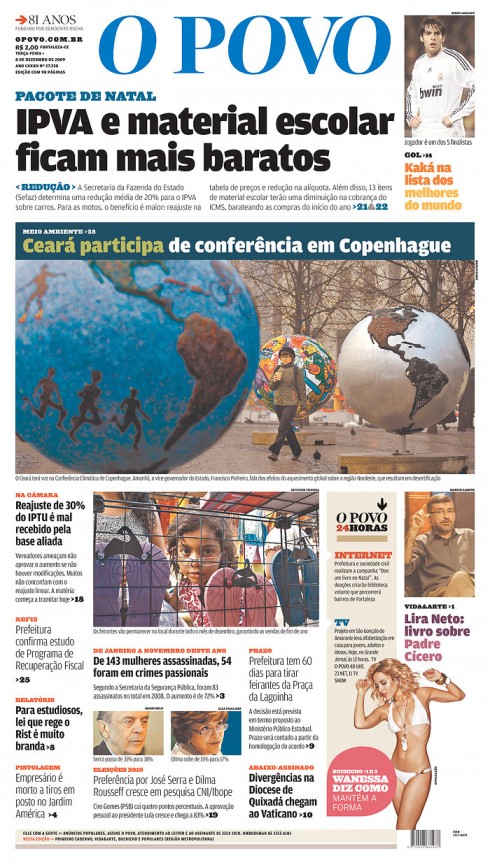
Brazil’s O Povo, published in Fortaleza
It is one of the most serious and important issues all countries deal with these days. Like the rest of the world, we are paying close attention to the proceedings at the United Nations’ Climate Change Conference in Copenhagen which runs through Dec. 18. We show you some pages covering that conference and hope to receive more from you in the days ahead.
Perfect climate for good, explanatory graphics
We continue to show you here pages of newspapers worldwide covering the Copenhagen conference with special sections, editorials and graphics.
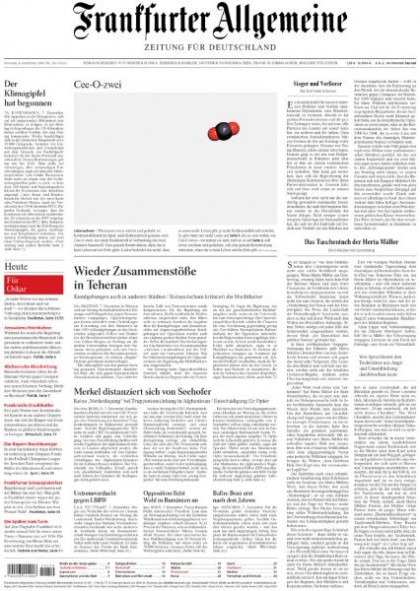
Germany’s Frankfurter Allegemeine’s front page
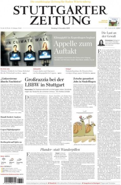
Today’s front page: Germany’s Stuttgarter Zeitung
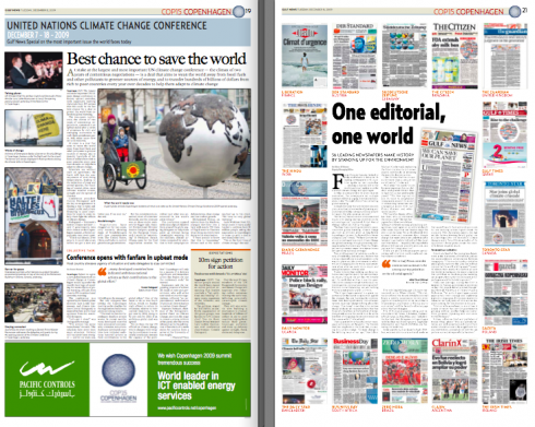
Today’s Gulf News of Dubai: page about the conference, and page capturing the many newspaper pages that joined The Guardian’s initiative yesterday to publish the same editorial on their page ones.
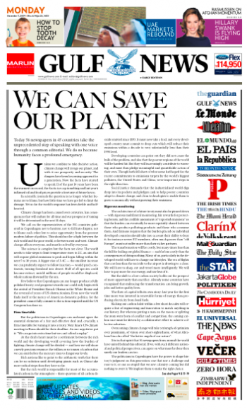
Front page of the Gulf News of Dubai: joining more than 50 other dailies with front page editorial
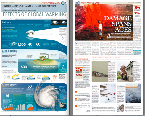
Two inside pages from Dubai’s Gulf News in special package about the Copenhagen conference on climate change
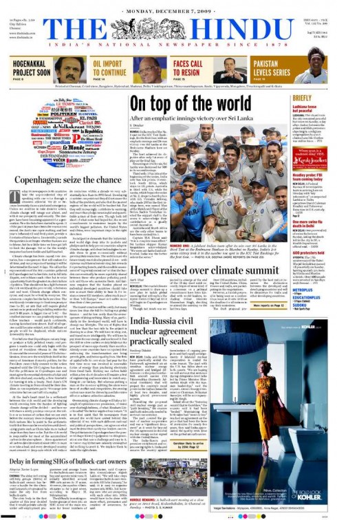
India’s The Hindu joins more than 50 newspapers worldwide with page one editorial on climate change
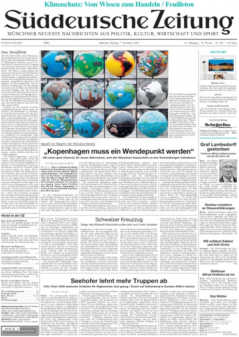
Germany’s Suddeutsche Zeitung
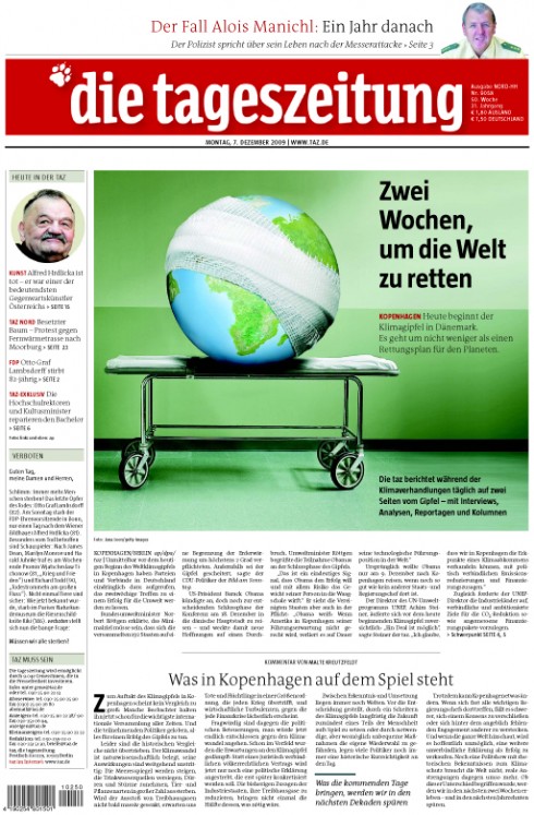
Germany’s Tageszeitung published in Berlin. Headline reads: Two Weeks to Save the World
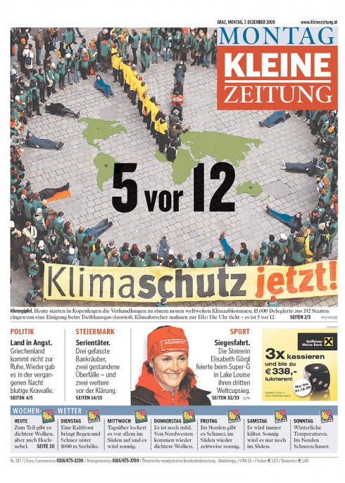
Austria’s Kleine Zeitung
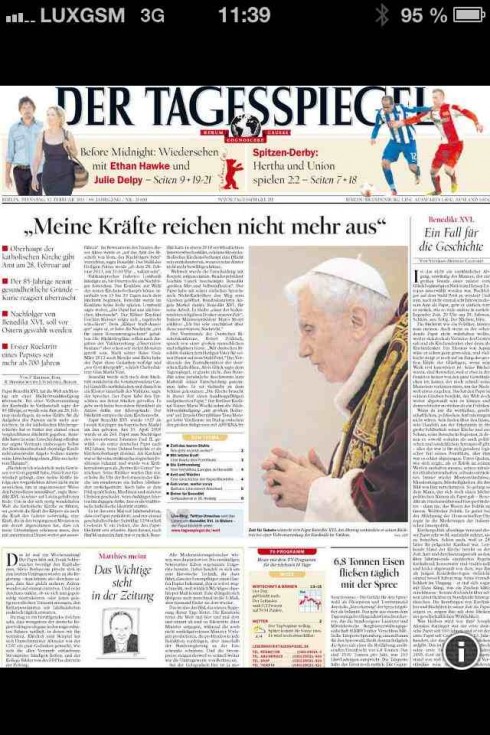
Germany’s Tagesspiegel published in Berlin
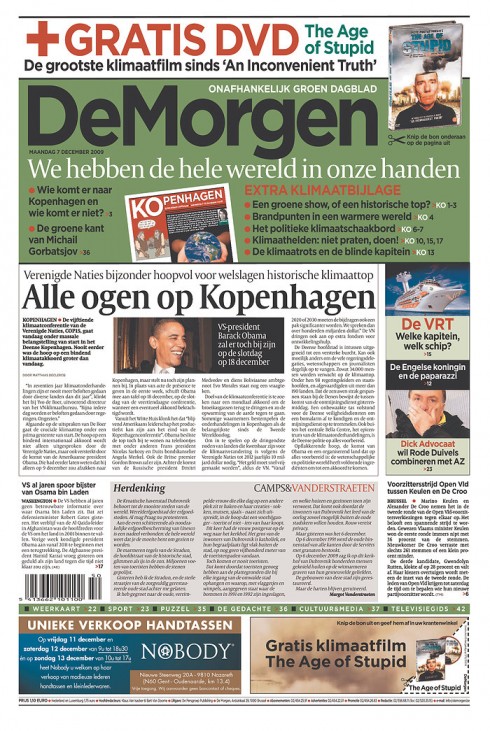
It is all green on the front page of Belgium’s DeMorgen today
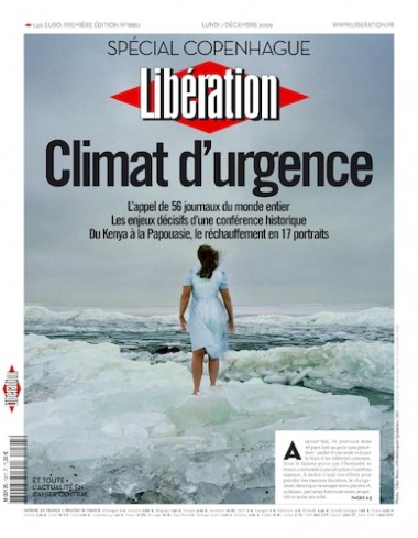
France’s Liberation
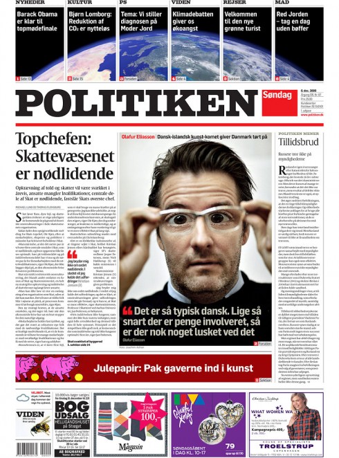
Here is front page of Copenhagen’s Politiken with top of the page advance promos to the Climate Conference
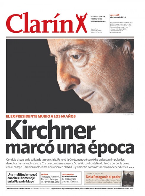
Argentina’s Clarin, published in Buenos Aires
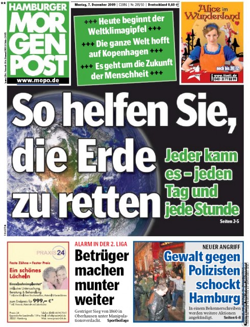
Germany’s Hamburger Morgenpost published in Hamburg
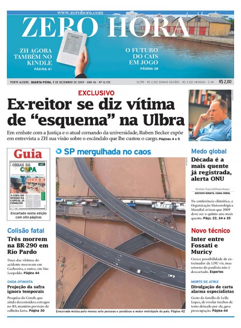
Brazil’s Zero Hora, published in Porto Alegre
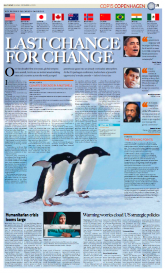
Opening page in the Gulf News introduces readers to the UN Climate Change conference
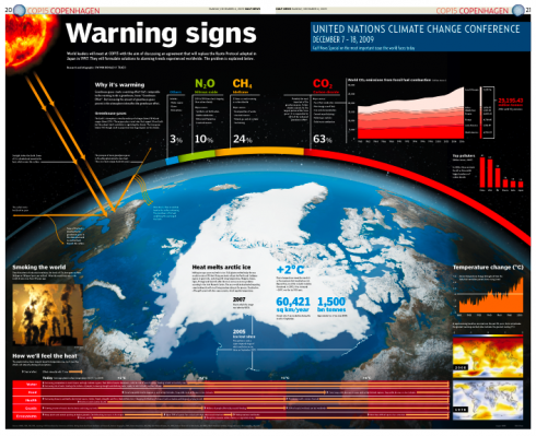
Gulf News graphic by Dwynn Ronald Trazo
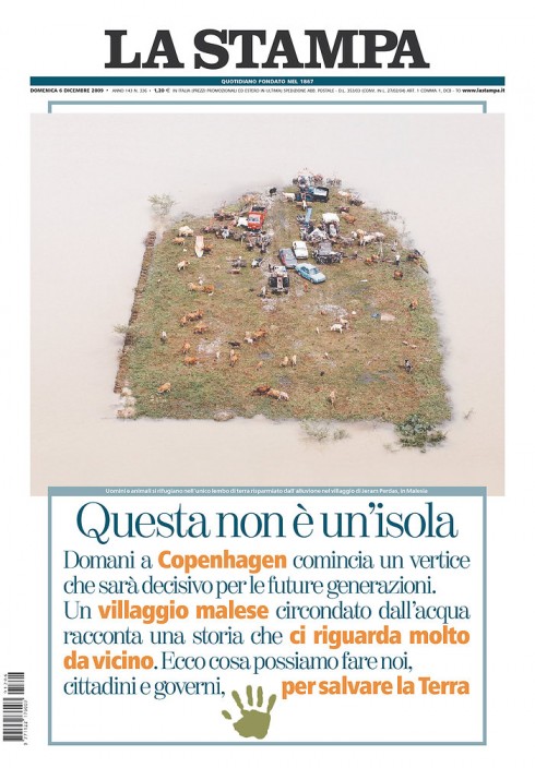
Italy’s La Stampa’s Sunday editions, leading with climate change story
The United Nation’s Climate Change Conference that opens today Dec. 7 in Copenhagen and runs thru Dec. 18 is attracting hundreds of ministers and officials from around the globe. At least 100 world leaders have said they are joining the forum, including US President Barack Obama, who will be present on the last day of the conference, Dec. 18.
This is a story where informational graphics can contribute immensely to explain the intricate climate patterns and how this situation affects all of us. I am hoping to see high caliber graphics and will love to show them here, including animated graphics.
I am interested in how newspapers cover the significant event, and the first two pages to arrive come from Dubai’s Gulf News. Design Director Miguel A. Gomez sends these pages and looks for your comments. The graphic that appeared in the Dec. 6 edition of GN is by staff artist Dwynn Ronald Trazo
Please share any interesting coverage/graphics of this UN Climate Change conference that you think our readers may enjoy viewing here.
Mario Garcia Jr discusses “tablets”

Mario Garcia Jr. discusses “tablets” in his blog just posted.
Titled “Thou shalt not get this “tablet” thing wrong”, Mario Jr. writes about tablets and similar gadgets:
…. make no mistake, something is coming, something that will change (once again) they way we experience media and the way we engage readers and users.
Go here for Mario Jr’s blog entry:
http://garciainteractive.com/blog/view/49/
TheMarioBlog post #433