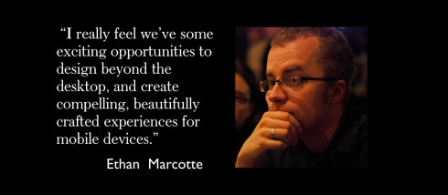
TAKEAWAY: Here is our three-minute interview with Ethan Marcotte, who worked closely with the team creating the new Boston Globe website. ALSO: Keep those questionnaires coming. Your thoughts and suggestions to improve the Garcia Media website are helpful to us.

Photo by Brian Warren
ETHAN’S BIO: “Ethan Marcotte is an independent designer/developer who is passionate about beautiful design, elegant code, and the intersection of the two. Over the years his clientele has included New York Magazine, the Sundance Film Festival, the Boston Globe, and the W3C. Ethan coined the term “responsive web design” to describe a new way of designing for the ever-changing Web and, if given the chance, will natter on excitedly about it—he even went so far as to write a book on the topic.
“Ethan lives in Cambridge, Massachusetts, and would like to be an unstoppable robot ninja when he grows up. Beep.”
I recently met Ethan at New Media Days in Copenhagen, where we both presented. He was part of the team behind the new Boston Globe website, which we have taken note of as an innovative and functional news site.
Mario: The new Boston Globe website continues to make waves, and people in this industry look at it as an example of how to integrate the various digital platforms. Now that it has been around for a month, what experiences have you had? What are users telling you?
Ethan: My own involvement with the Boston Globe ended once the site launched, but I reached out to Miranda Mulligan, the Globe’s digital design director, for her thoughts. She wrote:
Our first month’s traffic to BostonGlobe.com has been really fantastic… Much more than anticipated. User feedback has been overwhelmingly positive. We love to hear unprompted statements from users like “It just works” and the ability to access the content on all of their devices. We are still working through a number of challenges such as streamlining publishing interactive information graphics. So far we have only published one, but have another one coming this weekend. We are really excited for the potential and opportunity to push the nuances of story presentation. It has been a lot of fun developing an interaction based upon the width of someone’s browser and talking about how that might change “the story.”
So it sounds as though the reception’s been incredibly positive, and they’re continuing to evolve what they can do with a responsive framework. Speaking as a designer and as a Globe reader, I can’t wait to see what they do next.
Mario: It seems the industry is seriously moving towards HTML5 and Flash for Mobile in the future, and many say that it is also a web-future (browser) for the tablet . What are your thoughts on this?
Ethan: There’s obviously been some traction toward creating web-based experiences recently, the FT’s move toward a compelling mobile site coming immediately to mind. But personally, while I’m not a native app designer, I don’t place much stock in the “mobile vs. native” debate. Josh Clark had a fantastic post on the subject, suggesting that we should choose the approach that best meets the needs of a particular project or audience. In short: “it depends.”
I hope that doesn’t sound like too much of a non-answer. I really feel we’ve some exciting opportunities to design beyond the desktop, and create compelling, beautifully crafted experiences for mobile devices. Some of these will be web-based—some might even be responsive!—while others will be native. Personally, I’m most excited in working on the former, but the approach really needs to be tailored to the project.
Ethan’s blog post on The Boston Globe:
http://unstoppablerobotninja.com/entry/the-boston-globe/
Our previous blog posts about the new Boston Globe website:
The new Boston Globe website: innovative, functional, sets the pace
https://garciamedia.com/blog/articles/the_new_boston_globe_website_innovative_functional_sets_the_pace
News websites prepare for next generation: less is best
https://garciamedia.com/blog/articles/news_websites_prepare_for_next_generation_less_is_best/
Of special interest today
Steve Jobs wanted to help New York Times, struck up bond with Rupert Murdoch
http://www.poynter.org/latest-news/romenesko/150811/steve-jobs-wanted-to-help-new-york-times-struck-up-bond-with-rupert-murdoch/
Highlight: More of the inside story on The Daily: Isaacson writes that Jobs hated the initial design of The Daily, so he had Apple designers work on it. News Corp.’s designers tried again, and according to Murdoch, “ten days later we went back and showed them both, and [Jobs] actually liked our team’s version better. It stunned us.”
Publishers See Apple Newsstand Sales Surge, But Ad Sales Slow To Follow
http://paidcontent.org/article/419-publishers-see-apple-newsstand-sales-surge-as-ad-sales-slow-to-follow/
First paragraphs: Condé Nast is the latest publisher to claim a boom in digital magazine sales from the launch of Apple’s Newsstand two weeks: the publisher of Glamour, The New Yorker, Vanity Fair and Wired says that new subscription sales, per week, across all nine digital editions, was up 268 percent, with single copy sales up 142 percent compared to the previous eight weeks.
If other publishers are seeing the kinds of lift that Condé Nast is—and there’s no reason to think that there is something particularly unusual about Condé Nast’s titles compared to rivals like Hearst Magazines, at least at this point in Newsstand’s existence—it represents an initial validation of the demand for a separate area for periodicals, away from games like Angry Birds or social media apps like Instagram and Foursquare.
TheMarioBlog post #877
Starting to Rethink GarciaMedia.com
TAKEAWAY: We need your help: please fill out our survey about GarciaMedia.com to be eligible to win a forty-five minute Skype consultation with me. PLUS: A reflection on nearing 900 blog posts.

Our GarciaMedia.com survey: Enter here.
I can’t believe that TheMarioBlog will post its 900th entry in about twenty days. And to think that I was one of the last blog holdouts. In fact, I thought I was the last among my peers to start writing a blog. But my friend Ron Reason convinced me to do it during a two-hour session waiting to board a flight out of the Lagos International Airport. That was over three years ago, and now the blog has become a part of my daily routine—and I hope yours as well.
We at García Media are now in the process of rethinking our entire website, and I want to hear from you. What do you like about our current site, and what do you wish we would change? How do you visit us? And, while I know some of you, I want to learn more about those of you I do not.
To that end, we have prepared a short eight-question survey, which is available here. I would be grateful if you would consider filling it out. Or, if you’d prefer, send me an email at mario@garcia-media.com with your thoughts about the website.
In addition, one lucky person who fills out the survey or emails me about the website by 11:59 p.m. EST on October 31, 2011, will be randomly selected and receive a free forty-five minute consultation over Skype with me. We can discuss your publication or your personal portfolio—whatever you’d like.
Thank you all in advance for helping us to rethink GarciaMedia.com.