Welcome to GarciaMedia.com 5.0. As you may have noticed, today we’re introducing a new look for our company site that we hope meets not only your needs as visitors, but our business needs as well.
In redesigning our online presence we wanted a site design and interface that was more relevant to today’s new media consumers.
Site Evolution
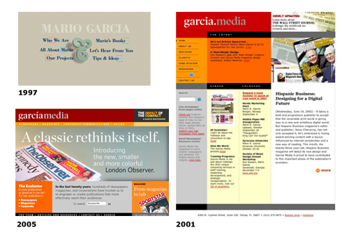
Since our first site in 1996, we’ve always based the decision to redesign on the evolution of the user experience. We’d like to think we were always ahead of the curve when we launched a new design, then on equal footing a short while later, and then way behind for the majority of the life of the design. This evolution happens pretty fast. Our last redesign was just in 2005, but already, we felt we needed a site that took advantage of new features the current internet usage requires.

Web Standards
On the design and coding front, we wanted a Web Standards based design. As this new blog evolves I’ll write more about Web Standards, but since we strongly endorse designing and building sites using these standards, it only seemed appropriate that our site reflect a design philosophy that delivers the “greatest benefits to the greatest numbers of web users” while being accessible to more people and more types of Internet devices.
Information Architecture
As for the content of the site, we were faced with the dilemma of having to serve two types of visitors—potential clients and the news design community. Having prided ourselves in being educators and storytellers, our early sites have always leaned towards being more informative and casual, offering detailed case studies, resourceful articles and personal insights into each of our projects. However, for the purposes of “selling” our services the site fell short somewhat. Except for potential clients who knew of our reputation for newspaper design, visitors interested in other services like web design or corporate communications could not figure how we could help them. So in the interest of commerce (read: doing better business) we decided we had to restructure our site in a way to not disappoint loyal visitors there to follow our work, while being more effective in guiding potential clients to our services.
We’ve developed a main navigation that highlights our key services, Print, Online and Mobile, with a short blurb on how we can help with each. Considering we’ve been developing and designing newspaper web sites since 1996 and still get “I didn’t know your company did web sites” from newspaper executives, we decided to give our newest and perhaps most exciting offering, mobile content/design, a prominent place on our site. This is an evolving service, and we’re just working with a few clients at the moment, but our team has spent the last few years preparing ourselves for what we think will be a quantum leap for news delivery. And this will happen sooner than later, with mobile usage already in the billions worldwide.
Blog
For those visitors who aren’t looking to hire, but enjoy reading about our experiences, projects or random thoughts, we’ve created a Blog that will be where we post that information. The blog has it’s own page for those that want to bypass the main homepage, and the RSS features let you stay updated on new entries. But what we like best about the blog (and I know we’re late to this game) is the ability for visitors to comment about what they’ve read, or ask questions. We’ll do our best to answer questions and encourage interesting (and respectful) dialogue on our site. We welcome the design, journalism, academic or any other communities to join ours and make this an interesting place to visit, if anything for the collective creativity and wisdom of the users themselves.
Of course, we welcome your comments on the new design. In fact, we encourage them. There’s still some work to do here and we’ll slowly be implementing new things and tweaks in the next few weeks.
Finally, what’s impressed us most about the web design community over the last few years is the spirit of sharing and collaboration that goes on. It’s with this spirit that our new site was created, working with the wonderfully creative U.K.-based designer, Mark Boulton and Web Standards guru and diverse designer Dan Rubin, along with the incredibly smart and efficient Alex Rubin producing the content management system that holds it all together. We look forward to continue working with this talented team in an effort to make the web a better a place to hang out. Our hope is the new GarciaMedia.com is a start.