Updated Sunday, Oct. 18, at 16:35 EST
TAKEAWAY: It is good to see American dailies getting more adventurous with advertising positioning PLUS: It’s Miller for The Washington Post AND: Design thinking and Tim Brown’s new book, Change by Design
COMING MONDAY: Download all of Pure Design!
Full book download Monday
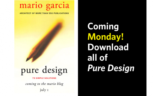
Fans of Pure Design will be able to download the entire conttents of the book here starting Monday.



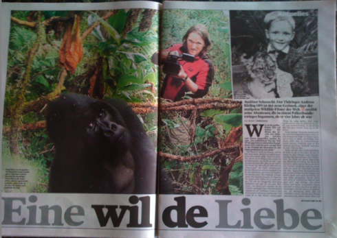
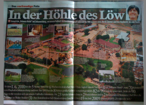
Jacky’s picks today from Bild am Sonntag run from love of a gorilla, to Amy Winehouse’s rumored romancing with boxer, to big hotel spread in Souith Africa.
Who is Jacky?
Jacky belongs to Frank Deville. The Luxembourg-based pooch is an “avid reader” of the German newspaper, Bild Am Sonntag. Every Sunday Jacky picks stories and interesting graphics in Bild Am Sonntag , the German newspaper.
Ad positioning gets adventurous!

Goya ad in El Nuevo Herald skylines into the text above.
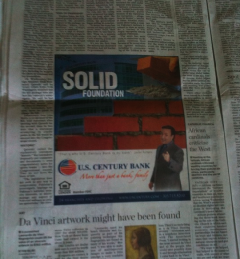
Island ad for US Century Bank in The Miami Herald
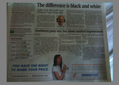
USA Today’s Money section front displays a skyline ad for Progressive insurance
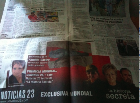
A double page towering ad in El Nuevo Herald for Univision’s Noticias 23
While in Miami staying with my mother in the hospital the past two weeks, I have been sampling the local Miami Herald in both English and Spanish, and one of the most noticeable changes here is in the placement of ads.
I am quite surprised to see how ads are displayed in nonconventional ways throughout. One finds island ads, towering ads, ads that sort of skyline into the story above it, and it is quite refreshing to see this degree of experimentation that simply was not there as recently as two or three years ago.
While these ad configurations are common in European and Asian newspapers, they have been slow to catch up with American dailies. The economic crisis has somehow opened the doors to this degree of experimentation with ads. Good thing.
New look for The Washington Post
The waiting is over. The much awaited unveiling of the new design of The Washington Post premieres Monday. Those with insight information report that the legendary capital daily is trading its trademark font, Century Old Style, for the trendier and more frequently used Miller , a surprise to those who expected perhaps a newly customized font especially crafted for the Post.
For an insider’s detail, go to the Hank Stuever blog. Hank is a Washington Post’s reporter with a fondness for Century Old Style. His posting, titled So long, ol’ Century. Hello, Miller Time., appears somewhat nostalgic:
For a long, long time, I considered Century Old Style to be the best way to read newspaper work. Maybe because I always wanted to work at the Post. I’ve become so used to seeing my work set in that font over the last 10 years that it’s difficult to imagine anything else.Well, starting Monday, it will be in something else. We’re switching to a font called Miller.
Looking at our craft from a different perspective
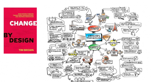
The new book, Change by Design, by Tim Brown, offers dozens of examples to prove the value of design thinking. The parallels to our media design are obvious. I highlight some.
I am half way through a most provocative book titled Change by Design, by Tim Brown, the CEO and president of IDEO, ranked among the world’s top ten most innovative companies. Among IDEO”s achievements: the first mouse for Apple, and the Palm V.
Brown’s book excels because he manages to combine theory with clearly presented examples of case studies, or sometimes just passing references to projects in which he and his team have been involved. He writes with emotion and intellect, and I find myself highlighting thoughts for which I can find immediate applications in our media design world.
I also found myself expressing agreement with my head, as I had been in identical situations over the past 40 years consulting with more than 550 media organizations worldwide. Brown described his experience with the design of a new bike, but it could have been that one weekly magazine or the conversion from broadsheet to tabloid for a newspaper somewhere. “Eerie,” I found myself saying about the very precise and identical situations.
I hope to discuss some of my “highlighted statements” in this blog, but must do so through a series of postings.
Brown’s book is all about design thinking, the centerpiece of Brown’s theories, and one that rings perfectly familiar for all of us in the creative fields of design—-regardless of what is being designed.
First, a definition of “design thinking,” according to Brown:
Design thinking begins with skills designers have learned over many decades in their quest to match human needs with available technical resources within the practical constraints of business……Design thinking taps into capacities we all have but that are overlooked by more conventional problem-solving practices. It is not only human centered; it is d of itselfeeply human in and of itself. Design thinking relies in our ability to be intuitive, to recognize patterns, to construct ideas that have emotional meaning as well as functionality, to express ourselves in media other than words or symbols.
As I read the introductory chapter of Brown’s book, I make a note on the margin of the page:
In our business of designing newspapers and magazines, we often use design as an end in itself. We create models. We test prototypes. We tweak. We implement. We have done this for decades. In the process, perhaps we failed to see that it was not the newspaper or the magazine that needed to be redesigned, but the industry as a whole.
Design thinking emphasizes this type of thinking, or as Brown describes it “the power of design not as a link in a chain, but as the hub of a wheel”.
Those with a traditional definition of design in their system will be slightly shocked to read that Brown’s concept of design thinking is “about more than style”.
The crisis in which our industry finds itself right now is the most opportune time for us to pull ourselves out of our comfort zones
(read “media designers”), to transform ourselves into design thinkers, taking design upstream. Sort of innovation riding on the coattails of survival. Not a bad thing.
Note: I am advancing rapidly in the reading of Brown’s book, and I hope to post several blog entries drawing parallels between Brown’s experience in the world of industrial/business design——he and his team find themselves creating kitchen gadgets, or a low tech weekend bicycle—-and its very appropriate connection with all that we do as we design media.
It would be fascinating to take Tim Brown along on one of our projects. His book emphasizes the importance of teams, so I can see how his presence in a media design project could bring another way to look at the process. For so many editors and designers who work following linear thinking, Brown could probably suggest what he refers to as “the mind map”—while linear thinking is all about sequences, he writes, mind maps are about connections.
Follow me at www.twitter.com/tweetsbydesign
Follow the Marios

Two Marios. Two Views.
Follow Mario Jr. and his blog about media analysis, web design and assorted topics related to the current state of our industry.
http://garciainteractive.com/
Visit Mario Sr. daily here, or through TweetsByDesign (www.twitter.com/tweetsbydesign)
In Spanish daily: The Rodrigo Fino blog
:
To read TheRodrigoFino blog, in Spanish, go:
https://garciamedia.com/latinamerica/blog/
TheMarioBlog post #398