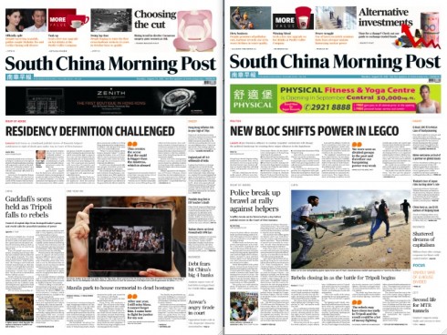
TAKEAWAY: It was part of our discussion at the South China Morning Post today: how do we handle the placement of ads on Page One? And what role does aesthetics play when the ad is at the top of the page? This is our third report from Hong Kong.


Advertising was not supposed to be at the top of our agenda as we reviewed three months of South China Morning Post editions here.
However, since the weekend when I arrived here, I had noticed that one of the Page One advertising positions that we had created in the rethinking of the newspaper was now apparently sold on a daily basis. Indeed, good news for the advertising department and for any newspaper these days, when coming across advertisers seems to be a challenge, to put it mildly.
However, not all ads are created equal.
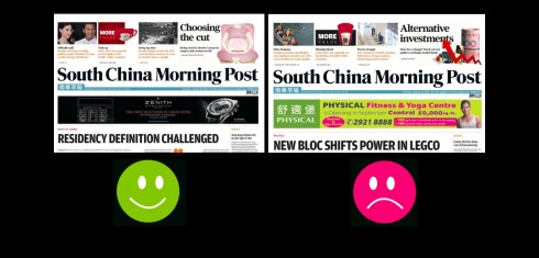
And some days, the South China Morning Post sports a classy, black ad which enhances the space and does not disturb the rest of what happens on it. On other days, however, there seems to be an ad which resembles a morning fruit salad, with bright colors not necessarily out of a good palette, and, indeed, in your face.
The editors are not very happy about it, and, obviously, the question was posed to me, as the person who created the various Page One ad alternatives.
I don’t like it either, I told them.
When advertising—-such as the straps seen here—- appear at the very top of the page, it is mandatory that the newspaper and the advertising agency (advertising client) agree from the start that the newspaper will have the final approval for an ad that appears so prominently. If that does not happen, then one risks that the tutti frutti style ad will creep its way onto the space between the newspaper’s logo and the rest, as you can see here.
This is work in progress. This is a discussion that continues. Stay tuned for more.
Previous blog posts about the South China Morning Post:
South China Morning Post: new beginnings in a new Hong Kong, new China
https://garciamedia.com/blog/articles/south_china_morning_post_new_beginnings_in_a_new_hong_kong_new_china
On the fourth day: South China Morning Post design evolves
https://garciamedia.com/blog/articles/on_the_fourth_day_south_china_morning_post_design_evolves
The marketing of the South China Morning Post relaunch
https://garciamedia.com/blog/articles/the_marketing_of_the_south_china_morning_post_relaunch
South China Morning Post: Three Months after its Rethinking
https://www.garciamedia.com/blog/articles/south_china_morning_post_three_months_after_its_rethinking
Of special interest today:
– USA: The Daily Dot wants to be a small town paper for the entire Internet
http://venturebeat.com/2011/08/22/daily-dot-launch/
First paragraph:
The biggest hurdle to enjoying The Daily Dot, a fun new online news site that launches today, is that its premise is based on a bad metaphor: The Internet is a community and The Daily Dot is its local paper.
– Magazines Flex Their Apps—But Will They Make Any Money From Them?
http://www.thewrap.com/media/article/magazines-wrestle-best-app-strategy-30204
First paragraph:
Beach-goers this summer may have noticed that their favorite magazines—from Time to Vanity Fair to Esquire—have shiny new tablet editions