Some of the creations that have made the Spanish chef Ferran Adria famous
Ferran Adria is probably among the most creative chefs ever. Restaurant Magazine referred to El Bulli as the best restaurant in the world. Behind its success, it was Adria’s constant pushing of the boundaries of how food could be prepared and enjoyed. From presenting artichoke as rose petals to frozen olive juice, he revolutionized the gastronomic world. He transformed how ingredients could be utilized.
Then, he decided to close his forever booked restaurant to recharge his batteries and think of new projects.
In an interview that appeared in The New York Times last weekend, Adria offers glimpses of what he is plotting next: looks like a foundation where gastronomic creativity can be given free rein.
It is all about creativity in the kitchen and elsewhere
You don’t have to have an interest in cuisine, or even cook at all, to be interested in Adria and his thinking. For those in design, the lessons are there to learn from Adria’s approach to rethinking food and how we prepare it and present it.
Adria’s restaurant, El Bulli, operated only six months a year and served just one meal a day. Then it closed. In fact, there is one line from his Times’ interview that stayed with me. It's the one where Adria admits being scared of repeating himself.
“Can you imagine this pressure?” Adria said. “You cannot.”
That statement is at the heart of what many creative people feel at some point in their career: how can we not repeat ourselves? Which prompts the question: what is the difference between a style that a designer may develop to become his signature and a repetitive pattern that he incorporates in all of his work?
When it comes to visual journalism and the design of publications, websites, apps, etc., style is not as important as respecting the brand one is designing for while creating a design approach that is appropriate to the content.
We all have sat through discussions with colleagues where a certain piece of work appears, and someone will attach it to a name of a designer. Perhaps one designer emphasizes a certain typographic font through all of her work, while another goes for a specific use of color, or a highly engineered grid pattern for use of white space. Trademarks, so to speak, become a designer’s calling card. But, should media designers indulge in this type of artistic license to brand themselves as such?
It is a difficult question to answer. I believe that most of us adhere to certain principles of what works, and we apply those to whatever we do, often unconsciously. If they become part of a style, then the threat of “repetition” is there. I believe that one can adhere to principles such as making the material easy to find, easy to navigate and easy to read, but use different strategies to get there.
As I see it, our work should reflect the brand that we are designing for and not that of the designer.
While Ferran Adria can afford to close his shop and take time off to reinvent himself and recharge his creative engine, most of us can’t afford that luxury. But we can stop here and there, catch our breath and study our own work before we get started with that next project.
The start of a new year is an opportune time to do so.
It’s a tabloid format world

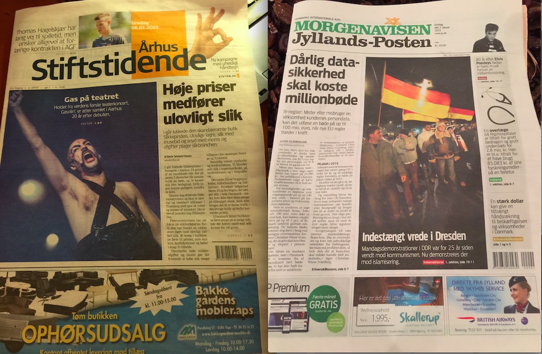
I find myself in Arhus, Denmark, this week, and it is a sort of nostalgic trip to this quaint Danish city north of Copenhagen. I remember my time here more than 20 years ago to redesign the Arhus Stifstidende and to do workshops for the other daily, Jyllands Posten. Both were big broadsheets then, but now have converted to tabloid, as have a majority of newspapers throughout Europe and almost all in the Scandinavian countries.