TAKEAWAY: The Spanish daily ABC shows that it is possible to design a front page that makes us take a second look. PLUS: Out of the mouth of babes
Pages we like


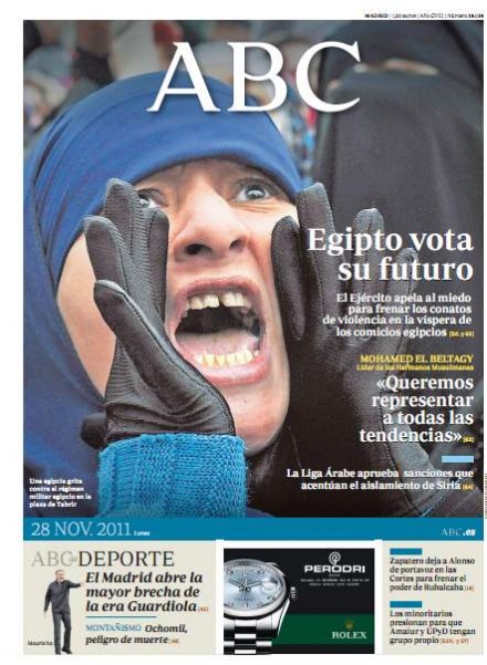
Here is how the regular front pages of ABC look like
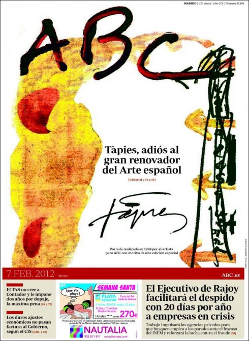
The Spanish daily, ABC, carried a distinctive and colorful front page Wednesday, a tribute to the artist, Antoni Tapies, the Spanish Catalan painter sculptor and art theorist, who died Feb. 6. He became one of the most famous European artists of his generation. In 1998 he created this front page for ABC in 1998 and the newspaper’s editors decided to publish it again today as a tribute to the artist who was referred to as “the great innovator of Spanish art”.
I like the idea of surprising readers while making an interesting point, as in the case of this tribute. Most interesting, how the logo of ABC was drawn, and integrated into the playful, art oriented front page.
After posting the blog last night, I have found out that there was total reader involvement in the selection of this front page. ABC editor Bieito Rubido Ramonde Tweeted several pages to allow readers to make the final choice. Good idea. The ultimate reader involvement, for sure.
What is a newspaper?
Here is one for definitions out of the mouths of babes.
Today, while I walked my grandson Frankie to the playground in Tampa, there was a newspaper lying on the floor of my neighbor’s driveway.
I asked Frankie, who is 4 years old: what is that?
“A newspaper,” he answered, which made me very happy.
I immediately asked him: what is a newspaper, Frankie?
“Something that comes from a bicycle,” he answered.
Obviously, Frankie has seen newspapers being distributed from a bike in his neighborhood, thus the association.