TAKEAWAY: Take a look at this front page of today’s Il Secolo XIX, of Genoa, Italy. The use of this lead mini poster allows the editors to display two important stories of the day, without the old dilemma: which one goes higher than the other? We share the page and our comments with you. PLUS: New An Nahar pages of today
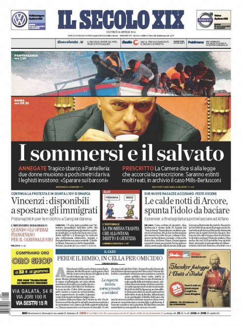
From time to time we discuss our dislike of using the term “the newspaper of the future” or even more the “the modern newspaper of today”.
And, although the page one from Il Secolo XIX that appears here does not pretend to be either, I must admit that when I received the pdf this morning from Il Secolo’s design director, Massimo Gentile, my initial reaction (over my first cup of coffee here at home in Tampa) was: indeed, here we have a front page that abandons traditions—-one story here, one story there——and uses storytelling as the glue that holds the package together into a six column mini poster.
Here is what the stories are about, in the words of Massimo:
“Here in Italy we had two major events happening that we had to cover: the death by drowning of two illegal immigrants following the capsizing of the boat that was bringing them into Italy. At the same time, Parliament approves a law drastically shortening the time for processing certain crimes, this at a time when our own Prime Minister, Silvio Berlusconi, is being tried for alleged corruption. So now, this new law saves Berlusconi.
As you can see, here we have a country with a big economic crisis taking place, then a social crisis with hundreds of immigrants arriving at our ports from Africa, but Parliament, once more, seems more preoccupied with saving the Prime Minister first….”
The headline: The drowned and the saved
Massimo adds that editors are beginning to realize that the “mini posters” that we created when working together on the last redesign of Il Secolo XIX earlier this year, are more than just a design strategy. “They truly allows us to experiment with storytelling in a different one, to create very modern looking and vibrant page ones.”
Indeed, and I see also how the concept I have embraced and used as the foundation of all my work for over 25 years, what I call, WED (Writing-Editing-Design) is the basis of how these stories and visuals——great photo use here, by the way—-come together to create one of those 10-second visual moments that tell the stories at a glance.
By the way, if you follow the progress of our mini poster concept for Il Secolo (see links below), you realize that, under Massimo’s able direction, what we started, the seed we planted when we thought the mini poster was the next logical step in the graphic evolution of Il Secolo, has now been enhanced and taken to the next level.
That is what we all expect when we introduce new ideas: the start is good, but the evolution is what makes it better, stronger, more permanent.
Note: In addition to Massimo Gentile and myself, our Garcia Media art director, Christian Fortanet, collaborated with us as we introduced mini posters to Il Secolo XIX. And, of course, there is no WED strategy implemented without the vision of an editor who thinks visually and wants storytelling to take priority. At Il Secolo XIX, we have that editor in Umberto La Rocca.
Note2: Massimo adds, “I have to admit that some of the editors last night were not so sure, thinking that the design was too modern for them.”
More on Il Secolo XIX and how we created those mini posters for page one:
Il Secolo’s mini poster prototypes
https://garciamedia.com/blog/articles/il_secolo_xixs_mini_poster_prototypes
A day for follow ups on mini posters, logos
https://garciamedia.com/blog/articles/a_day_for_follow_ups_on_mini_posters_logos
Read Massimo Gentile’s blog (in Italian):
http://mediumitalic.blogspot.com/
Today’s An Nahar pages
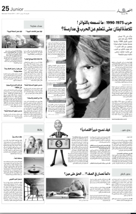
This is a follow up to our blog posts of the past two days with the launch of Lebanon’s An Nahar’s new look and content. Here is today’s front page.
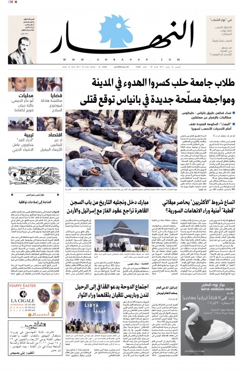
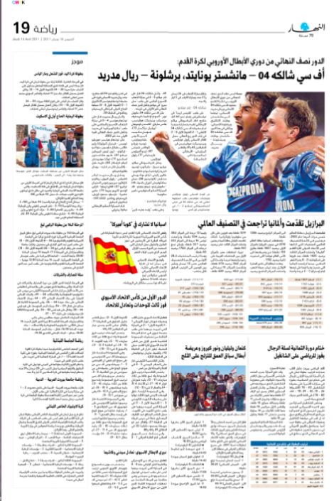
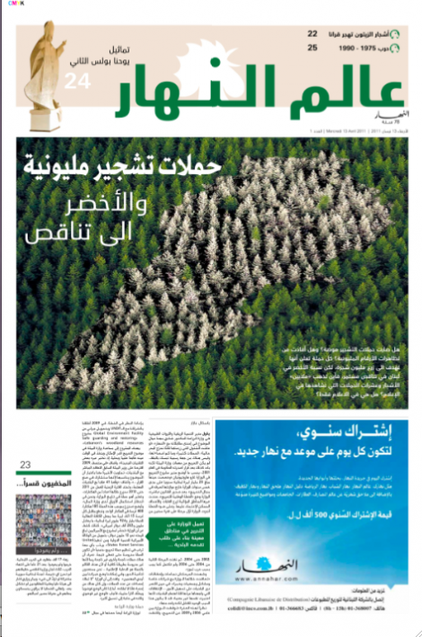
Previous posts:
https://www.garciamedia.com/blog/articles/an_nahar_and_hindustan_one_day_after_launch_of_new_look
Of interest

If you take your iPad with you on the road, then this is must reading. Tons of tips on how to use the iPad while traveling.
http://ngadventure.typepad.com/blog/2011/04/ipad-2-for-travel-more-packable-battery-tricks-new-travel-apps-trip-videos-more.html
USA: Online Ad Revenue Continues to Rise
http://mediadecoder.blogs.nytimes.com/2011/04/13/online-ad-revenue-continues-to-rise/
Dow Jones to roll out new tablet app
http://www.thedrum.co.uk/news/2011/04/12/20627-dow-jones-to-roll-out-new-tablet-app/
USA: Magazine Launches Double in Q1 2011
http://www.foliomag.com/2011/magazine-launches-double-q1-2011
USA: Who needs newspapers? One couple’s answer
http://newsosaur.blogspot.com/2011/04/who-needs-newspapers-one-couples-answer.html
Flexible, newspaper-style tablets inching closer
http://www.pcauthority.com.au/News/254343,flexible-newspaper-style-tablets-inching-closer.aspx
Publishers should follow Amazon’s lead and offer subsidized tablets
http://www.poynter.org/latest-news/media-lab/mobile-media/127742/publishers-should-follow-amazons-lead-and-offer-subsidized-tablets/
IPad and old media: a shotgun wedding
http://www.marketwatch.com/story/ipad-and-old-media-a-shotgun-wedding-2011-04-13
Switzerland: Ringier launches the collection, its first globally-distributed mono-thematic tablet magazine.
http://www.ringier.com/index.cfm?id=3466&articleID=14186&detail=true
International Symposium on Online Journalism – 2011 Symposium Presentations
http://online.journalism.utexas.edu/slides.php?year=2011
WoodWing’s Xperience seminar May 24-25

I am honored to be one of three keynote speakers at the upcoming WoodWing Xperience seminar in Amsterdam May 24-25
I did a previous keynote for a WoodWing Tour function in London in 2010.
For those interested in attending, here is more information:
May 24-25, 2011, Amsterdam, Netherlands
http://xperience.woodwing.com
WoodWing launches Open Format for Interactive Publications
The launch of ofip is an initiative of WoodWing Software aimed at developing a standardized data format for interactive publications, such as digital magazines, newspapers, books and brochures.
For more information:
http://www.ofip.info/Open_Format_for_Interactive_Publications/Home.html