Today’s blog will be updated with more information throughout the day. Stay tuned
Update 4: Moscow, 15:20h
TAKEAWAY: Today we catch you up with developments on projects about which we posted blog entries before. PLUS: 40 Years/40 Leassons: Culture and its effect on our personal and professional lives. AND: Great expectations about Murdoch’s Daily, the first newspaper created just for the iPad!
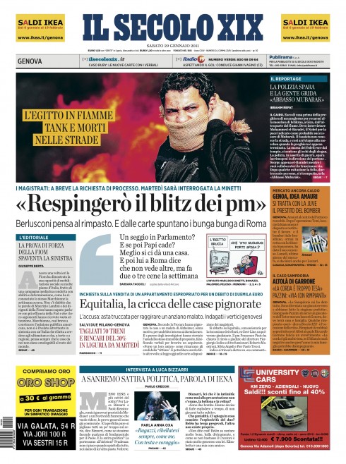
Mini poster on Page One
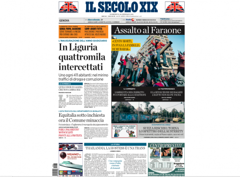
Front page of Il Secolo XIX of Genoa using mini poster concept.
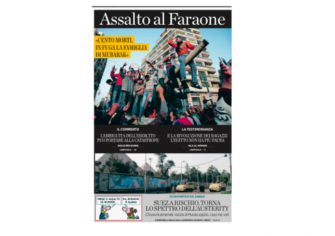
Close up of Il Secolo’s mini poster about the crisis in Egypt
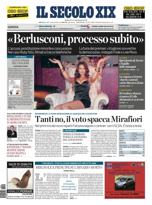
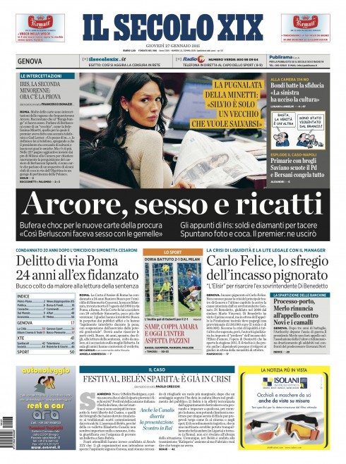
Mini posters come to the rescue as Il Secolo covers the Berlusconi sex scandals
The horizontal mini poster crowning the front page of Il Secolo XIX
In Italy, Il Secolo XIX continues to use the concept of the mini poster on its front page to group related images, headlines and texts and create a mosaic where the story of the day is presented visually at a glance.
I hear from Massimo Gentile, design director at Il Secolo, that his newspaper now prepares to officially introduce the mini poster concept, which we created together less than six months ago, as a part of the daily front page design.
“This is an economical way to present a lot of information in a small space,” Massimo writes me. “For example, in this page about the crisis in Egypt, we had a lot of good images and we are able to combine them, and give readers a visual overview of what happened, before they read anything.”
When we first discussed this concept together, I explained to the editor of Il Secolo, Umberto La Rocca, that I saw his very active front page as containing many good stories, but that sometimes the main lead piece of the day got lost in the middle of it all. Italian newspapers are highly caffeinated, with headlines and summaries running everywhere——sort of like the streets of Genoa or Milano themselves. The mini poster offers the opportunity to systematize the chaos a little bit, to group things visually for readers.
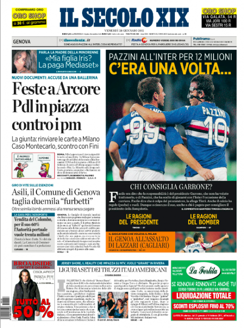
The headline plays a key role in the design of a mini poster. Take a look at the exaample above. Story is about two local football stars that were sold to big European teams. The headline reads: Once Upon A Time…..
Our practice “mini posters”
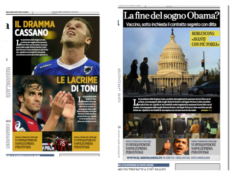
Sample practice mini posters here: A sports story inside is packaged as big mini poster promo on page one (left); a mini poster packages the US November Elections, with headline—End of the Obama dream?
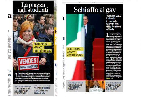
Notice that a mini poster can highlight a single story promo (student protest, left); or package an analysis of a political story (Berlusconi)
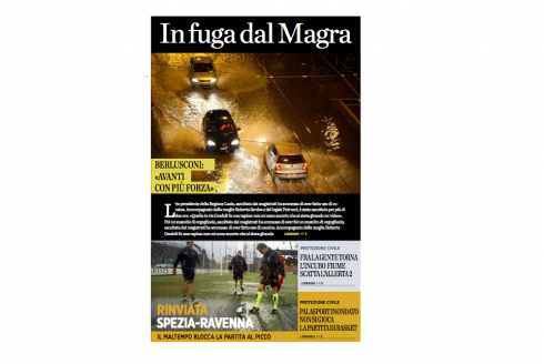
Even a local police story can benefit from the visual groupings of a mini poster
For Il Secolo, and we shall see this as the style becomes a permanent part of the front page, the idea is to use the mini poster NOT just for the big story of the day, as is the case in this example, but also to highlight photo groupings for stories that may not be the lead, but that have interesting visuals; or to use the mini poster as a giant promo to a good story inside.
With the help of our Garcia Media art director, Christian Fortanet, Il Secolo will prepare next week for the official “launch” of the popular mini poster on page one of Il Secolo XIX.
We will update you.
Previous Il Secolo blog posts:
https://garciamedia.com/blog/articles/for_genoas_il_secolo_xix_new_smaller_format_and_stile_italiano/
https://garciamedia.com/blog/articles/il_secolo_xix_three_days_after_relaunch
https://garciamedia.com/blog/articles/snd_design_contest_part_2_we_chat_with_steve_dorsey/
The Al Shabiba project revisited
It was early 2010 and Oman’s Al Shabiba, the Arabic language daily, was getting a total remake, rethink and redesign. The change of the logo was one of the most fascinating aspects of that project for all of us. Now, almost a year later , we revisit Al Shabiba’s pages and are happy to hear that there has been no major complaints either about the design or the controversial logo change.
What followed that redeisgn was a web reality show—-typography style—-with readers of the blog chiming in with comments about the Al Shabiba logo and the changes we were proposing. It was the first time that I incorporated the changes that were taking place, in a work in progress, into the blog for reader consideration. Fun it was.
So now, almost a year later, the logo has been “retouched” but it holds steady. There is no longer any controversy, and, as always happens in these cases, the readers of the newspaper probably have no reminiscing of how the “old” Al Shabiba logo looked like.
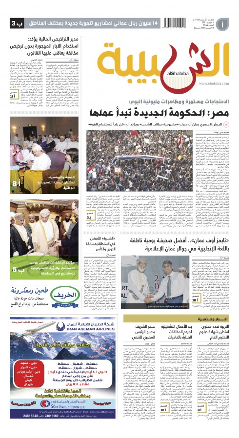
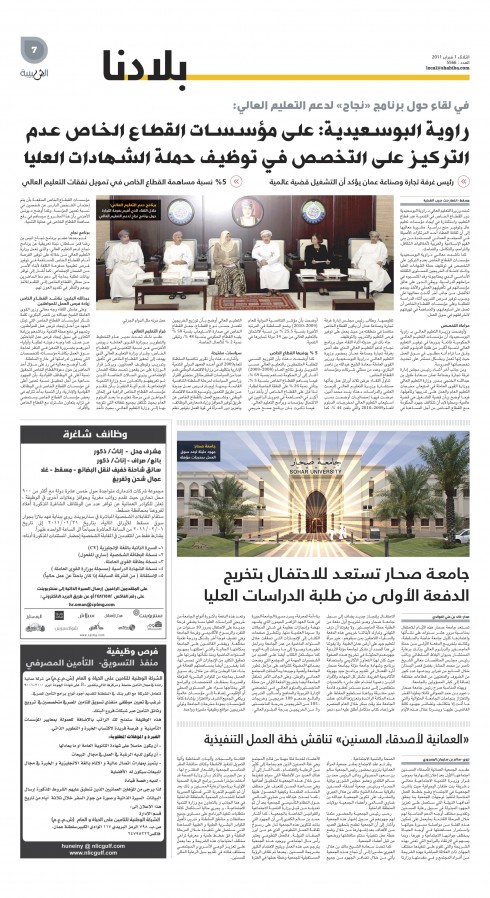
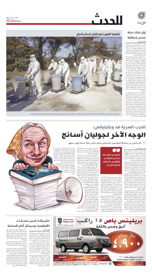
Recemt Al Shabiba pages
Al Shabiba design director, Osama Aljawish, updates us with these pages from recent Al Shabiba editions.
For previous Al Shabiba posts:
https://garciamedia.com/blog/articles/monday_in_muscat_readying_two_newspapers_for_april_4_launch
https://garciamedia.com/blog/articles/tuesday_report_from_oman_opinions_vary_on_al_shabiba_logo_and_we_continue/
https://garciamedia.com/blog/articles/moschino_it_is_the_best_youngest_logo_for_al_shabiba_wins/
https://garciamedia.com/blog/articles/basic_ingredients_for_ipad_design_stay_close_to_the_basics_plus_more_times_
Today is D (as in Daily) Day

The much awaited arrival of Murdoch’s Daily—-the first ever newspaper created just for the iPad——is today.
I don’t remember such mystery surrounding a newspaper project since USA Today’s launch in 1982.
This will be the main topic of discussion for media blogs globally for the next few days, and we, too, look forward to sampling the first edition.
TheMarioTip: Be on the lookout for The Daily’s sports section. Insiders tell me it is the one part of the new product that has the hook! Will continue to report on the subject.
Here is an interesting headline to get you the pros and cons of The Daily and its potential success:
The Daily is Doomed: The Daily is a Hit
http://mediamemo.allthingsd.com/20110202/the-daily-is-doomed-the-daily-is-a-hit/?reflink=ATD_yahoo_ticker
For a peek at who is who in the Daily cast, turn to the Poynter website:
http://www.poynter.org/latest-news/romenesko/117250/meet-the-staff-of-murdochs-the-daily/
Today’s iPad app “pop up” moment

One pop up moment from Germany’s Bild’s iPad app today, contributed by our TheMarioBlog correspondent in Luxembourg, Frank Deville:
Follow this pop up moment: German football player wanted to change teams, but lost his chance. Why? A malfunctioning fax machine. The guys at Bild’s app took the story and ran with it.
See the action here:
TheMarioBlog post #705
40 Years/40 Lessons #11: Culture.
TAKEAWAY: This is part 11 of my occasional series 40 Years/40 Lessons, which I call a “sort of career memoir” capturing highlights and reminiscing about what has been a spectacular journey for me, doing what I love most. Today’s segment: all about the impact that culture has had for me personally and professionally.
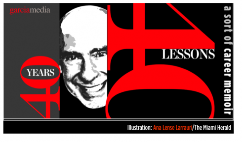
Illustration by Ana Lense Larrauri/The Miami Herald

Bicultural, multicultural
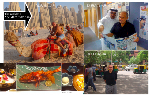
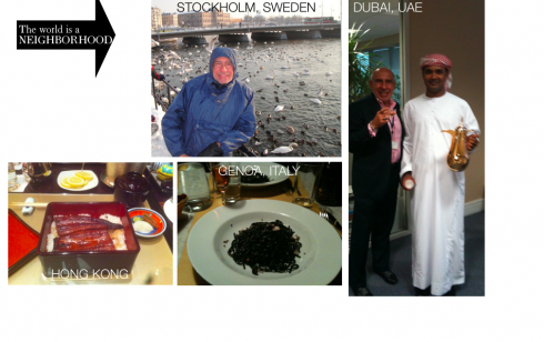

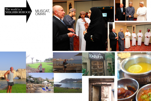
From time to time someone will ask me the question: Mario, you were born in Cuba, came to America as a young teenager, and have lived most of your life as an American, but travelling the world? Which culture defines you? Do you feel more Cuban? More American?
Sometimes I feel like a citizen of the world, and it is not a bad thing. Today, the world is our neighborhood, and fast, immediate communication and access to information make that neighborhood a smaller village all the time.
But, back to the question of culture and identification. I guess I am a bicultural person most of the time, with moments in which I feel extremely Cuban—-as when the smell of a good picadillo or the presence of a great artisanal Cuban dessert, like toronja en conserva, appears in view, not to mention when I hear Cuban music, when both feet are 150% Cuban each. Then, of course, I love America, my adopted homeland that took us in as refugees, something one never forgets. I love everything America, especially my American children and grandchildren, but also a good Macy’s Thanksgiving Parade, the Fourth of July fireworks, the sense of optimism and constant renewal that is the foundation of what we are as Americans—-even in the worst of times. I put my hand on my heart to recite the Pledge of Allegiance, and, if abroad, my eyes get misty when I hear the Star Spangled Banner. Sentimentally patriotic for the US, which I consider my country; symbolically and culturally attached to all things Cuban, especially the music, the art, the literature and the food.
With my sense of being a proud Cuban I honor not just the land where I was born, but also the memory of my parents, who were 100% true, patriotic Cubans until the very end; with my sense of respect, grattitude and patriotism for my adopted land, the US, I am a walking example that the American dream is possible and I hope to pass all of those feelings to my 11 grandchildren, who become part of the great American melting pot.
Work and cultures
Then comes the culture of work. I have worked in 96 countries in six continents to date.
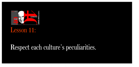
With each project, in each new country, I learned enormously about the impact and influence that culture has in the way we talk, think and carry out our professional duties. An element of sustenaibility for me, 40 years in this business, has been to respect each of the cultures which I encountered in my work.
It was clear to me from that first trip to Argentina, in the late 1970s, to work with La Nueva Provincia, of Bahia Blanca, my first project outside the United States, that the first step in succeeding as a consultant in a foreign land was to show respect for how others think——-and, by the way, one does not have to leave the country or deal with a different culture to do that. Especially if one is an American consultant, one must avoid imposing views that others may consider to be “air of American superiority complex”. The first step for me in each engagement is to listen, to acquaint myself with the people and their culture.
As a runner, I take early morning runs thru every city in which I work. I observe my surroundings, how people decorate their windows, the colors they paint the outside of their houses in, even what they throw in their trash. How they treat their animals. How they advertise consumer goods in the streets. How they assemble, or follow traffic signs. All of this weaves the cloth that I sort of wrap myself in to deal with the project at hand.
Once inside the organization, I try to think as if I were a permanent part of this culture.
Culture and design
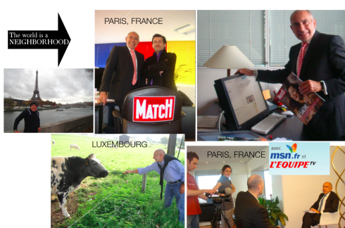
One cannot transfer a design model from Brazil to Scandinavia. Some ideas may be universal (navigation, legibility, clarity), but others vary distinctively (color, typography and, most importantly, a newspaper’s look and feel, which I have come to realize varies from country to country). There is not such a thing as a “newspaper look” that fits all.
What may be a classic newspaper look in one place constitutes a boring, “don’t go there” type of newspaper in another place. What may be loud, Carmen Miranda colors for one newspaper in Stockholm, are exactly the colors the doctor ordered for that newspaper in Fortaleza.
Appeal to the senses is important when one studies the likes or dislikes of a culture. I have always thought that the moment one steps out of an aircraft and walks the plank down to the baggage claim, one smells the country. Have you experienced this? If you disembark in Delhi, the first aroma of India embraces you in a welcome, but when you do the same in Buenos Aires, it is a totally different smell, as is Copenhagen or Moscow.
I usually let my senses capture the culture, visually and otherwise.
Be true to your cultural you

But I am also aware of two important things:
1. Those with whom I am working, are sizing me up for what they perceive to be my cultural background, just as I am doing it with them.
2. I must be true to my cultural values without sacrificing them as I respect those of the people with whom I work.
On item number one: I always get a kick out of the way my German or Scandinavian clients, for example, always see me as an exotic bird. Indeed, I may be one, and that is Ok with me. To the more reserved Nordic cultures, a person who, like me, talks with his hands, moves constantly during a presentation, never reads from a script, and ad libs along the way, reacting to the mood of the moment and the audience (blame this on my childhood acting days in Cuba?) is, indeed, an exotic breed of whatever. The fact that I insist to be treated with the informal Mario, as opposed to Dr. Garcia (it is always most troublesome to get them to do that in Austria, for some reason), that I talk to everyone the same way, from the CEO and owner to the lady who brings me coffee and water, is something many find strange.
And, of course, I cannot begin to tell you the number of times that a foreign client will tell me, in flattering tones: Well, Mario, you live in the US, but you are not a typical American.
A typical American, what is that?
I smile, knowing they are trying to tell me something nice, and I never open the Pandora’s box to ask: what is a typical American?
In Latin America, however, my clients always tell me; You think like a yankee.
There you go. Why do I think like a yankee? Because I insist on punctuality, following deadlines, the American work ethic.
As one Colombian editor put it to me: “Mario, you are packaged like a Cuban with the head of an American.”
Talk about picturesque language with a cultural twist.
It is not all roses and flattering statements, no sir.
Readers of this blog know that the makings of Die Zeit, Germany’s intellectual weekly, remains my most difficult project to date. Why? The German editors thought an American could never understand German culture. (Go here to read a blog post on that: https://www.garciamedia.com/blog/articles/40_years_40_lessons_10positive). It was a wake up call for me. Perhaps I had not understood German culture as well as I should. So I immersed myself in a learning process. It happened.
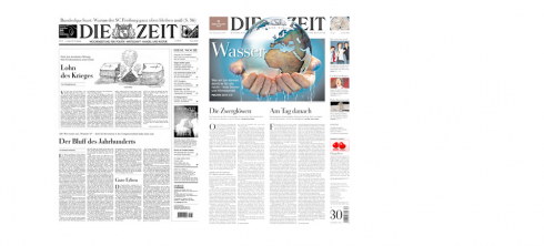
Preserving the concept of German elegance in Die Zeit: before and after redesign images appear here
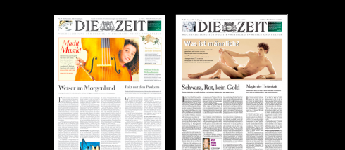
Die Zeit: purely Germanic in look and feel!
At times, perceptions of culture get on the way of moving on with a project or, as in the aftermath of the project, as was the case with The Wall Street Journal. It was 2001 and we were granting a lot of interviews to launch the new look of the WSJ. Repeatedly, reporters would latch to the connection between a former refugee who arrived in the US as a child escaping communism now redesigning the ultimate tool of American capitalism. At first it was fun to talk about it, eventually, it kept me from talking about the real changes in the design of the newspaper and how it would be easier to navigate it. In this case, culture “comparisons” appealed more interesting to many reporters than the story at hand: the visual change of The Wall Street Journal.
I must admit that at moments like that you feel like your cultural background is a heavy steelcase suitcase and you wish the airline would lose if for two or three days, as happens with my real suitcases at least twice a year.
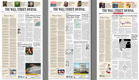
It made for good copy, of the cultural clashing kind: Cuban refugee helps redesign the ultimate American capitalistic tool!
Fortunately, we are what we are, the total result of our cultural backgrounds, and we carry the culture suitcase wherever we go.
Mine is a little heavier because it carries two solid cultures that are part of me and of which I am proud, plus the goodies and the essence of the many cultures that I have come to admire and to embrace during the past 40 years.
A frame that hangs in my office at home in Florida, and which my wife Maria gave me over 25 years ago, sums it up best:
I am a better person having seen the sun rise on the other side of the world.
Post-script: As I finish editing this segment # 11 of 40 Years/40 Lessons, I happen to be in Russia, and let’s say that both of the personal cultural entities that I represent pose a bit of a handicap with some, not all. As an American consultant I am perceived with the doubtful eye that casts anything America, the sort of “we love you and we hate you” attitude that may date back to the days of the Cold War and the USSR. But, oh, the Cuban connection ain’t so good either. There are some here old enough to remember when the Soviets made Cuba their second home, and that meant sending funds and goodies to the Caribbean island, which the locals perceived as “taking it from us to give to Castro”. So, better to be a citizen of the world here, evoking things from both of my cultures which generate smiles and positive reactions: American movies and Cuban mojitos.

1.Mirrors.
https://www.garciamedia.com/blog/articles/40_years_40_lessons_1—a_look_in_the_mirror
2.Refugee.
https://www.garciamedia.com/blog/articles/40_years_40_lessons_2—refugee
3.Teacher.
https://www.garciamedia.com/blog/articles/40_years_40_lessons_3—teacher/
4.Mentors.
https://www.garciamedia.com/blog/articles/40_years_40_lessons_4—mentors/
5.Consultant.
https://garciamedia.com/blog/articles/40_years_40_lessons_5—consultant/
6.Eagle.
https://garciamedia.com/blog/articles/40_years_40_lessons_6eagke
7.Abroad.
https://garciamedia.com/blog/articles/40_years_40_lessons_7._abroad
8. Books
https://garciamedia.com/blog/articles/40_years_40_lessons_8_books
9. Luck.
https://garciamedia.com/blog/articles/40years_40_lessons_9_luck
10.Positive.
https://garciamedia.com/blog/articles/40_years_40_lessons_10positive