Some may consider this treatment of a front page over the top.
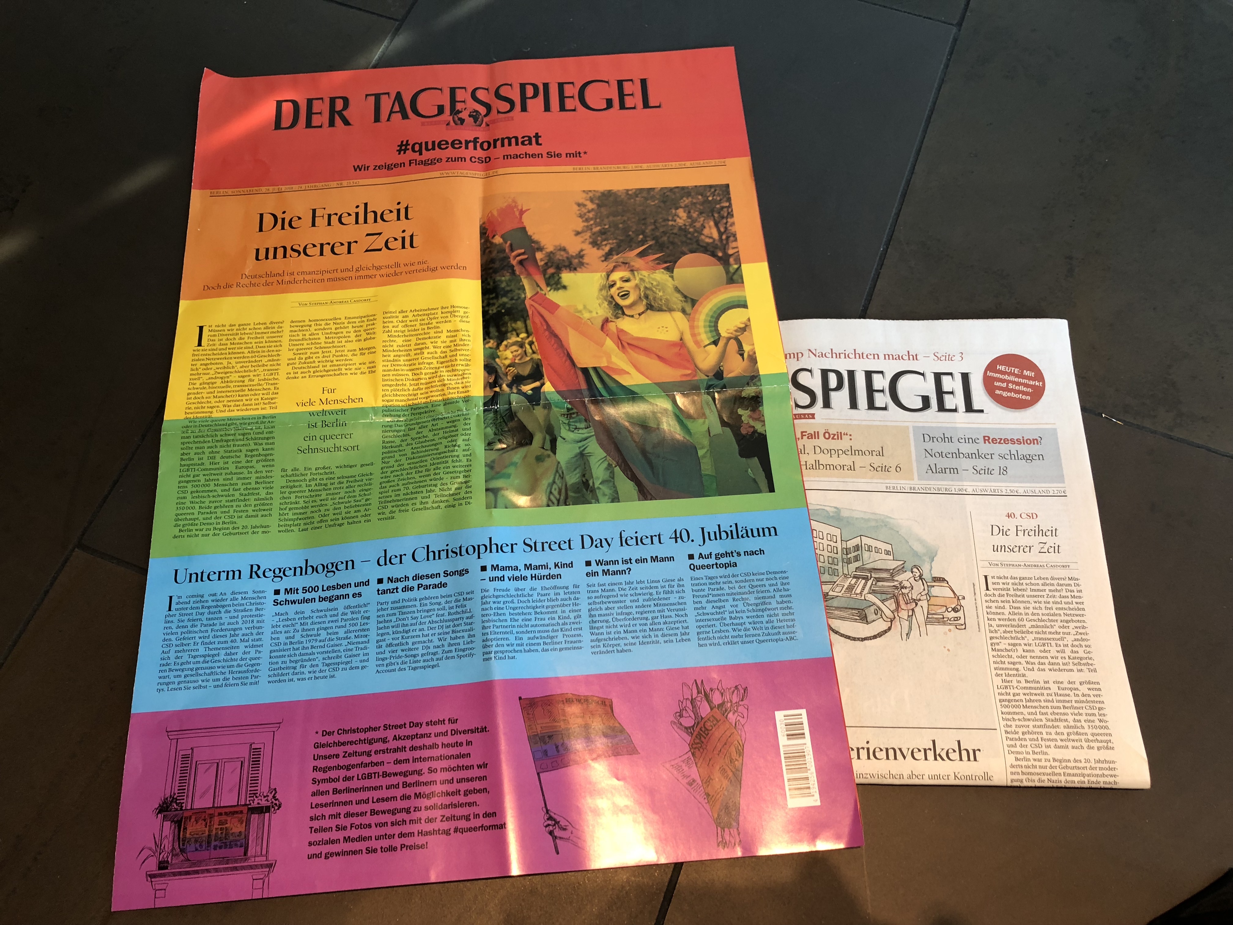
Count me among them. When I first saw this weekend edition of Berlin’s Tagesspiegel, I admit I did a double take. The glossy paper used to wrap the edition, the bright colors of the rainbow (as in the well recognized gay flag), and, most importantly the hash tag #queerformat all contributed to an element of surprise combined with a “what the hell is this”, which the eyes soon got used to it.
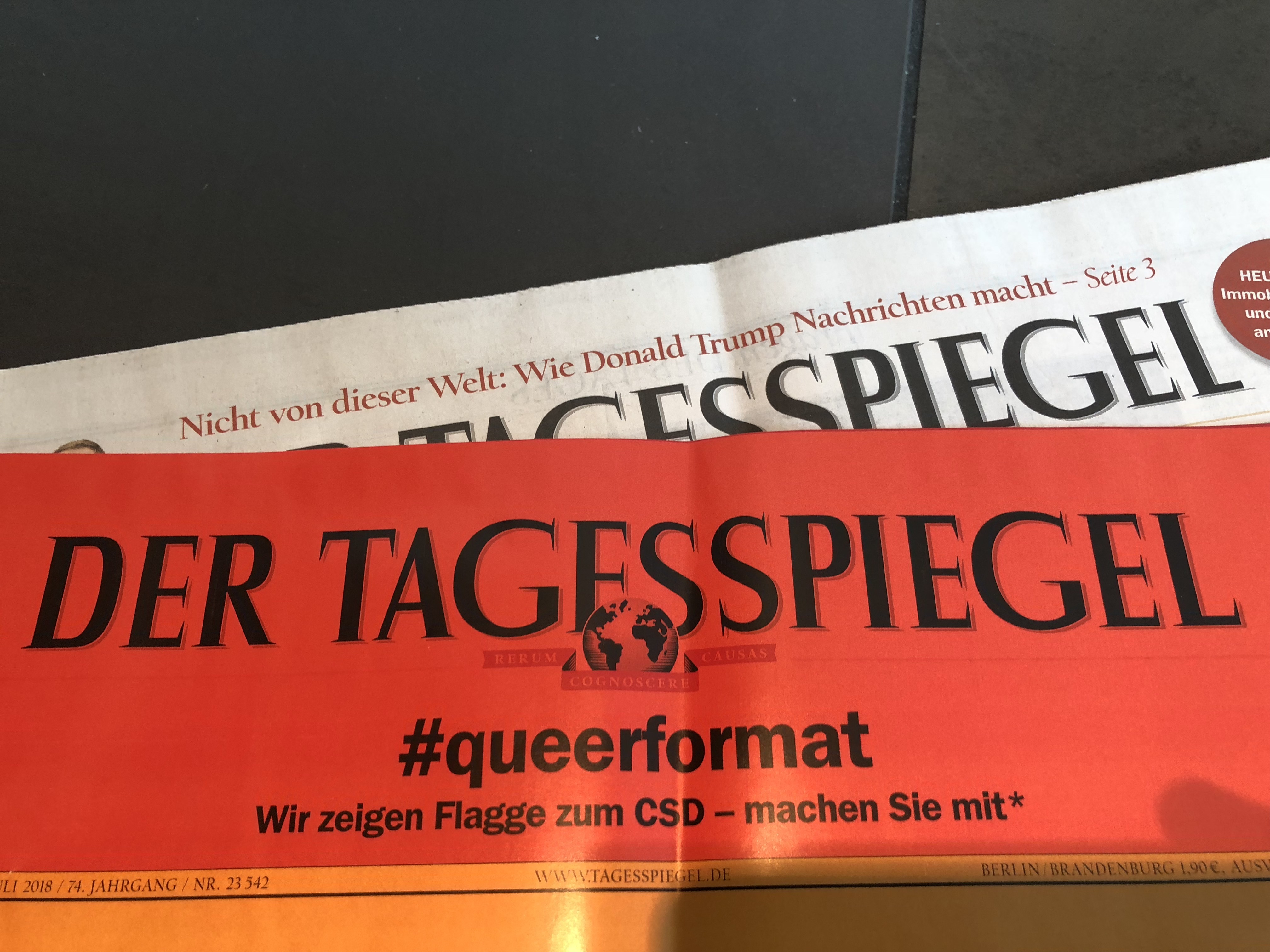
I understand that this the Tagesspiegel’s advertising department brainstorm, with Coca Cola as the main advertiser associated with the treatment and celebration of Gay Pride in Berlin.
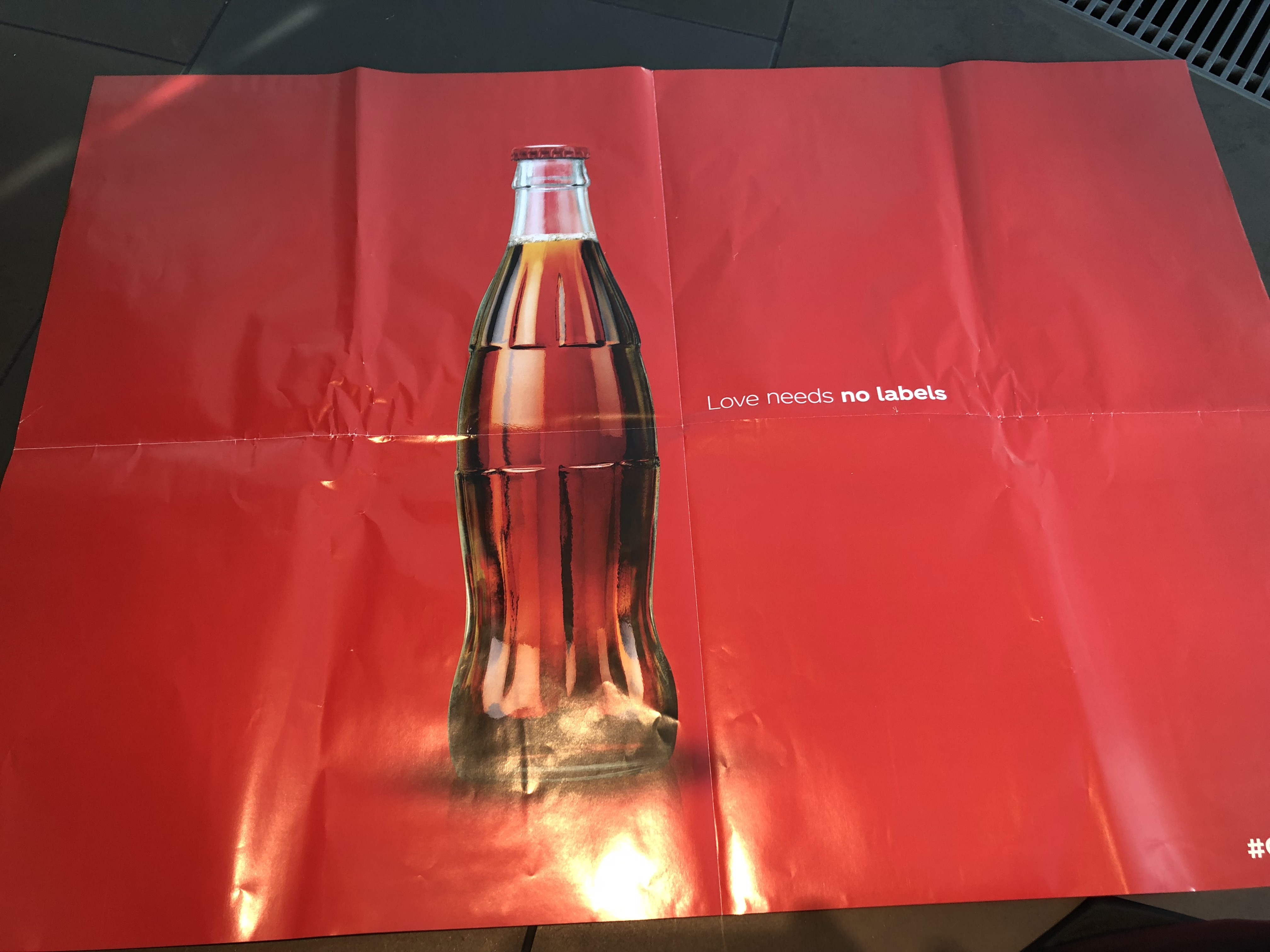
This is the back page of the wrap around glossy piece.
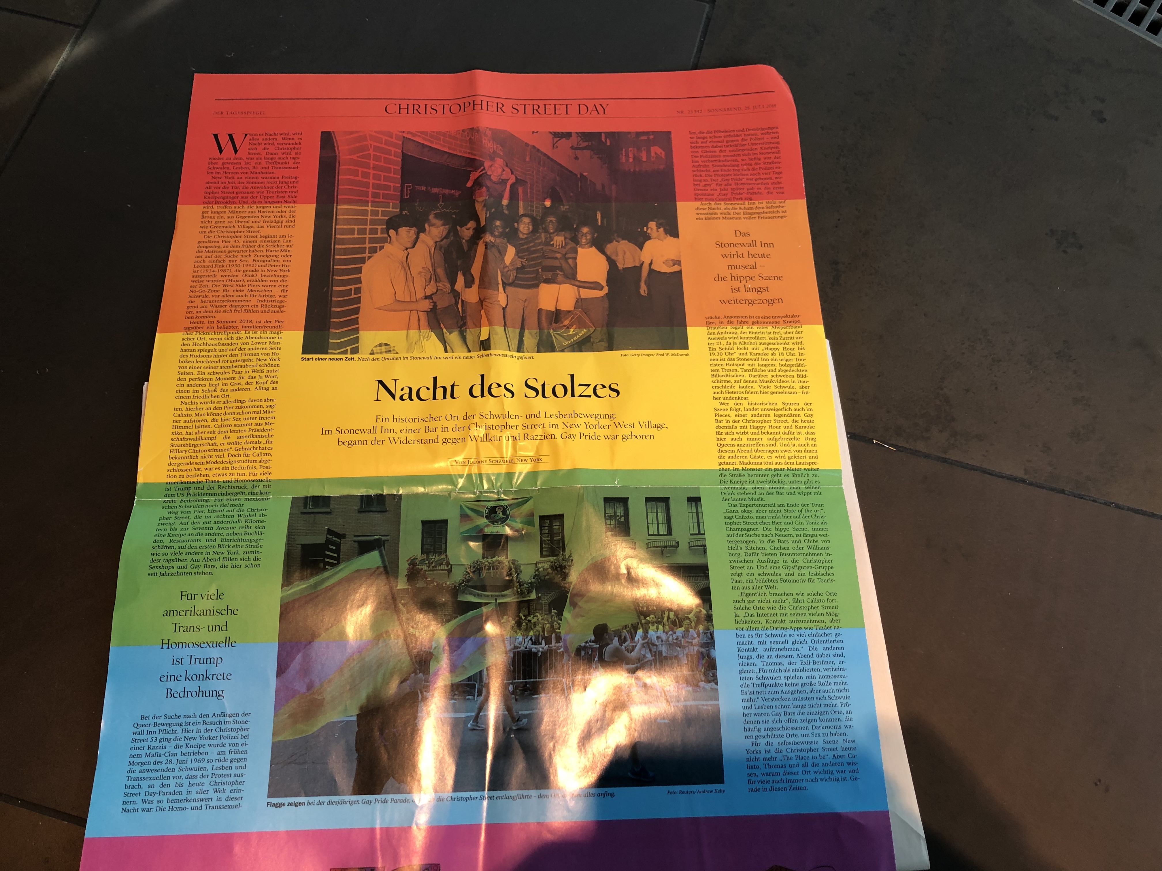
And, of course, there was a regular front page which the readers found when they opened the glossy wrap around, as seen here:

While I think that the type on the glossy front page with all the deeply saturated colors is hard to read, I applaud the initiative to push the boundaries and to utilize the advantages of print as seen here.
TheMarioClassroom
Several of you asking if these videos were still available. Check them out!
Center of Visual Impact
Text size
Typography essentials
Mario’s Speaking Engagements
August 2, Digital House (Facebook workshop), Buenos Aires

October 6, 20, 27–King’s College, New York City
The Basics of Visual Journalism seminars
October 25, Eidos Media Keynote, New York City

Garcia Media: Over 25 years at your service
