This is a special edition of TheMarioBlog. The next edition is Monday, January 6, 2020
And here we are, about to start the year 2020, which looks so futuristic then, 20 years away.
I had forgotten about this project, until my colleague Rodrigo Fino, who heads our Garcia Media Latin-American office in Buenos Aires, reacted to my Christmas card:
“Mario,your card makes me think that we are about to get into 2020, and do you remember when Paula (Ripoll) and I worked with you on a vision of what a newspaper would look like in 2020? Well, in case you forgot, here it is, since you mentioned it in your book Pure Design.”
It all came back quickly, the memories of that gathering at the imposing circular conference room of the American Press Institute, the many friends and colleagues who gathered there to offer their vision of 2020.
I am looking here at our version of what a front page of a printed newspaper would look like just about now:
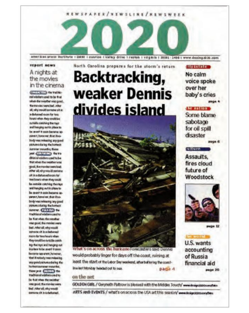
What did we say then?
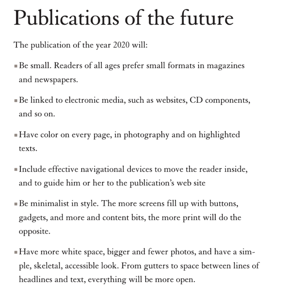
These are the points we made to justify our design of this futuristic 2020 front page:
Today’s reality
Much has happened since we designed the page of the future. The future has arrived, and print is still here–that is the good news, even if it is no longer the protagonist.
I think we stand by the following statements of 1999:
- Be small. I still believe that smaller formats will be the future of printed newspaper, and it is already happening. Even smaller than tabloid is the way to go!
- Be linked to electronic media. While not offering links, I believe it is vital to assume that readers of a print edition are also reading in a digital platform, so echo that in your navigation. Tell readers of good videos, podcasts or other digital-only offerings related to key stories. Don’t overdo, however.
- Have color on every page. Of course!
- Include effective navigational devices to get the reader inside.
- Have bigger photos. For sure. This is key.
Where we missed the mark:
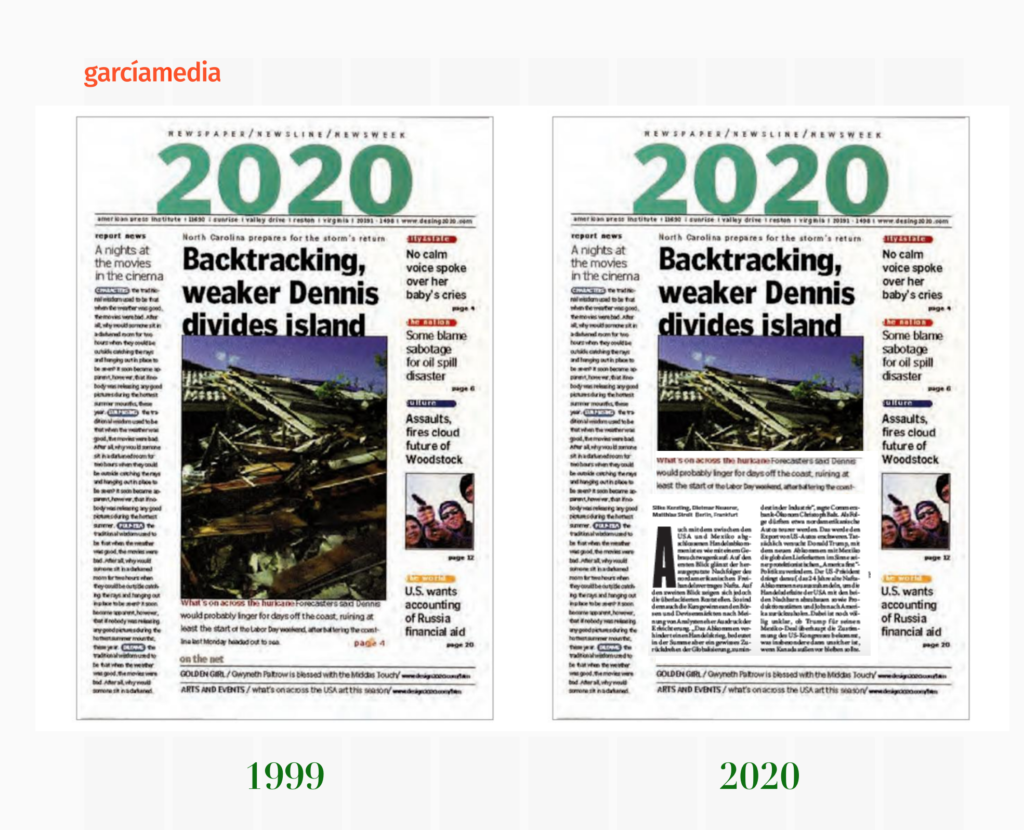
- Have more white space! No way, we are finding out that those who read newspapers in print want the pages to be full, and NOT a magazine look with pages swimming in white space. See our recent blog about this:
Here is how it should be today
The Garcia Media team
For our 2020 project for the American Press Institute in 1999, I joined senior Garcia Media Latinamerica art directors Rodrigo Fino and Paula Ripoll, from our Buenos Aires office. It was a collaborative effort from start to finish, a collaboration that still continues today and into our real 2020 projects.
Read more about it here:
https://www.editorandpublisher.com/news/2020-visions-of-the-newspaper-s-future/
Start the year with The Story
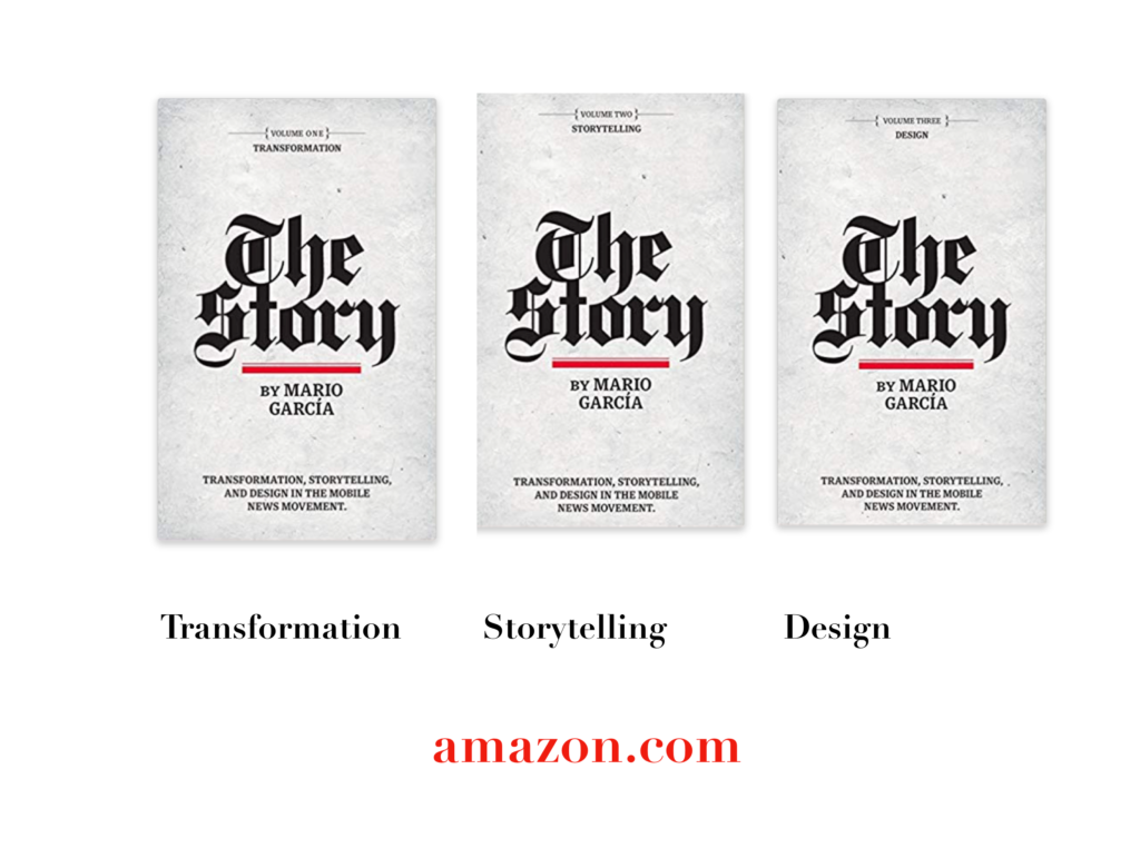
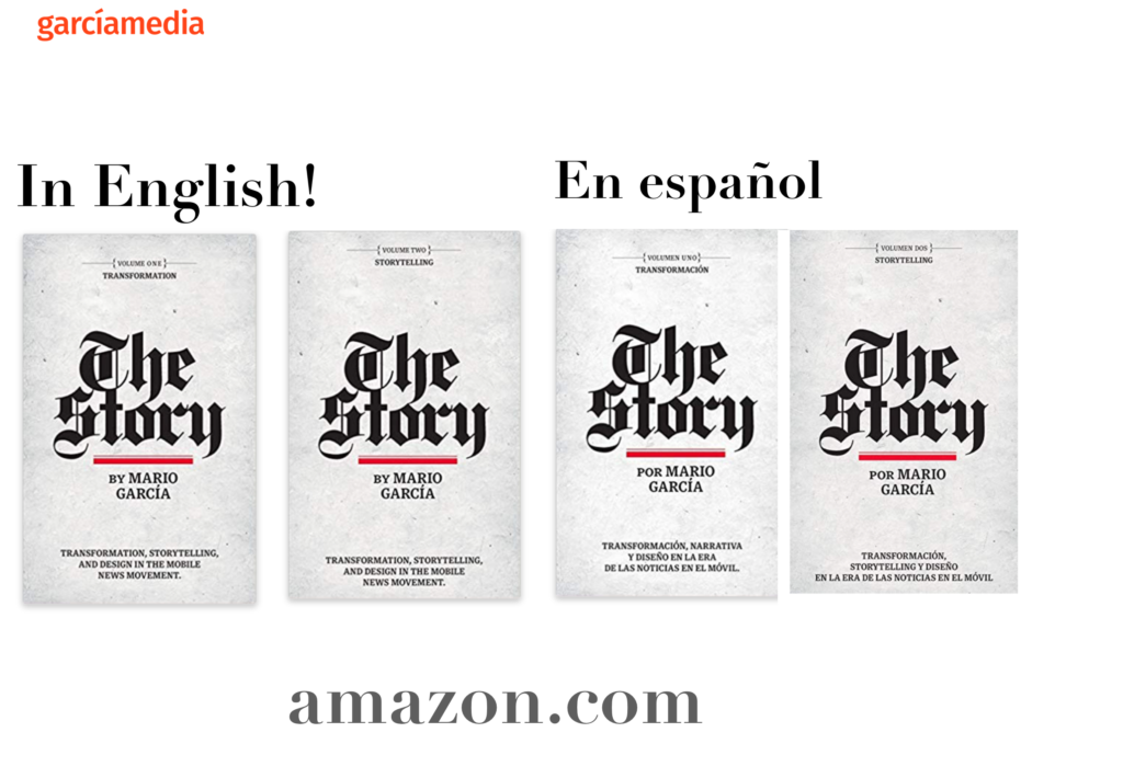
A good read to start the year 2020: The full trilogy of The Story now available–3 books to guide you through a mobile first strategy. Whether you’re a reporter, editor, designer, publisher, corporate communicator, The Story is for you! https://amazon
Mario’s speaking engagements
March 13, 2020
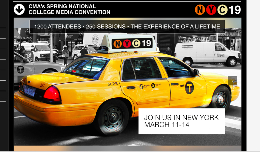
Keynote presentation at the National Media College Association Spring Convention, New York City, NY
March 27, 2020
Keynote
New York Press Association (NYPA), Saratoga Springs, NY.
TheMarioBlog post # 3178