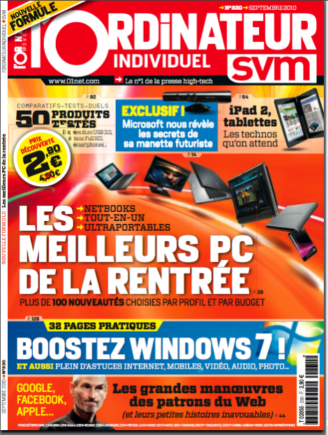
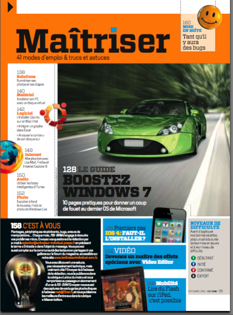
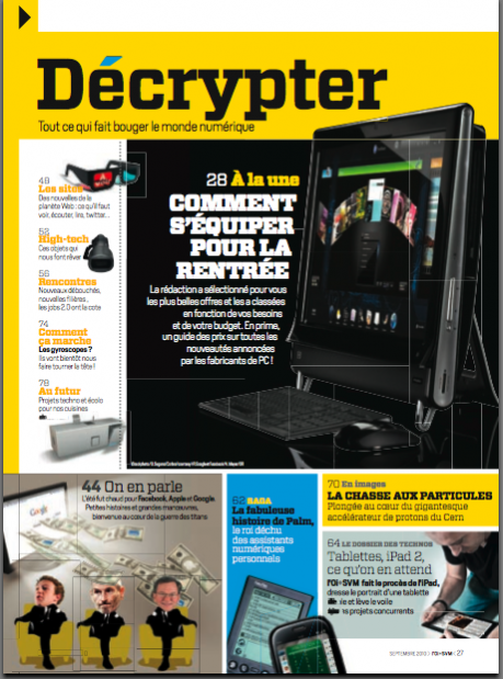
TAKEAWAY: The challenges of redesigning a computer magazine that merges with another, wants to have a contemporary look, but pack information as economically as passengers on an A380 and still pace itself to carry the best contents of two publications and make it all look visually coherent! Our team at Garcia Media faced the challenge head on, and the new L’Ordinateur is out this week.
Colorful, informative, needed
img src=“https://garciamedia.com/assets/uploads/blog/actualite_thumb.png” style=“border:0;” alt=“blog post image” width=“449” height=“610” />
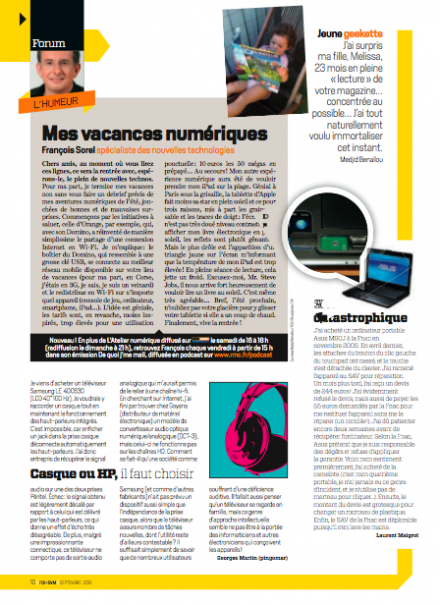
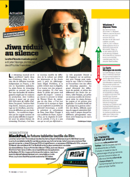
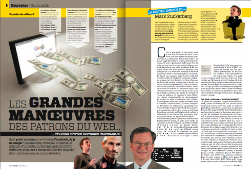
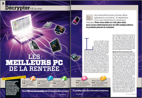
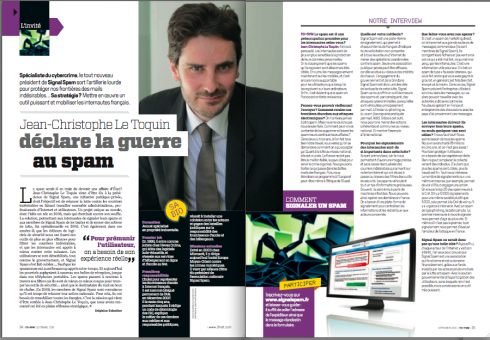
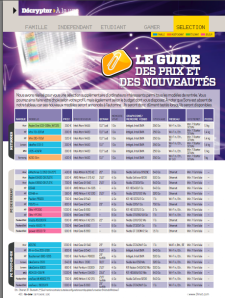
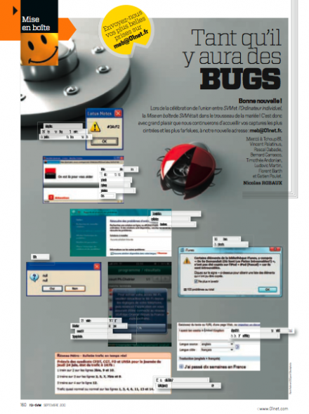
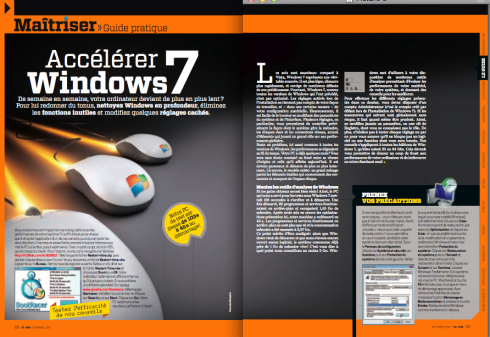
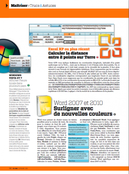
Make it colorful, distinctive, contemporary and blend the two mags nicely!
That is how our briefing went with the team of L’Ordinateur, with one important addition: let’s bring the best of that other French computer magazine, svm, to L’Ordinateur. The svm was on its way out, with bits and pieces of it coming to L’Ordinateur.
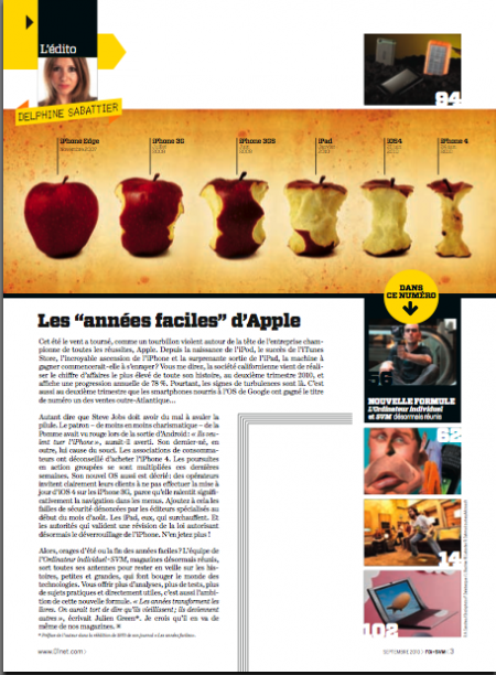
For us at Garcia Media no challenge is too big, and sometimes the bigger the better and more energizing. Working with my team of two superlative art directors, Frederic Plá, of our French team, and Paula Ripoll, senior art director at Garcia Media Latinoamerica in Buenos Aires,, we started sketching but only after we had gone through that difficult, but important, process of reviewing content, pacing it from page to page, and deciding when to allow for long narratives, when to interrupt with more “finger reading” style pages. L’Ordenadeur art director is Olivier Brault
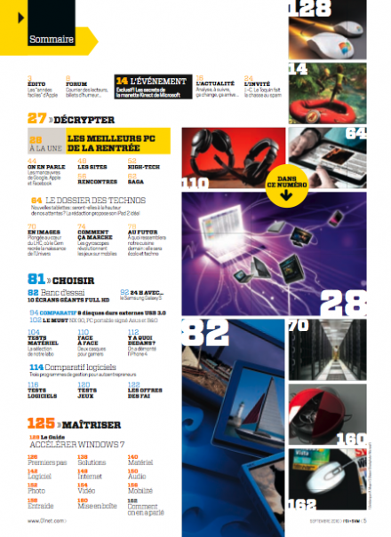
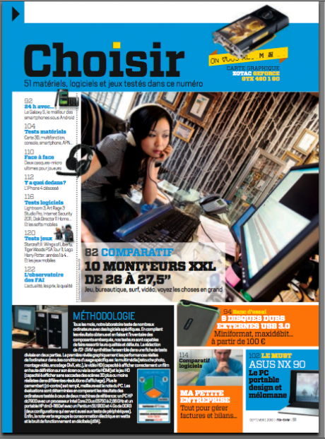
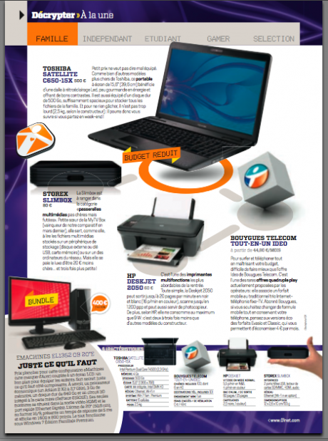
A difficult part of the process was to design all those listings of products and prices, plus reviews and comparisons of projects. We decided that the typography would be key for this type of finger reading. And we used color advantageously to color code sections and create what I described as “mini magazines” within the magazine.
Computer magazines, we found out, are a different breed from the general interest or single subject magazines.
The die hard techies who read these publications want it all: the specifics of products, the pricing and comparisons, but they want to sink their teeth into good interviews, expert columns, not to mention narratives about what is coming and what the products will look like. A tall order, indeed, for the designer.
So, this is how we distributed the work from the start:
1. Content Review: what is coming from svm that must be preserved and presented lively on L’Ordinateur.
2. Content Pacing: what sections should come first, second and third, and how can we establish a good visual symphony that will allow the reader to sample long narratives, then take a visual break with pages of short items and tons of finger readings: violins and trombones.
3. Typographic considerations: Type had to be orchestrated perfectly well, to create variety, but to make the small type of listings and comparisons between products extremely legible. Add to that the fact that we wanted to remind readers of svm of their magazine, while introducing them to a new publication. The fonts used are: Vitesse, Heroun Sans (headlines and small boxes and/or briefs; Dot Matrix (variations, small box headlines, ornaments); Commodore 64 (accessories) and Escrow text (bodytext).
4. Color Coding: Each of the various sections has a specific color to identify it throughout, contributing to easy navigation but also to how we created the “mini magazine” concept, as if the sections are magazines themselves, complete with navigational details and promos to stories in that section.
Visit website:
http://www.01net.com/outils/PseudoV6?base=grandpublic&pseudo=oi&rub=10481