TAKEAWAY:” Which elective course should I take?,” asks the graduate student in design. The first that comes to mind is one about presentation.
Back to the classroom
It is that time of the year when students put away their beach towels, swimming trunks and unread “summer” books, trading them for those required books that are part of the course syllabi.
As usually happens in late August, I have received an email from a grad student in design who tells me “I can have an elective class of my choice, which is a luxury, and I would like to ask you what you would choose if you were me.”
Well, dear student, psychology comes to mind immediately, as you will need to understand the human condition well to navigate the waters of the design world, especially to understand why many people who do not know much about design are the final arbiters of decisions that have to do very specifically with the nuances of our craft. But that is another story, another course, for another day.
Seriously, if I were a grad student in design with a choice to make about what course to take, I would probably move towards the offerings in the speech department or in marketing and check out any courses that teach you how to present your ideas to others. That, to me, is the key. Presentation skills are essential for a designer to succeed in the selling of his/her ideas, yet it is probably one of the most underrated and seldom discussed.
I would hope that every design school in the world would incorporate a presentation course (or segment) in its curriculum.
You may work hard to create the ultimate masterpiece, but if you cannot sell it well, with passion, enthusiasm and with your 100% backing and trust in the concepts presented, chances are that wonderful idea will become part of your “never used” portfolio.
Five tips for an effective presentation:
1. You must be convinced that what you have to present is wonderful. No, make that marvelous.
2. You must be clear, present in an authoritative voice (if your voice is not so good, hire a voice coach, seriously).
3. You must outline every step of your thinking process: people love to hear the behind the scenes of how an idea developed. Perhaps you thought of this particular strategy for bylines while riding a rollercoaster, so say so. Designers have such reputations for the quirky that nobody will be suprised.
4. Add humor and make your presentation as personal as possible. Whatever you do, DON”T read from a script, and even avoid cue cards in front of you. The best presentation is like a conversation with someone you like, ideas flow naturally (even if you have rehearsed it all before hand).
5. Don’t apologize for any part of your presentation: if you begin by saying something like “if I had had more time, I would have…..”, you are running the risk that someone will tell you to go back, take your time and return when you have the presentation up to your standards. Once you are in front of the group, you are a believer, you love your ideas and you state them clearly and passionately.
Finally, when questions come up, don’t pretend to circumnavigate around a question to which you do not know the answer. Better to say that you don’t know, but you are willing to find out.
And, yes, be open to criticism. You may be the presenter, and your project concept may be exemplary, but there are always people in that same room who know the brand much better, and who may address issues that they know well but that you don’t. Be prepared to let others help you understand what you don’t know.
Go into these presentations passionate about your ideas but not “married” to your ideas. A project chockfull of great concepts will be enhanced by the concept that originates with your audience of that day. But that great project will also be dragged down and perhaps eliminated if you, the designer, is so intrinsically attached to your set of ideas that you do not open the door for one of those ideas to be altered (enhanced?). Let the best ideas win.
Now, and I ask the question hoping someone will let me know the answer: do presentation courses exist? If so, which academic department offers them?
I may wish to enroll in one. Never too late to learn new tricks.
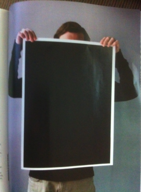
…how to hold that portfolio!

“Which is the right way to hold that portfolio?“Image courtesy of Print Magazine/August 2010 edition
Related to the subject: a funny and interesting piece by Steven Heller in Print
Magazine about what he describes as a rampant practice among design students and professionals: a person photographed from the neck down, holding portfolio samples that are gripped in two hands—-“as though it were clean laundry”.
According to Steve, “what was an innovative, efficient alternative to static, flat display ten years ago, has now become so commonplace and clichéd as to reflect the designer’s lemminglike lack of imagination.”
Steve’s best advice, in my view: “Print does not have to be dimensional, kinetic, or otherwise made to be something it’s not. Flat is just fine.”
TheMarioBlog post #616