Update #2: June 30, 08:29EST
TAKEAWAY: It is the runaway circulation winner in the highly competitive Istanbul newspaper market: Zaman, at 30, has matured into the newspaper everyone wants to have. It is also a radical departure in terms of design, opting for blue and gray tones in a world of newspapers that tend to go for the fruit salad approach to color use. ALSO: Meeting famous photographer Steve McCurry and posing for him in The Bosphorous

Reporting from the +1T Design Conference in Istanbul, Turkey
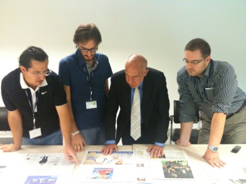
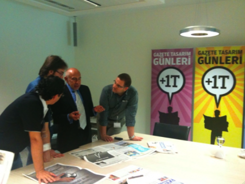
Conducting a critique of Zaman’s editions with designers
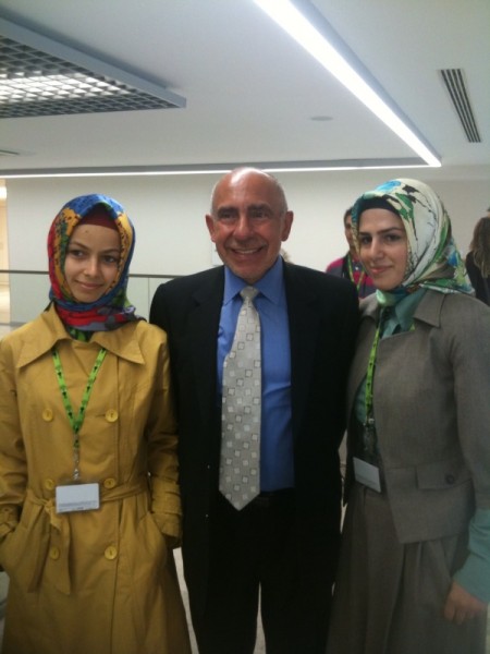
Design students from the University of Istanbul attending the +1T conference
Blue in a tutti frutti world
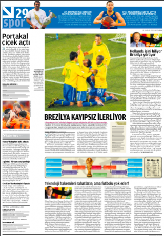
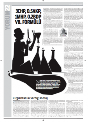
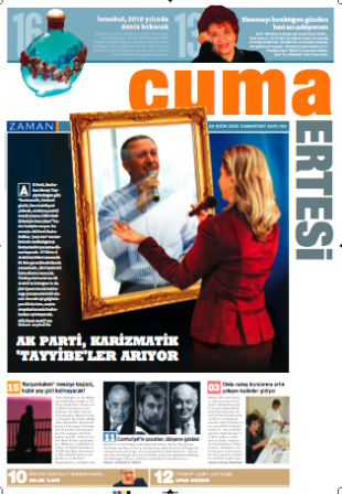
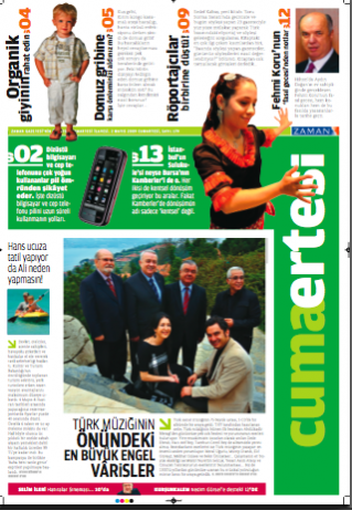
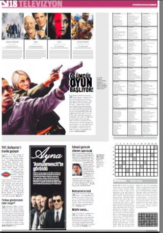
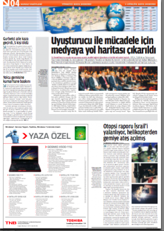
I usually include some local newspapers in my presentations. In my experience, it makes what one is saying come alive as more real, and it immediately creates a link between the content of the presentation and the audience.
So today was no exception. As I finished my two-hour presentation for the +1T conference in Istanbul, I used several front pages of Turkish newspapers; Sabat, Hurriyet, Milliyet, among others. All of these papers, although respected and credible, sport a lot of red, yellow, green and orange on their front pages.
Indeed, Carmen Miranda hats Turkish style, along with cutout photographs of pretty girls, stories that run into each other, boxes that may or may not have rectangular or oval corners, and the rest of what people refer to as a Turkish Bazaar in other parts, but probably not here.
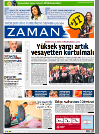
Then I showed a front page of Zaman, in its respectable blue logo, a grid that emphasizes order, and, yes, white space along the way to make things easier on the eyes. Zaman has become Turkey’s most constant winner in design competitions worldwide, including the coveted SND award for its selection among the best designed newspapers in the world.
I am not surprised, now that I have met with the editor, design director and assorted designers during this conference. They aim high. They are constantly studying how design is appraoched elsewhere, and they have the numbers to prove it.
At 800,000 circulation and climbing
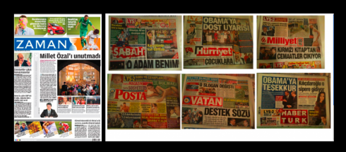
Here is how Zaman looks in comparison to its competitors in Istanbul newspaper market
“This is a newspaper that had 170,000 circulation in 2004 when we redesigned it to make it cleaner,” says design director, Fevzi Yaz?c?, who is also organizer of the conference. “Today, we are proud to say that we are at 800,000 and rising.”
Quite a feat in any market, but especially in the Istanbul market where at least 8 dailies go out each morning, each trying to grab readers with pages that are hard to ignore.
How can Zaman look like a prep school student in blue blazer and saddle shoes when the rest of the competitors are out there in colorful T shirts and baggy pants?
“Well, we are focused, and we do our thing, knowing that we don’t look anything like the others, and we respect what they do, but we stay true to our goals, and it worked, obviously,” says the editor in chief, Mustafa Saglam. “Perhaps other newspapers here felt they would not dare change things so dramatically, for fear of alientaing their traditional readers. But our readers like it, and the numbers prove it. We continually gain circulation, and our readers also like long pieces and good content.”
Part of the success of Zaman is that it invests in design, with a graphics department of approximately 70, including artists and illustrators.
“We let content drive our design,” says Fazi. “From news pages to editorial pages, we concentrate on the content, and we try to create a visual environment in which the meaning of the story comes across quickly and attractively.”
This is obvious, especially on Zaman’s opinion pages, perhaps among the most attractive I have seen anywhere in the world.
Ready for my closeup
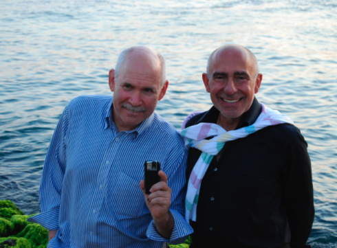
Steve McCurry and I in Istanbul, Monday, June 28
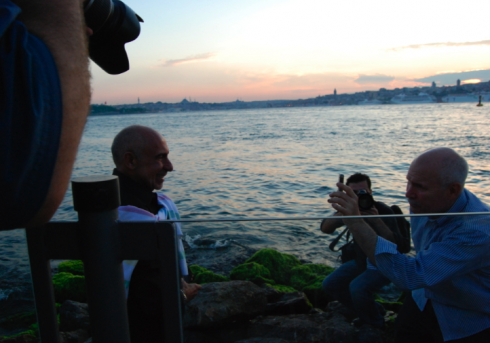
Steve McCurry taking my photo, while photographers took a picture of the moment
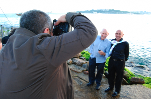
Steve McCurry and I pose for photographers from Zaman newspaper
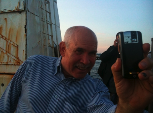
The audacity of Mario: I take a photo of the master photographer Steve McCurry
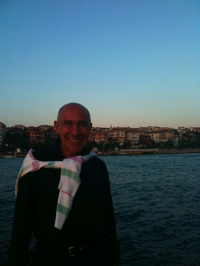
Photo by Steve McCurry as we arrived at The Maiden’s Tower Monday night
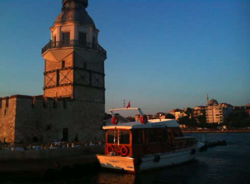
The Maiden’s Tower: situated in a small island within view of the city, a 10-minute ferry ride
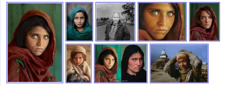
Images of McCurry’s most famous work
Although I have admired Steve McCurry’s
work for a very long time, I had never met him.
The serendipitous meeting took place as we sat side by side on a short 10-minute ferry ride across The Bosphorous Monday night on the way to dinner at the Kiz Kulesi (The Maiden’s Tower), a small island with the legendary tower which has now been converted to a restarant. The views could get Michelin stars, although not necessarily the food nor the service. But, oh, to climb the tower (about six flights of beautifully crafted wood circular stairs) and to take the circular view of The Bosphorous: priceless. Along the way, stop at the gift shop, or savour an expresso on the fifth landing!
Steve, described by some as “an observer, bearing witness to places rarely traveled” is a pleasant man only too willing to please. I handed him my iPhone and asked him for the honor of a photo taken by him. He smiled and did several, one of which appears here. It will always be a special photograph for me, of course.
Steve and I will speak Tuesday at the conference, to be attended by 400, including students, editors and designers from around Turkey.
I will be updating the blog directly from the conference in the next two days.
That certain look of Turkish newspapers
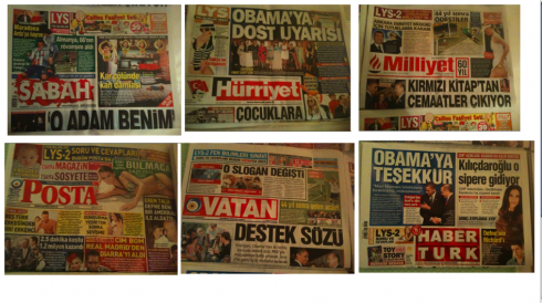
Directly from the corner press kiosk in Istanbul: to top half of a variety of Turkish dailies
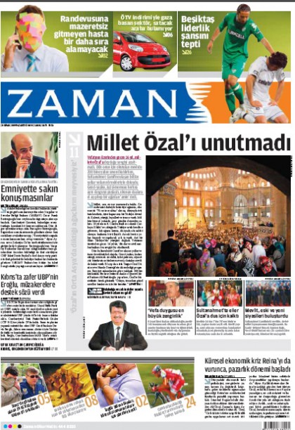
Front page of Zaman: one newspaper embarks on a journey of unique, modular design with white and blue as dominant colors
Red is the protagonist when it comes to the logos of Turkish newspapers. Take one quick look and you see huge broadsheets,big headlines set in sans serif, all caps bold, an abundance of cut out photographs, and each story pushing the other one out of the page as if to scream: Read me first, read me first.
But, if culture and region do give newspapers a personality, then these dailies represent what Turkish newspaper design is all about: exhuberance, color, and what can be described of maximum utilization of the available space on a page. The colors——mostly primary hues——do not necessarily imply that these newspapers are downmarket. Both Milliyet and Hurriyet, which are shown here are among the leaders in the market, with long standing journlaistic traditions.
One newspaper has decided to set itself apart from the rest, Zaman, which was born 30 years ago and has since grabbed a variety of design awards with its not so colorful or busy look.
TheMarioBlog post #584