TAKEAWAY: France Football’s new look: colorful, easier to navigate and on time for the World Cup 2011. PLUS: Countdown to the Power of the Tablet conference, with Reed Reibstein’s tips of the best articles to get us all thinking about tablets prior to the Poynter program.
Packaging France’s top football magazine
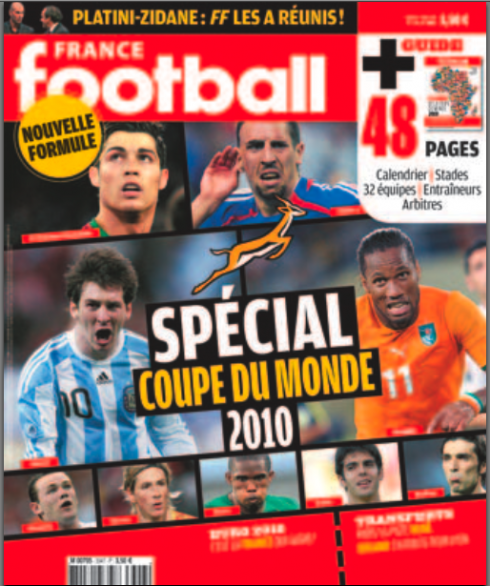
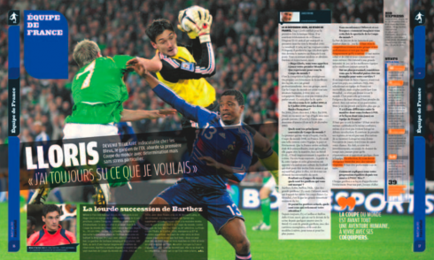
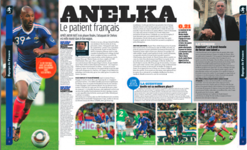
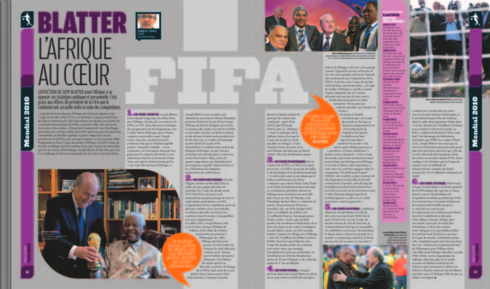
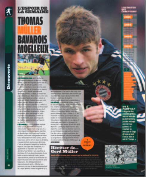
It is out today, the first edition of France Football with the new look. The Garcia Media team has worked with the FF group in Paris to create a magazine that is more colorful, easier to navigate, with better use of photographs, better storytelling and the same complete coverage of football that French readers have enjoyed for decades. The twice-weekly publication (Tuesday and Friday) covers football like a blanket, from major teams to personality profiles, with ample coverage of Europeean football as well.
Our Garcia Media team included senior art director Paula Ripoll (of our Latinoamerica office in Buenos Aires) , along with our Paris based art director, Frederic Plá. I was chief architect of the project and we all worked closely with France Football art director Pierre Wendel. FF editor is Dennis Chaumier and project leader was Alan Fournis
Stylistic design details
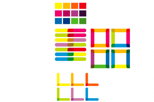
Here is the color palette, based on bright colors, that was created as a first step when we began to redesign France Football
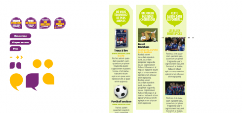
The bright colors helped us as we prepared design elements for secondary readings, columns of briefs, results tables, etc.
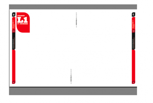
A magazine that is packed with football detail had to be easy to navigate: our system of headers and vertical bars helped
Typographic components
The fonts used for France Football redesign are: Acropolis (regular) and Amplitude (standard, wide, condensed, compressed, extra compressed).
Countdown to the Conference: 12 days to go
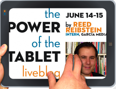
Almost two weeks before the opening of Poynter’s The Power of the Tablet conference, I turn over the blog to our Garcia Media intern Reed Reibstein, who will also be blogging live from the conference. Reed’s idea is to “warm up” to the conference with daily postings of essential articles that will help everyone understand the tablet as a new journalistic platform.
“Sneak Peak into iPad Newsstand Reveals Some Apps, Some Crapp “
As the first major tablet entered the world, illustrator and animator Joe Zeff took a critical look at the inaugural media apps. He provided an effective overview of divergent design philosophies, some of which he thought worked better than others. For a different take on these apps, check out Engadget’s round-up . Quite a few news apps have appeared since both these reviews came out, so if you have an iPad and haven’t visited the App Store in a while, take a look at the News category. Today’s new releases include”Libération pour iPad.”
Other links of interest
Khoi Vinh appreciates the pared-down effectiveness of EW’s Must List (and I do, too; it’s worth a download):
http://www.subtraction.com/2010/06/01/ews-must-see-must-list.
The iPad version of Popular Mechanics (not to be confused with Popular Science!) looks like a further step in tailoring the magazine to the tablet: http://gizmodo.com/5552315/popular-mechanics-ipad-app-the-future-of-magazines-all-over-again.
About Reed Reibstein:
Reed Reibstein, a rising senior at Yale University, is starting his third consecutive Garcia Media internship this summer . Reed , an art history major, also works closely with Mario Sr. during the year on a variety of projects.