This is the weekend edition of TheMarioBlog and will be updated as needed. The next blog post is Monday, October 29.
Wow, has it been 17 years already since the last redesign of The Economist?
Apparently so. I picked up a copy of The Economist, as is usually my routine, upon entering the airline lounge in Zurich—it could be Frankfurt or Berlin, of course.
At first glance nothing looked too different, but then I noticed the “centered” headlines, color on every page, and a font that, while familiar and not jarring, was not the one I had seen there the week before. There was a very small reference to the redesign on the summary page, which alerted me to the changes I was perceiving.
I admit I did not notice it at first glance on the cover itself..
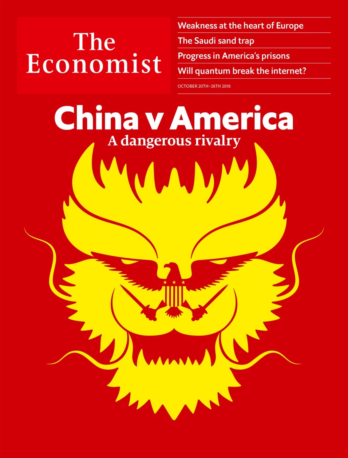
I then took a page by page journey through the magazine, the kind that we designers tend to do when concentrating on visual aspects of a publication, not the content. I wanted to discover. My eyes wandered from one detail to the next. Pleasant discoveries, such as more air around the headlines for commentary pieces. Perhaps bolder and larger illustrations.
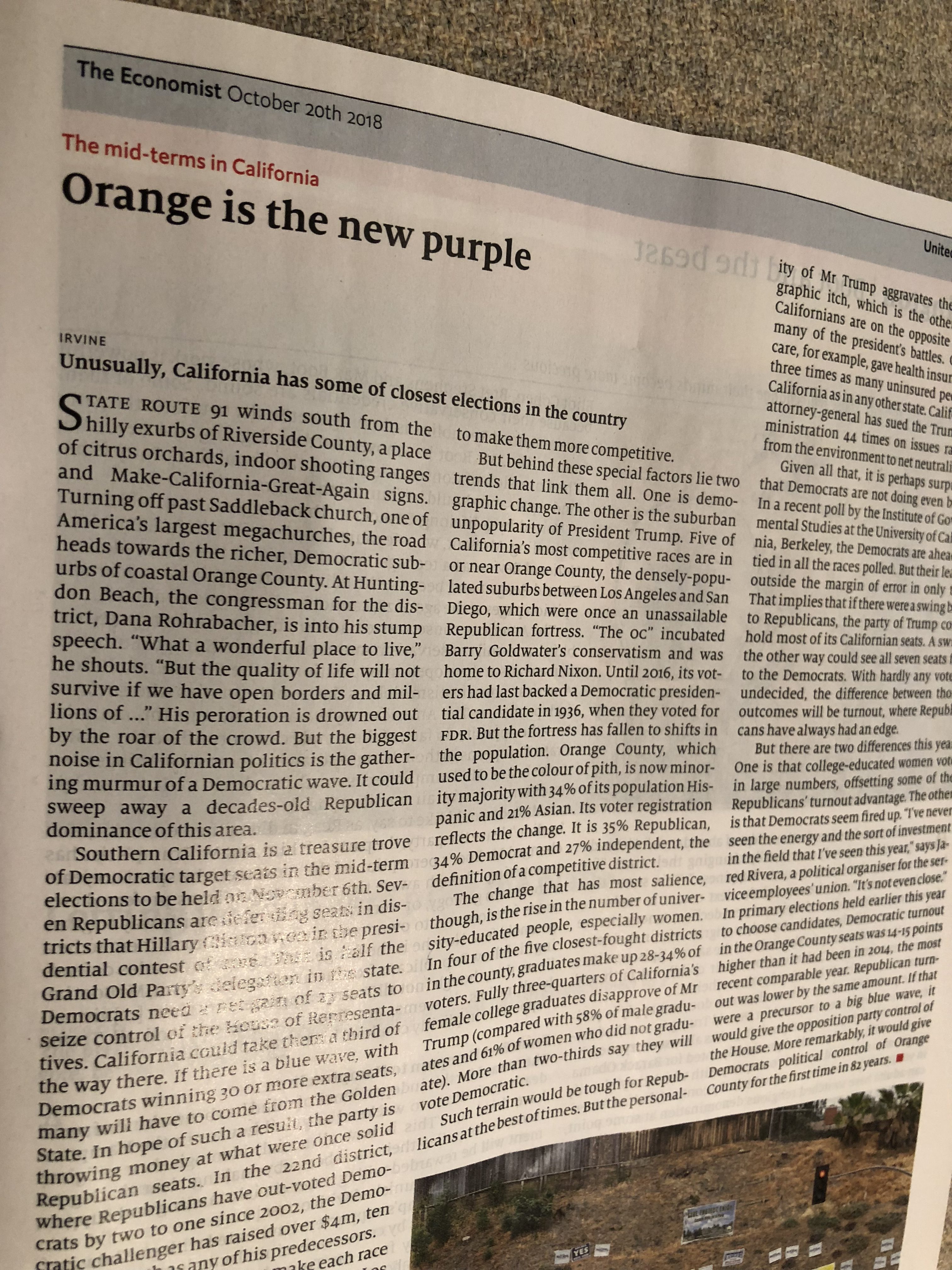
And the same clever headlines and captions that are like no others: so precise, informative and often entertaining. In this issue, a story with a headline that read: Orange is the new Purple (below).
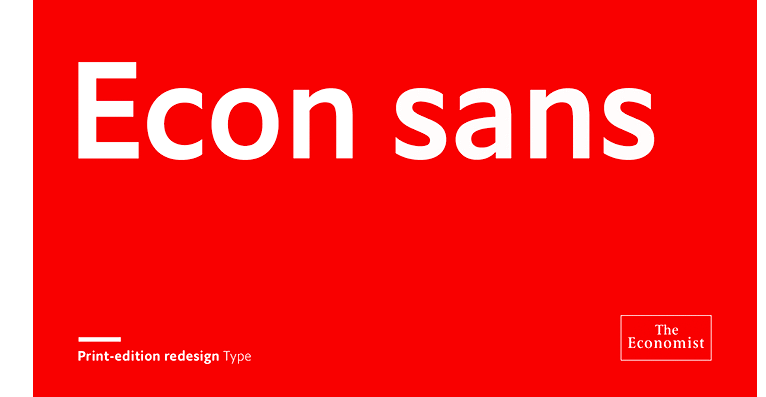
And, I like the sans serif font: refreshing, elegant (we would not expect less from The Economist).
The takeaways:
Designers–The redesign was headed up by head of graphics Phil Kenny and the art director Stephen Petch.
The new fonts– Milo Serif and Econ Sans

More color–All editorial pages in the publication will now be in full colour
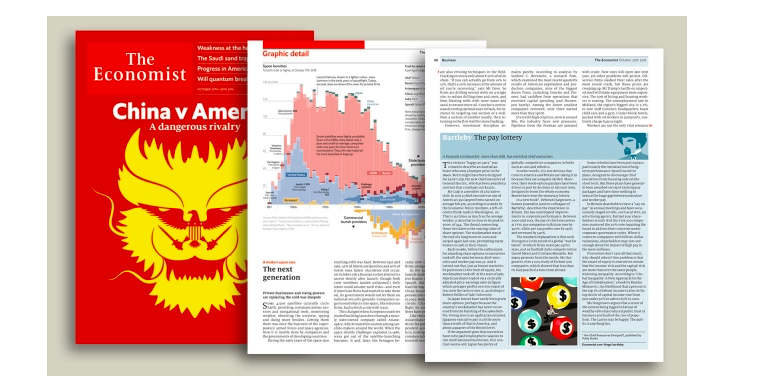
Visual unity–The new look was said to be done to align the print edition’s look and feel with the rest of its product line: The Economist apps, Economist Espresso app, Economist.com and 1843 magazine.
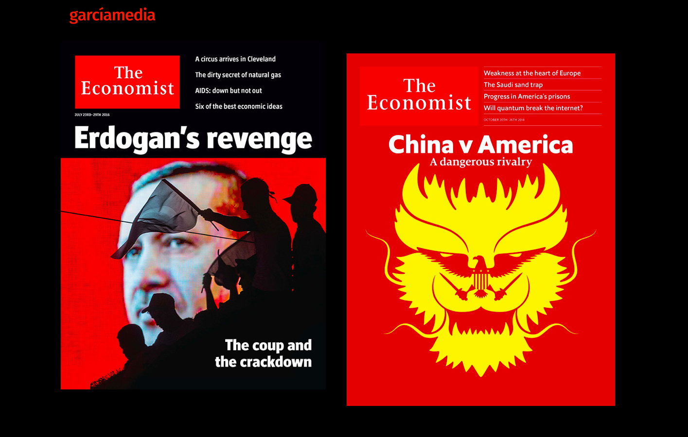
Larger logo–a larger cover masthead. Take a look at the contrast between the old cover design (left) and the new.
Contents page–has been revised.
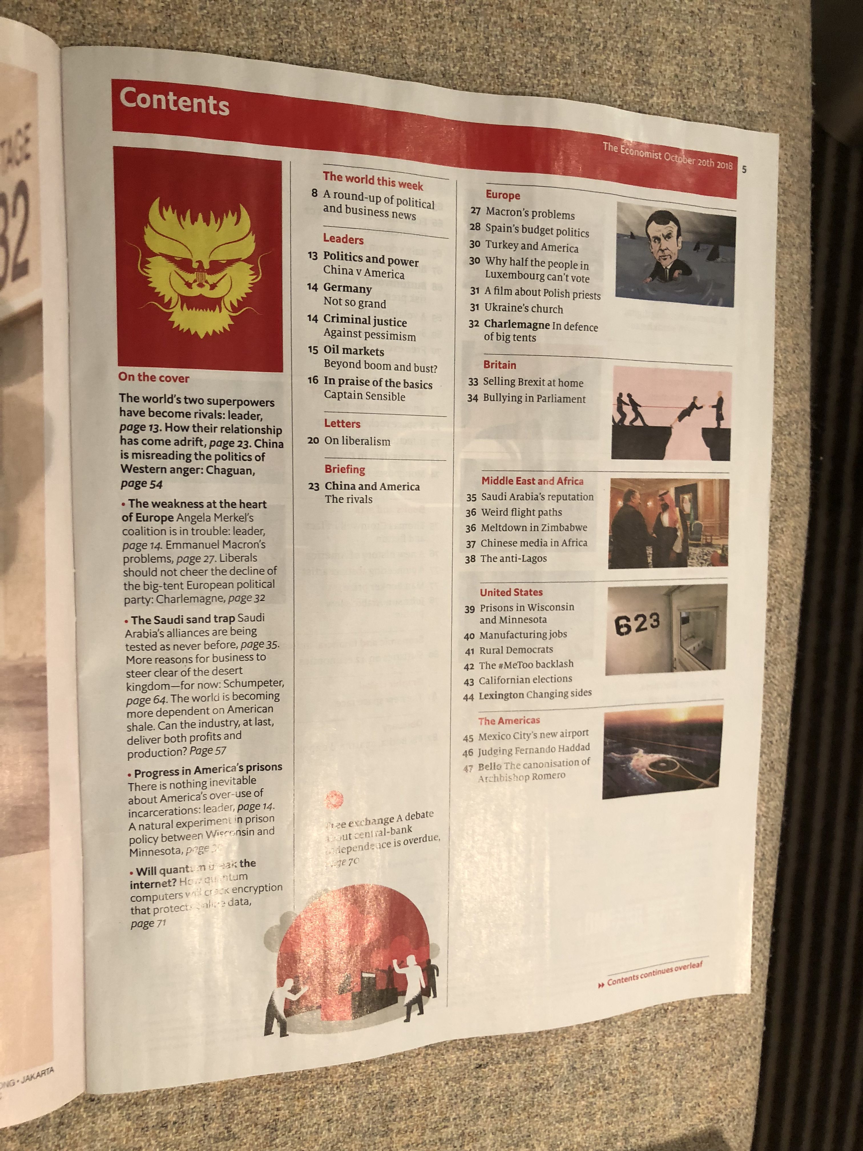
Navigation–an expanded “On the cover” panel for all featured cover stories.
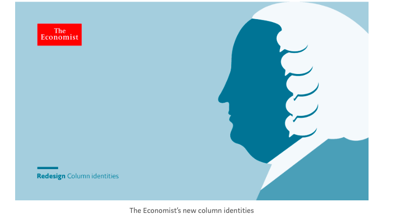
New column identity illustrations--See this one!
Previous redesign— In May 2001, the legendary German typographer and designer, Erik Spiekermann, redesigned The Economist. You can read more about it here:
http://spiekermann.com/en/why-the-economist-is-thriving/
Read all about it
https://www.itsnicethat.com/news/the-economist-rebrand-phil-kenny-graphic-design-221018
In their own words
https://www.economist.com/the-world-this-week/2018/10/20/introducing-our-new-look
TheMarioBlog post #2935