Reporting this week from Seattle, Washington
It’s all about the serendipity of a moment.
I was excited to read a Facebook post that was shared with me from a Swiss group of designers who had selected my book, Contemporary Newspaper Design (first published in 1981, but with a second edition in 1987) to be their choice of the Book of the Month for September 2018. Yes, you got that right. I, too, did a double take: that old book that almost wasn’t is dusted off and presented to a new generation of readers?
Indeed, and this is what the message said:
Book of the Month: «Contemporary Newspaper Design – A Structural Approach» (Second Edition) from Mario Garcia
246 pages, 210 x 280 mm, Hardcover
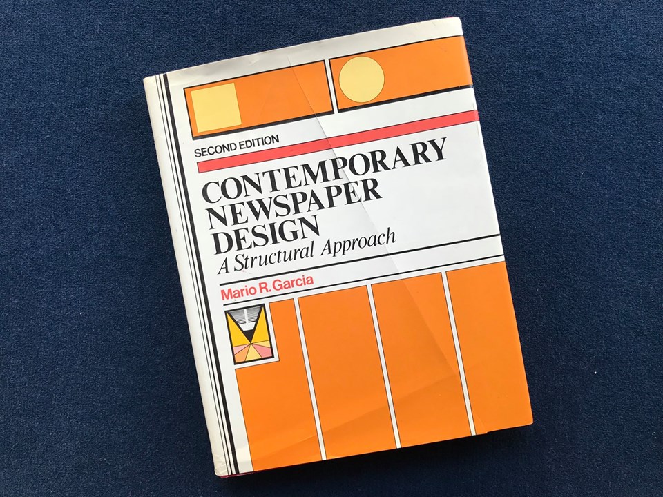
I owe this honor to Sven Gallinelli president of the Society for News Design – Deutschland, Österreich, Schweiz (SND for Germany, Austria and Switzerland). Sven is also an art director at NZZ Regionalmedien of Zurich.
My thanks to you Sven and group for honoring me and my book this way
Visual Impact in Print
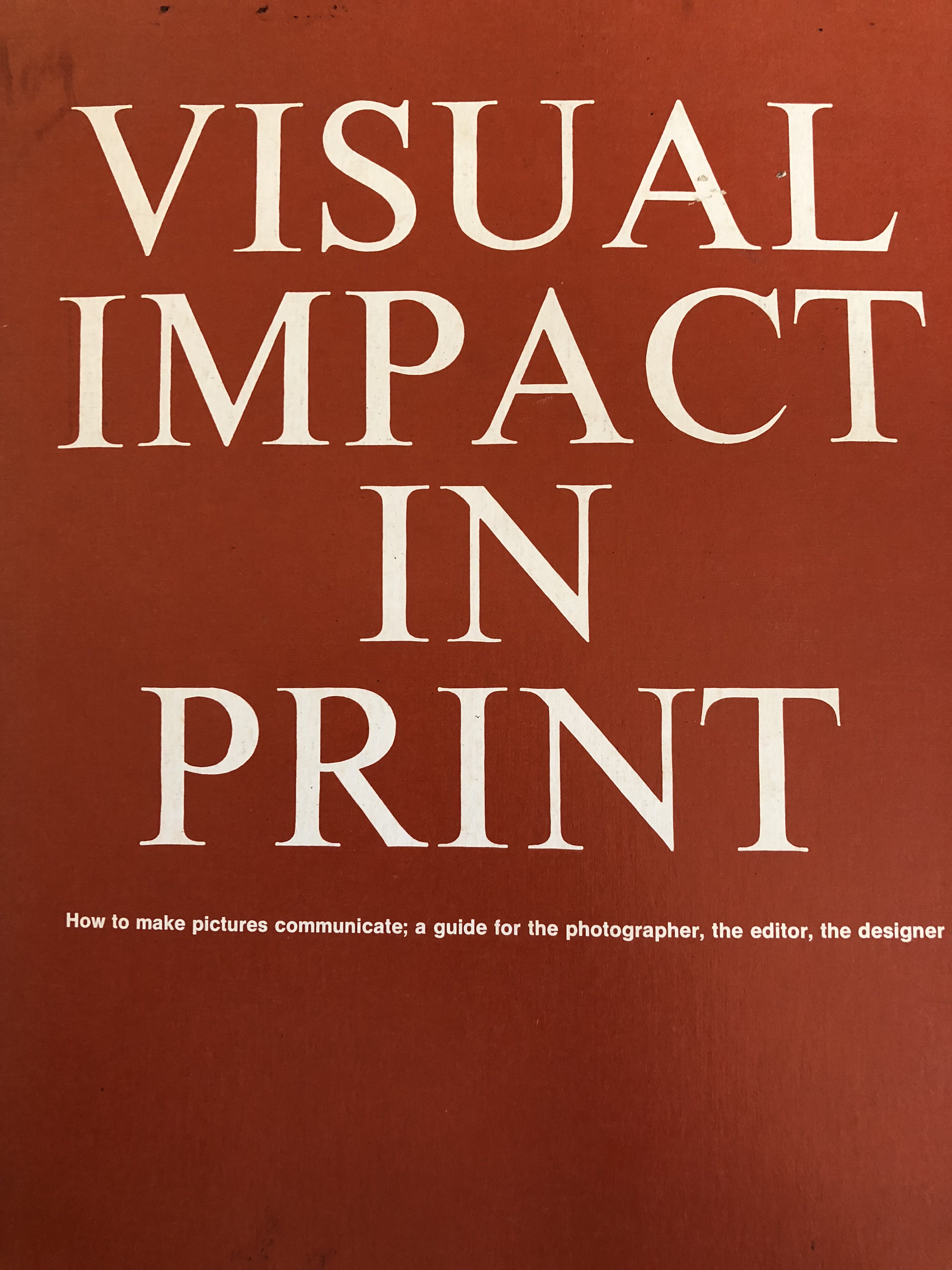
As I turned to my bookshelf in my NY apartment to check out the old book, I happened to run another oldie but goodie! It is Visual Impact in Print, by Gerald D. Hurley and Agnus McDougall (1971), a classic that I referred to often as a professor at Syracuse University, and when working on a variety of projects as a consultant.
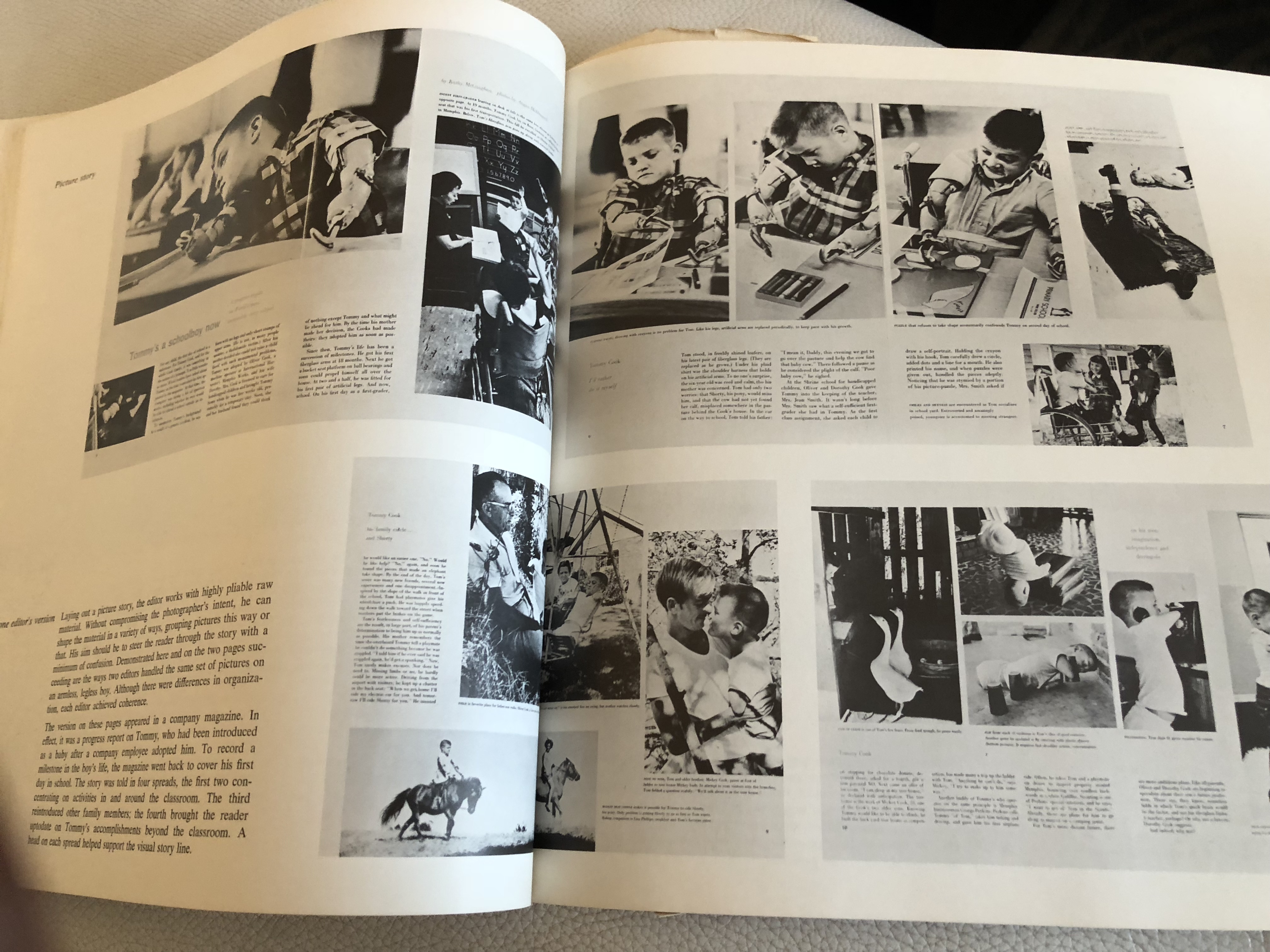
This is a book about photo editing, a skill that we need today more than ever, when everyone is a photographer/storyteller with a phone that takes photos at his disposal.
While the books shows its age, with only black and white images, the messages and tips provided are incredibly valuable today and beyond.
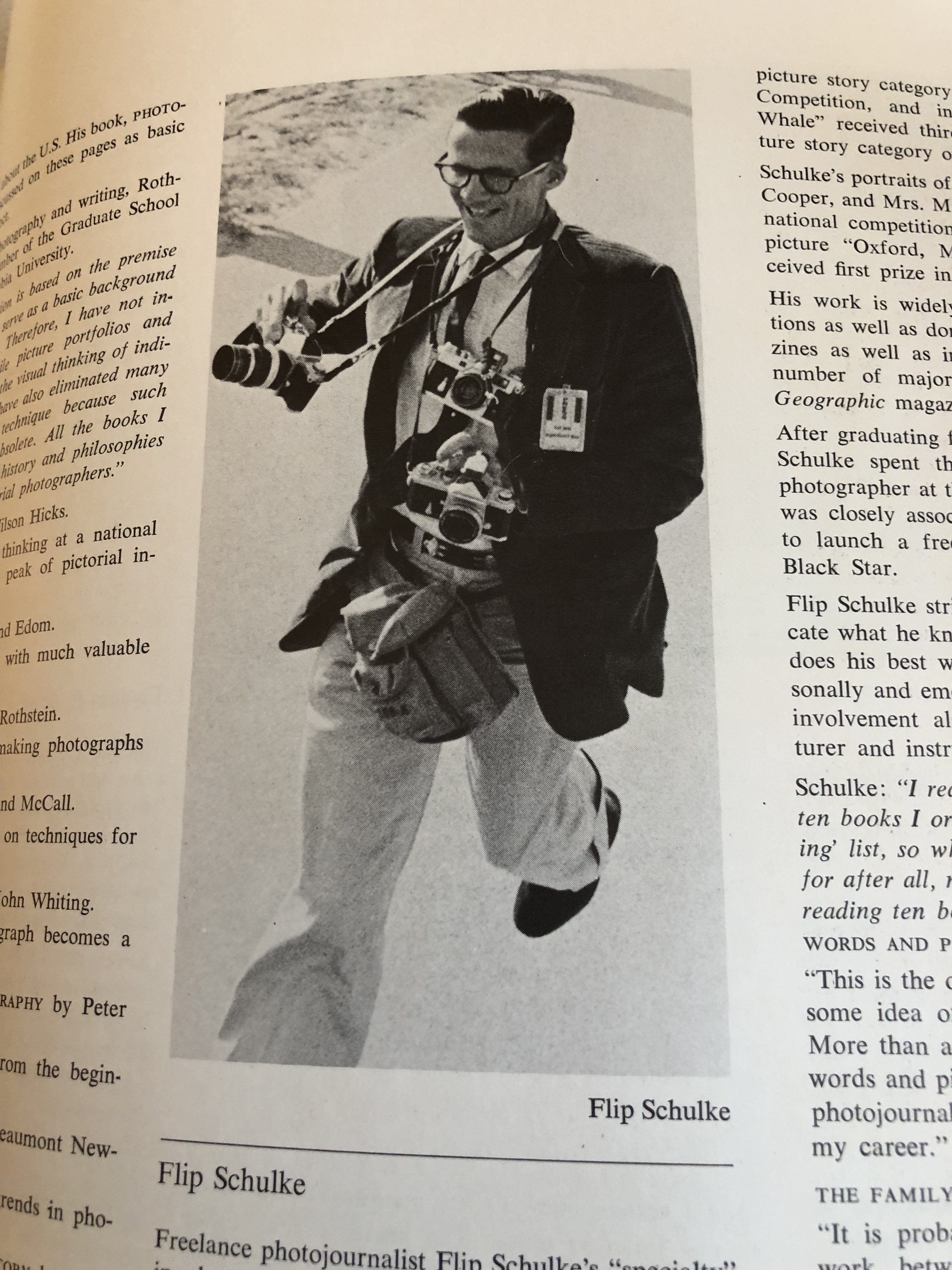
Looking a Visual Impact in Print today is also a trip back to another time, which I remember well, when photographers ran around with more equipment around their neck than a Hawaiian dancer:
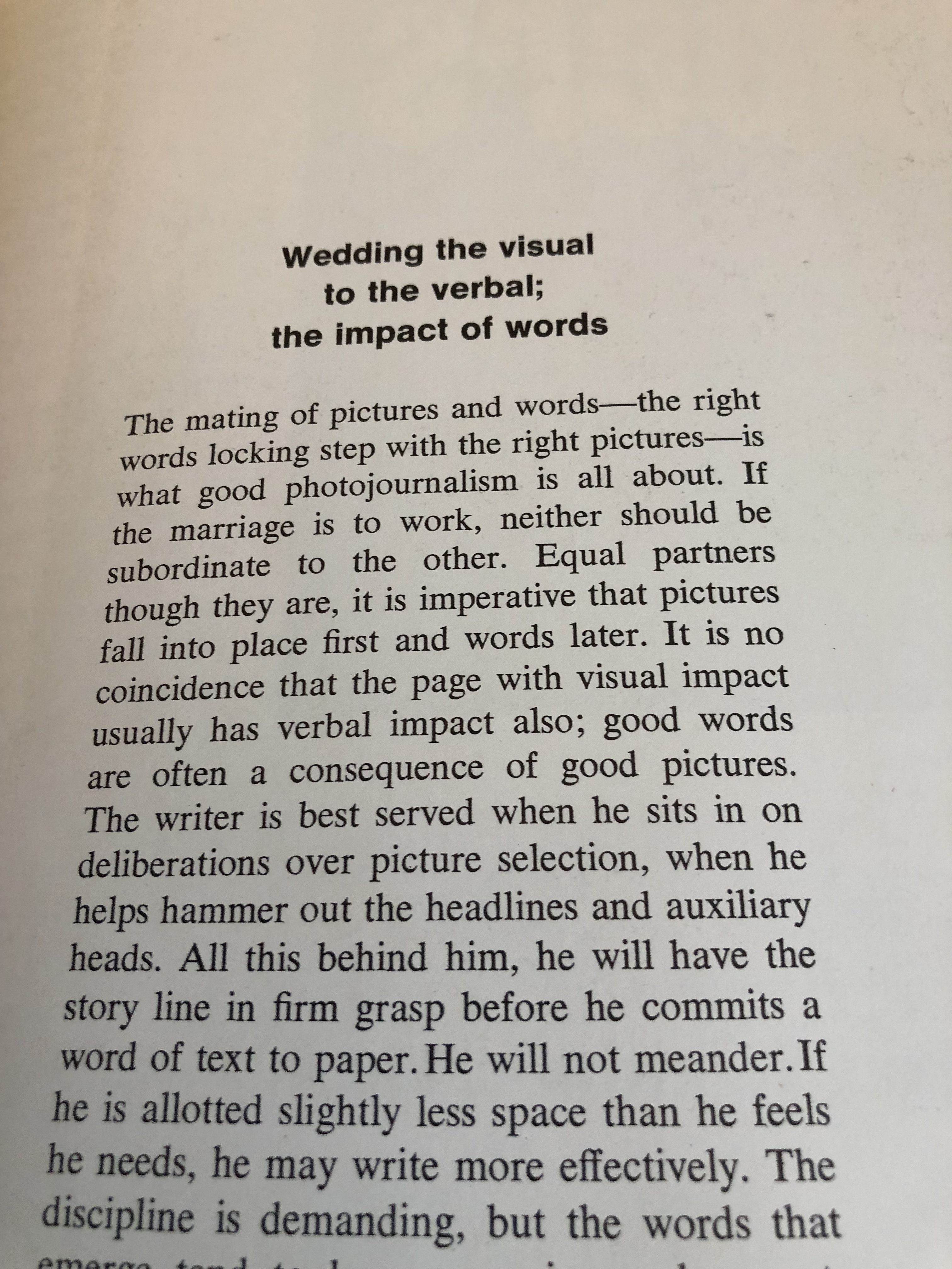
The reason this book is worth revisiting is the inclusion of such chapters as “Wedding the visual to the verbal: the impact of words,” which should be required reading for anyone attempting digital storytelling today. The authors here emphasize the importance of “cohesion for the long picture story or essay.”
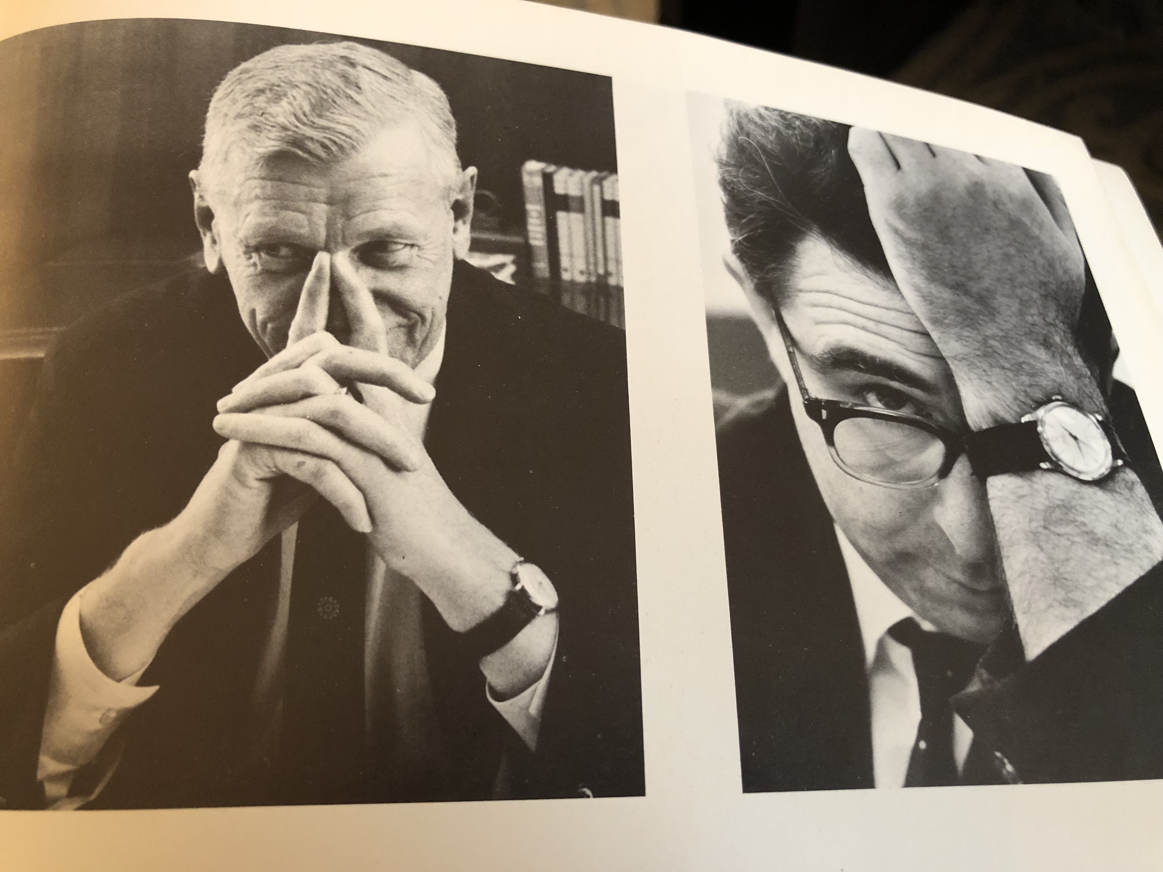
And, boy, can we learn a few lessons from the chapter about portraits and the impact of photographing portraits. Such tips as ” In a journalistic portrait, half of a face may reveal more than the whole,” or , how about letting the hands do part of the storytelling in a portrait, “…expressive hands that cup the chin, rumple the hair or help the subject epxress his thoughts.”
Finally, and this is a highlight of this book, and as timely a message today as it was in 1971:
Editors mistake the photo’s function. They regard pictures as elements of design as shapes on a page. Of less concern is what a photo says, how quickly it communicates.
In the environment of mobile communications and digital storytelling, those images must communicate quicker and tie to the story stronger than ever before.
My own cheat sheet from this book
I found my own notes on the inside cover of Visual Impact in Print, and, as I remember, these were my notes to make sure that these points were summarized to my Introduction to Graphic Arts class at Syracuse, where I had many photographers in the course:
–“….shoot now and correct later.”
–“leave the essentials in the photo, pare away the insignificant.”
–“Rarely is cropping obsolete.”
–“A photo should be reshaped only to improve ability to communicate.”
–“Size is important. Photos often do better larger.”
–“All emphasis is NO emphasis.” Focus your editing.
–“Emphasize variety, change of pace.”
–“In a photo essay, preserve the continuity (of the story), eliminate repetition and redundancy.”
This shows that paying a visit to your own bookshelf, and reopening some of those oldies, pays off sometimes.
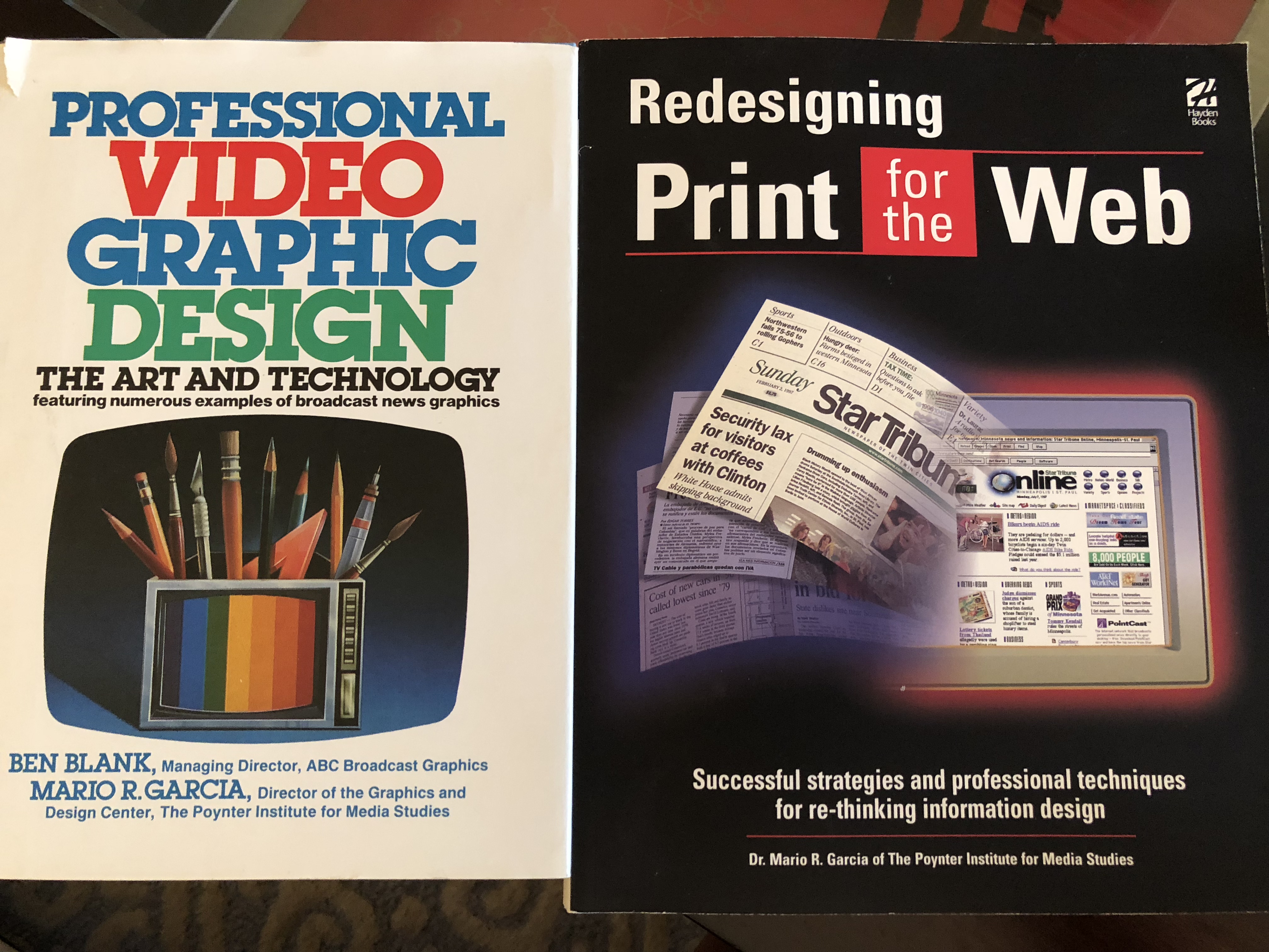
Tomorrow: Revisiting two other books that still resonate today
TheMarioBlog post # 2919